
Links are arguably the most important part of the web. Without links, we couldn’t navigate a website and access content properly. This makes it especially important to consider the accessibility of links and buttons when building a website.
The Web Content Accessibility Guidelines (WCAG) include multiple requirements regarding link accessibility, both explicitly and indirectly. There are also additional best practices recommended by experienced web professionals to further optimize your links for both accessibility and general usability.
In this post, we’ll explore the WCAG criteria and best practices for creating accessible links throughout all phases of the website creation process.
What does the WCAG say about link accessibility?
According to the WCAG 2.2, these are the main success criteria for links:
- 1.4.1 Use of Color. Color should not be the only means of conveying information. Links should be differentiated from regular text without using color alone (unless specific contrast requirements are met).
- 1.4.11 Non-text Contrast. User interface and graphical components, such as buttons or icons, must have a contrast ratio of at least 3:1 to adjacent colors.
- 1.4.3 Contrast (Minimum). Text (including links) should have a contrast ratio of at least 4.5:1 to the background color or 3:1 for large text.
- 2.1.1 Keyboard. All clickable elements must be accessible when using a keyboard to navigate a web page.
- 2.4.3 Focus Order. Focusable elements need to receive focus in the order that they are displayed in.
- 2.4.4 Link Purpose (In Context). The purpose of links can be determined by the link text or programmatically.
- 2.4.7 Focus Visible. Focusable items need a visible focus indicator.
- 2.5.8 Target Size (Minimum). The target size of a clickable element should be at least 24 by 24 pixels (with some exceptions).
While most of these link accessibility criteria seem straightforward enough, it can be challenging to interpret them in various scenarios that arise when dealing with links and other clickable areas on a website.
Now that you have a general idea of the “official” requirements let’s look at how you can pull all of this information together with general best practices to improve the accessibility of your website links and buttons.
4 tips for designing accessible links
Here are the key link accessibility guidelines for designers to remember when creating new page layouts for a website.
Links should look like links
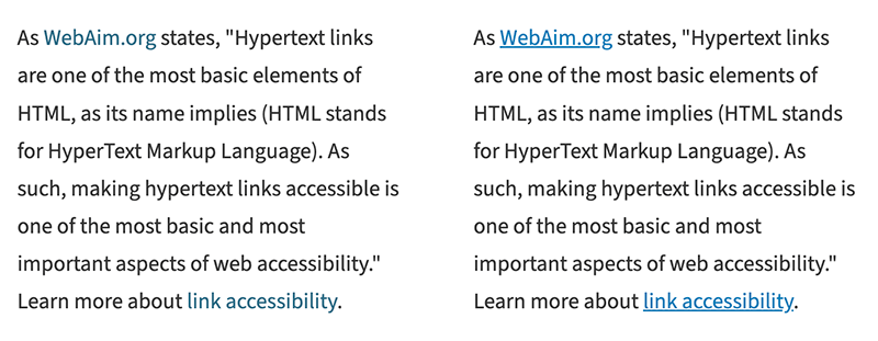
Generally, text links should be underlined to stand out and signify the difference between regular text and linked text. Underlined text is the default browser style for links, and users are most familiar with this link accessibility pattern. However, to avoid confusion, you should never underline text that isn’t a link.
While non-underlined text links can still be accessible, the WCAG has stricter color contrast requirements when the underline is removed, which are difficult to achieve, so it’s better to keep the underline.
For linked elements other than text, it’s best practice to use some type of signifier that an element is clickable, such as an icon. Link styles should also be consistent across your website. Overall, your primary link accessibility goal should be to eliminate any confusion for users about what elements are links and where they will take you when clicked.
Use proper color contrast
The WCAG has very specific link accessibility requirements related to color contrast. Link text must meet a 4.5:1 contrast ratio to the background color or 3:1 for large text. User interface and graphical elements must meet a 3:1 contrast ratio.
This can get tricky depending on the element being linked.
For example, text links and buttons don’t require the same contrast level according to these rules. Also, the amount of contrast needed for a button would differ depending on whether the button contains text or an icon.
If you’re a web designer, get familiar with the ins and outs of the WCAG link accessibility contrast requirements to understand better how to use color when creating accessible links.
Don’t forget about other link states
Hover and focus states are important parts of link accessibility, as they help users understand what elements they are clicking on. Remember to design these various link states. It’s worth noting that hover and focus states should also meet proper color contrast requirements.
Consider target size
WCAG 2.2 introduced a new criterion for the target size of accessible links. It requires that a link’s target size (clickable area) be at least 24 by 24 pixels, with some exceptions, such as when a link is within a sentence constrained by the line height.
This means that when designing standalone buttons or other linked elements, they must meet that minimum width and height. For example, it’s common to include icons that link to social media platforms. For link accessibility, they must be at least 24px by 24px.
Although that requirement excludes text links within paragraphs, limiting the number of links within a short content section is recommended. Too many links can be overwhelming, and it can be hard for some users to pick out specific links. If you have a group of links, consider using a bulleted list or some other way to set them apart from text and make them easier to click.
Content best practices for links
Meaningful link text is important for a multitude of reasons. If you’re responsible for writing content on a website, consider these tips for link accessibility.
Avoid vague link text
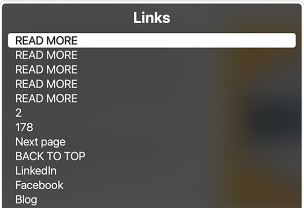
Vague link text such as “click here” or “learn more” can be problematic for users for multiple reasons. It’s a link accessibility best practice to use descriptive link text, so users will know where a link takes them when clicked.
Consider this text, where the bold text signifies the link: “Company XYZ is the best at what they do. To learn more, click here.” Linking the “click here” text wouldn’t tell the user much about what to expect on the next page.
Compare it to this updated example: “Company XYZ is the best at what it does. Learn more about the history of Company XYZ.” In this version, the link is on the text “history of Company XYZ,” which clarifies that the user will go to a page detailing the company’s history.
Another reason to avoid vague link text is that people who rely on screen readers to use websites often navigate through link lists or by tabbing through content. When taken out of context, linked text like “click here” becomes meaningless.
Other text considerations
There are other general link accessibility recommendations for consideration when writing link text, such as:
- Typically, the more concise the link text, the better. You don’t need to say, “Go here to browse our services,” when just “Services” would suffice. For people using assistive technology to read out links, this can help them browse a page more quickly. It also makes visually scanning a page for links easier.
- Related, you shouldn’t use full URLs for linked text. Screen readers will often read these URLs in their entirety, letter by letter, which can be frustrating for users.
- While not a hard rule, many experts recommend labeling links to things other than pages, such as PDFs or other documents. For example, instead of “2024 Product Brochure,” you would use “2024 Product Brochure (PDF)” with the label inside the link.
Functionality considerations for accessible links and buttons
Web developers are responsible for ensuring that an accessible link design gets translated to code properly without introducing new issues. Here are some link accessibility guidelines to follow.
Use semantic HTML for clickable elements
Web developers need to understand the difference between <a> and <button> tags and when you should use one or the other. Generally, the button tag should only be used for functionality. Don’t use <button> for a link that simply visually looks like a button.
Furthermore, for link accessibility, you should avoid adding click functionality to elements other than links or buttons, such as a <div>. Elements that aren’t clickable by default don’t have important accessibility features, such as being keyboard-focusable by default.
Avoid empty links or button tags
All clickable elements must have a label. If an image is linked without text, alt text is required, replacing a regular text label. Remember that linked images have different rules for alt text; check out the examples in the WCAG technique on providing link text for more information about handling linked images.
Test keyboard usage
All clickable elements should be accessible by the keyboard. The order of elements on the page should match the focus order. For link accessibility, keyboard focus states should be visible and not removed through CSS.
Ensure you know how to test a web page using the keyboard. This is an easy step to add to your testing process that can help minimize common accessibility issues.
Avoid redundant links
Repetitive links can make it more difficult for screen reader users to navigate through the links on a web page. For example, if a web page has an image and a title that should be clickable, it’s typically better for link accessibility to wrap both elements in a single link instead of linking them separately.
Consider options for opening links in a new window
One divisive topic amongst web professionals is whether or not external links should be set to open in a new window (using target=”_blank”).
Some link accessibility experts argue that forcing links to open in a new window or tab takes away the user’s control and should be used sparingly. Others say that while it’s okay to do so, any links opening in a new window should be clearly noted as such.
Whatever decision you make for your website, be consistent with your choices and ensure that your users understand what a link does when clicked.
Understand when additional code is needed
Sometimes, for more complex web designs or instances when you don’t have the option to change a problematic design pattern, you’ll need to use more advanced link accessibility coding practices to create accessible links.
For example, visually hidden (or “screen reader only”) text or ARIA attributes might be necessary to contextualize links. Web developers should be familiar with the tools and “tricks” available to help make links and websites more accessible.
