
If you’re struggling to create an accessible color palette for your website, you’re not alone. A common challenge we run into when designing accessible websites is adapting existing brand colors to the web when there are limited color combinations that meet WCAG color contrast requirements.
In this post, we’re going to walk through the process of taking existing brand colors and choosing contrast-friendly website colors combinations. We’ll look at best practices, helpful tools, and tips for working with a limiting color palette.
Web accessibility and color contrast
Before we go any further, if you’re unfamiliar with WCAG or web accessibility in general, here’s a quick overview to get you up to speed.
What is WCAG?
WCAG stands for Web Content Accessibility Guidelines, which are the most widely accepted accessibility standards for websites. The WCAG consists of a list of criteria that must be met in order for a website to be considered accessible.
What are the three levels of conformance?
- Level A
- Level AA
- Level AAA
Level AA is typically recommended as the base level of conformance to aim for.
What is included in WCAG criteria?
The WCAG criteria includes color contrast minimums for both text and non-text elements. The key points are as follows:
- Text requires a contrast ratio of 4.5:1 to adjacent colors, with the exception of large text, which requires a ratio of 3:1. Large text is defined as 18pt (24px) or 14pt (~19px) and bolded.
- User interface components and other graphical objects require a contrast of 3:1 to adjacent colors.
For more information about the WCAG and color contrast requirements, check out our detailed article on website color accessibility.
Working with brand colors
When creating a company website (or updating an existing one), it’s best practice to be consistent with established branding in order to increase brand recognition. Typically, this means web designers are given some level of branding guidelines to start from, which most likely includes brand colors.
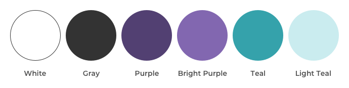
For the purpose of this walkthrough, we’ll be using the following brand colors as an example.
As a first step in building an accessible color palette from brand colors, we need to determine which combinations meet our WCAG color contrast requirements. There are various tools that can help with this step, with some of our favorites being:
Here is an example of our brand colors laid out using the EightShapes Contrast Grid tool.
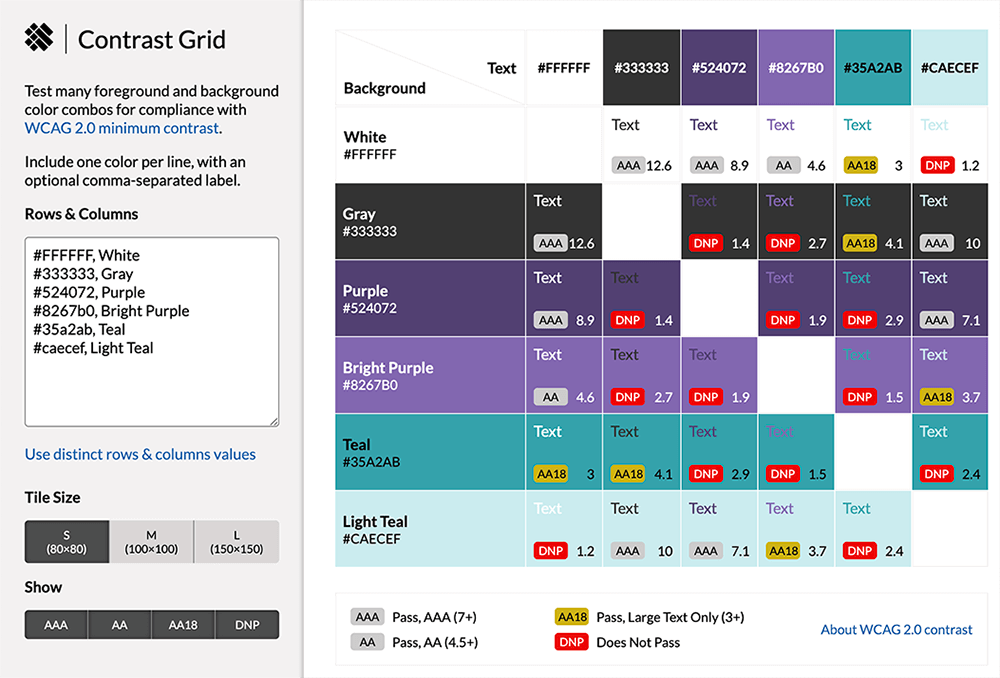
While each tool will be different in how it displays accessibility details, they all display similar information.. In this particular example, the tool generates a table of every possible color combination from the colors provided. Look at the the bottom right of each grid box. There you can see indicators showing which combs meet the WCAG color contrast requirements.
Color combinations that meet the minimum ratio for text are marked with an “AA” or “AAA” depending on which conformance level is met.
The “AA18” indicator means that the color combination meets the Level AA large text requirement. The “DNP” indicator stands for “Does Not Pass” and means it does not meet the contrast minimum. Each box also includes the exact ratio of the color combination for reference.
Let’s look at another example. It shows the result of adding the example brand colors into the Accessible Color Contrast Checker.
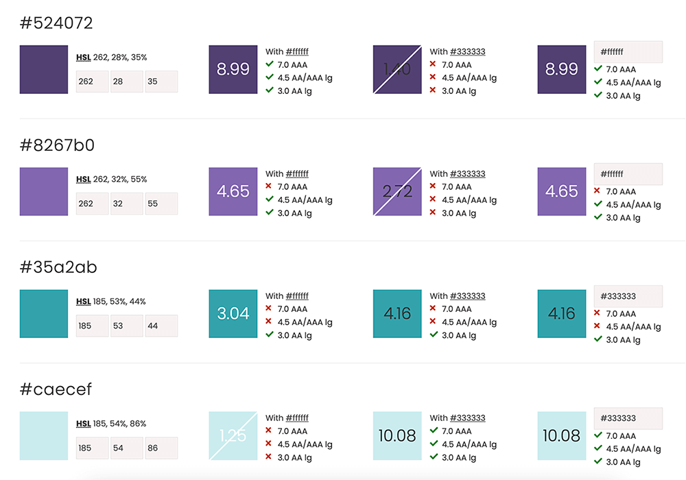
With this tool, you can provide a light and dark text color. It will compare each provided color to those values. It also includes an editable box at the end of the row so you can manually test other colors if needed. Like the contrast grid example, it shows which color combinations meet contrast requirements by displaying a checkmark next to the applicable criteria for each sample.
There’s no one right way to assess your colors, so try out a few different approaches to find out what works best for your process.
Once we have the breakdown of the contrast ratios for our brand colors, the next step is to use that information to start defining how we will use our colors on the web. For example, here’s a breakdown of how we might use this information to guide our decision-making during the design process:
- Since our gray color has an acceptable contrast, our website will have a white background and use gray text for the majority of content areas.
- Our bright purple color works against white as well, so we’ll use that for links within content areas.
- We want to incorporate the teal color more, but that only meets the large text contrast requirements, so we will use that for top-level headings that will be large enough to be acceptable.
- We want to set some content sections apart for emphasis by using purple as a background color. For those sections, we can use white text. However, since our teal color does not work over purple, we will ensure any headings use a different color within this section.
It might take some trial and error to find the best use of your website colors, so experiment with different options to find the right balance.
What to do if your brand color palette is limiting
In our example, we had enough color combinations that met contrast requirements to build an accessible color palette. However, this isn’t always the case.
If your brand colors result in limited options, consider one of these four workarounds.
Use colors acceptable for large text
While you might have brand colors that don’t meet the main 4.5:1 ratio for text contrast, if they are within the 3:1 large text requirement, you can still incorporate those colors for headings and other elements with large text.
One thing to be mindful of with that approach is to ensure that—if the text size is decreased for smaller screens like mobile devices—it still is large enough to meet the contrast ratio.
Add accent elements
For colors that don’t work for any text contrast requirements but that you still want to use in your website design, try using them as accent colors in other ways. Adding decorative, non-text elements to a design is a great way to incorporate challenging colors without impacting accessibility.
Choose a similar color
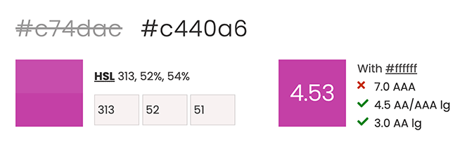
Sometimes color combinations you want to use are close to meeting contrast ratios but slightly off. In those cases, consider selecting web-only alternatives for those colors.
If the contrast ratio is already close, this difference in color is often barely noticeable.
Here are some tools you can use to adjust colors or find similar accessible combinations:
Below is an example of using the Accessible Color Contrast Checker tool. You can use it to find a possible replacement for a color that is close to the acceptable ratio. Just adjusting the lightness to reveal the alternative. As you can see, this new variation is only slightly different between the original.
Incorporate new colors
When all else fails, it may be necessary to add on to existing brand guidelines to include an accessible color palette for website use. Work with designers to find accessible color options that match your brand identity.
Use these resources to find accessible website colors:
Color accessibility upkeep
Once you’ve defined your accessible color palette and website color rules, it’s important that you continue to reference them throughout the website design and development process.
It’s easy to set these guidelines in the beginning and then start to stray as a project progresses, so consider these tips to help keep color accessibility front of mind:
- Bring the whole team up to speed on web accessibility. If everyone working on a project has at least a high-level understanding of why it’s important and the type of things to be aware of, it will help to minimize issues along the way.
- Document any rules or guidelines you develop for color accessibility so you have a reference point for any questions during the project as well as for future website work.
- Consider using a plugin for any design software your team is using to help identify color accessibility issues. For example, Stark offers a range of plugins for different design software. You can use them to color accessibility while designing.
- Use plugins and other automated testing during website development as well to help catch any issues that might slip through. Over time, new elements might be introduced to your website, so having an accessibility testing process in place is helpful to identify any new concerns.
FAQs for color accessibility
What is color accessibility?
Color accessibility consists of ensuring that the colors used in digital products are accessible to all users regardless of any visual impairments (whether permanent or temporary) that impact the perception of color.
What is an accessible color palette?
An accessible color palette consists of colors that include combinations that meet the WCAG criteria for color contrast. The WCAG defines color contrast minimums for both text and non-text elements.
How do you make website colors accessible?
You can make your website colors accessible by testing colors. Remember to only use combinations that have sufficient contrast.
Make accessibility a priority on your website
You have to make a lot of decisions when designing and developing an accessible website. And, choosing an accessible color palette is one of the most important.
If your team isn’t comfortable wading through all the options, you may need help from a pro. TBH Creative’s experienced team can help get you on the right track. We have the expertise necessary to make accessibility a priority during each stage of website design process.
