
When was the last time you were on a website without a form? Web forms have many uses—contact, subscribe, sign-up, download, register … and the list goes on! If your users are not filling out your forms, lack of form accessibility may be to blame.
Filling out an online form can be challenging for people with disabilities if the form hasn’t been properly optimized to ensure all users can successfully navigate and submit form data. Don’t let poor web form design be the reason you are missing out on crucial feedback from partners, important customer questions, and new lead conversions.
Creating accessible forms requires careful consideration during both design and development. Let’s look at some form accessibility best practices to follow throughout the web form design process.
Best practices for building accessible forms
What guidelines should I follow?
Part of creating accessible forms is simply following usability best practices. In general, forms should be easy to understand, logical, and as simple as possible.
In addition, the Web Content Accessibility Guidelines (WCAG) provide a variety of criteria applicable to form accessibility that should be considered when creating web forms. The WCAG is the most widely adopted standard for web accessibility guidelines.
Reminder: Depending on the specific needs of your website, you might have additional requirements for form accessibility. Remember to always check with your legal counsel to answer any specific questions and determine the exact requirements for your website.
Form basics
Labels
- Every form field should have a corresponding label.
- If a label must be hidden, use a method for visually hiding content that keeps the label accessible to screen readers.
- Labels should be programmatically associated with the proper field, using the “for” attribute and matching the value to the appropriate field’s ID.
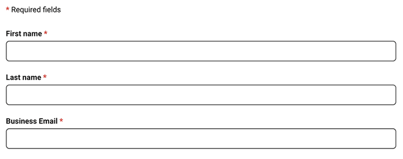
- Labels should be unique and descriptive. For example, if you have a first name and last name field on your form, use “First Name” and “Last Name” as the corresponding labels instead of one general “Name” label for both fields.
Fields
- Always use native, semantic form controls when possible for the best form accessibility. If you choose to create custom field elements using Javascript, make sure you’ve given special consideration to how these will work for keyboard users and assistive technologies. Properly implement ARIA markup to recreate the built-in accessibility features of native controls.
- Do not use the “placeholder” attribute as a replacement for a label or help text. Placeholder content is not visible to all users and is hidden when a field has focus, so this should not contain information crucial to successfully submitting a form. For example, if a field requires specific formatting such as a date, add that information within the label or as descriptive text underneath instead.
- Be mindful of tab order for keyboard users; it should be logical and follow along with the visual layout of the form. Avoid manually manipulating the tab order unless you are clear on the form accessibility and usability implications of doing so.
- Required fields should be clearly marked. There are multiple approaches for doing this in an accessible way, but whichever method you choose should be clear both visually and for screen readers. For example, color alone should not be used to signify a required field. One acceptable approach would be to add “(required)” text after the label of each required field.
Feedback / Error Handling
There are various techniques to provide feedback and error messages to users, which will likely depend on the technology you use for your forms. For example, you might provide feedback to users dynamically as they are working through a form or all at once after submission. No matter what approach you use, here are some general tips to keep in mind:
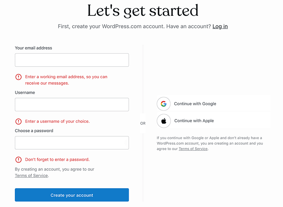
- Clear, concise messaging should be provided for any user feedback.
- Error messages should be close to the related field; these are typically placed beneath the corresponding field. It’s recommended to include some type of error notice at the top of the form, but that should be in addition to and not in place of inline error messages.
- Error text should be descriptive of what needs to be corrected by the user. For example, if a phone number field generates an error if not provided in a specific format, the error message should state what format is expected.
- Error indications should not rely on color alone, such as a red field outline. If there is not an error message clearly defined, consider a visual indicator such as an “x” icon that is easily identifiable as an error.
Additional web accessibility tips
- All text and form elements should follow the WCAG guidelines for color contrast. Any text should have a contrast ratio of at least 4.5:1 with its background color, and user interface elements, such as form fields, should have a 3:1 ratio with their background color. For fields, this is typically accomplished by adding a border around the field.
- Single column forms are typically the best approach to form accessibility. Multi-column forms can be confusing for users, especially those using a keyboard to navigate the page. If a multi-column form is needed, pay special attention to ensuring that the tab order of the form fields will be clear to keyboard users.
- Simple is often best for form design. By using familiar design patterns for form elements, users will better understand and navigate your forms.
- While there has been debate over the best placement for labels, it’s often recommended to place labels above fields instead of next to them for clarity and easy scanning.
- Don’t hide away important help text in a tooltip or other element that some users might find hard to access. Prominently display any information essential to successfully filling out the form.
- Consider grouping related fields with headings that make sense, especially for long forms that might be overwhelming.
Testing
Even after you’ve implemented all of the best practices for form accessibility, the best way to truly ensure your web forms are accessible is to test them.
Real user testing is the best way to identify any problem areas or pain points you might have missed. If you’re able to conduct testing with users with disabilities or who browse the web with assistive technologies, they can provide valuable feedback as to how real users will interact with your forms.
If not, consider trying an assistive technology to get more familiar with the experience and test yourself. Both VoiceOver for Mac and NVDA for Windows are free tools available by default on those operating systems. You can test the experience for keyboard users by trying to successfully complete your form with your keyboard only. There are other tools and browser plugins that can help with accessibility testing as well.
For more information about form accessibility, check out the following resources:
