
Design patterns play a key role in user experience (UX) design. Website layouts that use consistent, standard elements from page to page help users find the information they need more quickly, which helps increase engagement and overall satisfaction.
However, when it comes to accessible UX design you can’t always rely on popular design patterns, as many of them pose accessibility challenges. When determining which components and patterns to use on your website, don’t reuse something just because it’s common across the websites you visit—consider if it truly meets the needs of all users.
To help you get started in evaluating accessibility in UX design, let’s take a look at some common design patterns to be cautious of when designing an accessible website.
Challenging design patterns for accessible UX design
While not an exhaustive list, the following are examples of design patterns commonly found on websites that can cause accessibility issues. Keep in mind that this doesn’t mean all of these components are off limits in accessible UX design but that there are additional considerations and context required to implement them properly.
Displaying content on hover
It’s been common in the past to create components where certain content is displayed only on mouse hover. For example, a dropdown menu shown when hovering over a link in navigation, or a tooltip that shows additional information when an icon or other element is hovered over.
However, in order to meet website accessibility requirements, a user should be able to navigate your website using a keyboard. This essentially removes the option to “hover”, as does viewing a website on a touch device. Requiring the hover action to view content means those users likely won’t be able to access it at all.
It’s typically best not to hide content away behind a hover, especially important content. If you do, make sure to implement proper alternatives to make it accessible to all users.
Carousels
Carousels, also commonly referred to as sliders or rotators, are notoriously difficult to implement in an accessible way. There are extensive recommendations that must be considered, and even then, they can still provide a difficult experience to assistive technology or keyboard users.
If you’re considering a carousel for content on your website, take a step back and determine if there is a more accessible UX design pattern that could serve the same purpose.

Modals
Modals (aka dialogs, popups, overlays) can be found everywhere across the web. They are used for newsletter sign-ups, ads, content offers, and more. However, despite their frequent usage, they can cause significant issues for some users.
Before you implement a modal, ask: Is a modal the right design pattern? They are often overused when other approaches would better serve all users. If a modal is required for accessible UX design, an accessible implementation requires consideration of things like focus management, keyboard usage, and proper ARIA implementation.
Hiding form labels and misusing placeholder text
There have been a lot of trends in form design over the years, some of which have introduced concerns related to accessibility for websites.
For example, the “floating label” design pattern is commonly used to create a cleaner form design or to decrease the length of a form. However, this is often implemented in a way that makes it hard for some users to understand a form.
Pro-tip: The Nielsen Norman Group provides a helpful rundown of label and placeholder design and considerations for accessible UX design.
Additionally, the placeholder attribute for form fields is often misused as an alternative for a proper label or help text.
More often than not, the most inclusive approach to form labels is the tried and true method of the label above the field. If you plan to deviate from that, it’s important to consider not only the design but also the implementation to ensure that it can be built in an accessible way.
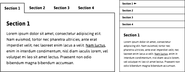
Tabs and accordions
Tabs and accordions are similar in that they consist of only showing one section of content at a time until another is selected by the user. Both of these patterns can be useful options in accessible UX design, but both require special consideration in design and development.
Unfortunately, many websites use inaccessible implementations that make these components hard for users with disabilities to navigate. Both tabs and accordions require specific design and coding considerations to meet requirements and pass web accessibility reviews.
5 tips for creating accessible web design patterns
As the previous examples show, accessible UX design requires thoughtful consideration of design patterns in order to ensure that they aren’t only visually impactful but also usable for everyone.
Here are some things to keep in mind to help further guide you in the right direction when creating accessible design patterns.
- While it’s tempting to get caught up in the latest design trends, they aren’t always the most practical option for actual website users. Rely on the knowledge of accessibility experts for best practices and the latest recommendations to make the right choices for your website design.
- Remember that there is always more than one way to display content on a website. If you like a design pattern but aren’t sure about its accessibility, or if you don’t have the resources to ensure proper implementation, then go with another solution.
- Get educated on the accessibility features needed for common design components. For example, the W3C provides an Authoring Practices Guide with detailed information on how to build common design patterns in a more accessible way.
- Reference existing accessible design pattern libraries to see how other accessibility experts are solving common problems. For an extensive list, check out the Web Accessible Code Libraries and Design Patterns collection from WebAxe.
- Not all guidelines and libraries are guaranteed to be perfect or will work for all scenarios. Make your own assessments based on the context of your website and your users and conduct thorough testing.
