Have you noticed your screen looks a little darker lately? You’re not alone. Black backgrounds are popping up everywhere. As dark mode web design grows in popularity—with operating systems, browsers, and apps—so does its prevalence in modern web design.
Though it feels fresh, dark mode websites and its use in design is nothing new. If you ever used a computer in the ’80s with a monochrome screen (or if you have seen them used in the movies—Ferris Bueller? Anyone, anyone?), you know the look. Most of the earliest home computers displayed green or white text on simple black backgrounds.
Read on to learn about the pros and cons of creating dark mode websites with black backgrounds, and see examples of sites with dark backgrounds done well.
What is dark mode?
Also called black mode, dark theme, or night mode, dark mode web design is a term used to describe any layout with a light-on-dark color scheme that many users prefer using in low-light environments. In its most basic iteration, think bold white text on a jet black background.
Fifty shades of (dark) gray
Dark mode web design doesn’t just mean choosing a black background color with a value of pure black (Hex code #000000) and calling it done. What works in one darkly-themed design solution might not make the same impact on another.
To get a look that works, color selection requires more nuance.
When you are ready to paint it black, don’t limit yourself to #000000. With tons of different dark mode website background color solutions available, consider if a cool black or warm black will best serve the user experience, complement the overall webpage design, and enhance your brand identity color palette.
Pro-tip: Dark mode web design doesn’t have to mean going grayscale.
Choosing a dark mode website doesn’t have to literally be black and white. There are plenty of ways to get a dark mode web design look with other colors with qualities similar to black.
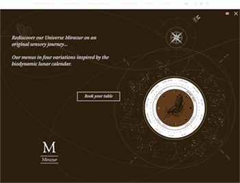
Take world-famous Mirazur, for example. Their web design firm picked an earthy coffee-black for its dark background color to create a homepage experience to match the French restaurant’s reputation of creating once-in-a-lifetime dining experiences.
Their site also features rich background colors—like velvety eggplant and smokey pine green—to achieve a dark mode look.
Best black background alternatives for dark mode website design
Unsure where to start your hunt for the perfect dark mode background hue? Here are some of the most popular dark mode Hex code values used to add rich darkness to websites:
- #0A0A0A
- #121212
- #15292B
- #161618
- #181818
- #192734
- #212121
- #212124
- #22303C
- #242526
- #282828
- #3A3B3C
- #404040
Pros and cons of dark mode web design
Black backgrounds help make images pop
Have you ever noticed that many museums and photographers often use black backgrounds on their dark mode websites? It’s not just a sophisticated aesthetic preference. They make that choice deliberately to ensure their photos and illustrations come alive. White backgrounds often wash out images, but—because the color black recedes—dark backgrounds make pictures with brighter colors stand out and come alive.
Another perk? If most people access your site from their smartphones, you’ll have delighted users. That’s because a dark mode web design interface featuring a black background requires less battery power to display on top of looking great.
“The eye is always caught by light, but shadows have more to say.”—Gregory Maguire
Darker website designs may hinder readability
Researchers have found that light text on dark backgrounds is more challenging to read than dark type on white backgrounds due to the “halation” effect. This phenomenon makes dark mode website design less ideal for almost all copy-heavy websites.
According to user experience designer Jacob Nielson, “Optimal legibility requires black text on white background. White text on a black background is almost as good. … Legibility suffers much more for color schemes that make the text any lighter than pure black, especially if the background is made any darker than pure white.”
If your website is likely to be used at night or by users in dimmer/low-ambient light settings, researchers have found that creating a dark mode web design might be your best bet for limiting eye strain. Staring at stark ivory screens created by bright white website backgrounds can cause discomfort when users are in dark rooms.
As with most things, there are exceptions in this legibility debate. For instance, users with cataracts actually find websites with dark mode backgrounds easier to read than those with white backgrounds. Double-check your website persona research to learn if there are any demographics for which it would make sense to pursue a dark mode website redesign.
Dark mode elicits powerful emotions
Black is anything but neutral. Ebony is always a dominant color associated with elegance, style, and power. When used strategically as a website’s background color, it can add visual appeal and depth.
Pro-tip: Check out what your competition is doing online.
Design decisions shouldn’t just be based on aesthetics and usability. You have to think about your business needs, too. If your customers see dark mode web designs when they visit your competition online, going with a layout that’s attractive, light, and airy may help you stand out from the crowd in their browsers.
46 examples of dark mode website designs
WeTransfer
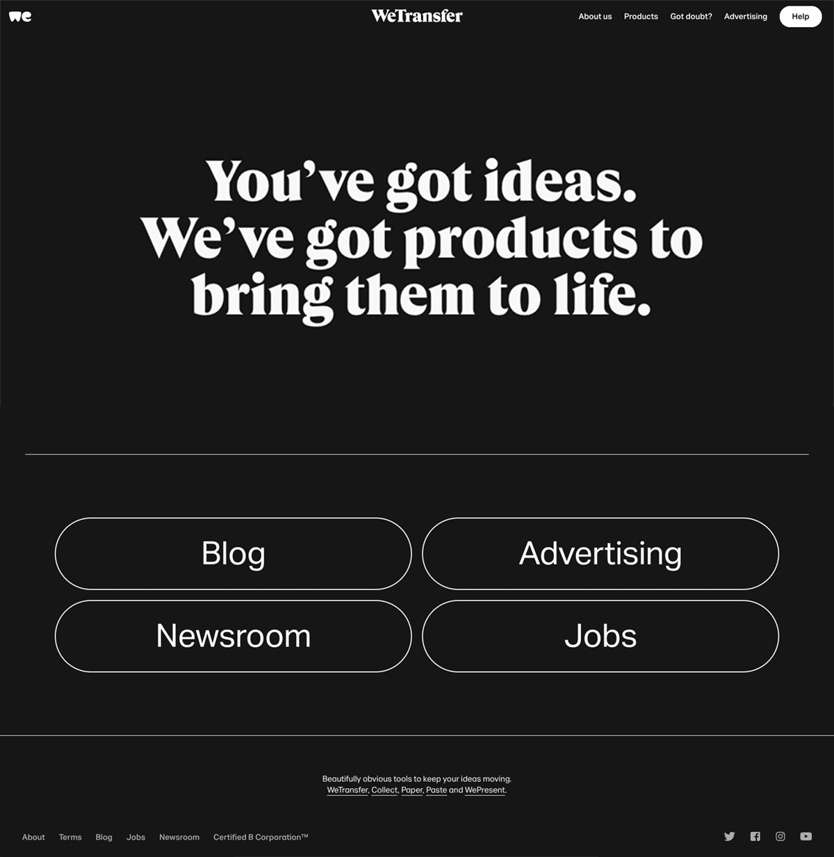 WeTransfer proves that black and white is anything but boring with their elegant, dark mode homepage design.
TCM
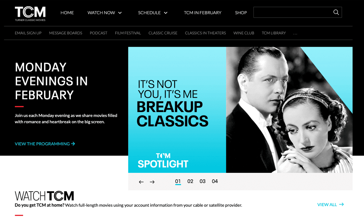 As part of TCM’s elegant recent rebranding, their website redesign team added a visual nod to the black and white movies popular on the channel with a dark mode hero design.
Saturday Night Live
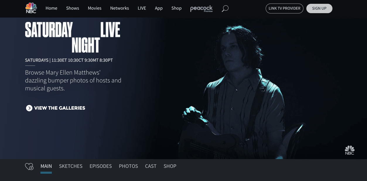 Talk about knowing your users and thinking about accessibility. Knowing many of their users will visit late at night when the show is airing, Saturday Night Live uses a dark mode web design to make low-light browsing easier on their audience’s eyes.
MasterClass
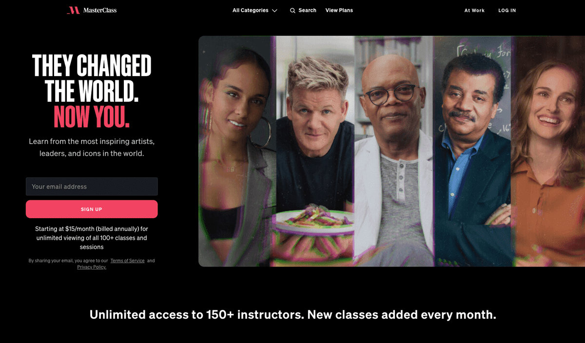 Photos of MasterClass’s famous instructors pop off the homepage because of its impressive ebony background.
Spotify
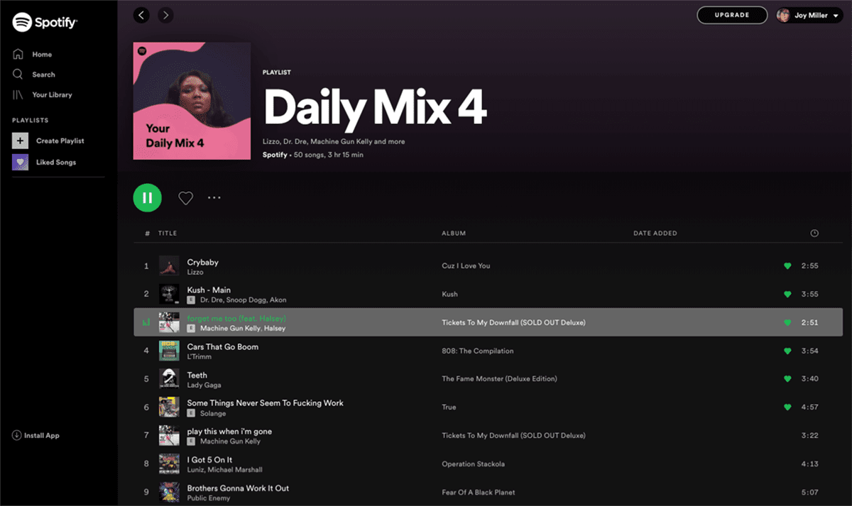 Spotify is an OG in the dark backgrounds space. Their designers have used black backgrounds in their dark mode web design for desktops, tablets, and mobile apps to energize their layouts and make album artwork “sing.”
Primex
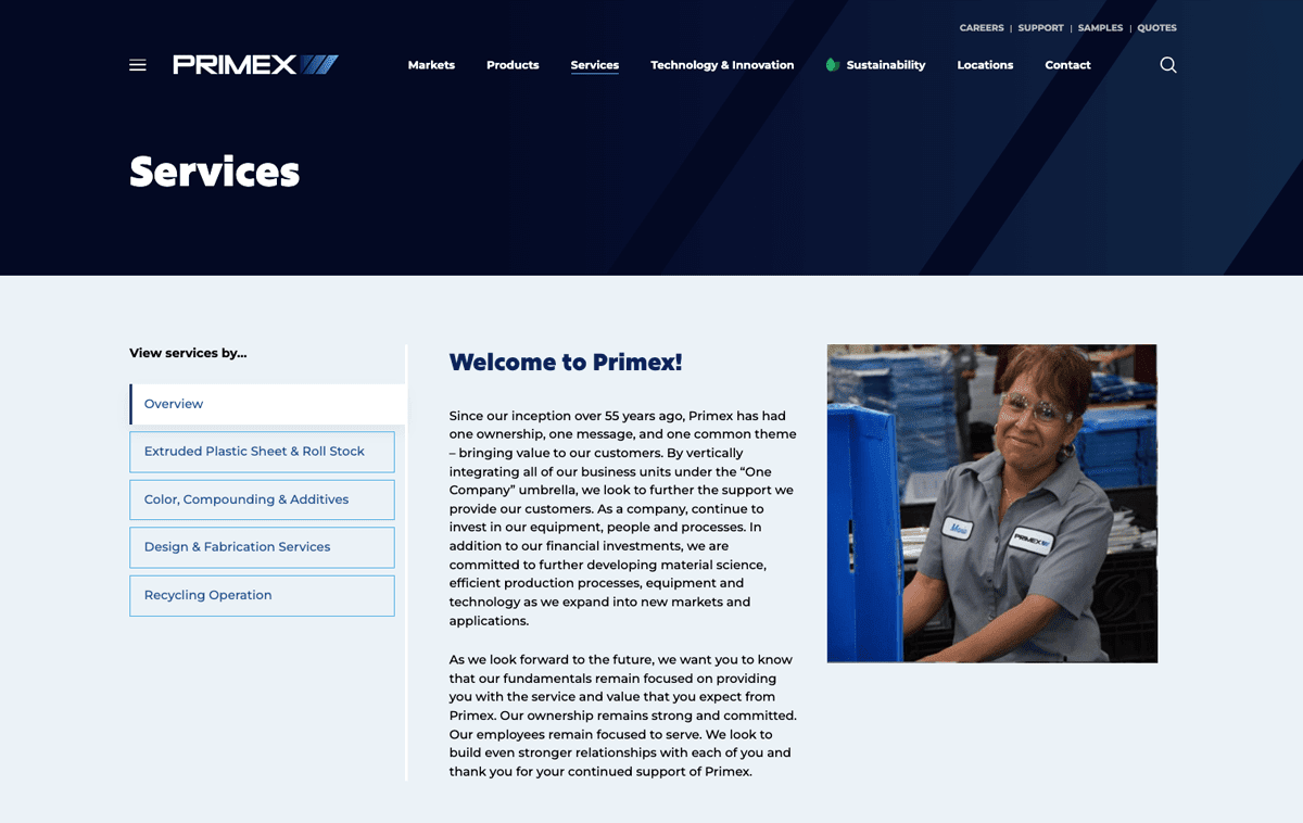 On its complex B2B website, Primex incorporates a rich navy background with a screen of its mark for the navigation area of its dark mode web design. Learn more about Primex’s website redesign.
Space Needle
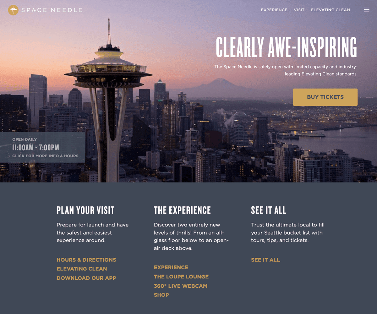 A dusty purple makes an unexpected—but practical—choice for getting that dark mode website look, as the city of Seattle’s handsome Space Needle website proves.
The British Museum
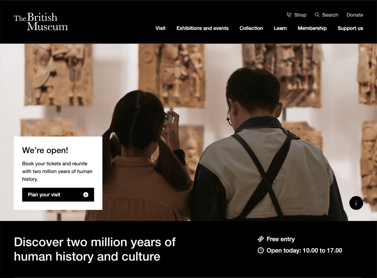 On the British Museum’s dark mode homepage, web designers use simple typographic treatments and a rich black background color to set off their eye-catching photography.
Kansas Heart Hospital
 Inspired by the layered aesthetic of its logo, the Kansas Heart Hospital’s web design team pulls in a rich brown overlay on top of its homepage hero image to create the mobile-friendly website’s unique dark mode look.
Tracking Football
![]() Not ready to go all-in with dark mode? Split the difference, like Tracking Football, by using a dark mode web design to create interest at the top of its homepage and a white background below to present more detailed information about their service. Learn more about Tracking Football’s website design project.
Not ready to go all-in with dark mode? Split the difference, like Tracking Football, by using a dark mode web design to create interest at the top of its homepage and a white background below to present more detailed information about their service. Learn more about Tracking Football’s website design project.
SkillSoft
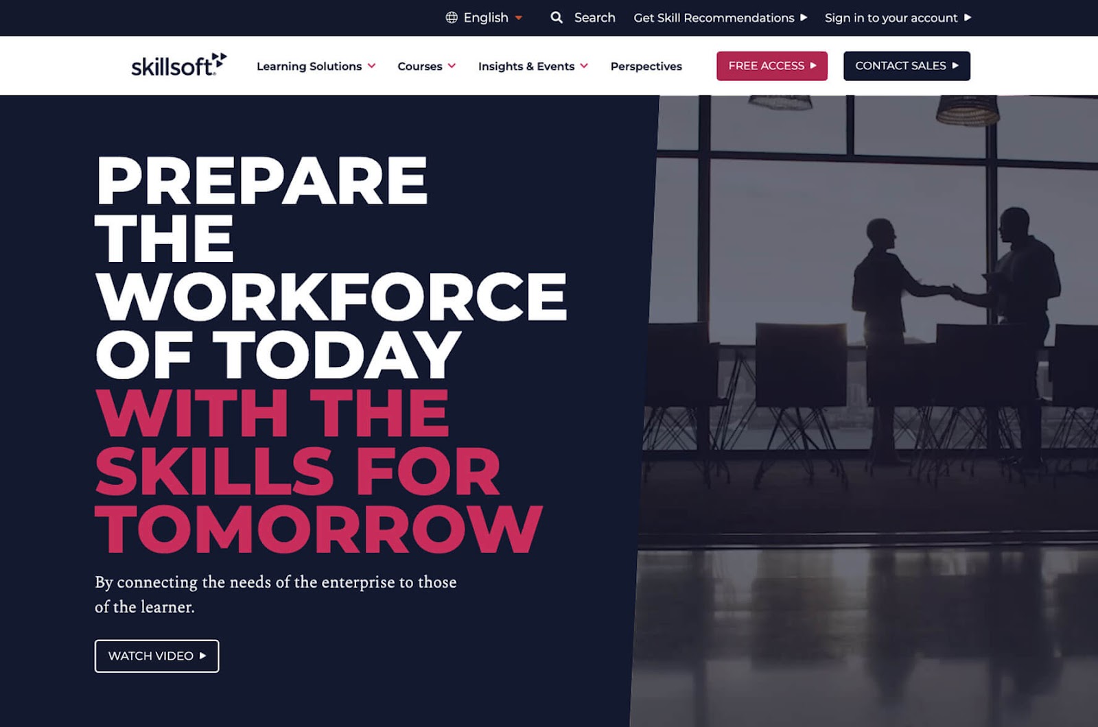 The SkillSoft website’s homepage hero area has a dark mode look, thanks to its navy background panel.
Thor Industries
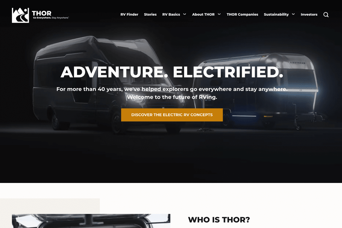 Thor Industries uses a shadowy photo of RVs in its homepage hero space to create a dark website look without incorporating a solid black background.
Diageo
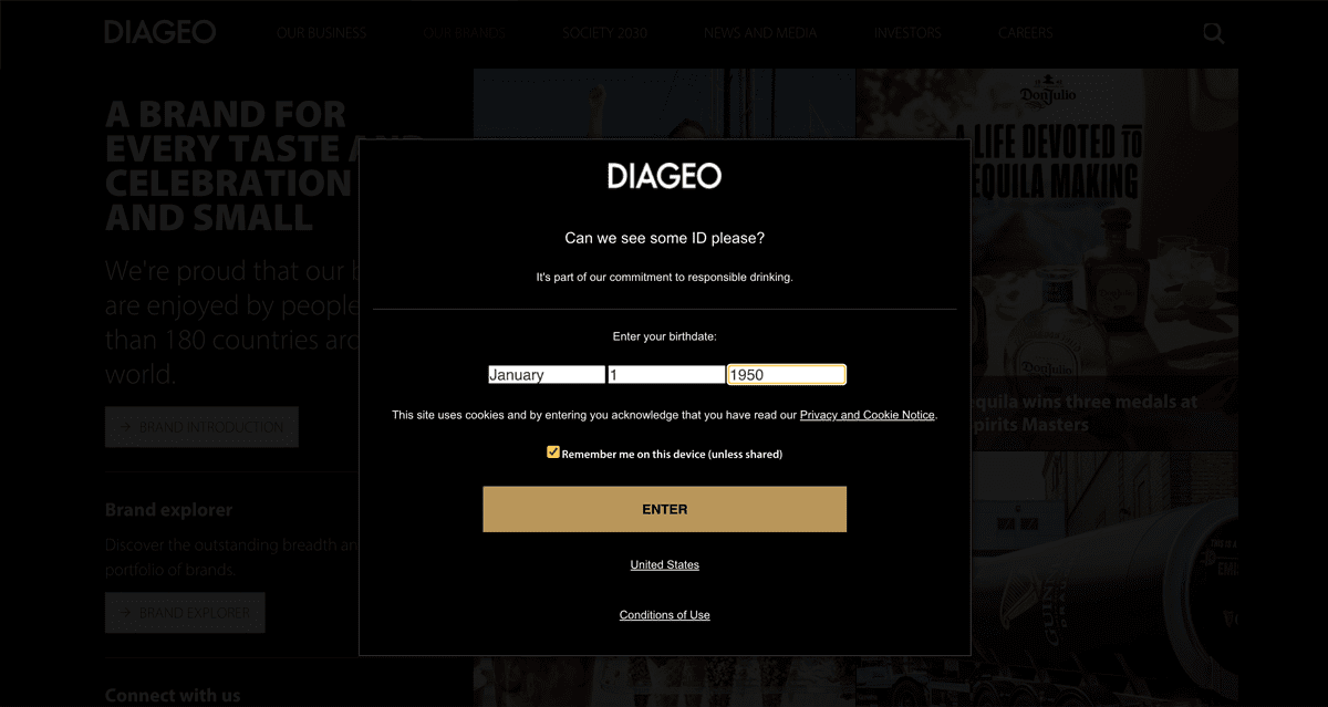 Diageo went all-in on using black backgrounds everywhere for its dark mode website. Even their alerts use the same visual treatment, which helps them keep this striking, uniform look.
Blizzard
 Dark mode design doesn’t always mean pitch black. As Blizzard shows with its dramatic website footer, Prussian blue works well, too, as a way to get this look without using a black background.
Pepsi
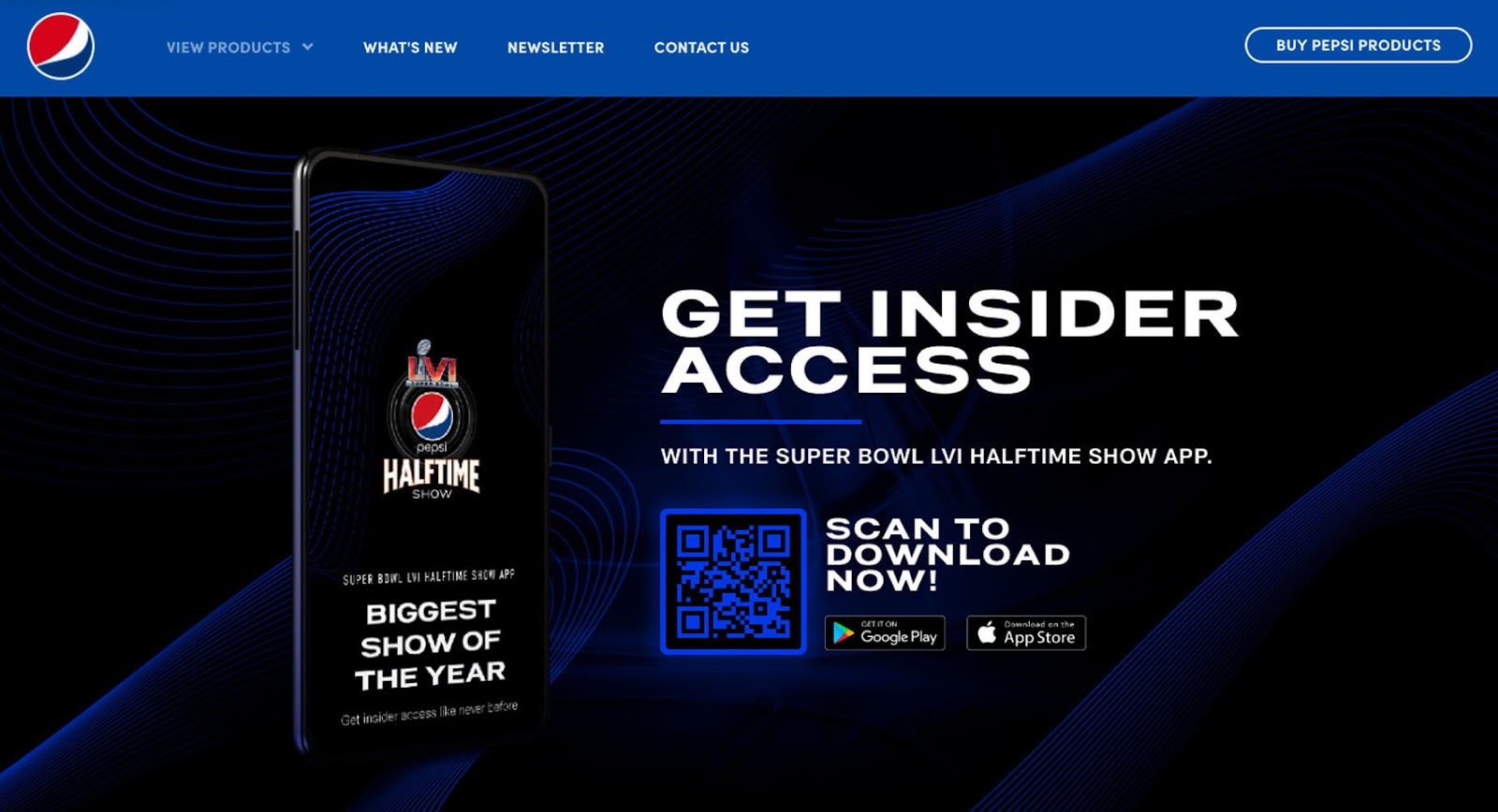 On its dark mode landing page to promote their Super Bowl LVI Halftime Show, Pepsi’s web design team used a vivid blue and black background.
NACCO
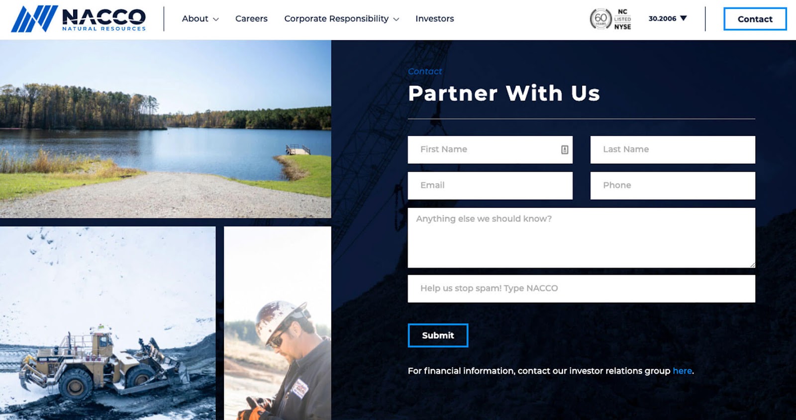 The high contrast web design used on NACCO’s “Partner With Us” webpage works because the contact form’s dark background helps to separate it from the surrounding bright accent photos and top navigation.
Vodafone
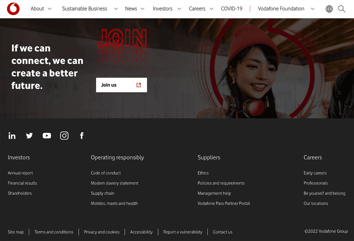 Vodafone pulls in dark mode elements at the bottom of its website with a footer featuring a grayish-black background and a muted photo closing CTA banner.
Apple AirPod Pros
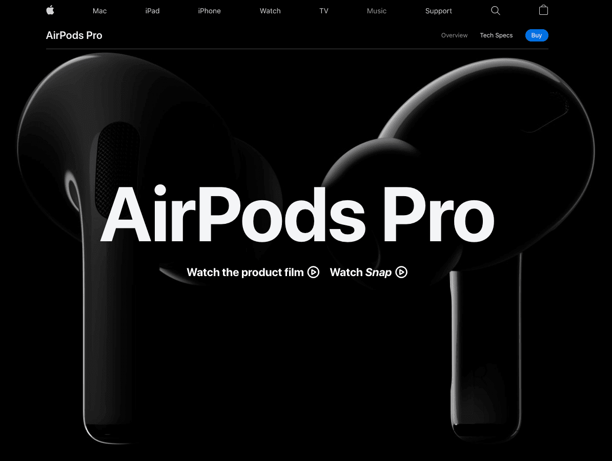 Depending on the product or content being shared, Apple changes its website templates from light mode to dark mode, as shown in this example of their black background landing page for AirPod Pros.
3M
 3 M’s web designers get back to the fundamentals of color contrast with their homepage hero design. Using high-contrast black and white together for navigational elements makes the dark mode 3M site easy to browse.
National Geographic
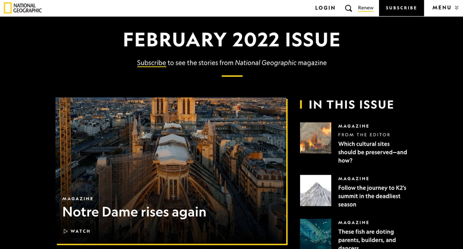 National Geographic puts a visual spotlight on the top stories from its magazine by using a high-contrast color pairing—black and white—for its dark mode website design.
Bobby Rowe
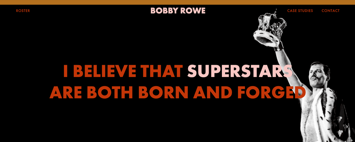 The all-caps H1 in Bobby Rowe’s dark mode web design hero area really sings, thanks to its graphic black background.
Raytheon
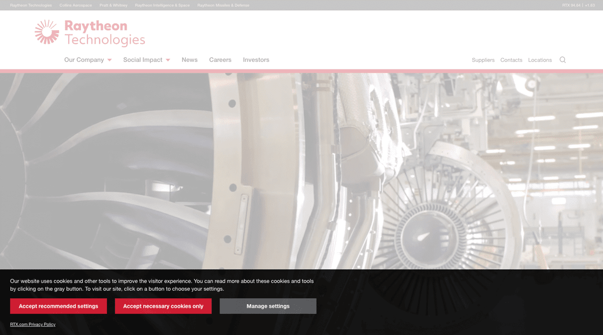 If it’s not on-brand for your whole website to go dark mode, follow Raytheon’s lead and add it sparingly—like in your website cookies alert bar—where it will make a subtle visual impact.
RISD
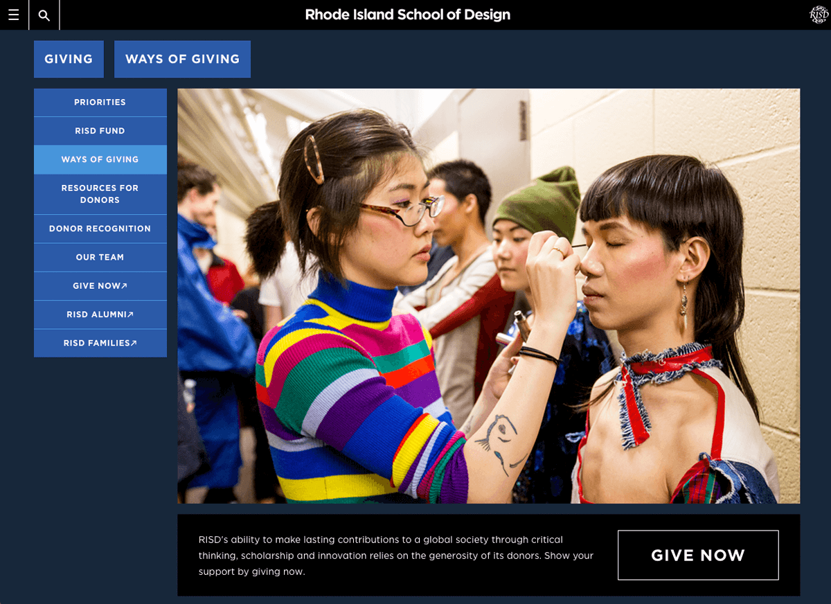 RISD’s fundraising microsite features a rich navy blue, almost black, background to create a dark mode backdrop for the school’s inspiring student photos.
Penguin
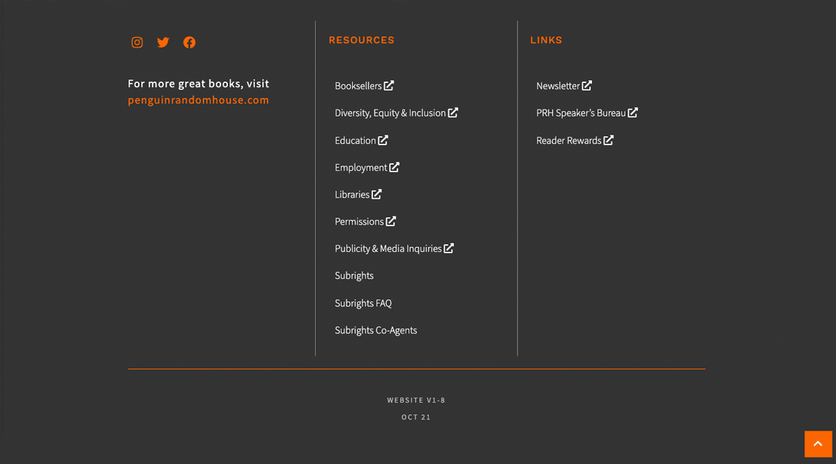 Penguin’s website is bright and colorful—until you scroll to the bottom of the page. Their dark mode website footer makes its bottom links stand out from the rest of the publisher’s webpage content.
Cotton
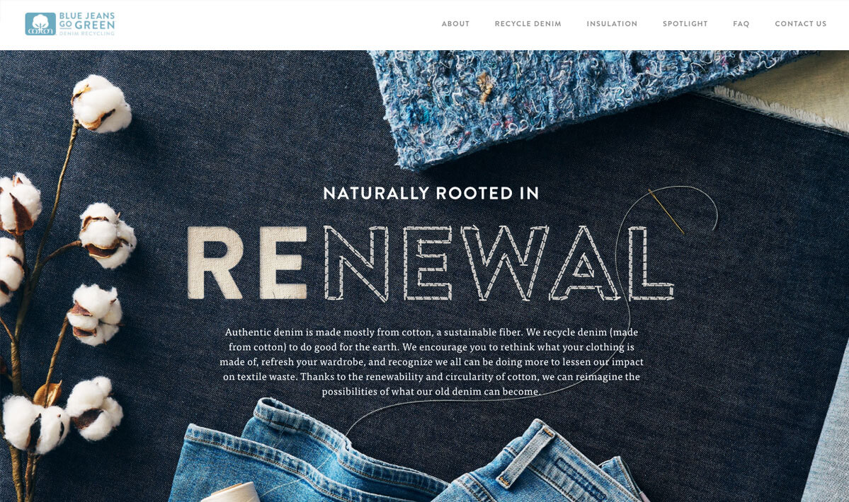 The Cotton company uses a playful photo of denim with a hand-sewn H1 as the backdrop for its spin on creating a dark-colored hero on its website.
Impact Roofing
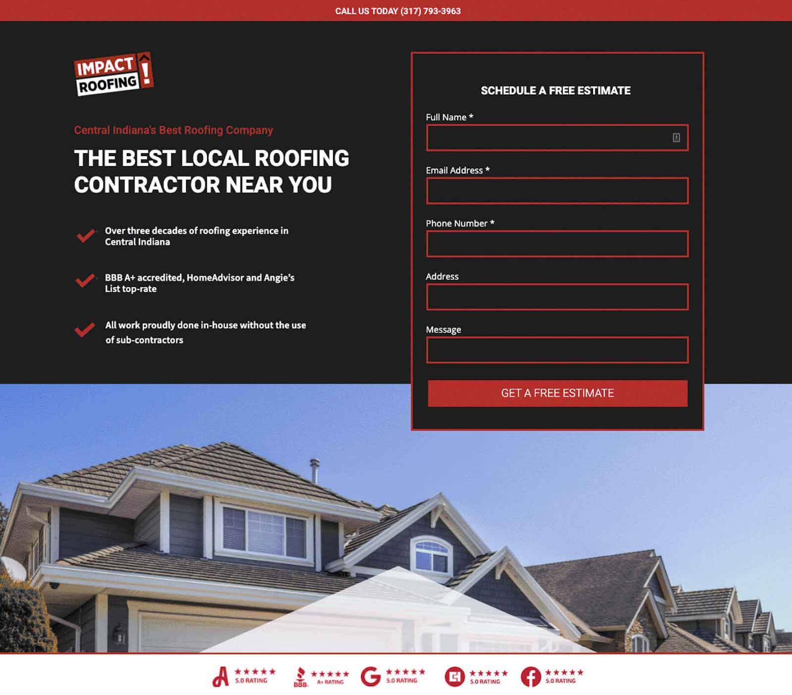 Impact Roofing uses a black background to set off the contact form on its landing page for paid ads.
Powster
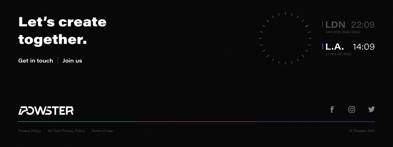 Powster’s website uses touches of dark mode design elements, including on the footer that uses a black background.
Chelsea Moxy
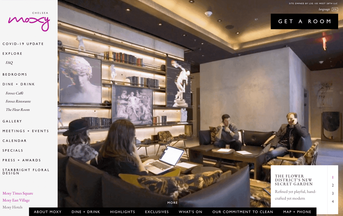 The Chelsea Moxy’s homepage uses dark mode web design navigational elements to frame the video in its main content area.
Municipal
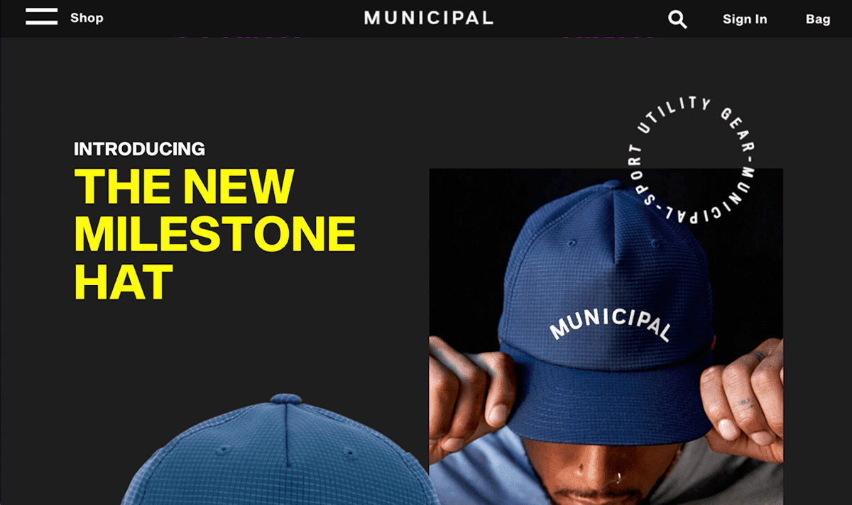 Even clothing brands are getting into the dark mode website design trend. The Municipal website features a charcoal background that helps make its marketing copy and alerts crackle on its dynamic homepage.
Star Wars
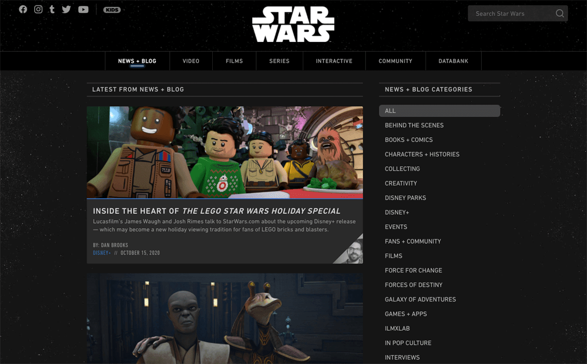 Don’t tell Yoda, but Disney’s website for everything related to the Star Wars universe has gone to the dark side … and embraced black backgrounds for all of their page templates—even its blog!
Brené Brown
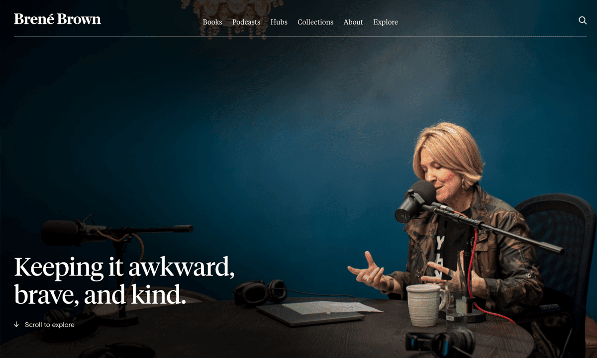 What can’t the fabulous Brené Brown do? Here is proof she even knows how to hire a web designer. The thought leader’s homepage artfully uses a dramatically-lit photo of Brown recording her podcast to create an eye-catching dark mode website look.
AMA Journal of Ethics
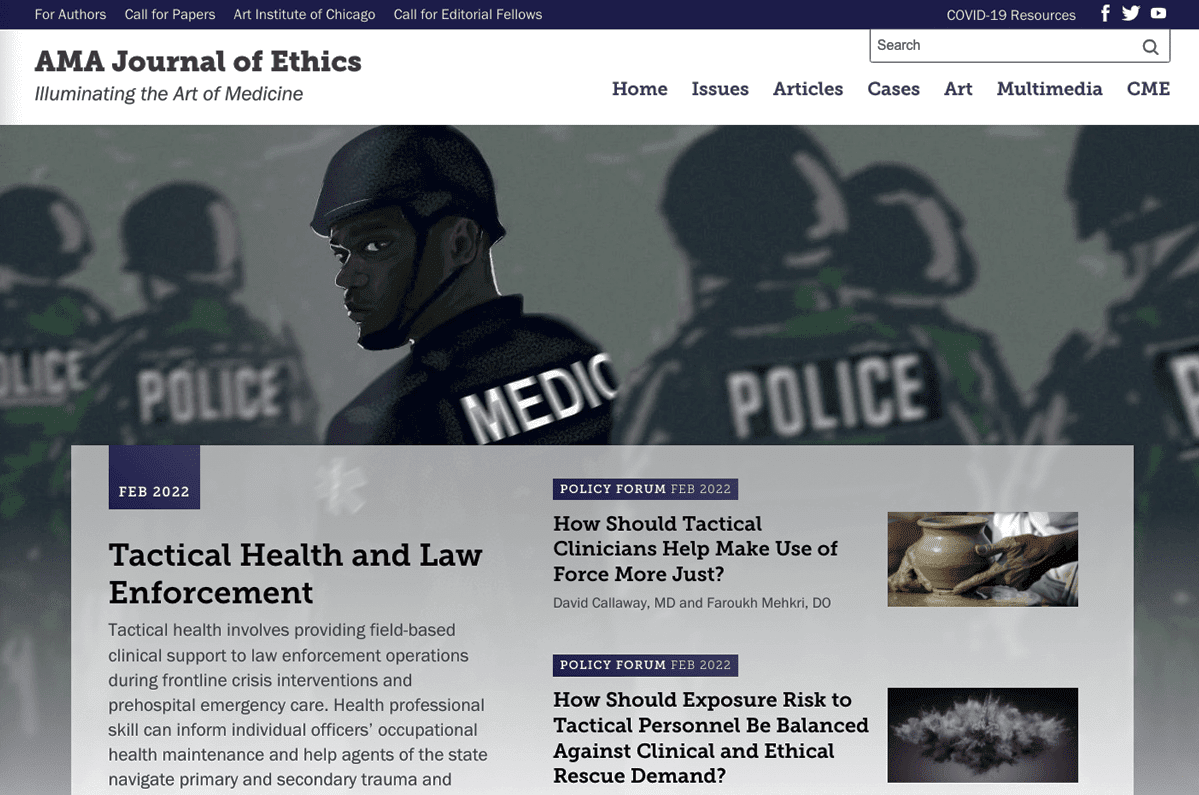 The AMA Journal of Ethics gets its dark mode web design feel from its brand’s dark purple touches used to offset its hero image and navigation elements.
MIT
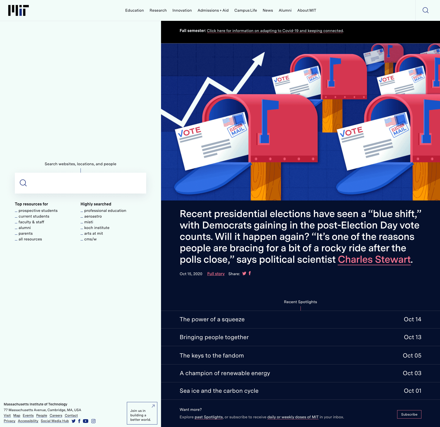 The right side of MIT’s homepage goes dark mode with a wash of midnight blue in the background to set off links to its latest news, announcements, and research.
The United States Marines
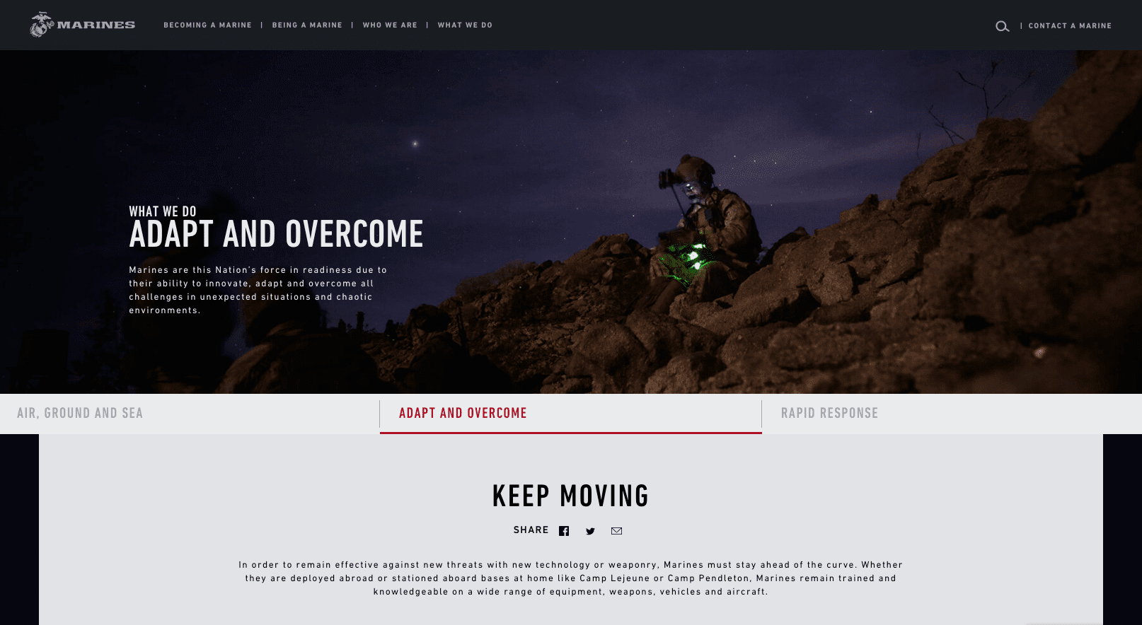 Each page on the dark mode website created for the United States Marines’ recruitment efforts deploys a dark mode aesthetic from the navigation through the hero area, supported by a black background that effectively frames copy in the main content area.
DeWalt
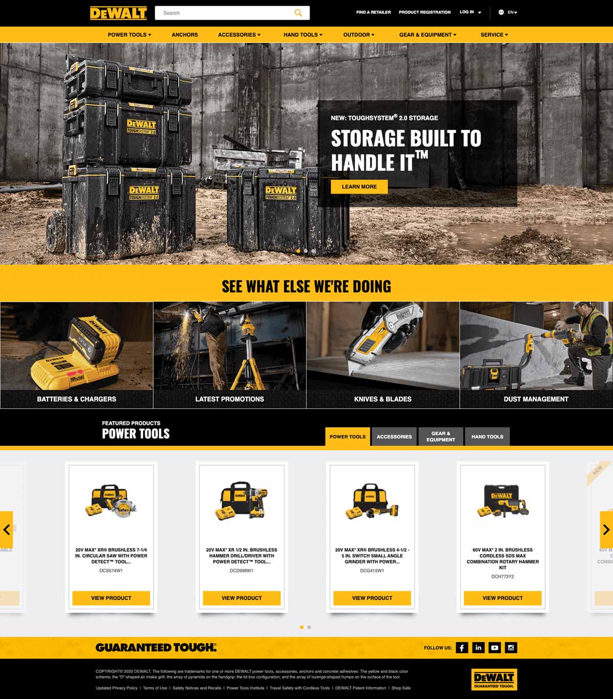 DeWalt’s dark mode website design is balanced out—strategically—with a light gray homepage carousel element to promote its featured products to users.
Orange Grove
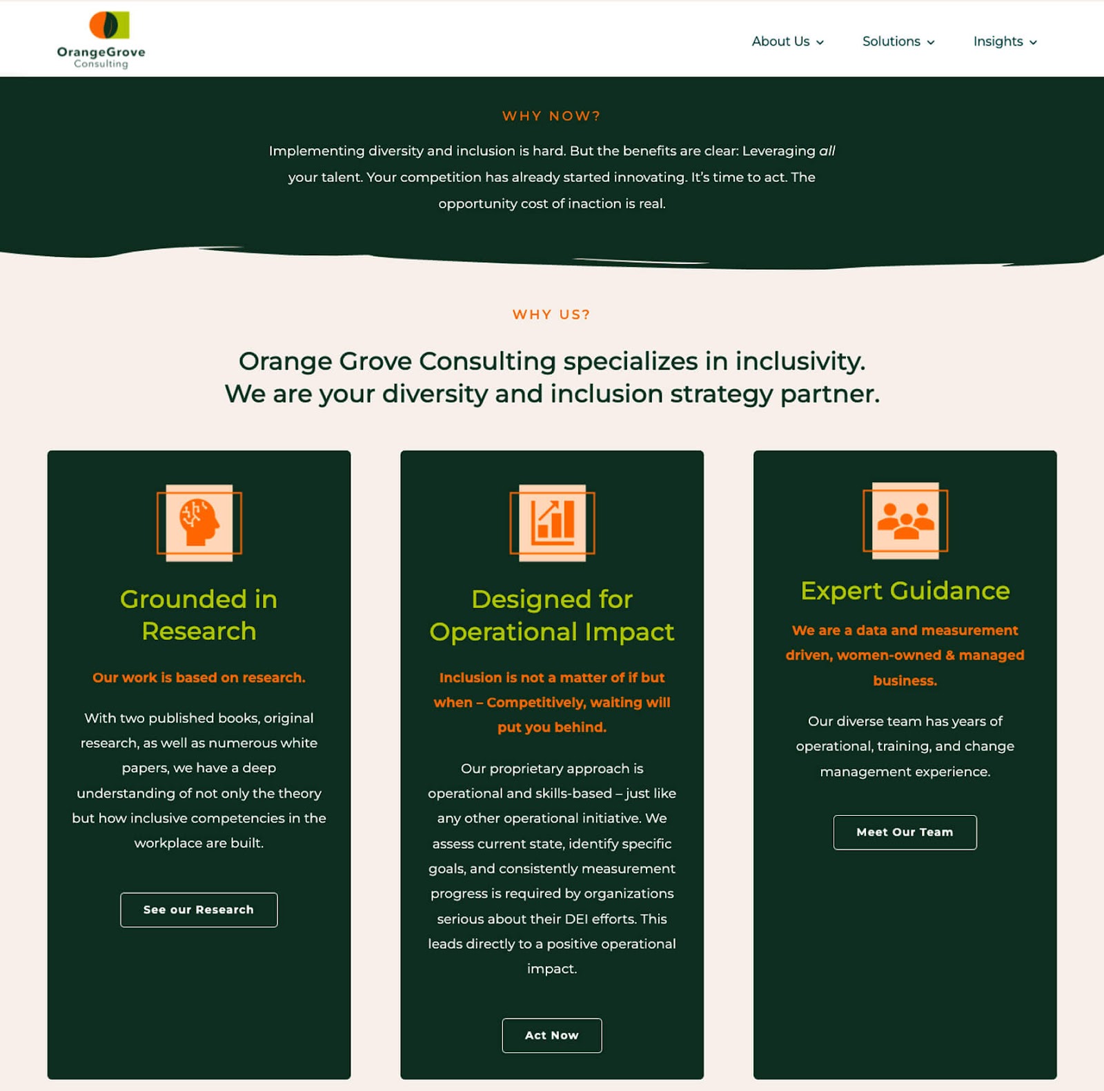 Orange Grove has a unique take on dark mode website design with forest green backgrounds to set off key content areas.
Campaign Monitor
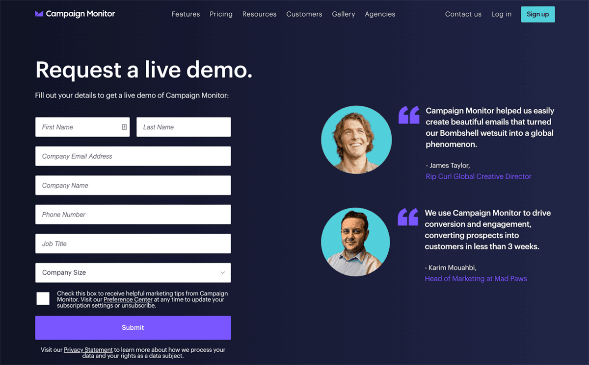 Notice how the dark background lures your eyes to the form after scanning the faces on the right? Even if the rest of your website isn’t designed with a dark mode look, you use dark fields of color to improve user engagement on critical web pages.
BMW
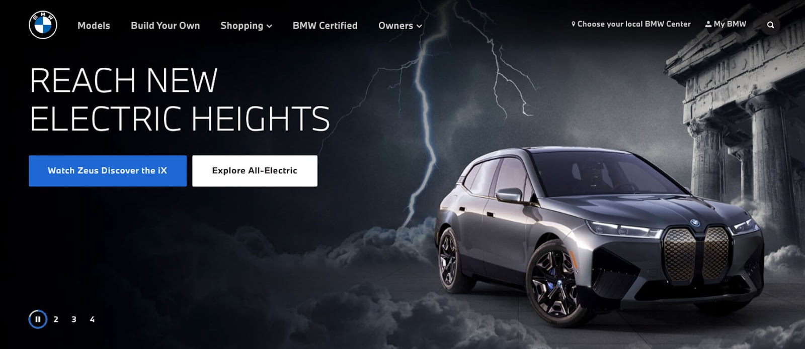 BMW’s web design team builds drama on the car company’s homepage hero area with a dark mode web layout. The centerpiece of their design is a blackened photo illustration of their newest offering in electric autos.
Cats
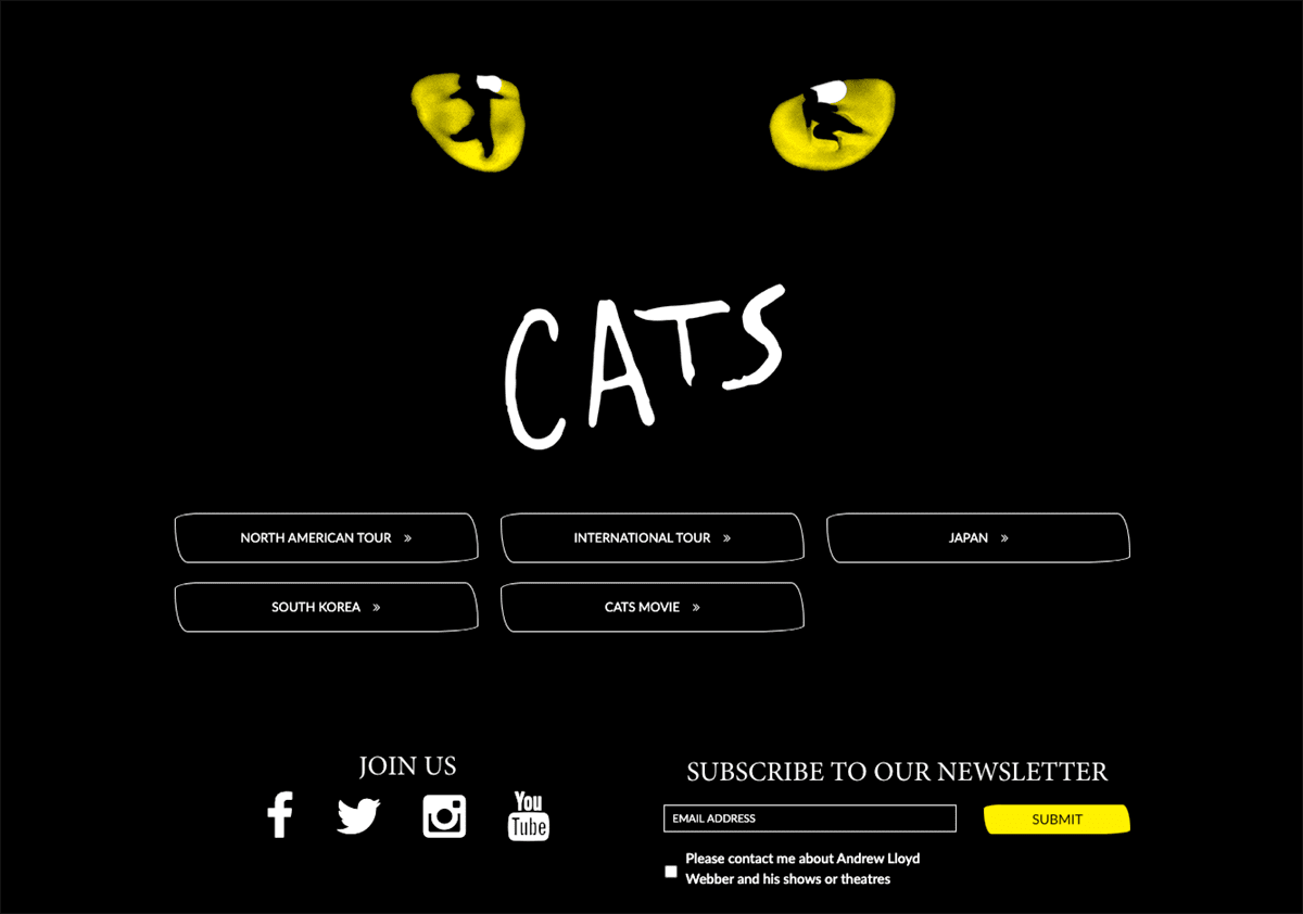 Echoing the musical’s iconic playbill design, the Cats homepage uses a black background and splashes of white and yellow to point users to popular content.
Neil Gaiman
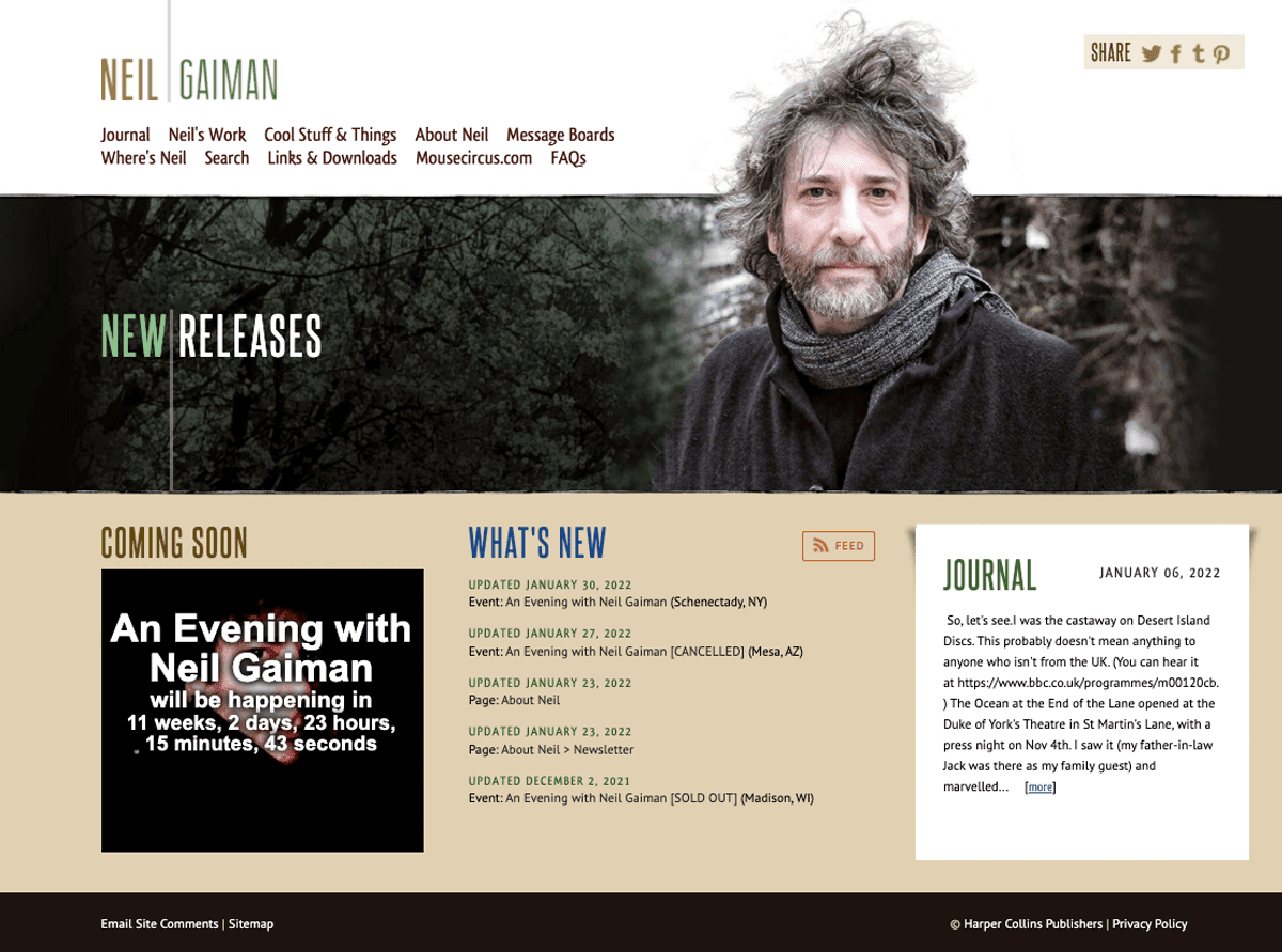 Neil Gaiman uses an on-brand gloomy author portrait to insert a dark mode feel into its website’s hero area design.
Penn & Teller
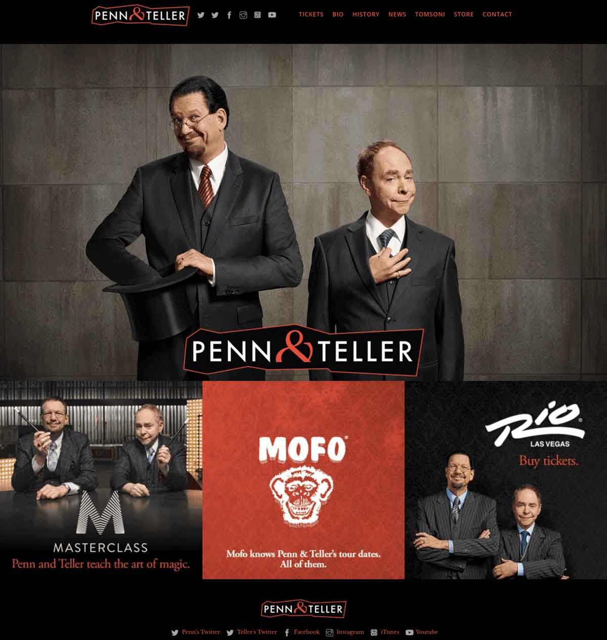 The dark mode website for the world’s most famous magicians breaks up the dense black background with a grid of vibrant news, photos, and promos.
Klarna
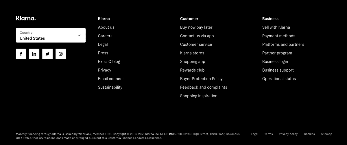 Sometimes, just a touch of a black background can make a site look more modern. Klarna’s dark mode website footer helps set these essential links off from the rest of its webpage content.
SpaceX
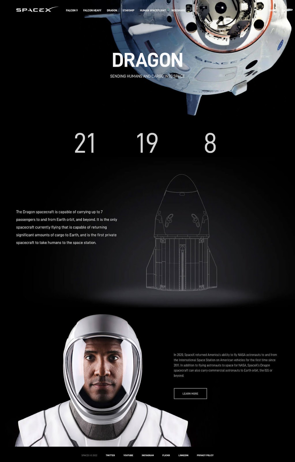 The photography, infographics, and type on the SpaceX webpage about its Dragon program come alive thanks to its background as jet black as outer space itself (minus the stars and satellites).
Regents School of Austin
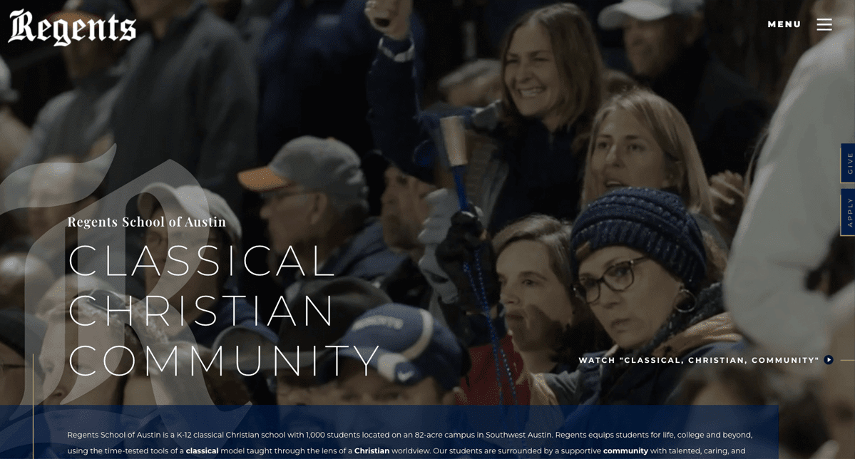 The Regents School of Austin uses a charcoal overlay on its homepage video to give the hero area a visually compelling dark mode website look.
JGMA
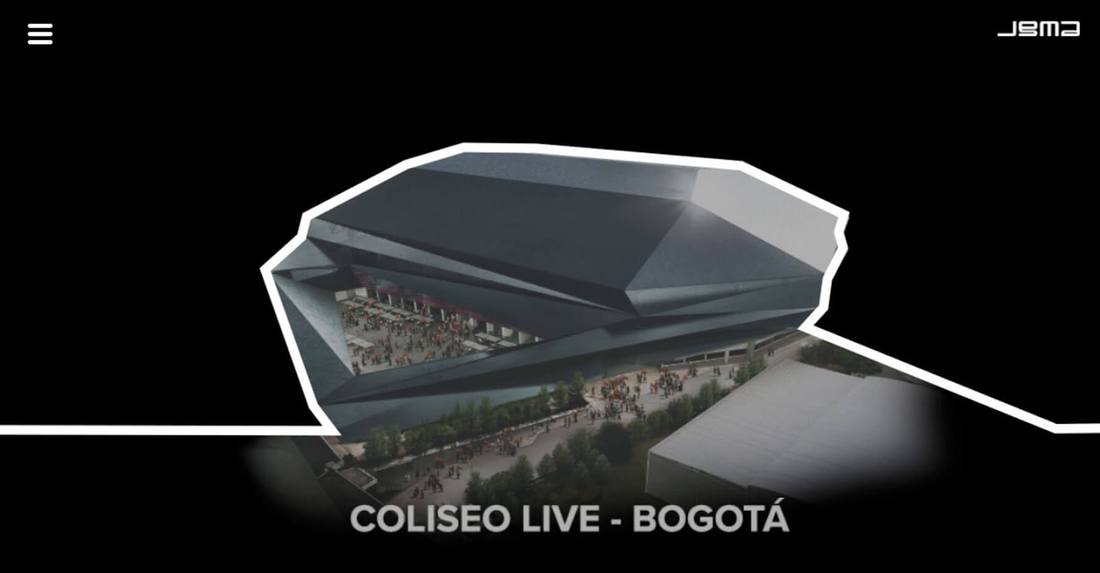 JGMA placed its dynamic homepage animation on top of a black background. This treatment creates a dark mode experience that makes items from their architecture projects portfolio dance across users’ screens.
Ozzy Osbourne
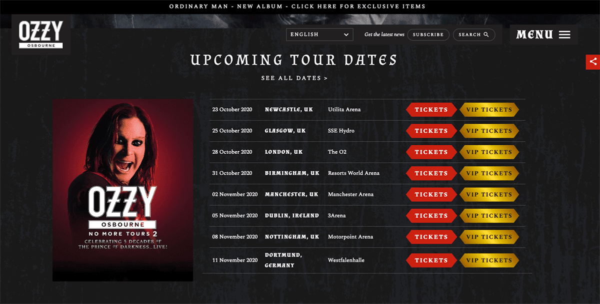 Last but not least—talk about being on-brand. Of course, the “prince of darkness,” aka Ozzy Osbourne, has a dark mode web design with a sinister black background.
FAQs about websites that have dark mode layouts
When did dark mode start getting popular?
Dark mode began to creep back into the zeitgeist as a favored design trend around 2010 with the release of the Windows Phone 7. Since then, it has been gaining popularity among app and website developers at leading technology firms, as well as designers at companies big and small.
Today, even Google offers a Chrome extension called Night Eye for dark mode fans!
Why is dark mode design a trend? Are dark websites good? Should my website have a dark mode?
It depends on your company’s industry and its overall visual brand guidelines.
Generally speaking, though, people do like websites with dark backgrounds. In fact, about 82.7% of people prefer dark mode when using their devices, according to survey findings tracked by Thomas Steiner, a web developer advocate at Google.
What are the features of a high-contrast web design?
High-contrast web designs are those where there is a big difference between the two primary colors in the site’s design. Dark mode websites are often classified as high-contrast layouts because slate, charcoal, and black backgrounds are often paired with #000000 (aka, white) typography.
Why is having sufficient color contrast important in web design?
Designing so that there is enough color contrast between different parts of your website layout helps people—especially low vision users—read and navigate webpages.
What is an achromatic color?
Achromatic colors are non-colors. They aren’t part of the traditional color wheel spectrum. Black, white, and gray are all considered achromatic colors because these neutrals don’t have a hue, making them popular pairing options when developing high-contrast, dark mode web designs.
What psychological feelings do people associate with the color black?
People typically associate the color black with a wide range of feelings, depending on how it’s treated in a dark mode web design. Some of the attributes it can convey are:
- strength, power, and authority
- calm
- elegance and sophistication
- fear and evil
- rebellion
- formality
- death and mourning
- mystery and magic
Is a dark background better for website? Is a black background good for a website?
Redesigning a company website is a significant investment. Making an investment of time and resources to change your website’s layout to a new look that features a popular aesthetic—like dark mode—shouldn’t be the main reason you update your site.
If you are revamping your website for other business or technology reasons, considering a dark mode design isn’t a bad idea if it will help you meet your goals. Even if you don’t go all in, there are lots of ways you can bring in what works with a dark mode web design if that’s an aesthetic you like.
Can you make any website that you visit be dark mode?
Yes! If you use Chrome, you can personalize your web browsing experience and turn websites to dark mode, even if the sites you are on weren’t designed to display that way. One option is to use the previously mentioned Night Eye browser extension from Google. Here are operating system-specific instructions for how to get black backgrounds on websites you visit:
- Chrome, Windows 10
- Chrome, macOS
This post was last updated on April 12, 2022.