Navigation is one of the most important elements of a website. Without proper navigation, a user can get lost within a website, with no idea how to get back to where they started or where to go next.
One navigational aid that designers commonly implement to improve wayfinding is breadcrumb navigation.
Breadcrumbs consist of hierarchical links showing where a user is located within the sitemap.
For example, if you were on a website’s team page, the breadcrumb navigation might look something like this:
Home > About Us > Meet the Team
It would include links to the parent pages back to the homepage.
In addition to location-based breadcrumbs, some sites implement attribute-based breadcrumbs as well. This is commonly found on e-commerce websites, where a user might be looking at products under various category levels. Attribute-based breadcrumb navigation might look like this:
All Furniture > Office > Desks > Corner Desks
The path is based on the specific attributes the user has selected to narrow down their results.
What are the benefits of breadcrumbs?
Breadcrumbs have been a web design staple for quite some time, and for good reasons. Here are some of the primary benefits:
- They give users a quick way to see exactly where they are within your website’s content.
- They allow users to get back to higher-level content pages more easily.
- They are beneficial to SEO. Breadcrumb navigation helps search engines understand how your site is structured and boosts internal linking.
- They help reduce bounce. If a user enters your site through a lower-level page but isn’t in quite the right place, they might use breadcrumbs to navigate to more relevant content instead of immediately clicking away.
- They help to increase the amount of time users spend on your website. Breadcrumbs can allow users to more easily browse related content, thus staying on your site longer.

When should I use breadcrumbs?
While breadcrumb navigation is beneficial for many websites, it’s not a one-size-fits-all solution. Take the following scenarios into consideration when determining if breadcrumbs are the right solution for your website.
DO use breadcrumbs …
- Suppose your website has multiple content levels with a clear hierarchy. Breadcrumb navigation is beneficial for these types of complex and content-rich websites with pages that are organized three or more levels deep.
- On e-commerce websites. E-commerce sites lend themselves well to using attribute-based breadcrumbs especially if they have a large number of product offerings. In this instance, breadcrumbs can help customers better understand the range of products available and get from one category to the next.
- As supplemental navigation, not as the primary means for a user to navigate your website. Breadcrumbs should be an extra guide for users and not be used in place of primarily optimized navigation.
DON’T use breadcrumbs …
- As a band-aid for poor navigation or site structure. Breadcrumbs are most effective when added on top of a well-optimized content hierarchy.
- If you do not have multiple page levels. If you have a shallow site structure with only one or two levels of content, breadcrumbs aren’t adding much value to the user.
- If they are overly redundant. If your interior pages already have both a primary navigation and a sub-navigation that clearly indicate where in the site structure a user is located, consider if breadcrumbs are necessary or just cluttering up the page.
- On pages that are heavily interlinked from various locations and don’t have a single primary path. For example, if you have a landing page that doesn’t fall under one content section and is linked from multiple pages, breadcrumbs wouldn’t be very helpful and might end up being more confusing to the user. Even if you are using breadcrumbs on some sections of your website, you don’t have to have them on every page.

Tips & best practices for breadcrumb navigation
If you decide to add breadcrumbs to your website, here are some strategy and design tips to keep in mind during implementation.
Start with a solid site structure. Optimize your content and navigation first in order to ensure breadcrumbs will be beneficial and not creating confusion for users.
Use a subtle design for breadcrumbs. Design them to be secondary to the main navigation and not overly prominent. They should be easy to use but not distracting so they don’t overtake page content or other important calls-to-action.
Choose the best placement based on your website design. Typically, breadcrumbs are placed underneath the main menu or close to the page title. If you decide to go with a nontraditional placement, make sure your users are savvy enough to not be confused.
Keep it short. Breadcrumbs should be kept as short as possible to avoid wrapping issues. If your page titles are too long, consider optimizing for better display. If you have too many levels in your breadcrumbs when you get deeper into your site, that might be an indicator that your site structure needs to be cleaned up.
Don’t include a link to the current page. All pages should be linked within the breadcrumbs except for the current page. Linking to the current page you’re on results in a confusing user experience.
Consider what link separator to use. Most breadcrumbs use the “>” symbol between links to indicate the relationship between pages. Other separators can be used to match your design aesthetic but it’s best to keep the same general approach that is familiar to most users.

Add structured data. To ensure maximum search engine optimization, include the proper breadcrumb markup as recommended by Google.
Don’t forget about mobile users. Some websites hide breadcrumbs on smaller screens, which can be a detriment to your users once the main navigation is hidden. Oftentimes on mobile, there is little indication of where a user is within site content without opening up the main menu. The best approach for mobile devices will depend on your design and site structure, but make sure it doesn’t get forgotten during the design process.
More breadcrumb inspiration
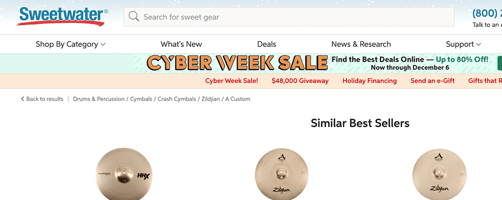
Sweetwater
Most e-commerce sites like Sweetwater use an attribute-based breadcrumb structure to show users what product categories they are looking under.
Indiana Hemophilia and Thrombosis Center
The breadcrumbs on the IHTC website double as sub-navigation to save real estate and aid in navigating multiple levels of content.

University of Notre Dame
Notre Dame keeps their page titles short enough that breadcrumbs fit well on all screen sizes.

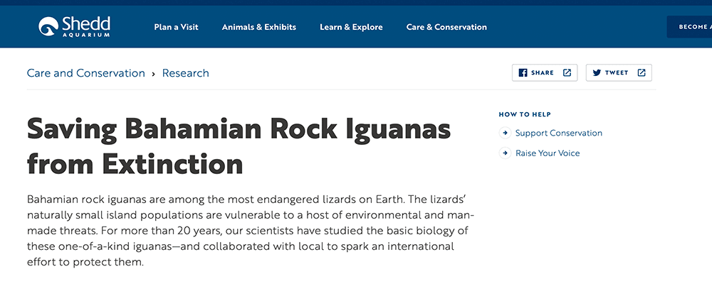
Shedd Aquarium
Shedd places breadcrumbs directly above the page title, eliminating the need to include their longer third-level page titles within the breadcrumb navigation. This is one approach to keeping breadcrumbs short.
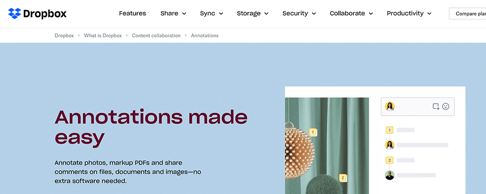
Dropbox
Breadcrumbs are useful when you are many levels deep into a site without other clear ways to get back.