
Using black backgrounds is not just a passing design trend. The “switch to dark mode” feature, once only available in a few apps, is now almost everywhere, even email clients. It’s so popular that a significant portion of your audience likely is already taking advantage of this setting.
As with any new feature on the web, dark mode has implications that businesses can’t afford to ignore. For email marketers, darker display could be the difference between a perfectly optimized email and an unreadable mess.
The current state of dark mode email design is not all good news. Thanks to inconsistent implementation, you need to follow usability best practices to improve the email experience for your users who choose to go dark.
To get started, let’s look first at how different email clients are implementing a dark setting to better understand the unique challenges when creating HTML emails.
How do different email clients implement dark mode?
One of the biggest pain points of optimizing emails for darker display is that email clients are not consistent in applying it. This fact will be unsurprising to those familiar with the challenges of HTML email development, as it’s just one of the many inconsistencies in how different email clients render email content.
There are three primary ways that email clients are currently applying dark mode:
- Partial color inversion. Light areas will be detected and inverted to a dark color scheme. Outlook.com uses this technique for dark mode.
- Full-color inversion. In email clients that take this approach, all colors will be swapped to the opposite color scheme. This method has been met with criticism, as it applies to already dark color schemes as well. In other words, if your email is designed with a dark color scheme, it will be inverted to a light color scheme in dark mode. The iOS Gmail App uses this technique.
- App UI change only. Some email clients only change the color of the app UI in dark mode without any changes to email content. A primary example of this is Apple Mail.
These differences mean that there isn’t one single approach to improving your emails for darker display. Instead, you have to tackle the problem with a combination of both development and design techniques.
How do I control email styles in dark mode?
Step 1: Enable dark mode
If you are optimizing for users with a darker display, you’ll want to include these meta tags in your email template:
<meta name="color-scheme" content="light dark">
 <meta name="supported-color-schemes" content="light dark">
This specifies that your email supports dark mode and enables it in email clients such as Apple Mail that don’t automatically invert colors when users opt for a darker display.
These values can also be set in CSS as follows:
<style>
  :root {
  color-scheme: light dark;
  supported-color-schemes: light dark;
  }
 </style>
While both methods achieve the same results, using the meta tags will help to ensure the color scheme is defined as soon as possible.
Step 2: Adjust styles with the prefers-color-scheme media query
For email clients that support media queries, you can use the “prefers-color-scheme: dark” media query to apply styles that specifically target dark mode. Here’s what that looks like:
@media (prefers-color-scheme: dark ) {
  /* Dark mode styles go here */
 }
Within this media query, you can overwrite styles to optimize the dark mode experience, such as changing colors or adjusting image display.
Known issues
These styling approaches will not work in email clients without media query support. For example, the Gmail mobile app uses the full-color inversion method for dark mode and doesn’t support media queries. Unfortunately, there may not be a perfect way to optimize emails in these clients until improvements have been made to better target darker display users.
In such cases, the best you can do is test your emails in those clients and make sure that your most important content is still accessible. While you might not be able to perfect your design for all users, you can design your emails to still get your message across with or without dark mode enabled.
How should I design HTML emails for dark mode?
Getting familiar with how styles and images are affected in dark mode will help you make more informed decisions when designing email templates. It can be helpful to start by reviewing real emails in dark mode to get an idea of what works and what doesn’t.
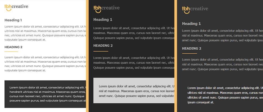
For text content, test your emails to confirm that any color changes are acceptable when presented in a darker display situation. Certain combinations of text color and background color might be more challenging to read when inverted.
Using images can be especially challenging when it comes to dark mode, specifically when dealing with transparent PNGs that might be optimized to work over a white background but not over a dark background. For example, if you have a logo with black text and a transparent background, it may be practically invisible when the background color is inverted.
Furthermore, it’s not uncommon to achieve complex HTML email designs using flattened images since there is limited support for advanced styling in some email clients, but this can cause unexpected issues in dark mode. See this in action in the Best Buy email below, where the shadow divider graphic does not work as well in dark mode since it has a white background.

To avoid such issues, you might need to get creative with solutions to find the best balance of design and readability. For example, consider adding a glow or stroke to dark text to offset it against dark backgrounds, or add a background color with padding to transparent PNGs so it looks more intentional when colors are inverted.
Determine what trade-offs you are willing to make and design your emails accordingly.
Final steps
The most important thing to do as a final step: test, test, test! No matter which approach you take to optimize your HTML emails for dark mode, you should test in various email clients to confirm usability and readability.
Overall, the goal should be to provide a positive experience for all of your users, whether they have a darker display option enabled or not.