Great digital-first logos make sense for the business or organization they represent. The best are uncomplicated, memorable, and versatile.
But that wasn’t always the case. As recently as ten years ago, most companies were still doing a lot of their communicating offline. Think memos on letterhead, direct mail collateral, magazine ads, and other popular forms of print marketing.
The best logos worked when they were scaled to a variety of sizes, from thumbnails on business cards to jumbo-size on billboards. Logos had to look sharp and make an impact when converted to black and white for communications like faxes—remember those?
Things are a little bit different nowadays, and digital-first logo design is now a necessity. Three out of ten adults report they’re almost always online, according to the Pew Research Center. Given this booming universal web usage, most marketing communications today are taking place on the Internet.
Having a digital-first logo designed to work well on the Web is not just a “nice-to-have.” It’s essential. Read on to learn more about how to create a flexible visual identity optimized for different uses online.
What is a digital-first logo?
Though the fundamentals of good logo design haven’t changed much over the years, today a visual brand’s web usage should be a top consideration during its development.
For companies, your logo is often one of the first things potential customers will see and shape their impression of your business. It’s crucial to create a digital-first logo and supporting visual brand assets that get it right, whether the application is in a retargeting ad graphic, website landing page, email signature, or product packaging.
“When a design is completed, it should seem natural and obvious. It should look like it has always been this way. And, it should last.”—Roger Black
This shift in how we primarily communicate means that digital-first logo designers have to think about all the different devices—and ways—people might interact with elements of a company’s brand identity online, from wordmarks and pictorial logos to abstract icons and emblems.
It is critical to get a digital-first logo’s flexibility, boldness, and simplicity perfect during the design process to have it work in basic applications. Still, it’s also essential to think about how a logo might be extended for less noticeable but still impactful uses, such as:
- advertisement animations
- website favicons
- social media avatars
Top considerations when designing a logo for online use
Today, designing a digital-first logo requires planning for a wide range of online applications. Not thinking broadly can be usually risky, often resulting in second-rate usage because of compromises that have to be made to “make it work.” But, there’s a better way.
Just as website designers now think through the mobile user experience at the start of a website redesign project, the best digital-first logo designers serve their clients by thinking about how the visual brand assets will be used. This includes apps, websites, and other non-print applications—whether they’re refreshing existing brand elements or creating a whole new visual identity.
Digital-first logo must-haves
Use these must-haves to assess if your current visual identity assets meet modern usage needs.
Logo
Color palette
Typography
|
Photography
Icons & illustration
|
Your visual branding foundation should be functional and fantastic
Does your digital-first logo look good? Does it look bad? How does it work cropped as an avatar on LinkedIn? How does it look when it’s converted to a favicon? Does it fit into your website design without overwhelming its top navigation? Does it complement your other visual brand elements, or does it feel discordant?
During the digital-first logo design process, what works and what doesn’t is always subjective. Everyone will have an opinion, but the people you need to listen to are those in your target audience. A logo fails if it turns off your customers because it’s too complicated or doesn’t make sense.
It was supposed to be a joke, but…
For April Fool’s Day in 2019, Porsche pulled a prank by announcing it would be integrating QR codes into its class crest.
Car aficionados who didn’t know it was gag were aghast at Porsche’s digital-first logo, but now in 2020—as our society becomes even more “touch-free” in light of the ongoing COVID-19 outbreak—the idea of updating your mark true so that it is true to your brand identity, as well as flexible and functional, is an idea worth thinking about more seriously.
Imagine if you could pull up a landing page with a car’s model information, statistics, and price just by scanning a QR code integrated into the manufacturer’s bumper adornment? Maybe revisiting using QR codes as part of your visual branding assets isn’t such a bad idea after all.
When you’re exploring options, ask yourself: does the relationship between this digital-first logo and your company’s service or product match the expectations of the audience you’re trying to reach? How does it help you meet your business needs and those of your target audience?
Though design and technical execution preferences are always subjective, the best digital-first logos for online use always create a sense of aesthetic joy. They are memorable because they’re executed flawlessly and solve a problem.
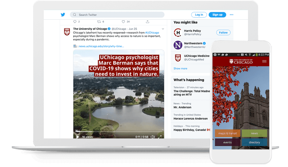
Case study: The University of Chicago
A versatile refresh maximizes impact
The University of Chicago has been one of the leading institutions in the world since its founding in 1890.
For 100 years, its iconic brand identity stayed—more or less—the same. Though the renowned research university has always been at the forefront of scientific and technological breakthroughs, their visual identity struggled to keep up with the demands of the Internet age. Its use looked little dated in digital applications. (Full disclosure: I should know. I spent a good part of my career there, and the struggle to solve design problems without a digital-first logo was real. Everyone was doing their own thing to make the visual brand assets work in online applications, and our results were inconsistent.)
Things turned around in 2012 when the university unveiled its current brand identity guidelines. The crisp new digital-first logo and visual branding assets were rooted in the institution’s rich tradition but reinvented around contemporary needs and featured forward-thinking, updated visuals—finally meeting the varied needs of designers across campus.
The refreshed, modern logo assets were streamlined, finally making it easier to achieve greater consistency across the influential university’s multiple digital channels.
Case study: truTV
Bold typography plus playful animation = memorable branding
American cable and satellite television channel truTV rebranded in 2017, refreshed its new look in 2018, then further reworked its identity again in 2020 to play up the ethos of their original programming line-up. The new animated logo graphic treatments were designed to be flexible so they could work with—or without—footage from their shows.The best logos adapt with changing business needs. Home to unique shows like At Home with Amy Sedaris and Hot Ones: The Game Show, truTV’s takes their visual brand one step further in support of their digital-first logo as a destination for fun, distinctive content.
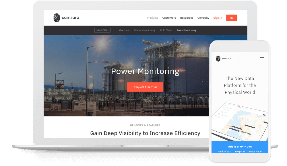
Case study: Samsara
Simple yet distinctive mark strengthens company’s visual imprint
Founded in 2015, Samsara—a leader in Industrial IoT—entered the marketplace with a unique solution that required a unique brand.
Samsara chose a simple-yet-striking illustration of a wise owl motif for its mark to reinforce its reputation for providing tools to help companies increase the efficiency, safety, and sustainability of their operations.
Samsara’s design team has adapted this memorable icon successfully for every detail—big and small—in their digital marketing, from the company website’s favicon to their social media avatars.
Case study: Baker Hill
Comprehensive digital-first logo and visual brand assets supports online marketing
TBH Creative helped Baker Hill create icons and refresh its logo and color palette to modernize its brand identity assets for more flexible digital use.
Their dynamic, cohesive, and comprehensive identity system is prioritizes working in a wide range of applications, both online and offline, by addressing the opportunities and challenges of consistent digital marketing.
Case study: King Arthur Baking Company
Modern visual rebrand “doughs” right by beloved identity
![]()
This summer, the 230-years-old King Arthur Flour Company became King Arthur Baking Company as part of their rebrand to better represent who the company is today.
In addition to a new name, the oldest flour company in the United States unveiled a new logo, patterns, and other assets that “celebrate the brand’s commitment to baking” and support its reputation as products of superior quality.
Business goals aside, the new digital-first logo is also a great example of modern visual branding.
Need help developing new digital-first logo or refreshing your current visual brand identity for stronger application online? TBH Creative can help you avoid the pitfalls of the logo design process and help you create a suite of beautiful assets that will support your marketing goals, differentiate you from the competition, and delight your customers.