
When redesigning a website, you need to accept that everything can’t look exactly how you want. And, that’s absolutely okay! Knowing when to splurge on custom art that matches your website images and branding needs is the key to staying on budget and meeting your project’s deadlines.
I’ve been responsible for helping find, create, and manage marketing photos for almost 100 different websites. Commissioning or creating original imagery for every element of every page of those redesign projects was not only impossible but also unwise.
Over the last 25 years, imagery limitations forced me to figure out what works (and what doesn’t) with website images and branding during a redesign project.
Here are the tricks I’ve used to build visually dynamic redesigned sites—that match existing brand identity assets—using stock. Keep reading to learn more about each of these helpful website stock customization techniques.
How to turn generic stock into tailor-made website art
Bringing website images and branding together harmoniously takes work. If you’re up for the challenge, you can effectively tweak public domain, CC-licensed, and royalty-free content (from sources such as Getty Images, Shutterstock, iStockPhoto, Adobe Stock Images, Pexels, and more) to take your site’s art to the next level:
- Composites & collages
- Color consistency
- Focused isolation
- Custom framing
- Graphic overlays
- Perspective alignment
- Background harmonization
- Selective filtering and effects
- AI enhancements
While you don’t have to be an artistic genius like Leonardo Di Vinci to make these stock modification tricks work, these tactics require some tenacity, resourcefulness, and creativity if this is a new way of thinking for you. Still, they are doable and get easier with practice. Let’s get started.
Composites & collages
Technique
Combine several stock images into a cohesive image to represent a broad concept or theme.
Why it works: This method enhances visual storytelling by capturing diverse elements in one compelling visual, increasing the advertisement’s appeal and effectively communicating a wide range of options or features.
Example
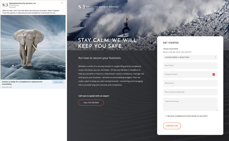
Specialized Security Services, Inc. effectively uses this technique to upgrade otherwise boring stock images in its marketing campaigns. Its creative team combines two photos into one composite image—using the established color palette—to visually show its expertise in managing risk by providing security and compliance solutions.
Pro-tip: Collage compositions can also be a creative technique to use when you have a bunch of super low-res images and need to make them fill up a space.
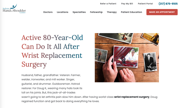
In this example from IHTSC, an 80-year-old man provided several 8KB and smaller thumbnail images to go with this story of his patient experience, and all were too small to stretch to fit the space needed for the webpage’s featured image slot.
This article, written in his voice, includes his memories and callbacks to several of the scenes depicted in the provided images, so we used a stock image of hands looking through other photos as a base to build this customized art.
Color consistency
Technique
Apply a consistent color filter or tint to all stock images to harmonize them with your brand’s color scheme.
Why it works: Color palette harmony? As Martha Stewart would say, it’s a “good thing.” Consistently using color in your website’s images is a great way to establish a cohesive presence across web pages (and other marketing materials, too). Color uniformity can also help build a strong, memorable brand identity that your consumers will instantly recognize and associate with your company or organization.
People often associate color with a brand more than a logo. Coca-Cola is known for its ton of red (called “Coke Red”), Tiffany & Co. for its robin-egg blue, and McDonald’s for its golden “yellow” arches. With color being such a powerful part of any company’s brand, customizing your stock using a color palette helps instantly make even basic elements feel more integrated and purposeful.
Example
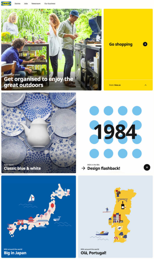
IKEA’s in-house marketing team often uses its branded specific yellow and blue color scheme across its website’s stock illustrations to reinforce its brand identity. This consistent use of color ensures that—even when mixing in with custom product photography—there is a unified and authentically IKEA feel to all content on the Swedish multinational conglomerate’s website, enhancing overall consumer recognition and this digital marketing content’s overall appeal.
Focused isolation
Technique
Utilize photo editing tools to selectively highlight specific elements within a stock image. This can be achieved through techniques like masking or applying selective focus, which isolate and emphasize particular aspects or objects in an image.
Why it works: This approach draws attention to key features or products, making the image more relevant and engaging for specific marketing campaigns. It allows marketers to repurpose generic stock images for diverse promotional contexts, enhancing the visual focus on specific elements critical to the brand’s messaging.
Custom framing
Technique
Apply consistent custom framing or borders to all stock images. This method involves adding graphical frames or edges that align with the brand’s visual identity.
Why it works: Custom framing can significantly enhance the visual consistency across various images, making them feel like part of a curated collection. This technique helps to integrate disparate stock images more seamlessly into the brand’s visual narrative.
Example
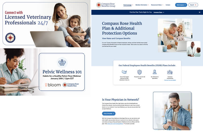
On its website, CTA graphics, and other digital marketing assets, Compass Rose Benefits Group uses a rounded outline to echo the shape of its stock art. Echoing the original image’s shape adds interest and makes the royalty-free art feel more customized and aligned with its brand identity.
Graphic overlays
Technique
Integrate dynamic overlays in a way that complements and interacts with the visual elements of stock images. This includes placing text in strategic locations within the image to enhance the message without obstructing key visual components.
Why it works: Even if the starting image is stock, an overlay adds a layer of customization to help standard imagery stand out and feel more tailored to specific campaigns and your overall visual identity.

Example
On its website, Cloudinary uses graphic overlays on top of stock images to spotlight how its solution works. These unexpected elements—created using the company’s brand colors—not only add interest and make the art feel more special, but they also make the pictures feel more “on brand.”
Perspective alignment
Technique
Select and edit stock images to have a consistent perspective or viewpoint. This can involve choosing images with a similar camera angle or editing images to adjust their perspective to align with the rest of the visual content.
Why it works: Aligning the perspective across images creates a seamless visual flow on the website, enhancing the overall aesthetic cohesion. This uniformity can also aid in storytelling, making the website feel more structured and intentional in its visual narrative.
Background harmonization
Technique
Modify the backgrounds of stock images to ensure they harmonize across your website. This can be achieved by either selecting images with similar backgrounds or using photo editing tools to adjust the background elements.
Why it works: It creates a visually cohesive experience across different website sections, reducing visual clutter and focusing on key elements.
Example
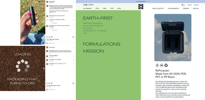
MOB Beauty doesn’t just tell customers about its commitment to the environment. It also uses website images and branding to reinforce that differentiator (of offering items that are “good for the planet”) by consistently pairing product imagery and other graphics with nature photos across all of its digital marketing.
Selective filtering and effects
Technique
Apply selective filters or graphic effects to stock images to create a unique visual style that matches your brand. This might include adding a sepia tone, a vintage look, or a modern, high-contrast filter.
Why it works: Differentiates your stock images from those used by other companies, making your visuals unique and more aligned with your branding.
Example
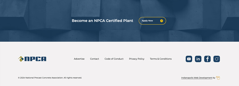
Sometimes, even companies with a huge repository of custom images need to use stock art on their websites. In those instances, filtering and graphic effects can be a great way to harmonize these website images and branding assets also on the page. In this example from the NPCA, a bold navy blue filter treatment helps to make this closing CTA photo feel unified with the organization’s overall visual identity.
AI adjustments
Techniques
- Neural filters: Use Photoshop’s neural filters or similar AI tools to subtly alter the direction a person in a stock image is looking. This can help align the subject’s gaze towards specific elements like text or key visuals on your website.
- Generative fill: Sometimes, you may need more of an image to unify a piece of stock art on which you want to also use custom framing or perspective alignment. In instances like these, Photoshop’s generative tool and Dall-E 2’s outpainting feature are great ways to use artificial intelligence (AI) to speed up this process and extend a picture beyond its beginning edges.
Why these work: Ensures the visual flow on the webpage guides the viewer’s attention towards important content, enhancing engagement and the overall effectiveness of the visual layout.

Example
AI to the rescue! For this customized stock image used in the hero section of IBJI’s website, we used AI tools to subtly adjust the runner’s gaze (so she was more directly looking at the page’s H1) and extend the background to ensure there was enough area for the superimposed text (and so that new part of the image looked realistic yet was muted enough so that the overlaid text readable).
When to get help aligning your marketing images and branding
Even for companies and organizations with a modest budget allocation for website photography, icons, and other illustrations, it is possible to use stock and create a visually dynamic, redesigned site that complements your established brand identity … but only if you follow these proven tips (or work with a website design agency with a team experienced at this important work). If you need help with this task, TBH Creative can help bring unity between your website images and branding. Let’s talk.