Client: Compass Rose Benefits Group
Positive user experiences are essential for any website. Having a productive visit matters even more if potential customers must make life-changing decisions based on what they learn from your site. That’s why Compass Rose Benefits Group partnered with TBH Creative on its recent health insurance web design project.
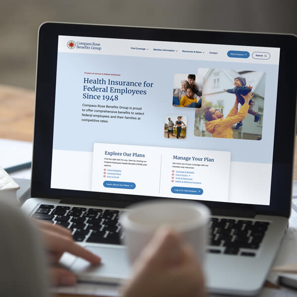
There is a lot of fine print to navigate when choosing the right insurance coverage for you and your family. It is now easier than ever for their existing members and eligible Federal employees to look into health insurance options to access key details about Compass Rose Benefits Group’s coverage options.
The solution—
TBH Creative’s work for Compass Rose Benefits Group included:
- Brand refresh, including logo refinement, new color and font selection, custom icon design, and overall new design style direction
- Website planning and site architecture
- Web page content writing
- Web design composition
- Responsive web development
- Resource center custom development
- 508 compliance testing
- Website production, training, and quality assurance testing
Launch date: September 2023
Q&A
TBH Creative founder and president Tatum Hindman and Compass Rose Benefits Group Marketing Manager Lindsay Vormack answer questions about this recently launched health insurance web design project. Their responses—below—have been condensed.
Why did Compass Rose Benefits Group need a new website?
Vormack: Our website was functional but hadn’t been updated in a few years. Web trends change quickly, and we knew there was more we could do to modernize the site, improve navigation and functionality, and make it a better user experience for our two audiences: members and prospects.
A website is vital to any business, and Compass Rose is no exception. Our members rely on our site to help them find and utilize the health care coverage they receive from us. It’s also the place prospective members go to research their health plan options.
How does the refined brand enhance the new site?
Hindman: The brand was restrictive and bland. The objective of refreshing the logo and brand was to support the total project and marketing initiatives.
First, the logo was an emblem format only, which only worked well in certain applications. Second, the colors were very cold. The font family was nice but didn’t offer much contrast or hierarchy to separate long content visually. The solution included a refined logo that eliminated the obstacles and provided new options that would work in all applications.
Incorporating softer color variants and warm gold/yellow helped separate sections and added depth as part of this healthcare marketing website project. The font used for headlines greatly improved users’ ability to quickly scan information. Even the subtle choices to remove previous all-caps styled headlines helped accessibility and general readability issues.
How does the updated website better support Compass Rose Benefits Group’s target audiences?
Vormack: Our old site didn’t necessarily have separate sections to cater to our different audiences. Prospects had to sift through member information and vice versa.
The new site makes a clear distinction between our audiences to make it easier for users to find what they need. The new plan comparison page helps users compare plans and find the best option for them and their families. Members get a whole new member information section to better assist them in accessing and using their plan benefits. Plus, our new resource center pulls together all of our separate communication channels into one central hub—helping to ensure no message is missed!
Hindman: There are so many ways that the new website better serves the end-user. The top improvements for this health insurance web design project that come to mind include the new site architecture, which separates member and prospect information, and the overall redesign and organization of information.
What did TBH Creative do to help keep the project on track?
Vormack: We set up a very rigid timeline from the get-go, and everyone was committed to meeting that goal. Due to TBH’s excellent planning, the site was pretty much ready to go two weeks before our launch date! We did a lot of work upfront, and it was nice not to feel pressured when we got down to the wire.
TBH Creative provided weekly status updates; these helped keep everyone organized and ensured the project was on track.
Choosing a new website partner is a big decision. What factors led you to select TBH Creative?
Vormack: We like to do our due diligence when choosing a partner. There are a lot of web developers out there, but we were looking for a partner who understood the healthcare space as well as the unique needs and challenges we face. TBH came to the table prepared. They wanted to make sure every element that goes into the website was accounted for on both the design and content side. Plus, they had some ideas for how we could refresh our brand, which is something we had been considering.
One of the biggest factors in our web project was the strict timeline. TBH was realistic about our goals, and Tatum was incredibly thorough in our initial discussions. We felt confident that TBH would be able to complete our vision within our timeline as they had a solid process in place.
What’s been the response to the redesigned website?
Vormack: We haven’t heard from members yet, but we have heard positive reviews internally. We’re excited to see what others say about the upgraded experience.
Would you recommend TBH Creative to other companies looking for a professional web design team?
Vormack: TBH’s web design team was able to take abstract ideas and put them into practice. They really took the time to get to know our visual brand identity and style preferences, which translated into a website even better than we envisioned. It was also really important to us that our website be Section 508 compliant, which they took into account every step of the way.
If you are looking to improve your site’s design, functionality, and accessibility and ensure that you’re competitive within your marketplace, consider TBH Creative.
Anything else you’d like to add?
Vormack: After a year in the making, we are excited to show our new website to the world. Thank you to the TBH team for all of your hard work. It’s been incredible to see our new site come to life, and we thank you for helping us push the bar in what we could achieve with this web project.