Check out a newer version of this post! Even more things have changed since we first wrote this post! Head over to our blog for more tips about the evolution of homepages.
TBH Creative is celebrating its 10th anniversary this year, and there’s one thing we can say for certain: the web has changed immensely since we started out.
In 2004, a few familiar websites called Facebook and Flickr were just starting out too. Podcasting began that year, and iTunes had only been around since the previous year.
These days, 42.3% of the world’s population uses the web. With the rapid changes in tools and technologies, the web design techniques of today are immensely different from when the first website was published in 1991.

Let’s take a look back at just how much web design has changed over the years.
Remember when… websites were primarily text?
In the early days of the “surfing the web” when home pages were referred to as “cyber” content, websites mostly consisted of texts and links, with little integration of images or design elements beyond hard rules to improve presentation. Here’s a screengrab of the first website ever published:
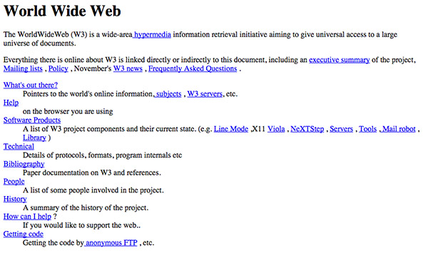
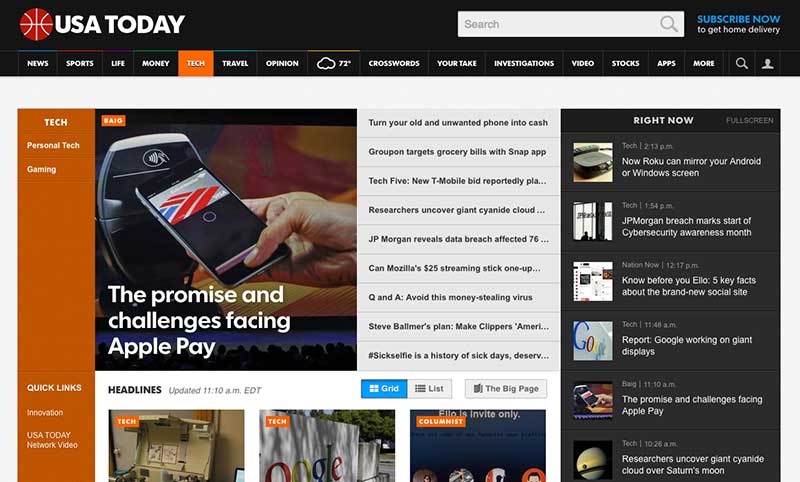
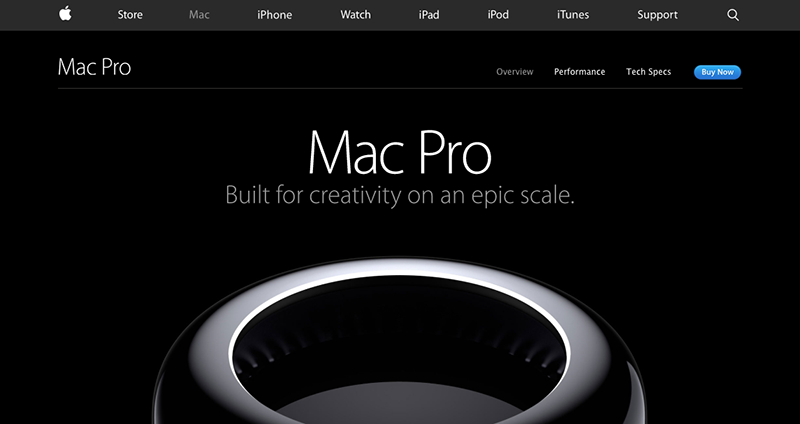
2014: These days, while content is still the most crucial part of a website, designers and developers have come a long way, using images, graphics, and other design elements to create attractive websites.
Remember when… CSS wasn’t standard?
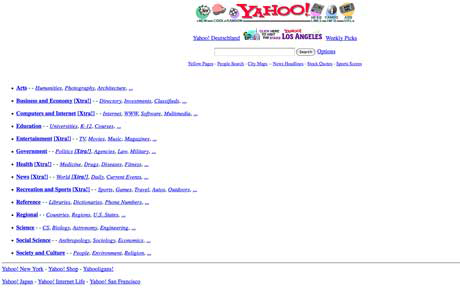
CSS did not become fully widespread until around the early 2000s, which means that most websites prior to that period lacked any advanced method of styling. Tables and frames were used to create page layout before CSS became standard.
2014: CSS is now the primary method of styling a page. CSS3 is the most current version, and it offers many exciting new features that make advanced styling easier than ever before.
Find out more about the latest CSS trends in our CSS3 blog series.
Remember when… today’s popular web browsers didn’t exist?
In the early days of the web, there wasn’t a wide selection of web browsers to choose from. Netscape and Internet Explorer were the most popular browsers for many years. Options such as Safari, Firefox, and Chrome weren’t available until the mid- to late-2000s.
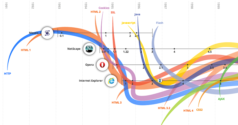
2014: Now, there are a variety of browser choices for users. This means that web designers today have more to take into consideration when creating a website.
Remember when… Flash was everywhere?
Starting in the late 1990s, Flash become a popular web technology for adding interactivity to a website. It allowed for animation and advanced graphic effects to be embedded on a website in place of traditional text and photos.
2014: Flash was never a great web solution, due to lack of accessibility, poor search engine optimization, and other issues. In fact, many devices no longer support Flash. Today, web technologies such as JavaScript or PHP are used to provide interactivity and create a better user experience.
Remember when… design trends included flashing graphics and scrolling marquees?
As the web became more widespread, user-created websites rose in popularity. Page builder tools such as Geocities or Angelfire allowed anyone to create a web presence for themselves or their company. Elements such as animated GIFs, guestbooks, embedded audio clips, and scrolling marquees were heavily used.
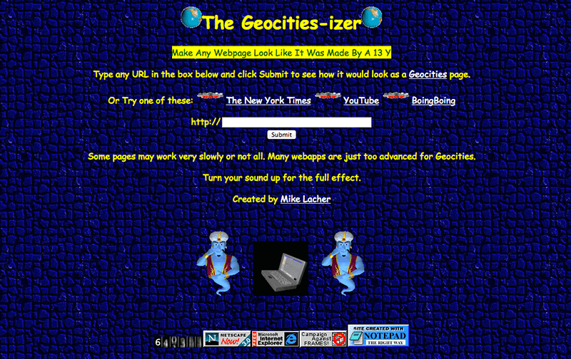
2014: Design trends have come a long way. Animation is used in more subtle ways with CSS animations or JavaScript. Animated GIFs have made a return and have their own special place on the web. Overall, good design is valued much more than it was in the past when development options were limited. Today, it’s better understood that a website serves as a crucial marketing tool, which means that it should be attractive, professional, and easy-to-use.
Read more about the value of a good website.
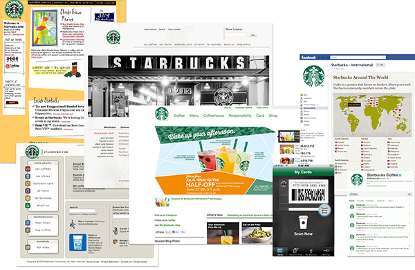
Remember when… social media became an important marketing tool?
When early social networks launched (like Friendster and MySpace), social media was not yet a a widely used strategy for most companies.
2014: Today, most businesses use social media accounts as a way to increase brand recognition, improve brand loyalty, increase opportunities to convert customers, grow inbound traffic to their websites, improve search engine rankings, provide richer customer experiences, improve customer insights through social listening, and more.
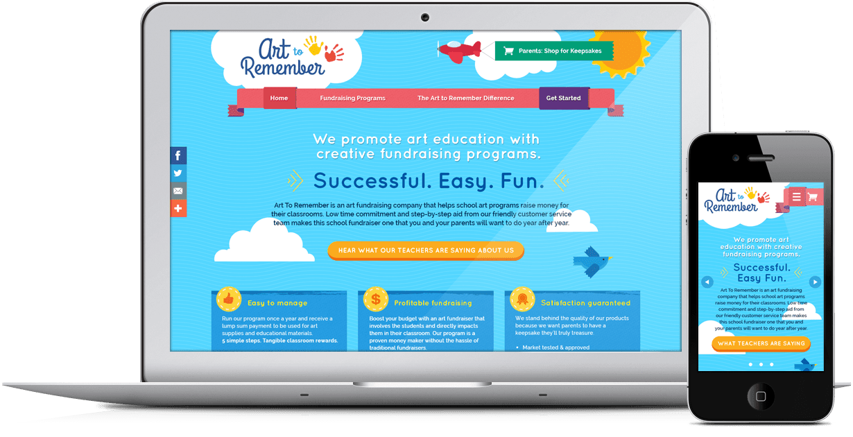
Remember when… mobile became huge?
In the early days of the Internet, desktop computers were the primary way to browse the web, with only a handful of screen sizes that need to be taken into consideration when creating a website.
2014: Mobile devices have rapidly become the most popular way to browse the web, which has brought about many changes for web design techniques. Responsive web design has become one of the most popular approaches to web design in order to accommodate users visiting via a wide variety of devices.
For more on designing for the mobile web, read our blog post about mobile design strategies.
Be ready for the future!
It is our responsibility here at TBH Creative to keep up with the ever-changing nature of the web, and to continue to provide our clients with the latest tools and technologies.
