When it comes to web marketing, do you know what solution—or solutions—are the best fit for your online communication needs? When determining what is the best solution to optimize delivering web content to your customers, it’s best to start at the beginning and look what all the different buzzword solutions really mean and what benefits they can bring.
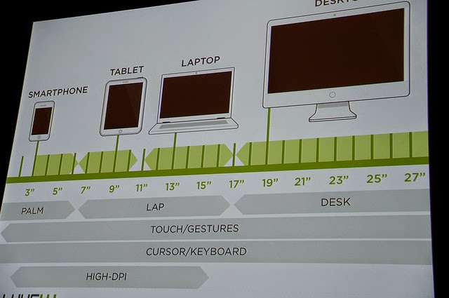 |
| Multi-device web design, charted. (Image by Jeffrey Zeldman, CC BY 2.0) |
Should you create an app? Do you need an app if you already have a website?
To keep things simple, think of an app as being a software program that you use online or with mobile devices like a Blackberry or an iPad. Apps are downloaded onto a devices and live there. Sometimes they use the web, sometimes they work without an Internet connection. Sometimes apps are faster and more interactive than websites, and in some instances apps can integrate with all kinds of other phone features—from GPS to microphones to cameras—making their customization options nearly limitless.While there’s no question that some apps provide useful content and make sense as part of a company’s online marketing portfolio, there are many instances when an app is overkill and therefore a bad fiscal business decision. For most web marketing needs, a responsive website is a smarter investment choice.
Here’s why: App development can be pricey because apps can take a lot of time to build and maintain. This is primarily because you need to build a version of your app that will run on any device, no matter if your user has the latest Samsung smartphone or an older Apple iPhone. You have to create many versions because these devices all run on different platforms that require different apps.
Is creating a mobile website a good idea—and, what’s the different between a mobile website and a responsive one? Will a responsive website suit all your needs? What does adaptive mean?
Before you pick the best web marketing solution for meeting your customers’ needs, you need to ask yourself what are their objectives when they visit your company online?Is it more important to have a website that is readily accessible and viewable from any device than it is to give a streamlined solution that maybe online works on one or two devices? When customers access your website from mobile devices, how are their needs different from those who visit from desktops. Are they are looking for different things? Getting a clear picture of usage will help you strategize your solution plan.
Instead of focusing solely on creating a solution for one or two mobile devices, it’s important to create a web strategy that prioritizes creating an effective design your website that works on all devices, from tiny phones to huge living room flat-screens. Responsive designs can help you get there because with responsive designs, the server sends the same stuff to every device but includes information about how to display content depending on the screen. Mobile websites are usually just a set of custom webpages that have been designed for a specific mobile experience different from desktop.
There are some things that should be shared across all devices, like content, and there are some things that should be designed for the device, like photographs. Neither responsive design nor a mobile website offer both so it’s important to have a clear sense of what you need and what your customers need as you develop a web communications development strategy.
Want the best of both worlds? Like some features of mobile and some from responsive design? Think about going with an adaptive design in which some CSS files are common to all, but where smartphones will get custom sizing and layout instructions different from those sizing and layout instructions sent to desktop users. Though new, some content management systems, like Drupal, allow for adaptive design because of their built-in browser detection and response capabilities.
Where do I start?
As a minimum starting place, you need to adjust your business’s existing website to accomodate today’s Internet users. Every business must pay attention to the fact that more than a billion people primarily access the web from mobile devices, and that number only continues to grow.Even if you aren’t ready to get into development-based solutions, you can start refining your content to make your website more friendly for those accessing it from mobile devices. Look at your analytics and see what pages people are visiting. In almost all instances, people access your website for three reasons: to save time/look up information, to connect with you/others, and to waste time. Knowing these priorities, reorganize your content to give customers quick and easy-to-find access to contact information (including links to maps and directions) and then incorporate blogs, videos, and other diversions to keep them on your website.
Are you ready to think through how to make your company’s web content more accommodating for customers, no matter how they’re accessing your website? TBH Creative can help you with your mobile development strategy and execution. Learn more about our Web Strategy Services and contact us to discuss how we can help you.
