Technological advances and rapidly changing trends have helped usher in a new era of web design. This has brought along some much needed improvements to functionality, content strategy, and the overall user experience. To see these improvements in action, look no further than the homepage of a modern, well-designed website.
By comparing modern homepage designs with those of the past, you can pinpoint the shifts in strategy and design that make today’s websites more successful. Understanding these changes can help you to better evaluate the effectiveness of your own website. Consider the following ways that homepage design has changed into consideration when looking for ways to improve your website.
By comparing modern homepage designs with those of the past, you can pinpoint the shifts in strategy and design that make today’s websites more successful. Understanding these changes can help you to better evaluate the effectiveness of your own website. Consider the following ways that homepage design has changed into consideration when looking for ways to improve your website.
Strategy is key
Digital marketing is more popular than ever, with websites playing a key role. Having a strategy is crucial when creating any successful website. It influences design choices, content decisions, and more. This focus on strategy has led to more homepages with clearer, simplified marketing messages and websites that are more user-oriented because starting with a well-defined marketing strategy to help determine the direction of your website often helps to increase overall lead generation.Related article: Two steps to a smart, strategic website
Content can make or break your website
Previously, homepages were packed with content, trying to fit a variety of elements into a small space. Elements such as content sliders were the primary focus of many websites as a way to fit lots of content and multiple calls to action into one section of the page.Simplicity has since become the norm, with web designers and marketers better understanding the value of presenting a focused message instead of cramming as much information as possible onto the homepage. Instead, your homepage should feature the most important content first and guide the user to the action you want them to take. That means the main call to action should be obvious and other content that will distract users from the primary goal should be limited.
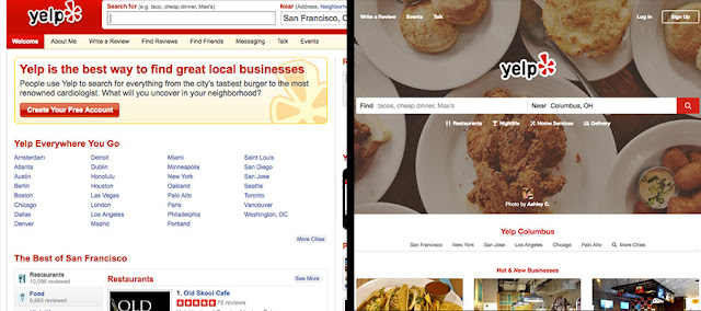
Yelp’s previous homepage was cluttered with content. It’s current look puts focus on the search with all other content secondary.
Related article: Quality vs Quantity in Website Content
Mobile use can’t be ignored
The rise of the mobile web has made perhaps the biggest impact on how web design has changed in recent years, with technologies and best practices adapting to accommodate the variety of devices that now exist. Users expect websites to be functional on mobile, and responsive design has become the standard.Homepage design trends have adapted accordingly, favoring simpler designs that adjust more easily to smaller screen sizes. Mobile use should be considered from the beginning of any website project and worked into your online strategy accordingly.
Related article: Benefits of a mobile first design process
Navigation requires planning
Website navigation has come a long way. Minimal navigation is now the popular choice, as opposed to long menus with a multitude of dropdown choices.Creating an effective navigation requires strategically mapping out site architecture and limiting the number of top-level items in the main navigation. This keeps users from being overwhelmed or confused on where to go, and creates a more tailored path through your website.

National Geographic has improved its navigation over the years by simplifying the number of main choices and adding a collapsible menu for all other links.
Related article: Website navigation design trends to watch
Design principles matter.
A well-designed website is a more effective website, and there are more tools now than in the past to help achieve clean, attractive designs. For example, typography can make a major difference in readability and user experience, and the introduction of web fonts has allowed designers more control over how content is presented.Furthermore, scrolling is now more accepted than in the past and screen resolution is less important, allowing content to better fill the available space. Many homepages take advantage of this with full screen images or videos, larger text, more white space, and other design approaches that weren’t possible before.
Related article: Top reasons why your website should have a user-centered design
Graphics should support content
As a whole, modern website designs have higher quality imagery and graphics. Previously, small or low quality images were commonplace, and trends like skeuomorphism resulted in overly complex graphics.Now, more effects can be achieved through styling than ever before, so the use of graphics can be simplified. Images are typically larger and used in more impactful ways. As a general rule, graphics and images should enhance content without distracting from it.

PayPal has changed how it uses imagery to enhance its content. Instead of complex graphics, the homepage now uses simple imagery and illustrations to highlight its features.
Related article: Tips for choosing effective imagery
Ready to revamp your website? Start here