Catching up on the latest design trends is always fun homework when starting a website redesign. Though different preferred treatments may come and go, one thing never goes out of style: the best site designs always put function first and solve the problem in the most effective, efficient way.
Doing all of this while making a site modern by using current trends simultaneously is a surefire way to build a website your target audience loves to use and that helps you stand out from the competition.
Read on to get website redesign inspiration, and see examples of what’s popular right now.
2021’s most popular web design trends
- Statues
- Plants
- Interactivity
- Brutalism
- Distortion
- Vintage/retro styles
- Neumorphism
- Beige/comfort colors
- Simple geometric shapes
- 3D elements
Note: I didn’t include minimalism, illustration, and video—not to mention boldness, high contrast, and high saturation—on this list because these styles will always be important in modern web design. Instead, this article focuses on the newest web design trends of 2021.
I also haven’t covered dark mode. Like with your devices, some web designs go the dark route or even give the visitor the option to switch to dark mode in navigation. This is not only easier on your eyes, but your device’s battery life as well.
Statues
I’ve seen really cool uses of 3D statues, especially in interactive websites.
This could have fallen under the 3D category or the interactive category, but I felt it deserved its own.
Go ahead and unleash your inner Michelangelo in your next design.
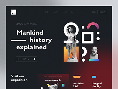
Design Inspiration: Statues
Plants
Using nature and floral photos and illustrations in web design isn’t really that new, but I have seen more of an emergence of using plants in web design. Also a great pair when selling furniture.
Design inspiration: Plants

Interactivity
In the most basic terms, every website is actually interactive.
With this label, I am specifically referring to when a website features something in the hero background area that moves with the user’s mouse as they drag their cursor around that space.
Some other great examples are this web design functionality include Awesome Mirror Effect and Exploding 3D Objects over at Codrops.
Design inspiration: Interactivity
Brutalism
Brutalism is sometimes referred to as “anti-design” because it isn’t concerned with looking good, and it sometimes even evokes a feeling of discomfort. I can’t say that this is my favorite trend, but interesting because it’s popping up everywhere right now
If you like this trend, Brutalist Websites is a great resource to explore the trend.
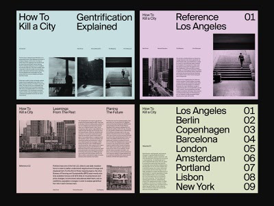
Design inspiration: Brutalism
Distortion
No, your monitor is not broken.
Lately, web designers have been intentionally making text and photos look glitched or distorted. This style can add another level of creativity to a website design. Though unexpected and interesting, it isn’t one of my favorite trends because of its limited potential for use (e.g., it probably wouldn’t work well for a corporate site. Somewhat similar to the brutalism trend, but it’s not the most functional trend.
Design inspiration: Distortion
Vintage/retro styles
Who doesn’t crave a bit of nostalgia now and then?
Bring back the serif fonts and retro colors because, as they say, “style is cyclical.” You can still have a modern UI and layout, but add a splash of vintage aesthetics to achieve a look that sets you apart from other websites.
Design inspiration: Vintage/retro styles

Neumorphism
First, we had skeuomorphism (think the icons on the original first-generation iPhone), and then everything went flat.
Neumorphism is like a hybrid of the two. You can see this trend reflected in the macOS Big Sur icons (at right). It gives a sense of depth and often uses an embossed look with UI elements.
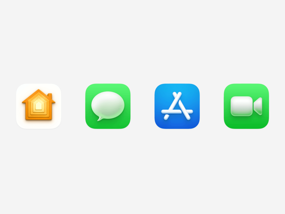
Design inspiration: Neumorphism

Beige/comfort colors
Beige is the new white. Using muted and soothing colors gives the design a human touch while making you feel like the colors are metaphorically hugging you.
Design inspiration: Beige/comfort colors

Simple geometric shapes
Simplicity is timeless.
It is pleasing to the eye when simple shapes are used in design. Web designers today are doing inventive things to integrate abstract geometric shapes and patterns into their website redesign projects.
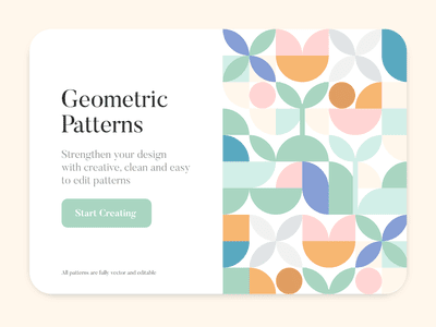
Design inspiration: Simple geometric shapes

3D elements
From 3D isometrics and satisfying loops to abstract 3D renderings and 3D visuals representing different people, more and more web designers are making 3D elements a part of their website designs.
I have been using a program called Blender to create 3D visuals to go with my projects.
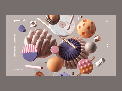
Design inspiration: 3D elements


As a web designer, it’s always a lot of fun to browse through inspiration websites like dribbble to see what is popular right now (and what’s about to take off). But, you always have to keep in mind that a design trend that might be good for a museum web redesign client might not necessarily work for your healthcare website design client and vice versa.
As an experienced web designer, it’s my job to balance my expertise with what is shared in the redesign project creative brief to figure out which solution will work best to help each client reach their website marketing goals. Designing websites your customers can’t ignore is more important than following the latest trends.
Though popular website design trends change over time, if you want a website that feels cutting-edge in 2021, consider which of these popular web design trends of 2021 might be the best fit as you start your next website redesign project—or maybe, just maybe, work with your web designer to get jumpstart the next trend!
