
Leveraging website marketing to establish trustworthiness and reliability online is an essential step for all businesses looking to grow, and this is especially true for hospitals and health systems.
Hospital websites play a huge role in patients decision-making processes. Is your site’s healthcare web design helping you make an excellent first impression? Or, is it putting you at a disadvantage?
According to Google, 94% of patients rank a healthcare provider’s reputation as their number one consideration when choosing whom to trust. 83% of people visit a hospital website before booking an appointment, and 61% of that group visit at least two other sites before converting. If it’s going to help your business flourish and meet patient expectations, your healthcare website needs to do more.
The best healthcare web design solutions put patient needs first
Competition is fierce within the healthcare industry. Your patients likely have more than one option for their care. To stand out and establish your trustworthiness, it’s more crucial than ever to ensure your website is designed to present what patients need in a way that is helpful and engaging.According to NRC Health, these are four types of information most people are looking for when they visit a healthcare website:
- Patient reviews
- Hospital specialties/service line information
- Provider bios
- Payment and billing information
Patient reviews
Online reviews make a difference. Over one-third of patients surveyed by NRC Health told researchers that their doctor’s online reputation mattered to them. Almost two-thirds of patients said they both selected a doctor based on their positive reviews and avoided doctors because of negative reviews.Social proof, especially in the form of online patient reviews, is a crucial part of establishing a new provider relationship. Online reviews are often the first tool a new patient uses to evaluate a potential provider and determine if they can trust them.
NRC Health found that over 83% of patients said they trust online ratings, scorecards, and reviews more than personal recommendations. Researchers found that it takes at least seven high-quality reviews before patients trust the comments and believe the trend that a doctor provides exceptional care.
DESIGN INSPIRATION
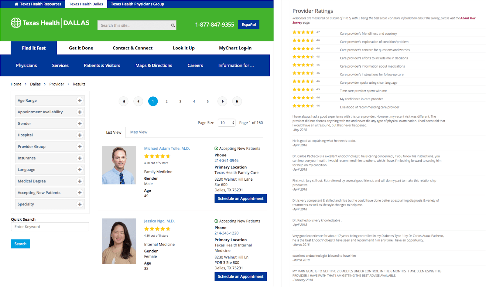
Here are some of our favorite healthcare website design examples showing different strategies for effectively sharing patient reviews and earning prospective patients’ vote of confidence:Texas Health Dallas created a design that prominently displays simple star-rating information on its search results pages. They also provide users with the option to view a comprehensive list of all reviews at the bottom of each doctor’s biographic webpage.
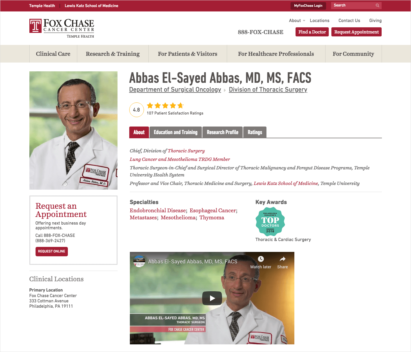
Fox Chase Cancer Center incorporates star-rating details as part of each doctor’s header information panel on their provider bio page.
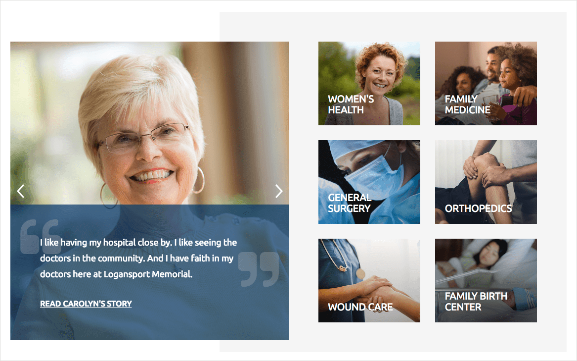
TBH Creative worked with Logansport Memorial Hospital on their 2018 healthcare website redesign project, and we designed different ways throughout the website to incorporate real feedback from actual patients to win over and build trust, including designed photo pull quotes.
Hospital specialties/service line information
Finding service line and specialties information should be an effortless process for consumers visiting your healthcare website. You’ll lose potential patients if your site makes researching services for treating pain an actual pain point.DESIGN INSPIRATION
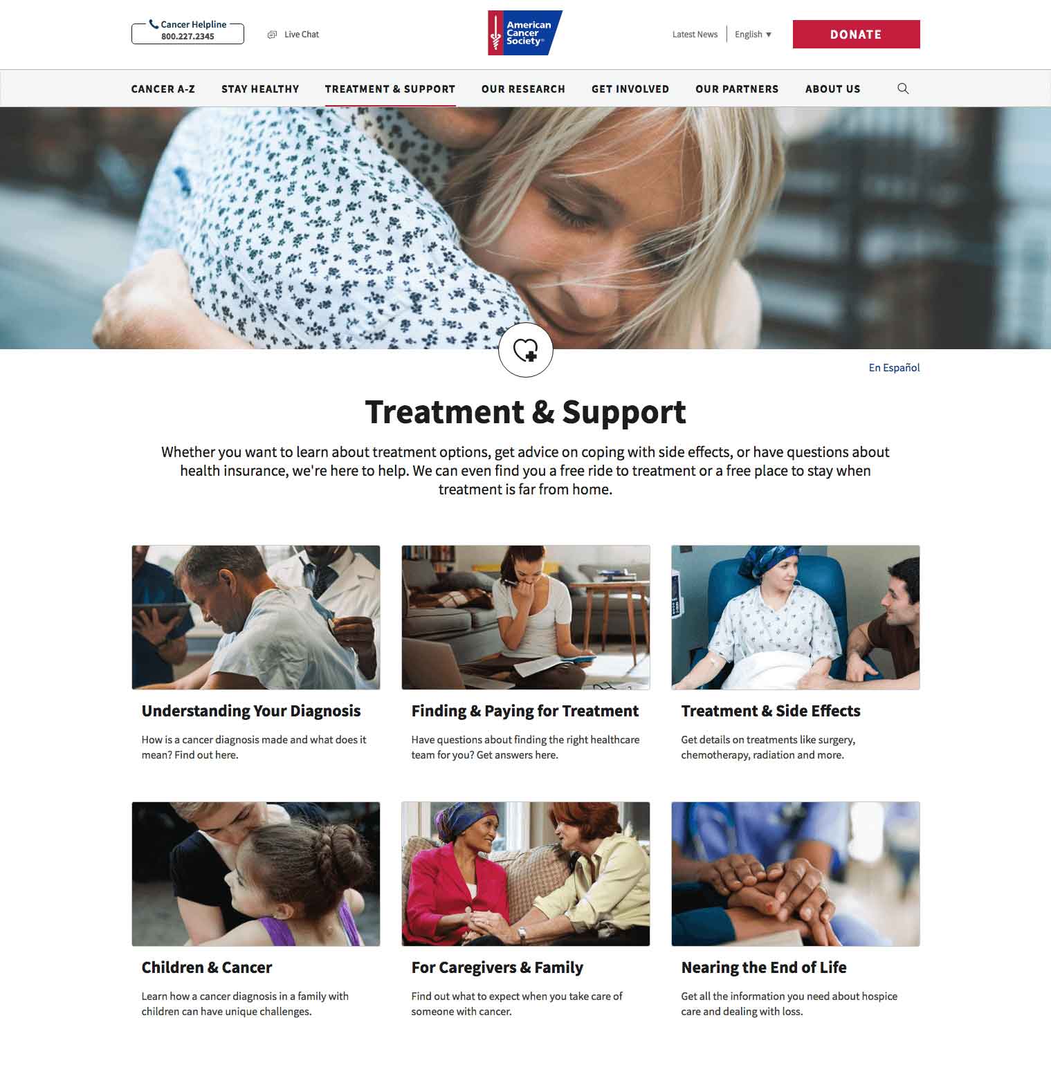
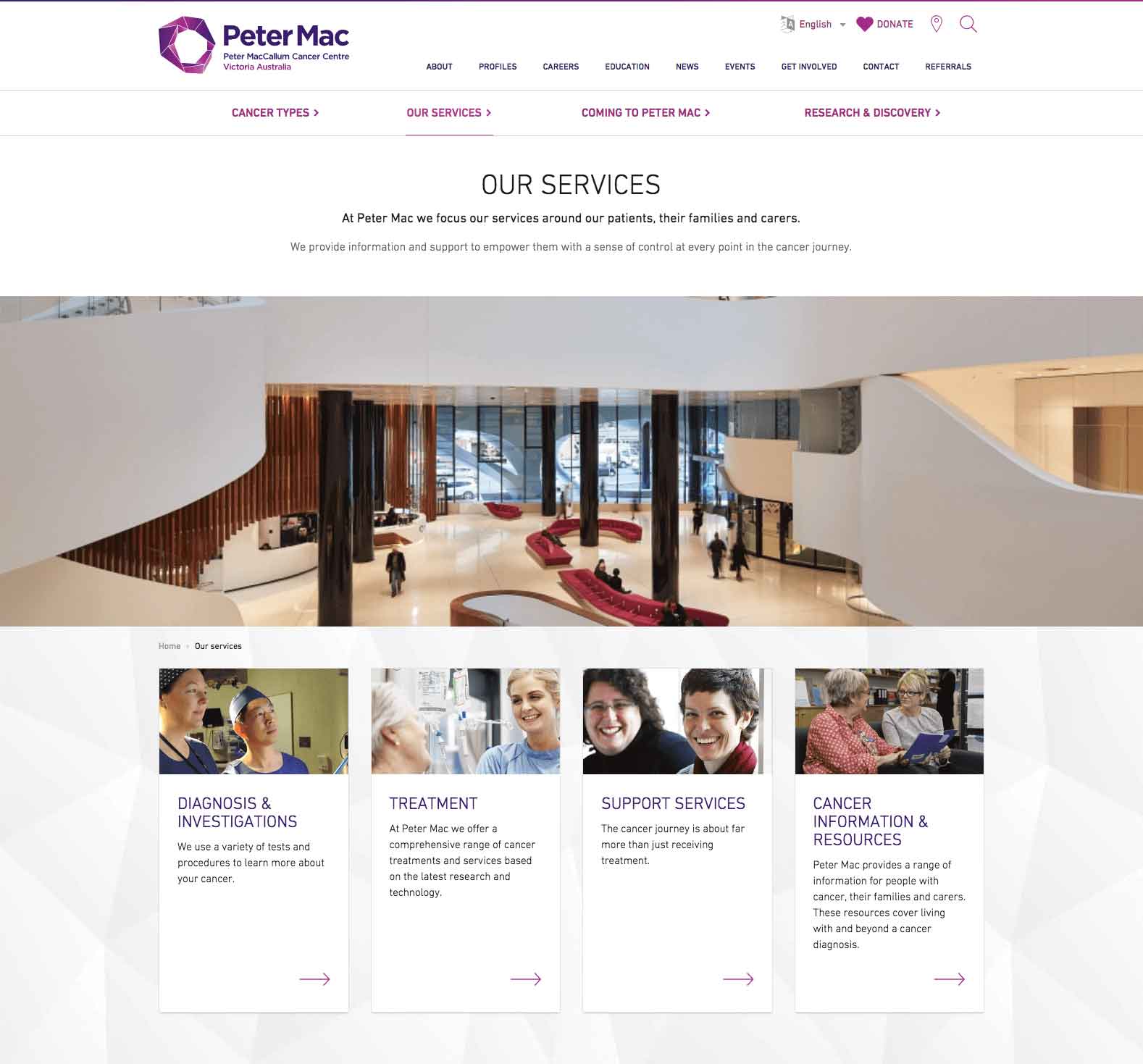
Here are some examples where providers have designed their sites to reduce friction and make it easier for patients to secure the right treatment and find the right services:Cancer.org and Peter Mac Hospital use strong photography to help patients quickly navigate their services.
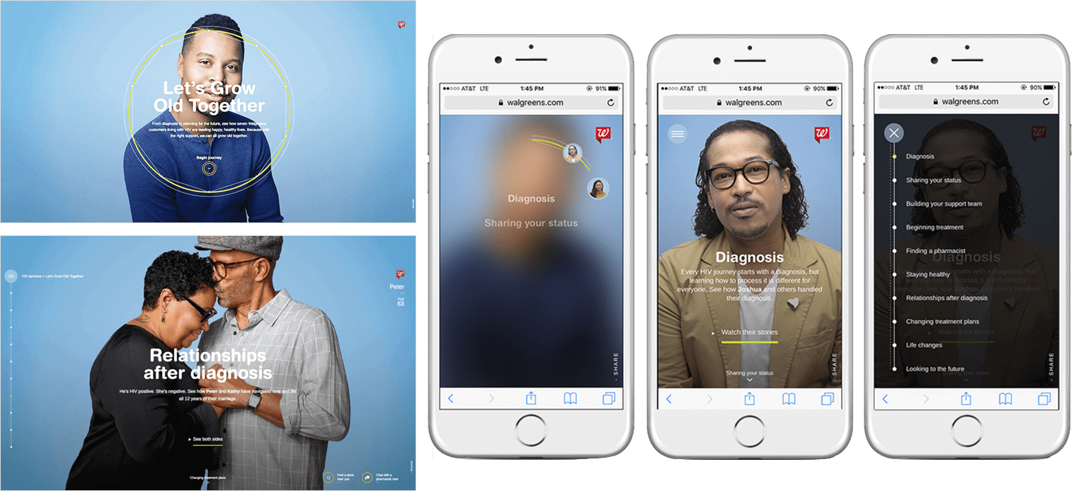
Walgreens uses empowering storytelling, engaging responsive layouts, and professional photography to help consumers learn more about HIV treatment service options.
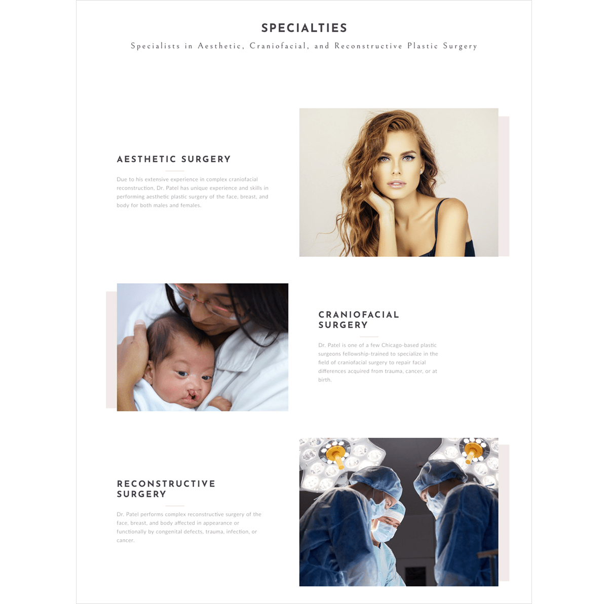
Plastic Surgery Center of Chicago presents its three primary services visually on its homepage using strong photography to help patients scanning to know—at a glance—what sort of plastic surgery services and specialties their practice offers.
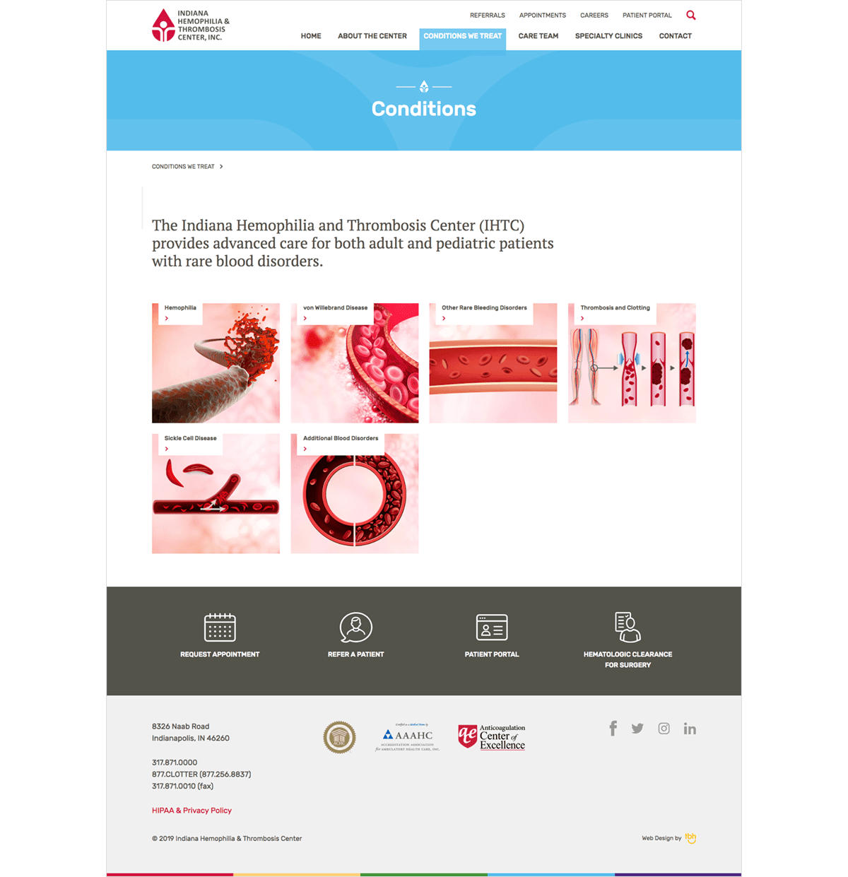
TBH Creative worked with Indiana Hemophilia and Thrombosis Center on their 2018 healthcare website redesign project, and we designed a visual landing page that makes it easy to navigate to additional information about the organization’s specialties.
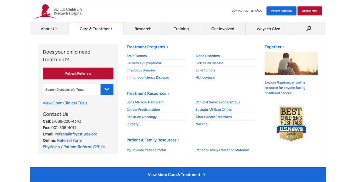
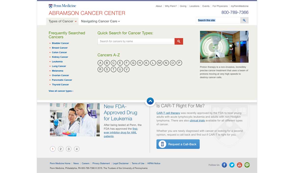
St. Jude Children’s Research Hospital and Penn Medicine Abramson Cancer Center both strategically use mega menus to provide quick links to learning more about their specialties and service line offerings.
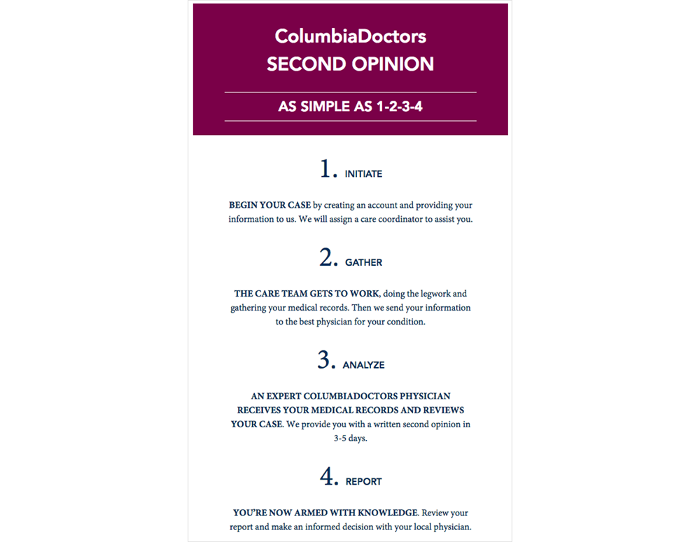
The Columbia Doctors website uses creative typography to explain its “second opinion” service clearly to patients unfamiliar with how the process works at their healthcare system.
Provider bios
Most healthcare consumers want personalized solutions. Sharing well-designed biographic information on your website about your providers is a great way to make patients feel more comfortable about the people helping them feel better.DESIGN INSPIRATION
Here are some examples of healthcare websites that are building trust and strengthening relationships by sharing biographic information about providers using well-designed web pages:
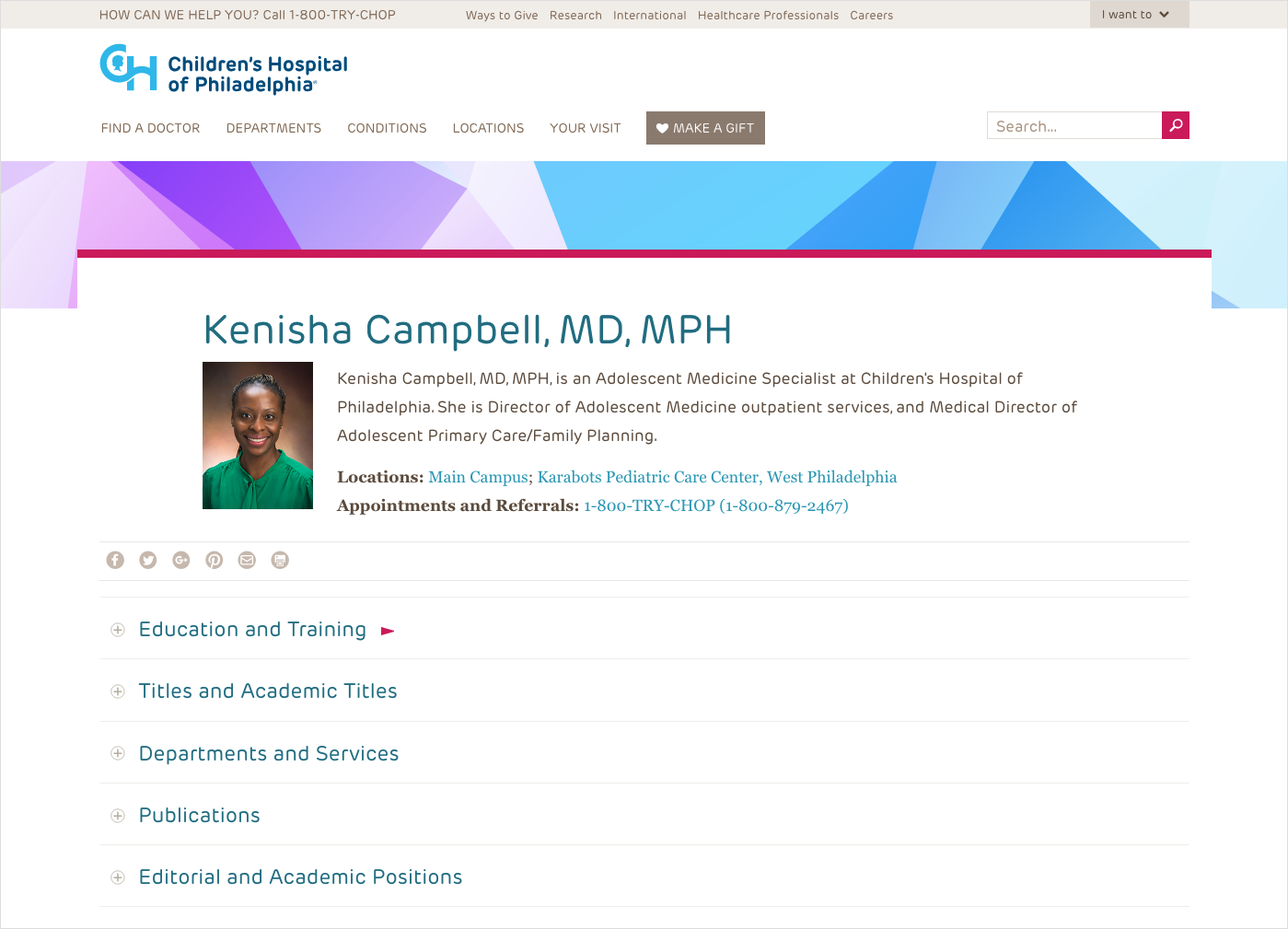
The Children’s Hospital of Philadelphia shares a lot of information about each provider on their team, and they keep the presentation of secondary biographic information looking clean using a simple, expandable accordion-style menu.
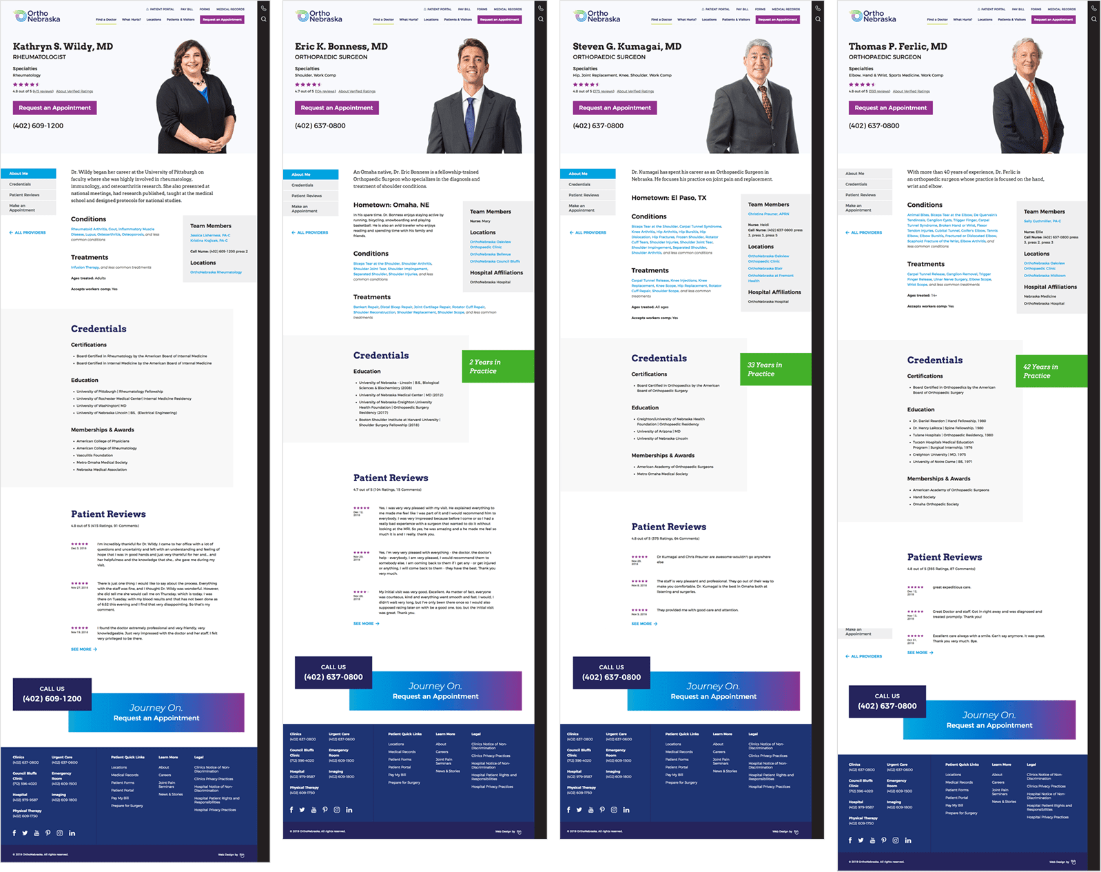
TBH Creative worked with OrthoNebraska on their 2018 healthcare website redesign project, and we created a flexible template for provider bios to accommodate sharing a wide range of information, images, and other assets, including video.
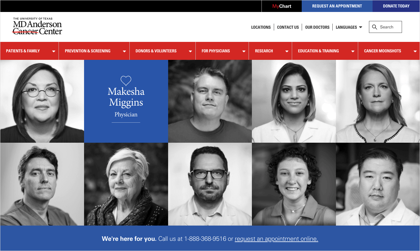
“Find a Doctor” tools aren’t the only way to help patients find a provider. MD Anderson Cancer Center uses a grid of high-quality portraits on their homepage as a gateway to bios, interviews, and more information about their team.
Payment and billing information
According to Beckers Hospital Review, 61% of patients are confused by medical bills. This frustration can even sometimes make consumers put off (or forgo altogether) getting care, which isn’t good for their health (or healthcare providers).Building a well-designed billing section as part of your healthcare website is one way to inspire loyalty and provide clarity to current patients as well as show prospective patients that your organization places value providing exceptional customer service.
DESIGN INSPIRATION
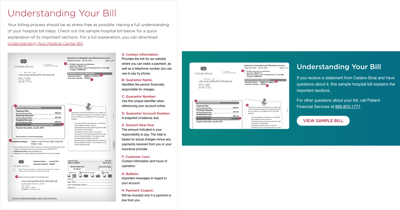
Here are a couple of examples of how some providers are using healthcare web design tricks to improve the presentation of payment and billing information on their sites:Cedars Sinai uses a sample bill as an infographic to help patients interpret the charges for their medical care. They also use a colorful CTA graphic on web pages with content related to payments and billing to guide patients to their “Understanding Your Bill” guide.
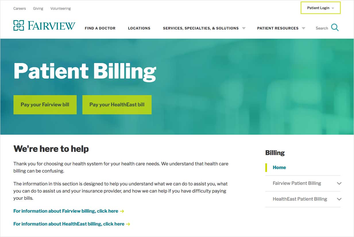
With two different locations that have two different bill pay policies and procedures, Fairview uses bold CTA buttons and clear sub-navigation links to help patients to get to billing information quickly.
In the emergency room, there’s no margin for error. When it comes to designing your healthcare website, you can avoid most errors—and, convert high-value consumers—if you implement design best practices and make content decisions that put patient needs first.
Design elements on your site—including everything from color themes, typography, and photography to layouts, media types, and menus—should be created with a purpose. When your healthcare website design is optimized around helping your patients (and providing them with a better user experience), it makes a difference in how they not only feel about your website but also how they feel about your health system or hospital.
If you’re considering a healthcare website redesign, TBH Creative can help. Our team has been helping hospitals and health systems figure out how to implement web design best practices to create websites that deliver results by building trust and providing the best possible user experience.
Is it time to redesign your healthcare website? We can help. Let’s talk
You might also like: