People are overwhelmed with information daily. When your business has important content that needs to be quickly put out to your audience, how do you present it in a way to guarantee your users will notice? One fix is to use website alert banners.
Alert banners are referred to by various names—such as notification bars, announcement banners, and sticky bars—but these terms all refer to the same thing: any prominent alert on a web page designed to capture user attention.
Having an effective website alert system in place is crucial if you run a website. If you wait until you need a way to communicate pressing information to your users to create this functionality, you might find yourself scrambling to find the right solution under pressure. Using an existing element on your website is not typically the best approach because you want something that stands apart from other content.
Read on to find out more about the different types of content for which you might use an alert banner, learn best practices for their design and implementation, and check out real-life examples.
Types of website alert banners
Alert banners are best used for various kinds of temporary page content. Below are some of the most popular types of alerts.
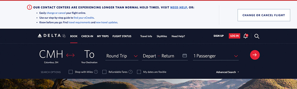
- Business alerts: You can use an alert banner to display timely information about your business, such as temporary changes in hours, outages, and delays.
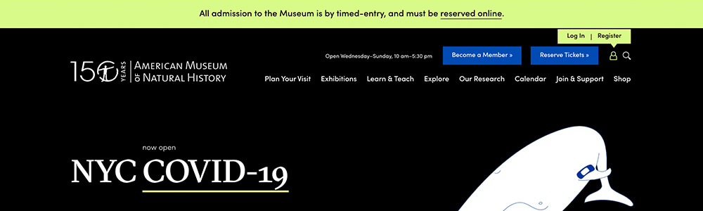
- Emergency alerts: We’ve all seen endless COVID-19 notifications over the past year, which is a great example of emergency content that is well-suited to website alert banners. This could also include information such as breaking news, ongoing incidents, or weather emergencies.
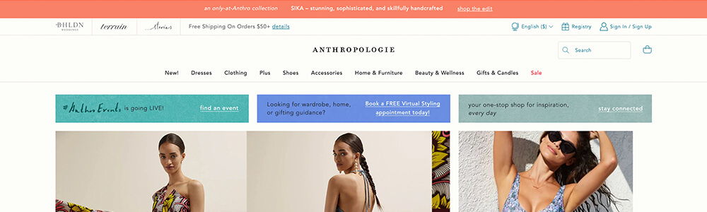
- Informative alerts: These notifications might not be as urgent but still include information that you’d like to call out for your users, such as policy changes, new products, or upcoming events.
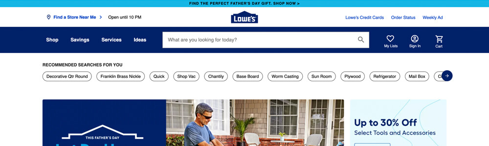
- Marketing alerts: Some websites use alert banners for more marketing-focused content like content offers, discounts, or subscription forms.
All of these types of content need careful consideration to get noticed by your target audiences. Let’s look at some of the best practices for creating a website alert banner that is effective and attractive.
Best practices for website alert design and implementation
Follow these tips and best practices for placement, content, style, and functionality to create the best alert banner for your website.
Placement
You’ll need to decide where on your website you want your alert to display. For most alerts, the homepage is the most obvious choice. However, not every user will be coming into your website through your homepage, so a sitewide alert is typically a better option for urgent information. If you have an alert that is only relevant to a smaller subset of your audience, such as information for a single location or a discount for a specific product, you might decide to only include it on specific pages. Make an informed decision based on the type of alert and your audience.
In addition to what pages to display your alert on, you’ll need to decide where on the page it should be. The best place for alerts is somewhere easily accessible to users that doesn’t require scrolling. For example, the very top of your page, just under a global header, or a sticky element in the corner.
Another decision to make for placement is whether your alert will overlap other content. A sticky alert is the most common example of this, where it covers up some content on the page and is persistent as you scroll. However, covering content can interfere with a user’s ability to browse your site, especially on smaller screens. Therefore, placing within the content of your page is often the better choice, but— either way—you should carefully consider the user experience.
When choosing placement, you should also be thinking about the longevity of your alert. If you leave an alert banner on your website for an extended period of time, returning users will likely start to ignore it, which can be an issue when you have updated information to share. If you have alert-type content that needs to be up indefinitely, it might be better to use a different type of element or another dedicated space on your website communicating this information.
Lincoln Park Zoo
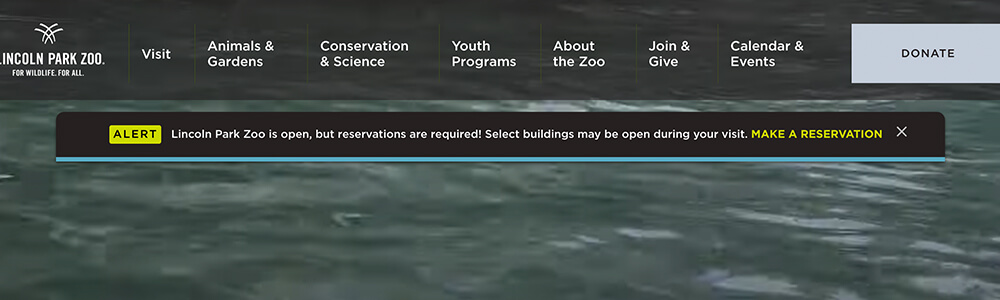
On the Lincoln Park Zoo website, the alert is placed just under the global header so that it doesn’t completely overwhelm the top of the page. It is a sticky element and scrolls with the page but can be closed by the user.
LeadPages

This LeadPages example shows an alert placed at the bottom of the page, and it displays on blog articles where its message is most relevant.
Content
Avoid clutter and use a minimal amount of text within your alert. Don’t load it up with images or make it several paragraphs long, which could distract from getting your message across. Be succinct and link out to more information if needed; a single line of text is a good goal to aim for.
If you provide a call-to-action, try to keep it to one or two links to keep the user focused on what’s most important. Too many options might confuse your users and be less effective.
If your alerts include time-sensitive information, it’s a good idea to include a date so your users can be certain it’s the most up-to-date information.
OrthoVirginia
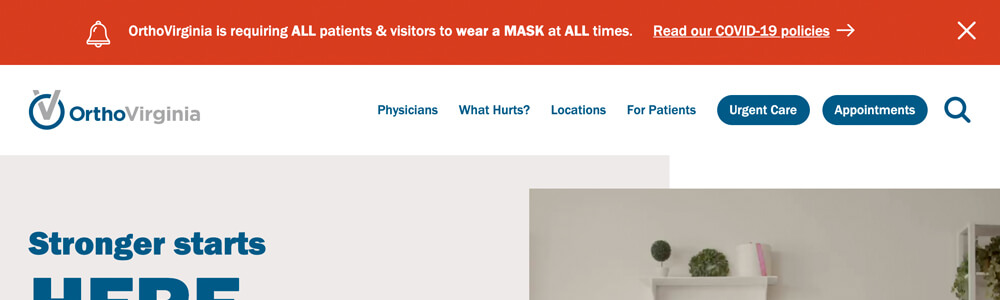
This website alert banner on the OrthoVirginia site features one line of text with a clear call-to-action.
Style
Choose a design that will stand out from the rest of your site content while still fitting within the general aesthetic of your website. Color is essential, especially with emergency alerts. You’ll want to properly convey the level of importance of your message and capture attention.
You may need multiple designs for website alert banners if you have various notification types in use on your website. For example, emergency alerts might be styled differently than an alert about discounts so that users can quickly assess what type of information you are providing.
Accessibility should also be taken into account to ensure important content is available to all users, especially emergency info. Follow the WCAG guidelines to design your website alert banners accordingly.
National Aquarium
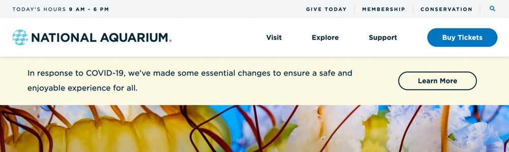
The National Aquarium alert utilizes an accessible color scheme that is not used elsewhere on the page in order to set the alert content apart from the rest of the elements on the page.
Moxi Skates
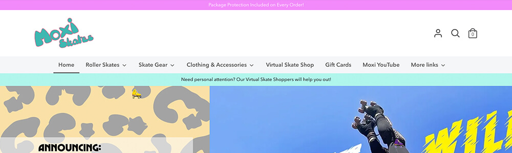
On the Moxi Skates website, you’ll see there are multiple alert bars with different colors to set them apart from each other. They are placed in different sections, which gives them a varying level of importance. The aqua-colored alert is only present on the homepage, whereas the top alert banner is sitewide.
Functionality
One of the main functionality concerns for website alert banners is whether they should be dismissible by the user. Oftentimes, you’ll see alert banners with a close button, and cookies are used to keep an alert hidden after being closed by the user. This may or may not work for your alert, depending on the urgency of the content. If it’s crucial information, you may choose to not provide a close option to better guarantee it doesn’t get accidentally dismissed. Consider how you want users to interact with your alert to determine the best option for you.
When developing an alert banner, you should be mindful of performance and loading times as well. For example, if you have an alert that slides down at the top of your page, this can unintentionally shift things around for users as they load in and begin interacting with your page. This is referred to as “Cumulative Layout Shift” and is one of Google’s Core Web Vitals, which have recently become ranking signals. Or, if you opt for a third-party tool or plugin to implement alert banners, it may load in large scripts or stylesheets that slow down your website. Have an experienced developer assist with implementing alerts and have them weigh in on any technical considerations to avoid these types of issues.
Don’t forget to fully test your alert as a final step to make sure it functions as intended. Check it on various devices, such as tablets and mobile, to see what it looks like for a larger variety of users. Be certain that your alert system is running smoothly so you can be confident you have the right tools in place when you need them.
More examples of website alert banners
Now that you have a better idea of what alert banners are and how to design them, here are some additional examples for inspiration.