A hero graphic is an introductory-type area of a website that generally consists of a large banner image accompanied by a minimal amount of text and/or a call to action. This typically is the first thing a user encounters on the homepage of a website.
Examples
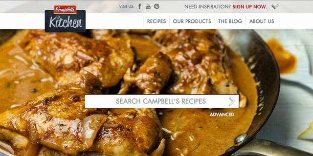
Campbell’s Kitchen Australia incorporates a recipe search into their hero area, while enticing users with photos of prepared recipes.
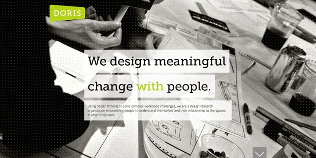
The Doris Research website incorporates its marketing message into its hero area.
Pros & Cons
As with any design element, the hero area has its pros and cons. Here are some things to take into consideration:Pros
- Focus viewer attention. A hero graphic creates one large focal point. This allows users to focus in on and connect with that particular piece of content, as opposed to multiple content areas competing for their attention. This makes hero areas great for displaying a call to action.
- Make a first impression. A hero area should contain a meaningful message. This will generally be the first bit of content a user encounters on your site and associates with your business.
- Encourage users to view more. A well-designed hero graphic will capture the attention of users. Once you’ve generated interest, users will be more likely to browse further into your site to find out more about your business.
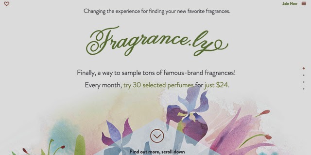
The Frangrance.ly site prompts users to view more by placing an arrow at the bottom of their hero area.
- Flexible content. Hero graphics are a flexible design element. They can be used to put the focus on your most important content, whether that’s a marketing message, advertisement, or featured product.
Cons
- Takes up space. Most hero areas are very large, taking up a good amount of screen real estate. This can be an issue if it would be pushing down important content that users need to find quickly.
- Hides additional content. Depending on how large your hero area is, it may be unclear to users that there is additional content below.
- Not as impactful for mobile devices. Another downside is that if your website is responsive, once your hero graphic is taken down to a size fit for mobile, it may lose it’s visual impact.
- Large loading time. If you’re using a large banner image in your hero area, this could increase the loading time of your site.
Want more hero graphic inspiration? Check out some creative examples in our unique hero graphic showcase.
TBH Creative can help you evaluate which trends are most appropriate for your audience, and avoid these possible downfalls if a hero graphic is selected to communicate your message.
Ready to revamp your website? Start here