A call to action, also called a CTA, is an area on a webpage that prompts you to do something. Some times a call to action entices you to click a button or picture. In other cases it may make you want to fill out a form or contact a company representative for more information.
Ways to improve your call to action
- Integrate white space
Strategic use of white space helps guide the users’s eyes to your call to action. A cluttered website with many buttons and different sections often draws attention away from the call to action. White space, when used thoughtfully, can make your call to action stand out. - Make relevance is clear
When creating a call to action include a description of the promotion. Users need to know why they should act on your call to action. - Provide alternatives
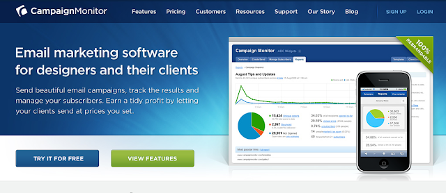
The most common call to action buttons or forms are “Sign Up Now” or “Download Now,” but it’s useful to add more than one option. Campaign Monitor has a great example of having multiple options for the user. - Express urgency
When writing your call to action’s copy, consider using terms that express urgency. Effective terms to use includ “now,” “free,” “donate,” “subscribe,” “call,” “register,” “buy,” and “purchase.” - Put it on multiple pages
If your call to action is so important, add it on multiple pages.
I selected some of my favorites to share with you. Have you seen an interesting call to action recently? Leave the URL in the comments with why you found it effective.
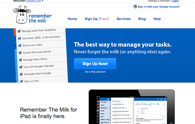
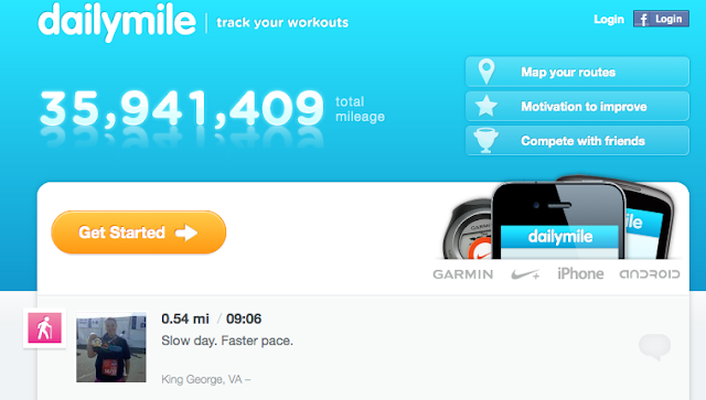
Examples

DailyMile
Themes Kingdom

Blurb Creative


A call to action is an important component of any website. When done right, it can help your company make new sales. If you don’t already have a CTA integrated as part of your website to help you reach a business goal, the TBH Creative team will work with you on a strategy to integrate an effective call to action on your website.