
Choosing the right navigation design depends on the unique needs of your website. To make a more informed decision when selecting the best approach, it’s helpful to be aware of the different types and styles of navigation available to you.
In this article, we’ll explore the most common navigation design patterns, including real-life examples of each navigation type.
Horizontal
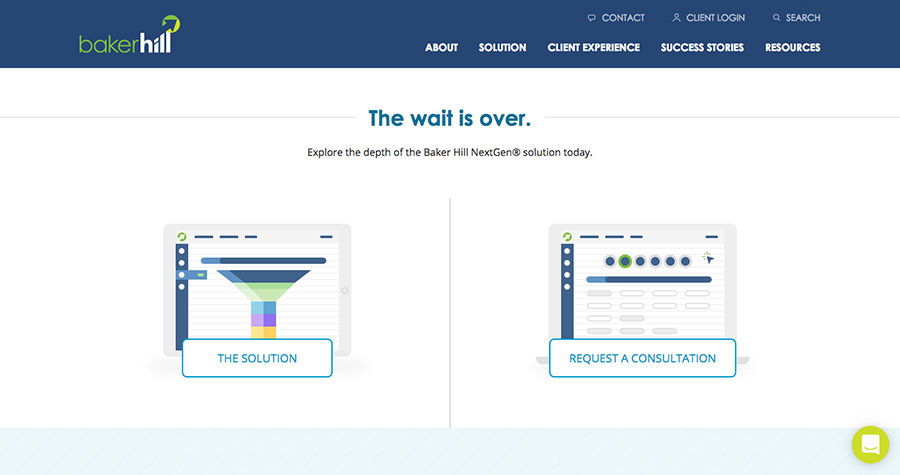
This is probably the most popular type of navigation and consists of links somewhere along the top of a website, typically along with the company logo. This is a familiar pattern to users, and that familiarity makes it an excellent choice for most sites since it aligns with user expectation of where site navigation will be.

TBH Creative uses a horizontal navigation pattern.
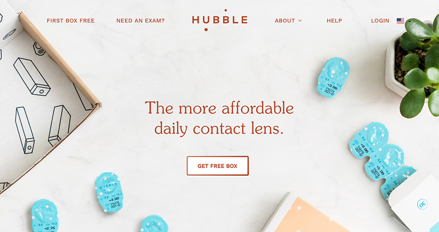
This pattern can also be switched up a bit. This example breaks up links with the logo in the middle, which is another popular horizontal navigation approach.
Vertical
Many sites opt for a vertical placement for the primary navigation instead. This typically consists of navigation items listed from top to bottom down the side of the page.

This website uses a simple vertical navigation pattern.
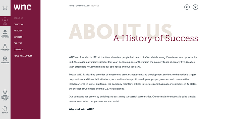
The vertical navigation on the site is multi-level and uses icons for added interest.
Subnavigation
If a website is large enough to warrant sub-navigation, the horizontal and vertical patterns can be carried over to this as well. Sub-navigation can be in the same section as the main navigation or in a different area of the page entirely.
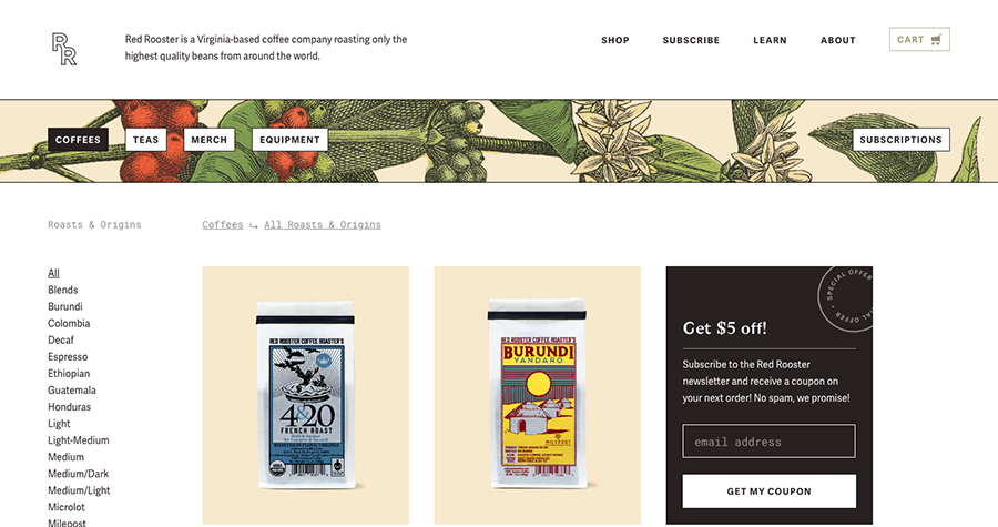
On shop sub-pages, the sub-navigation displays in its own panel underneath the header.

The OrthoIndy website displays a collapsible side navigation on interior pages.
Dropdowns
Dropdown navigation is often used to more easily guide users through page levels. Dropdown menus can deter users from top-level pages and require particular attention on mobile devices, so this navigation pattern should be chosen carefully. They work best on large websites, such as e-commerce sites with a multitude of categories. Dropdown menus with extensive choices and content are commonly referred to as “mega-menus.”
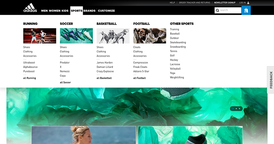
Many e-commerce websites like Adidas use the mega-menu dropdown approach for better navigation through categories.
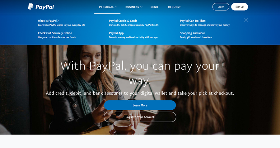
PayPal uses dropdown menus with additional descriptions for each navigation item to help users in finding the right information.
Breadcrumbs
Breadcrumb navigation is used to show a user where they are within a website’s structure. This navigation pattern can significantly improve the user experience on websites with multiple page levels.
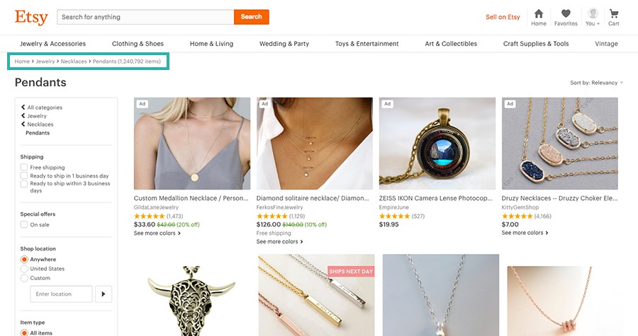
Breadcrumbs are great for showing where a user is located within a product category.
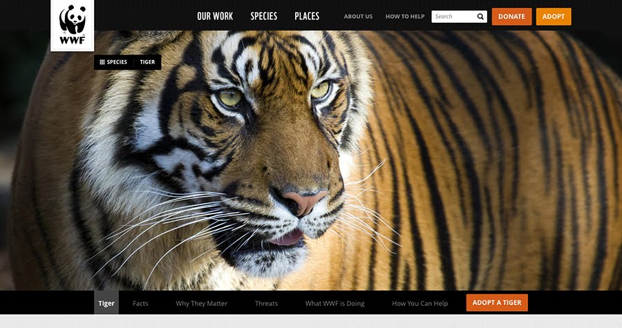
The WWF website displays breadcrumbs on their third-level pages, giving users an easy way to get back to the top-level page.
Fixed/scrolling menu
A fixed menu pattern can be helpful for sites with long pages. This consists of a navigation that remains “fixed” to the top of the page when scrolling down. Another popular approach is for the fixed navigation to appear only when a user starts scrolling up the page. This allows users to continue on to other pages at any point while browsing a page without needing to scroll back to the top for the navigation.
A fixed navigation on scroll gives users easy access to the navigation at all times.
An alternate approach is to display the fixed navigation when scrolling up only, which helps keep the user’s primary focus on the content, especially on smaller screens.
Hidden menu
If you’re taking a mobile-first approach to your website, you might consider using a mobile-focused navigation pattern for all devices. For example, hidden navigation that is displayed only when a user clicks to open it is a growing web design trend. This can be an effective design pattern if your users are savvy enough to not be confused by the lack of initial navigation.

The “hamburger” menu icon is a popular approach to opening a navigation and is now familiar to most users.
No navigation
Yes, that’s right—some websites skip the main navigation altogether! While this is a rare approach, it can be useful for small websites that aim to focus in on content with minimal distractions for the user.
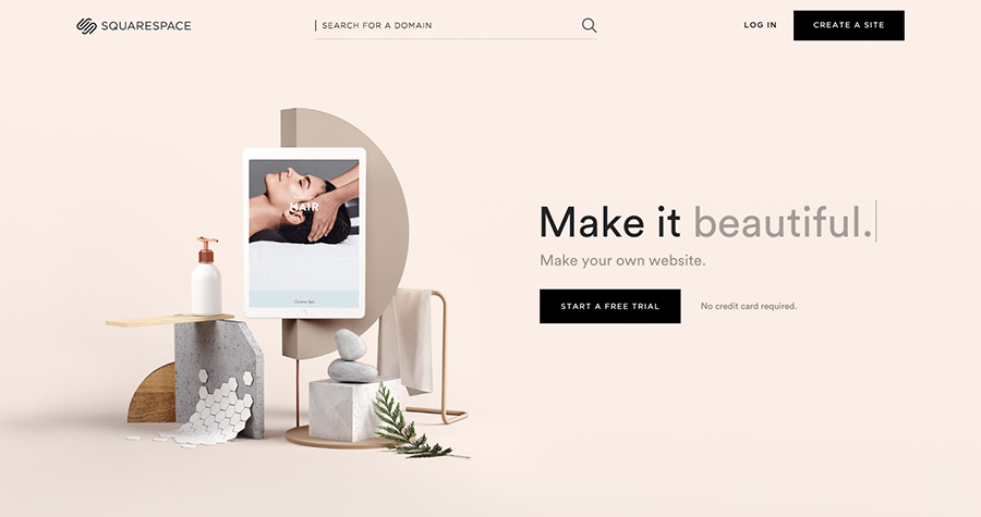
SquareSpace has no main navigation outside of a prominent call-to-action, which help users to focus on the desired action of the site.

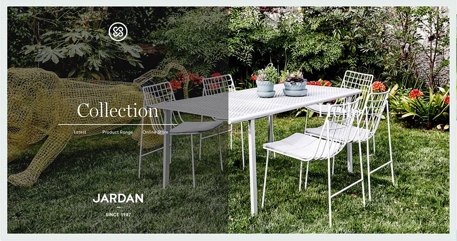
In place of a main navigation, this site uses links throughout the content to get to the interior pages.
Creative navigation
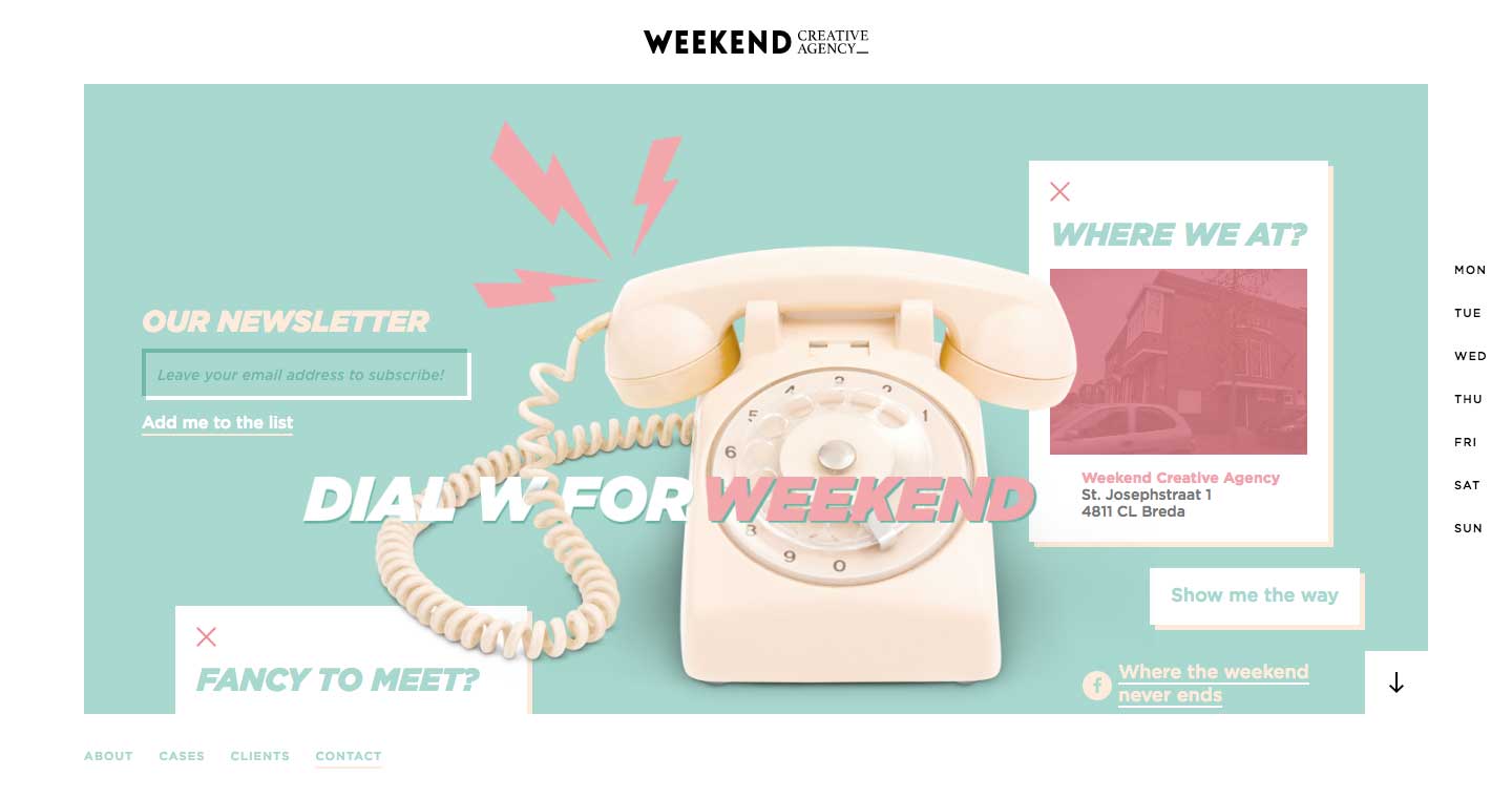
If your audience and web strategy allow for it, you can also break away from the traditional navigation patterns and really get creative.
Full-page style navigation is a trendy pattern. On this website, the navigation displays when hovering over different sections of the page.
The main navigation on this website is located at the bottom of the page, a twist to the traditional horizontal navigation pattern.
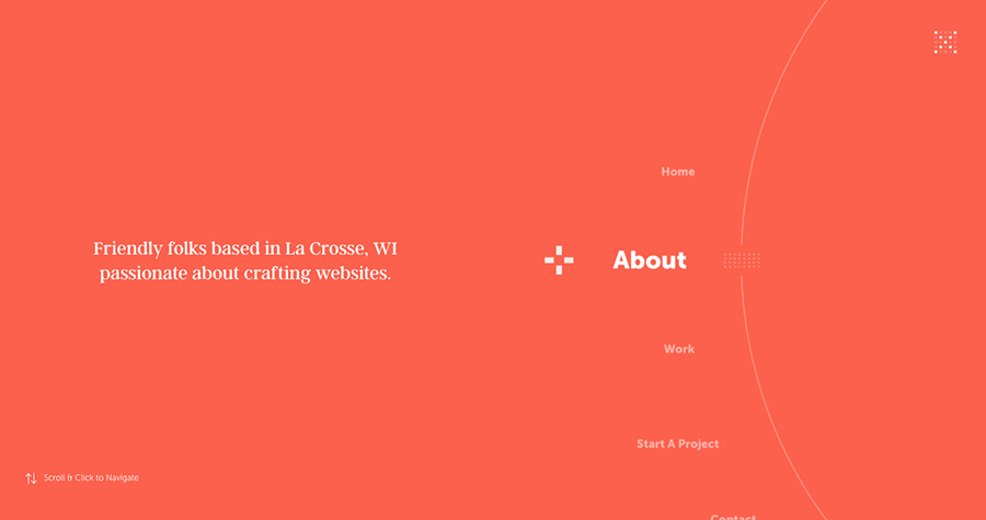
This interactive navigation shows how navigation can be both functional and creative.
