Check out the following websites that break away from the norm with their unusual navigation designs.
Full page navigation
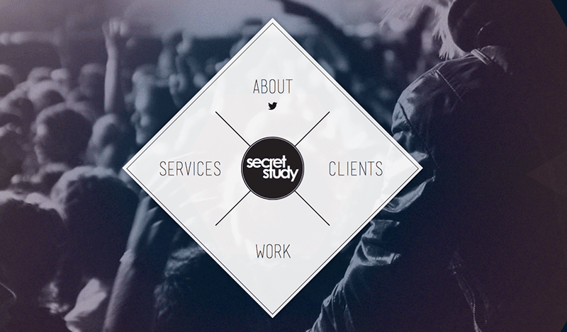
The Secret Study website puts primary focus on its navigation, displaying a full screen menu before you even get to any content. Once an area is selected, the menu is minimized to the top left corner to easily navigate through the site.
Full screen navigation with extra content

Union initially hides the navigation on their website, but provides a toggle button in the top right corner. When clicked, not only does the navigation appear in a full screen overlay, but they also use this area to promote blog and social media content.
Full screen navigation with search bar
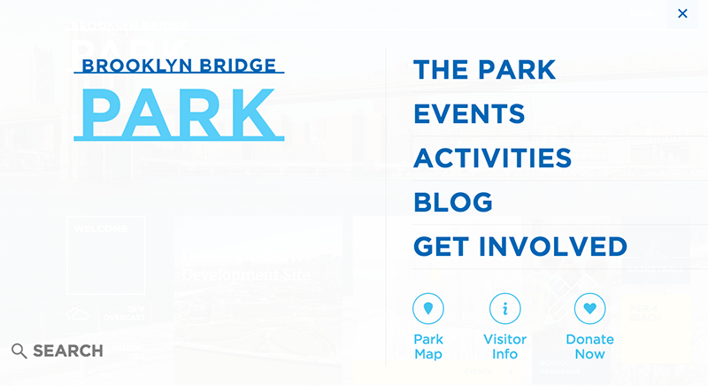
The Brooklyn Bridge Park website takes a similar approach, with the website menu initially hidden. They provide a bit more indication of how to access the navigation with a “menu” label, which can be helpful for users. Once clicked, the navigation displays full screen, along with a search bar to help users find content quickly.
Animated navigation
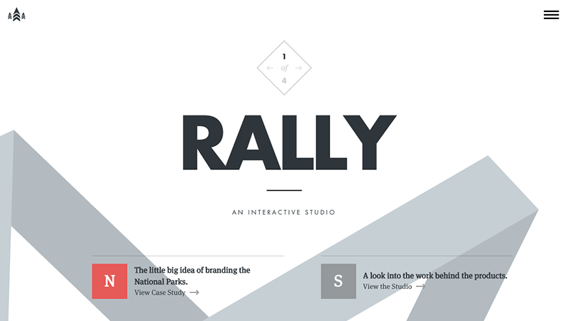
The Rally Interactive Beta website has a very unique navigation. When the menu button is clicked, the entire page background animates into the menu. This adds a great interactive element to the website. They also include arrows at the top of the website to move between pages easily.
Multi-level left navigation
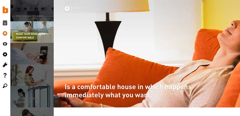
The bticino website provides a very clean, well-organized approach to left navigation. Once an option is selected, the page slides over to show a secondary menu level. When you’re on one of those subpages, the secondary level menu stays open and the top level items condense to icons.
Draggable page navigation

Tonda Pizza takes a fun approach to website navigation. You can drag the page to get to the different content sections, with a menu icon in the top left corner that lets you jump to a section as well. When you first enter the site, there is a graphic overlay explaining how the navigation works, which is helpful for users so they aren’t confused as to how to access content.
Navigation through content
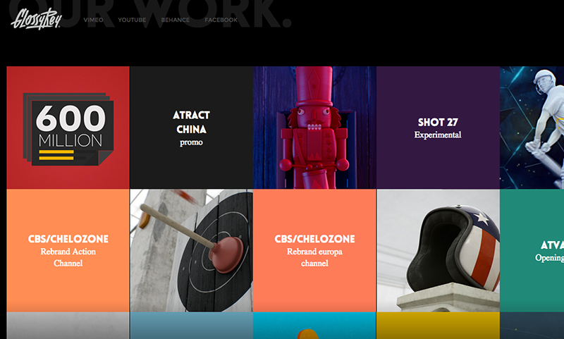
Some websites like GlossyRey don’t provide a traditional navigation menu at all. This site uses a content tile approach to link to the different areas of the site within the page content. The space at the top of the page where you would traditionally see a menu is reserved for social media and contact information.
Corner navigation

Code and Pepper provides a simplified navigation with one link taking up an entire side of the browser. Each individual section can be navigated by scrolling down.