So what makes for an effective navigation design? There isn’t one right answer to this question, and it ultimately depends on your website’s needs and goals. However, there are a variety of styles out there to draw inspiration from, and designers are continuously coming up with new and creative ways to present navigational elements.

Trends in navigation
We look at a lot of websites every day. Here are the some of the most prominent changes and trends we’ve seen over the last year that we expect to carry into 2017.Simplified navigation
Simplifying and reducing the number of items in a navigation continues to be an important aspect of improving the user experience. Instead of trying to fit all of your pages in the navigation, it’s important to guide users through your website with less initial choices if possible. Because of this trend, we’ve seen less drop down menus for simpler sites, although mega menus are still very much in use on larger sites.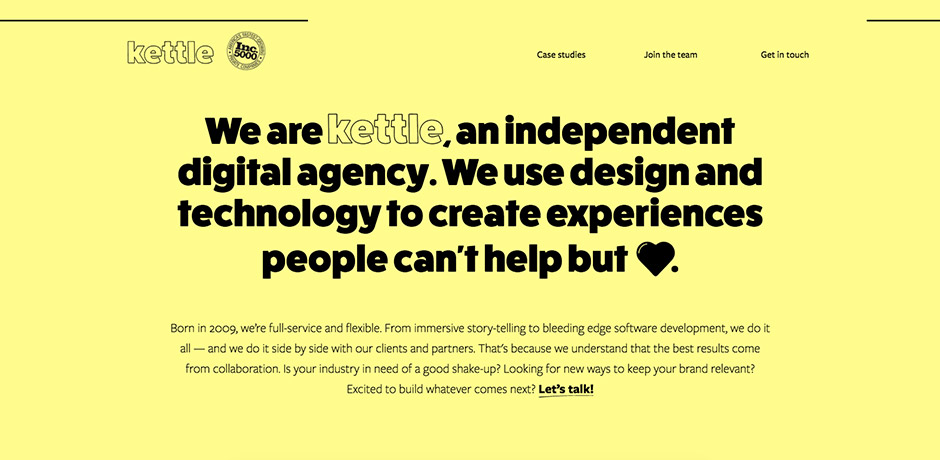
The Kettle navigation is simplified to only three main choices.
Our thoughts on this trend: A simplified navigation is a more effective navigation, since it allows users to focus in on the most important content. However, mega menus still stand out as the best way to handle navigation on websites with a large number of pages.
Blurring the lines between desktop and mobile
Responsive design brought along a whole new set of navigation challenges, and web designers are still working to find balanced solutions that work well across all screen sizes. One response to this challenge is the trend of using off-canvas navigation not just for mobile views, but for desktop as well. This is typically presented as a menu icon that opens some type of navigational element, such as a full-screen menu.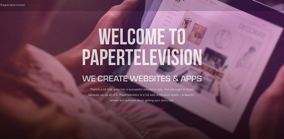
The Paper Television website navigation expands when the menu icon in the top right corner is selected.
Our thoughts on this trend: While this can be a clean, modern approach to navigation, it’s not always the practical choice from a user perspective. Some users may not be savvy enough to understand how to find the navigation, so be sure to consider who your target audience is when making decisions on navigation design.
Fixed navigation
Fixed (or “sticky”) navigational elements are those that stay in place while a user is scrolling through a web page. This trend is commonly seen on one-page websites or websites that have long pages in order to provide easy access to the site navigation without needing to scroll back to the top of the page. One newer trend is a fixed navigation that only appears when a user starts to scroll back up the page.
While reading articles on Medium, you can access the top navigation once you start scrolling back up the page.
Our thoughts on this trend: We are a fan of sticky elements, especially for websites that have longer pages that require more scrolling than usual, as it typically makes browsing a website quicker and easier for users.
Unique hover effects
Hover effects are an easy way to add a little bit of interest to you website. Web developers have been pushing the limits of what you can do with hover effects for some time now and continue to come up with new options for links, buttons, and more.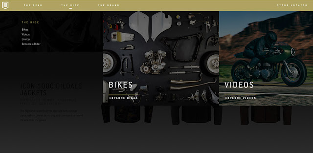
The Icon1000 navigation has subtle border hover effect in addition to opening up a page overlay with menu options.
Our thoughts on this trend: We’re always experimenting with new hover effects and think they are a great way to make your website more interactive.
Unusual navigation
One final trend that has gained popularity over the year is the use of unusual navigation patterns. This is a modern approach to navigation that isn’t typically seen on your average website, as abstract navigation design isn’t always intuitive for users. For example, using only icons for links, placing navigation in an uncommon position on the page, or removing navigation entirely.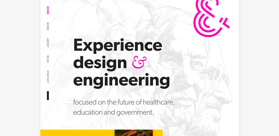
The navigation on the AndCulture website is flipped vertically, running down the left side of the page.
Our thoughts on this trend: Extra creative navigation is fun and interesting, but it isn’t a practical option for most websites. However, if it makes sense for your website and strategy, then we’re all for pushing the limits and experimenting with new techniques.
Get inspired
Check out the collections below for even more navigation designs for your inspiration.- Web design trends: Creative website navigation
- 40 Beautiful and Effective Responsive Navigation Menus
- 30 Fantastic Examples of Fixed Navigation Menus in Web Design
Don’t lose out on leads because of an ineffective navigation.
If your website is in need of a refresh, we can help you improve your strategy and get up to speed with modern trends and techniques.
Let’s start talking
You might also like:
- Website design shouldn’t be frustrating! Learn three ways to make your next project easier.
- Internal site search tips & best practices
