Have you ever visited a website with confusing navigation? How did that impact your browsing experience?
Chances are, it resulted in confusion or frustration when trying to find information. This situation is all too typical for users, and it can negatively impact a business. If potential customers can’t easily find what they are looking for on your website, they will gladly move on to the competition.
Potentially losing frustrated customers who can’t locate what they need is why navigation is one of the most critical components of a website. Taking the time to get it right will help your users have a more positive experience and can improve the number of leads generated from your website.
But what goes into creating useful navigation? In this article, you’ll learn how to determine what will go into your navigation and how to choose the right navigation design.
Developing navigation content
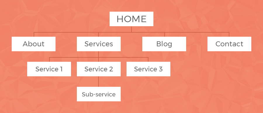
Before deciding what your navigation should look like, you need to determine what it will contain. Start with generating a sitemap to help you identify what navigational components are needed and how your pages will interlink.If you haven’t organized your content into a sitemap yet, take a step back and familiarize yourself with your content and website goals. Determine the priority of information and how pages are best grouped together. The idea here is to create a visual representation of the different sections and levels of pages on your website.
 A sitemap is a visual representation of the pages on your website.
Once it’s clear what pages you will include on your website, essential to start building your navigation.
Types of navigation
Depending on the number of pages your website will have, you might have more than one kind of navigation. The main types of navigation are:- Main navigation: This is the primary navigation for your website.
- Utility navigation: If you have links that are important but might not fit into the main navigation, you may need a utility navigation. For example, links to a login section or customer portal are commonly found in utility navigations.
- Subnavigation: If your sitemap has multiple levels, you might need to include subnavigation on your website that allows users to navigate through interior pages easily.
- Footer navigation: It’s common to repeat essential navigation items or include additional links such as a privacy policy in the website footer.
Pages in navigation
Use your sitemap to determine what your top-level pages are, which should be the primary items in your main navigation. These should be the most important pages on your website.Number of items
In general, your main navigation should have no more than 5–7 items. The fewer links, the better. Users will have an easier time finding what they need when you don’t overwhelm them with options.For drop-down, there isn’t a set limit, and this will highly depend on the sections of your website and how many pages you have. However, “less is better” still applies here, so avoid long lists of links if possible.
In general, this might mean that you need to reduce the amount of content on your website to simplify your navigation. Consider if any pages could be combined or removed entirely to improve content flow.
Order of links
The order of items in your main navigation matters. It’s best practice to put the most important links first and last, due to the serial position effect, which essentially means that users pay more attention to links at the beginning and end of a list.Naming and language
Pay particular attention to the naming of your main navigation items. Consider how users would hope pages are labeled, not just what those familiar with your company would be expecting.It’s best to choose a naming convention and be consistent. For example, your links might be object-based (work, resources, contact) or action-oriented (view our work, download resources, contact us). They might be organized by audience type or by product categories. Whatever you decide works best for your users, consistency is vital in implementation.
However, don’t forget about search engines. Navigation should be labeled in a way that strikes a balance between being user-friendly and search-engine-friendly. Keep keywords consistent throughout your website, even in your navigation. Don’t get so creative with your naming that is obscures the purpose of your pages.
Choosing a navigation design
Once you’ve decided on the contents of your navigation, you can move on to how it will look. Answer the following questions to guide you in the right direction when choosing a navigation design.- What is the desired user action on my website? If the primary goal of your website is to educate users, your navigation will likely be a more significant component than on a one-page website where the desired user action is to fill out a form. Determine what role the navigation plays and use that to help determine how prominent it should be in your website’s design.
- What is the comfort level of my audience? If your audience is a tech-savvy group, you might be able to get away with a more creative approach to navigation. If they aren’t, then an unusual navigation pattern might be confusing. Understand your audience and their needs to choose the best type and placement of navigation.
- Do I need dropdown menus? This question comes up frequently during navigation development, and its answer depends on the needs of your website. You don’t always need to include dropdown menus on the average website, but researchers have found that mega-menus perform well for large sites with many pages, such as for an e-commerce business. In general, dropdown menus can encourage users to skip top-level pages with valuable content, so consider that when deciding if they are needed.
- How will my navigation look on mobile devices? Don’t make mobile navigation an afterthought, especially if you have a high number of mobile visitors. Make sure your navigation is well-designed and easy to use for all users, no matter their device, browser, or screen size.
Is it working?
There’s one last step to developing an effective navigation: testing!Review your analytics and any user feedback to determine if your navigation is working well or if it needs improvement. Identify any issues and test different ways to make your navigation work better for your users.
You might also like:
- Web design trends: Creative website navigation
- Website navigation design trends to watch
- Your homepage isn’t as important as you think: How to identify and optimize your top landing pages
Need help with your website?
Let’s start talking
