Each of these pages has its own needs and considerations to be successful. Understanding the unique goal of each page will help to you to refine your content and better reach your audience. In this series, we’ll explain best practices for improving these pages and provide examples to help guide you in the right direction.
Our best practices for common pages series will cover how to create these types of content:
Contact page
A contact page is extremely popular across the web, and it is generally one of the first pages that a user will navigate to when looking for ways to get in touch. Therefore, this makes it one of the most important pages on your website because it serves as a direct link between you and your users.
About page
An about page represents your business and gives you the opportunity to explain your background, goals, vision, and more. It will help the user decide if they are interested or not in what you do, so it needs to be well thought out.
Products/services page
A products or services page should display whatever it is that your business offers. It’s important to pay special attention to this page, even if you aren’t selling anything online. It should be created to capture interest and push users to engage in purchasing a product or utilizing a service.
Part 1: Contact pages
Contact pages are found on most websites. They are typically where users go to get in touch, which is why it’s important for the content on this page to be correct, clear, and user-friendly. A contact page serves as a direct link between you and your users. Here is a review of best practices for creating contact pages, including key elements and tips:Key elements
- Basic info: Even the most basic contact page should include a phone number, email address, and physical address, if applicable.
- Contact form: Including a contact form directly on your page makes it quick and easy for users to get in touch with you.
- Map/directions: In addition to an address, if you have a physical office location you might decide this is the place to include a map or directions. Consider embedding an interactive map through free services like Google Maps to make it even easier for users to see where you’re located.
- Hours/availability: If you have set business hours, include those on your contact page. This way, users know when the best time is to contact you.
- Social media: A contact page is a great place for links to any social media accounts you maintain. This content gives users even more ways to connect with your business.
- Photos: Adding photos of your location/office or team members to your contact page helps to give it personality and connect with users.
- Extra features: Don’t limit yourself to just the basics. Consider adding features that are unique to your business, such as frequently asked questions or a newsletter sign-up.
Tips for success
- Include a short introduction explaining how and why users should reach out. Be clear on what type of information you wish to receive, and how you will respond.
- Be creative with your design, but don’t add too much clutter to the page that might distract from it’s purpose. Simplify your layout to focus on the most important information.
- Display your information in a clear, easily scannable format so that users can quickly access the information they need.
- Give users options. It’s best to include at least two ways to contact you out of the key elements listed above.
- Make sure that any email accounts you link to are checked regularly. Keep in mind that delayed responses inquiries will reflect poorly on your business.
- If you include a contact form, ask for minimal information so you don’t deter users from reaching out. Find out more about creating user-friendly forms.
Examples
Fior de Latte
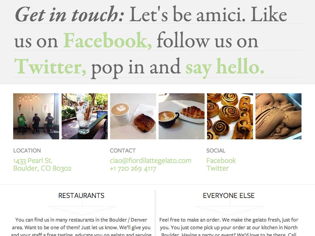 |
Fior di Latte’s contact page includes a large header linking directly to social media and email. It displays photos of their company and employees for a more personal touch, in addition to their address, hours, and contact instructions. |
Grain and Mortar
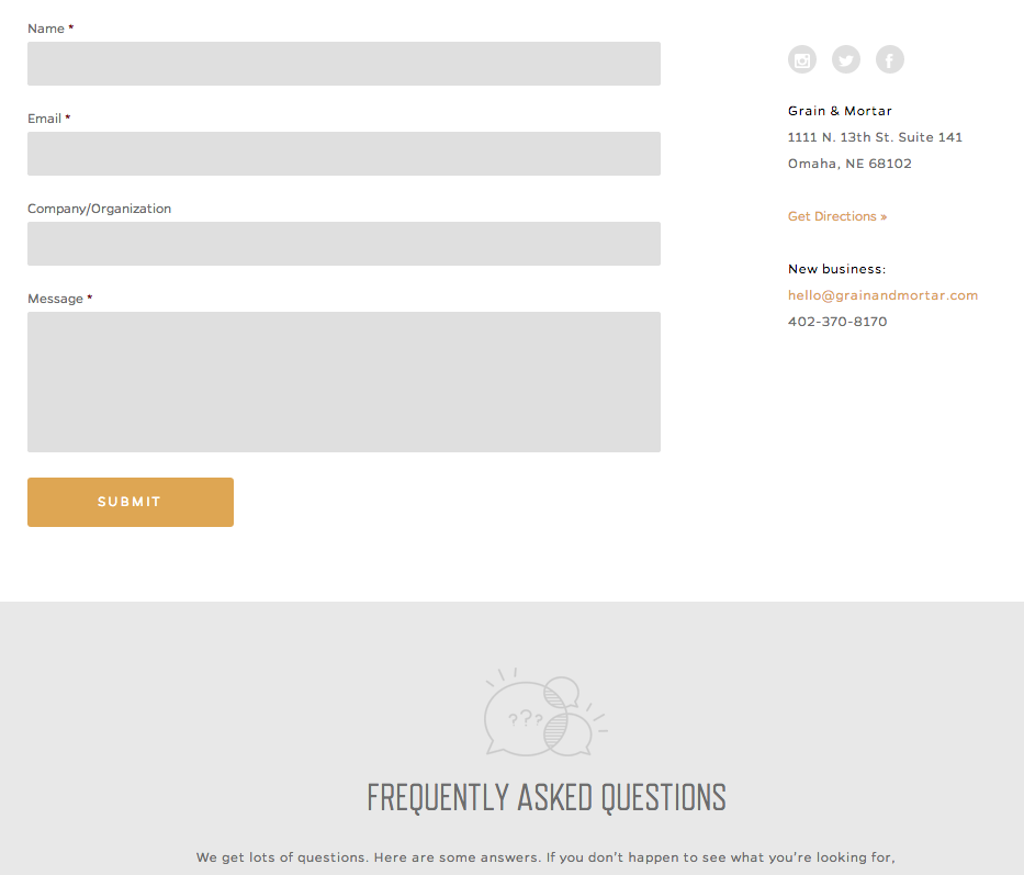 |
Grain & Mortar has a clean, simple contact page with basic contact information, social media links, and a form. Further down the page, they include a list of frequently asked questions. |
Built by Buffalo
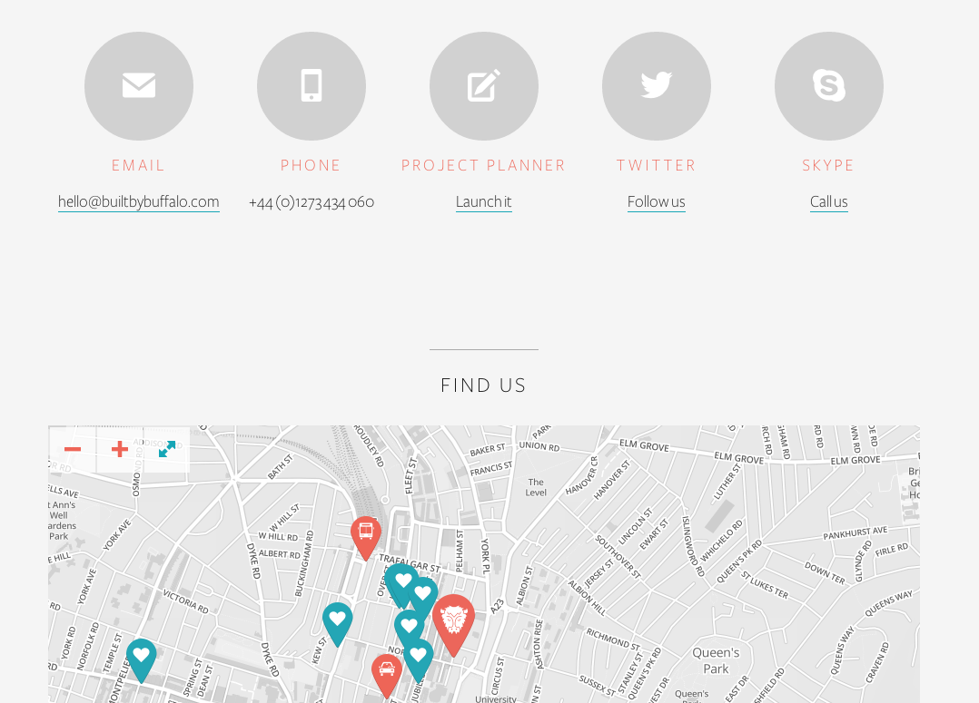 |
| Built by Buffalo prominently features the different contact methods with icons and includes an interactive location map with directions. |
McColl Center
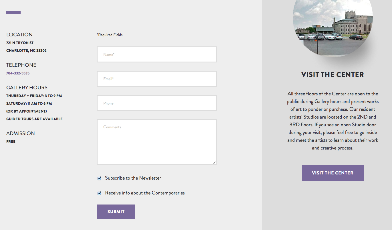 |
| The McColl Center contact page include basic contact information and a contact form, as well as a link to a”visit” page with extended details about the location. |