Seeing as 2011 is starting to come to a close, I thought it would be a good idea to talk about what I see as being hot trends in web design for 2012. Last year, Shannon posted her predicted trends for 2011. There are several similarities between last year and this year’s predictions but some new ideas as well.
I also checked out CPR Enterprises and their predictions for 2012. Our ideas were aligned in several ways. As a web design, it is important to be aware of what great things are coming to the future of web design and development so this is an important topic.
Until the end of the year, I will be posting blogs on 2012 web design trend in my list. There will be plenty of examples (and design inspiration) with each post. We hope you enjoy reading about 2012 web design and encourage you to give us your feedback and samples too.
Here are the design trends I will be blogging about in the coming weeks:
1. HTML5/CSS3
This hits the top of my list! HTML5 and CSS3 are still in the development process. I am very impressed with what has come out of these coding advances so far!
2. Design Below the Fold
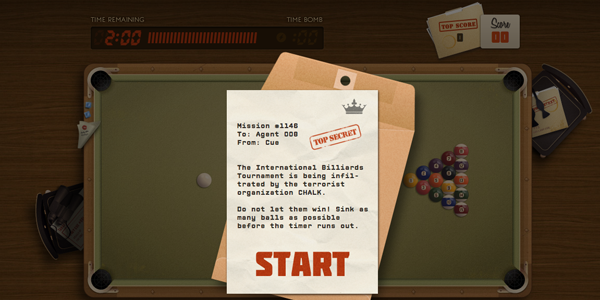
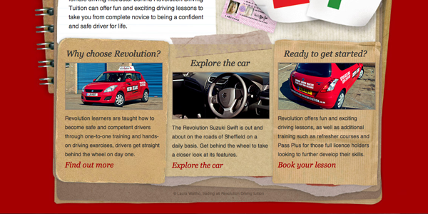
Lately I have been seeing a lot of beautiful graphics near the footer of websites. The graphics are either very colorful or blend into the background. The help anchor the website design, give balance on the page, and reiterate important links and information.
3. Responsive Web Design/Fluid Grids
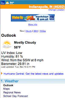
Mobile compatibility is extremely important this year. There are more smart phones and tablets than in previous years and it is a steady growing change. Making sure your website looks great in any platform is becoming more and more important, and the options for coding for these platforms are also becoming easier to implement and test.
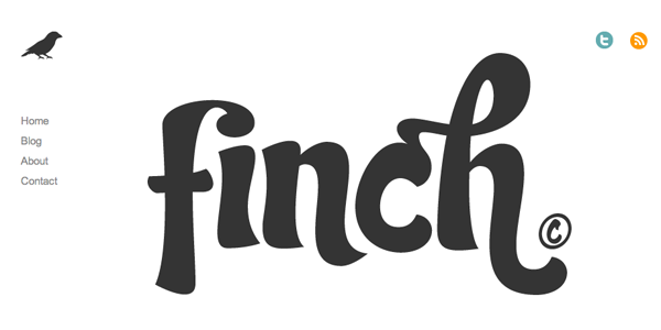
4. Typography
Typography makes things a little more interesting, right? Sometimes, standard fonts look okay for certain websites. Most of the time, however, a little typography can make any website stand out. There is a balance between using a creative font for highlights and an easy to read font for the main body of information.
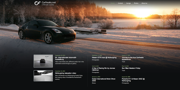
5. Large High Quality Photograph Backgrounds
I have been noticing this on a lot of websites lately. Large photograph backgrounds definitely grab they user’s attention, but are they too distracting?
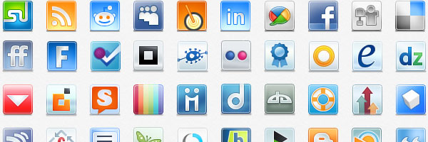
6. Social Media Integration
Social media definitely is not going away. More and more websites are making it easier for users to share the information on their Twitter, Facebook, Google+, etc.
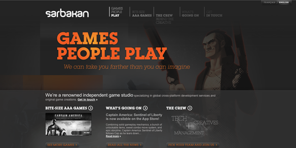
7. One Page Layouts
Single page web design with anchor tag navigation is still popular. These work bests on sites that do not have a lot of content.
Do you want to add some of these new trends to your website? Schedule a web consultation with TBH Creative. It is important to continually update your website and incorporate new trends — your website is a 24/7 marketing tool for your business and communicates to visitors many times before they even make contact with you.

