
Our first prediction for web design trends in 2012 is design below the fold. We are doing a series of 2012 web design trends.
Designs below the fold, also known as large footers, are becoming a very common trend in web design. Footers are no longer a boring place at the bottom of a website. Just the copyright and a handful of links are not cutting it anymore. There are several ways to spruce up your footers: beautiful graphics, extra navigation (sometimes the entire sitemap), contact forms, videos, social media icons and more!
Below are a few examples of great footers.
Yodiv has a very simple, but beautiful, footer.
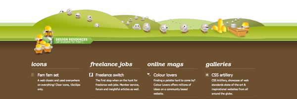
Web Designer Depot has a very beautiful footer with stunning graphics that match the header design.

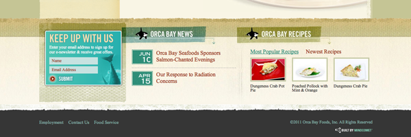
Orca Bay Seafoods, Inc. has a very organized and simple footer that blends very well with the rest of the website.
Large footers should not be overpowering, but accent the rest of the website. Beautiful footers give the user something nice to look at once they get to the bottom of the page. Besides, who wants to look at just a boring copyright? You should still have the copyright in the footer, but don’t be afraid to add even more content down there!
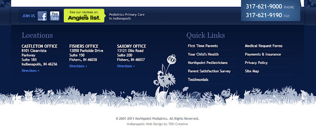
Here are a few big web design footers that TBH Creative applied for clients this past year:

Looking for some more inspirational designs below the fold?
Vandelay design posted a fantastic list of 25 Impressive Blog Footers. Google (or any other search engine) is always a great resource if you’re looking for some design inspiration.
Wondering how a redesigned ‘big’ footer would look on your website?