With the 2012 Presidential Primaries right around the corner, I thought it would be a perfect time to talk about the Republican candidate websites. Some states have already had their primaries. Mark your calendars folks, Indiana primaries are May 8!
Below is my review of the Presidential Republican Candidate websites of 2012:
Newt Gingrich
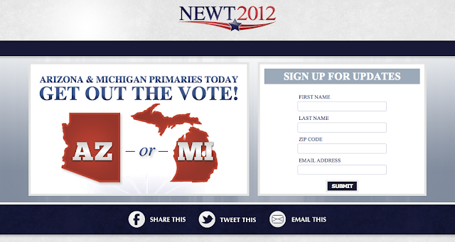
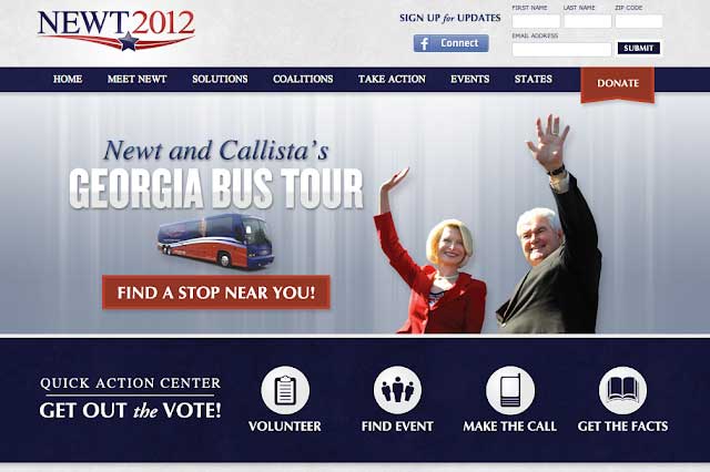
When I first went to Newt Gingrich’s website, I liked how organized and clear the splash page was. He had an image showing which states were voting for primaries today, as well as information about each primary. He has a “skip to website” button, which makes it less confusing to users on how to get into his website. I also liked how the website was easy to navigate. Gingrich doesn’t have a large rotating image slider on the homepage either. This is a plus for me, because the user isn’t distracted easily. He is also collecting names front and center–a very good tactic to communicate with interested follower via email marketing.
Ron Paul
I actually applaud Ron Paul for not having a splash page. For most people, nothing is more annoying than going to a website and having to click on another link to get to the actual website. If I had to pick at anything on the website for improvement, it would be that the content below the fold could be organized little better. It seems that the map and store advertisement are just kind of thrown in there. Maybe this would have been a good time to add a “big” footer?

Mitt Romney
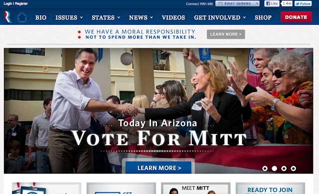
If you are not too Internet savvy, you may think you have to enter your information to get into Mitt Romney’s website. The “sign up” button is significantly more noticeable than the “continue” text. Once you get into the website, it is really nice. One thing that really bothered me was the buttons. The “donate” button at the top is very sleek. However, when you get down to the content, the buttons were compressed too much and look pixelated. I know, I know; the average person won’t notice that, but a designer will, and it seems sloppy

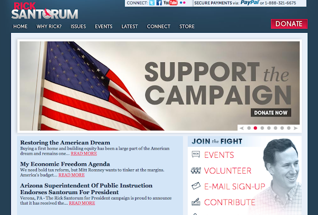
Rick Santorum
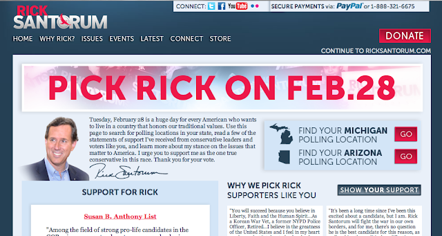
I’m just going to give my honest opinion: the splash page for Rick Santorum is terrible. There is too much text. I did not know where to look first. I have no idea why they even decided to add this splash page because it seems repetitive. They could have included this information on another page. The interior homepage is so much nicer, and the user should not feel as distracted. He has nice call to actions in the lower right quadrant.
Mobile Web Design Observation
Regardless of the growing trend in mobile usage and mobile web design options; after checking all of these websites on my Android, I was disappointed to find that only one candidate had a mobile friendly website. Mitt Romney’s mobile website is very user friendly. Nice work, Mr. Romney.
Which website is your favorite?
Would the look of their website make you want to vote for them? It sounds silly, but in this world, a lot of visitors and voters are learning about candidates from their websites. Beyond the information provided, how easy it is to find / follow and how appealing the graphics makes a huge difference in forming an opinion.
Do you need a website for a special event? TBH Creative is located in Indianapolis, Indiana and specializes in web design and application development.

