According to Salesforce, 80% of healthcare customers revealed their patient experience—including online interactions—is as important as the quality of the care they receive from providers, making a medical website redesign essential for any hospital or practice with a site that doesn’t quite deliver.
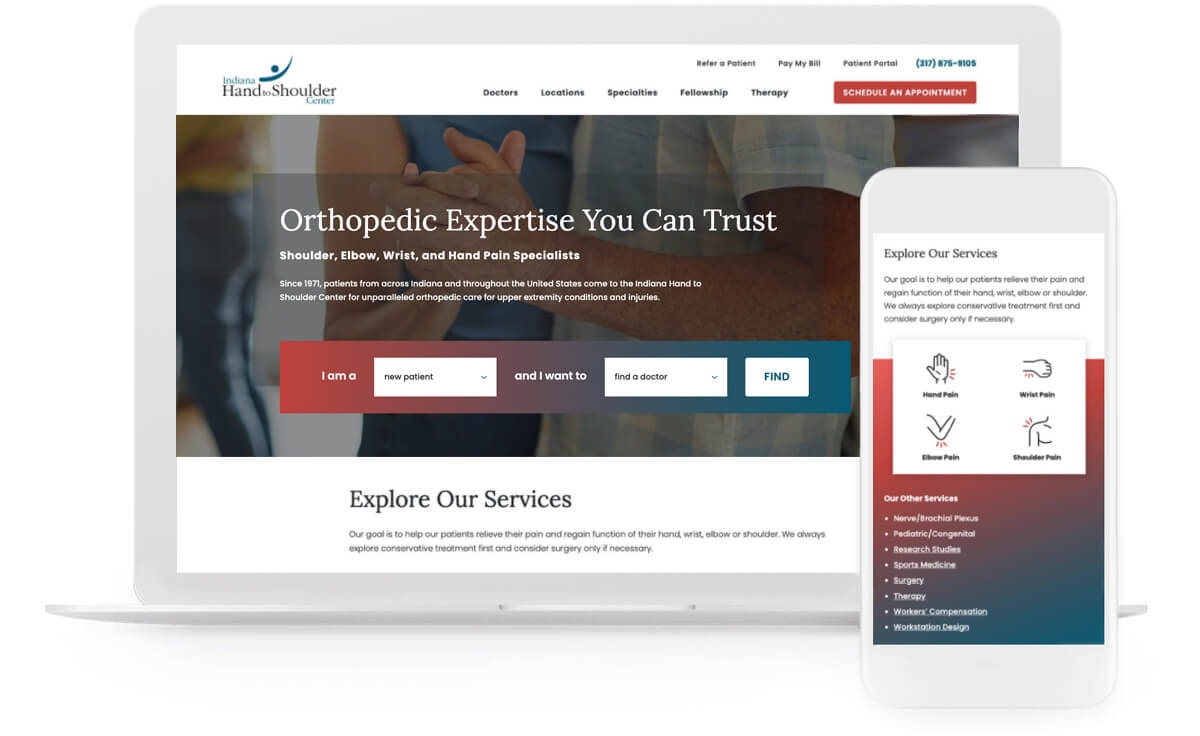
Looking to build a more dynamic, higher-quality website to better match their brand identity as the premier destination for first-rate upper extremity care, Indiana Hand to Shoulder Center hired the experts at TBH Creative to upgrade its healthcare site.
IHTSC’s comprehensive website upgrade supports other ongoing strategic efforts in brand development and digital marketing to help their experienced specialists help more people battling hand, wrist, elbow, and shoulder pain.
The solution—
TBH Creative’s medical website redesign work for IHTSC included:
- Website planning and site architecture
- Web design and responsive web development
- Content writing and optimization
- Website production, redirect planning, training, and quality assurance testing
Launch date: December 2021

Q&A
TBH Creative chatted about IHTSC’s medical website redesign project with IHTSC’s CEO Angie Stevenson, MHA, FACHE, FACMPE, SPHR, CHFP, CF-L1. Her responses—below—have been condensed.
Why did IHTSC want to redesign its medical website?
Angie: IHTSC chose to redesign the website to enhance the user experience. We wanted to continue to highlight our unique expertise and extensive experience while giving users a website that has a more visually appealing design.
What new features do users like the most?
Angie: Users appreciate that we’ve incorporated more pictures and presented content in a less bulky format so that information is easier to scan.
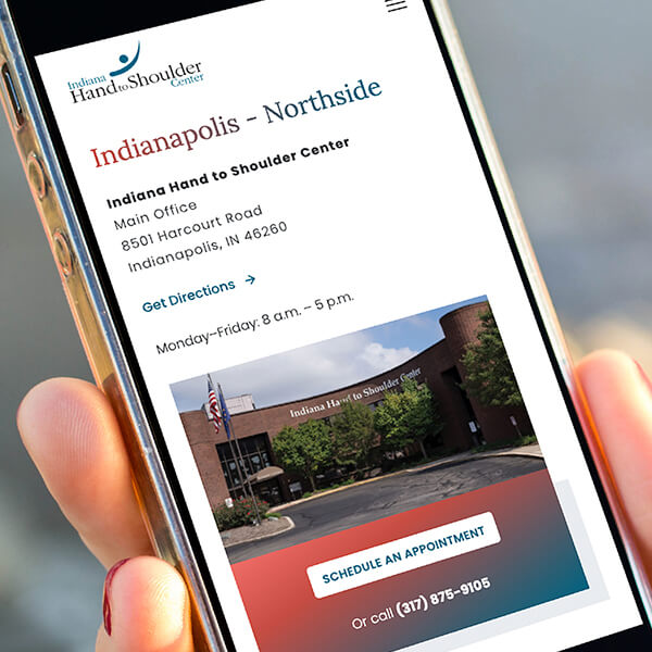
Our users also like our interactive physician and location search, updated images of our surgeons as well as the addition of new resources and extra pages detailing IHTSC’s many services.
“We are excited to have several completely new pages to promote IHTSC advanced practice providers, cutting-edge research, therapy offerings, and other service lines.”
What do the doctors think of the finished medical website redesign project? What has the staff said?
Angie: All the feedback has been positive. The look is fresh and updated and showcases our practice so well. I know the amount of work that has gone into this project from TBH Creative and my IHTSC colleagues—and the effort shows in this fabulous medical website redesign.

What sets the best websites apart?
How did TBH Creative help you keep things on track during this medical website redesign project?
Angie: Throughout the project, I was in constant communication with TBH Creative: detailed progress reports, emails with highlights, Google Docs for tracking, etc. Everything was very well organized. Though it sometimes felt like I had a lot of to-do’s at times, they always kept their requests succinct and easy to follow.
There are a lot of web design and brand companies in Indianapolis to choose from. Why did you choose TBH Creative as your partner?
Angie: I appreciate their expertise—especially that they share the “why” behind what they do. Everyone on the TBH Creative team always provides reasons for recommending one option over another.

