
A few months ago, I reviewed a certain Indy marketing agency’s homepage and was underwhelmed.
Yes, it’s true. It was TBH Creative’s new website, pre-launch—and, my love was missing.
It looked familiar, a little too familiar:
Yes, it’s true. It was TBH Creative’s new website, pre-launch—and, my love was missing.
It looked familiar, a little too familiar:
- a hero image at the top with statement and button,
- three icons underneath,
- followed by panel after panel of the same old thing.
This article is part of the Complete Guide to Planning a Success Website Redesign Project.
When I checked out our competition, I saw the same thing. It’s a homepage layout that we’ve all seen hundreds of times by now, and I knew that we could do better to showcase our talent and ingenuity.
We went back to the drawing board and brainstormed ways to make the homepage represent both our innovation and who we really are. Internally we had varying ideas of what design solutions would work best, what was modern and engaging, and what would make us stand out to our audience.
 And, the newly rolled out layout? It clicks. The love is no longer missing.
Now, the TBH Creative website represents our whole team’s creativity—and, we’re only getting started. Next, we plan to incorporate layering and animation next. (Watch for a zooming rocket ship!)
Is your website having a similar identity crisis?
When you first meet someone, you hope that they see you as unique, memorable even. Who wants to be perceived as only slightly modified version of someone? (What’s his name again?)Homogeneity is a plus on a factory line, but less so in other areas of life.
Take online marketing, for instance. Since 2012 generic experiences on the web have become the norm. A prospect visits a website—and three others—to help narrow her search for a new service provider, but there is no clear standout because they all look the same and sound the same.
The good news is that cries for individuality are getting louder and, because technology is improving, they’re being heard and prioritized.
I’m encouraged by this change. It empowers us to do more exciting, effective work for our clients. Fueled by the knowledge that our team gleaned during An Event Apart in Chicago, here are three ways to grow your business with web design and brand authenticity:
- Embrace custom designs and stop following rigid grid rules
- Use new technologies to stretch the limits and stand out
- Tell your authentic story
1. Get off “the grid”
First off, let’s explore a question: How did this pervasive sameness from website to website happen? The simple answer is smartphones. Though the growth of mobile device usage is partly to blame, it doesn’t tell the whole story.In 2010 coding specifically for mobile websites ramped up. The most common solution for handling these new devices at the time? Build condensed “mobile sites.” It wasn’t the greatest moment for usability because—with this tactic—visitors saw an incomplete picture of a business or organization’s story, products, or services.
Despite these benefits, what the grid also does, to an extent, is limit our creativity.Responsive design overtook the condensed “mobile sites” strategy, and it introduced a whole new way to code, prepare images, and think about web design in general. Instead of designing for “above the fold” or “pixel perfect,” we adjusted to create flexible designs that prioritized legibility and functionality, no matter the screen size.
At TBH Creative, we embraced this change. It was exciting. And, it was a lot of work too!
We went from designing and coding a single viewport to designing and coding for all shapes and sizes. And, I stopped touting that we do responsive coding. It wasn’t optional anymore. It was simply the way it should be done. Building a website that didn’t perform across devices would have been irresponsible then, and it remains so now. Today, roughly three-quarters of Americans (77%) own a smartphone, twice as many as in 2011.
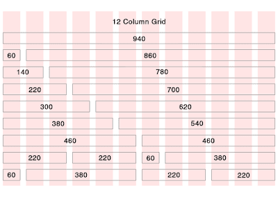
Technology enhanced to help this evolution. Design patterns and grids were created to save time and help with the sudden change in our industry and way of working.
By 2013 our firm developed our own grid system inspired by tools like the Twitter Bootstrap Grid. We adapted and customized it, and it still serves us very well because it saves time, allows us to reuse basic elements/assets, and eases maintenance for responsiveness coding.
Despite these benefits, what the grid also does, to an extent, is limit our creativity.
Using the grid, ideas for design and fluidity must fit into set columns and gutters. Since the dawn of grid adoption, account managers and designers have been telling clients “no” when they request something that is not supported by the grid, and many of us have been stubbornly hacking site elements to force them to fit.
The allure of the grid led to the rise of templates. Again, a smart fit for some but certainly not most professional businesses. Attractive, inexpensive (starting as low as $35) templates are available to everyone. Choose a basic template, and it’s possible that your site might easily look a lot like your competitors’ websites.
Thankfully, there’s life beyond templates. Technology continues to offer more solutions. New to the front-end development scene is CSS grid. It is more flexible, and it almost takes us back to table grid control of the early 2000s.
In order to stand out in your space, commit to creativity and lead with a big idea. Push back on designers, developers and anyone else who says your approach doesn’t fit into the grid. You can combine basic UX best practices with patterns and unique new ideas.
The form (grid) doesn’t have to dictate the function (user experience, education, storytelling, etc.). They can work together without compromising creativity and brand distinction.
2. Use new technology to enrich the user experience.
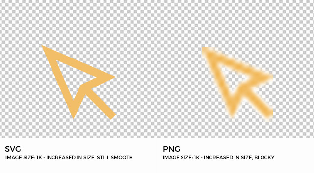
Digital tricks come and go, but what is emerging in digital circles today are new, robust technologies that can actually make your site better. We aren’t talking about moving away from responsive design and grid foundation. Make upgrade—and layer new techniques—on top of what currently exists to gain more visual control.For example, build faster, bolder, crisper experiences by using SVG image files on your website:
- Speed. Graphics such as PNGs that are 100+ KB on your site can be scaled to 1 KB SVGs—and then animated. When you take an image that was 100 KB (or more) that fills a mobile screen on mobile down to 1 KB, you are able to scale it bigger without increasing the file size. Now multiply that by 10 images per page.
- Originality. Add extra interest your website with an SVG-based visual, like a signature shape, swirl, or illustration. Then bring that element to life through animation. There are new technologies to support this bringing movement back like you saw in 2005-2010 during the Flash era—only it’s lighter weight, scannable by Google, and will work on all modern browsers.
- Sharpness. When SVG illustrations, icons, line art, and logos are scaled down, they retain their crisp edges and uninterrupted lines. The qualities of SVG files fixes the cloudiness you might have noticed with scaling of other image formats.
Beyond improving the user experience, details also make a difference if you are selling a product or service that is similar to other providers. By taking advantage of new technologies to improve your site’s visual appeal, you will stand out as being bolder, different, and of higher quality. Details matter.
Other benefits of these advances include huge savings in bandwidth, more responsive flexibility and more control over design. Kayleigh Circle, a TBH Creative web developer, explains this further in a past blog post.
The risks for early adopters of these new techniques are few but worth mentioning. People using older browsers might not be able to keep up with the newest technologies right off the bat. Making changes to your website costs money, so there’s an expense involved, but allowing your website to flounder certainly won’t produce an ROI. (As a general rule of thumb, you can keep your site for 5-6 years if you’re consistently making improvements on an ongoing basis and larger upgrades every 1-2 years.)
Related articles:
- Website ROI: The return on investment for a website redesign
- How often to upgrade your website
- Trend alert! Where web design is going
- Website navigation design trends to watch
3. Make sure your website tells your story
As you fight for your audience’s attention, it’s not enough to fill up an “About” page, populate a “Team” section with charming faces, and list the shiny attributes of your product or service. Online stories have to do more. Instead of talking about what, talk about the why and how. Get to the root of your business and why you exist.
The story your website shares should intrigue visitors enough for someone to want to talk to you. You have to be different, be better.
Here’s an example.
Before we recently met the folks at the Indiana Hemophilia and Thrombosis Center (new website in progress at the time of this post), we hopped on the organization’s website. Without digging too deeply, we had a first impression of what they do and who they are.
During our first, face-to-face planning meeting, they explained that who they really are is completely different from what they appear to be online. They told us how they got started, and their origin story inspired us. We were impressed by the fact that medical professionals from across the United States came to IHTC for training. We were engaged in the tale of all the families whose lives their team improved, the problems that their organization has solved, and expert support care they have provided.
Though IHTC isn’t sharing its stories on their current website, it’s part of their next steps online and we’re excited to be a part of making it happen.
The TBH story.
Telling an authentic story isn’t always easy. To be honest, I used to be a little gun shy about how to tell our story. I wondered if my web company was too small for big clients. Now I include that as a huge advantage and part of the story that we tell. We are a small team who is big on talent, experience, and creativity. We are nimble yet more detailed and strategic than many competitors. I’m the owner, I’m involved in your strategy, and I care about the success of each and every client and project.
“Either you’re going to tell stories that spread, or you will become irrelevant.”Unsure if you’re telling good stories? Consider how well your site is performing overall. Are you getting leads from your website? Does the information online reflect what your salespeople are saying? Are your clients using your blog to gain valuable insights/sharing your information?
— Seth Godin, author and former dot-com business executive
(also, my professional hero)
Telling your authentic story requires a larger investment of time, money, and thought than filling content holes using readily available brochure fodder. That strategy won’t set you apart from your competitors. Telling better, more authentic stories will. Make it a priority before your competitor does and beats you to the punch.
Making changes to your website should not be done on a whim. The work should be part of a real business solution. If your business is good, there is no need to change right away but it’s still important to be aware of how people are using the web.
Complacency hurts the bottom line. Make sure you stay ahead of the curve. Don’t wait to make improvements until your website is an embarrassing sales tool that fails to generate leads. That’s not OK!
Another way to think about it: If you aren’t seeing the results you want, look at your top three competitors and what they’re doing online. Then, compare. Would you pick your company over the others? If not, it’s time to take action and make improvements to give users a reason to pick you. Websites are changing for the better, and you can stay ahead of your competition.
How we can help you get more from your marketing in 2018? Let’s talk