Web design is constantly changing, but it’s for the better (don’t believe me? Just think back to your business’s website circa 2007 and you’ll get my point). Since it’s ever-changing, there is no “goldilocks recipe” for a stellar website. What works for an ad agency’s website might not be strategic for a pediatrician’s site, and visa versa. However, distinct web design patterns have started to crop up within the past 6 months, and companies who have adopted them have tended to stand out. I can’t predict the future, but it looks like these four emerging web design trends of 2017 are here to stay.
Web Design Trend #1: The Bold and the Beautiful
Websites have been moving towards minimalism since content management systems like WordPress and Drupal began adding modular functionalities in 2014. Minimalism used to mean that sparingly-used copy was organized in a neat, monochromatic fashion. Black and white was the indication of modernity. Well, we’ve made it through the proverbial twister and landed in the technicolor world of Oz, because grayscale is out and bold color palettes are in.Bryn Taylor
Bryn Taylor’s portfolio website is a great example of a bold, yet minimalistic color scheme. He uses two bright, contrasting colors to bring the user’s eye exactly where he wants while allowing his featured design work to stand out on the page.
OrthoIndy
We incorporated the bold trend into one of our recent web design projects with OrthoIndy. By pulling some of the brighter brand colors that weren’t utilized on their old website into their new site, we were able to bring the company’s page to life.See OrthoIndy’s bold, new website
Web Design Trend #2: Typography Takeover
With the advent of Google’s Material Design Principles, a variety of eye-catching fonts have begun to pop up all over the web (actually, a lot of the trends we’re seeing can be traced back to Google Material Design). A strategic mix of bold fonts helps combat a user’s short attention span and draw them through the website. This, coupled with aesthetically-minded type setting, elevates a site’s look and feel. Typography is starting to become a main design element, and one of the biggest trends shaping web design today.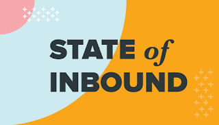 Hubspot
Our best friends in inbound are also the poster child for this new trend in design. This graphic pulled from a tweet shows how typography can be an interesting design element.Nurture Digital
Nurture Digital uses a mix of fonts to enhance and add clarity their portfolio section. You’ll notice the Material Design Principles here, as well. Google Fonts, centered layout, responsive graphics– experience the Design Principles at their finest.Web Design Trend #3: Icons, Icons, Icons
Consistent use of icons creates a sense of coherence and continuity in a website, while adding visual value. Many brands are starting to utilize icons, and, in fact, many of TBH’s recent design projects include icon development. Here are a few examples of how businesses are using icons today.Baker Hill
As part of their website redesign, we created a set of modern icons to created a consistent look and feel of their services. The great thing about icons is they can be repurposed on social posts to create continuity between your marketing strategy and website/landing page – hello, inbound!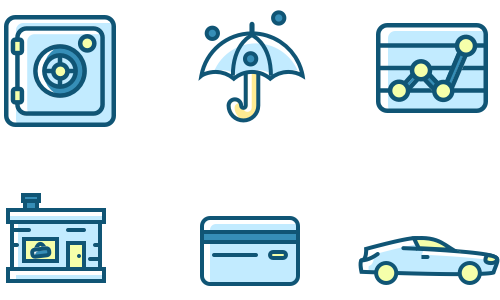
Web Design Trend #4: Get Moving
One of the cutting-edge trends that have begun to show up more frequently is the use of animation. From simple underscores to highlight section titles to intricate SVGs that dance across the page as you scroll, the animation is guaranteed to grab the user’s attention. What’s more, correctly-used animations add meaning by dynamically displaying content, while using fewer resources than shooting and embedding a video.Our web developer Kayleigh discussed the emergence of animation in web design – read her article “Web Design Trend: Animated GIFs and SVGs” on our blog!
In Summary
As I mentioned earlier, there is no panacea for bringing your website from drab to daring. It all boils down to knowing what you want to convey, who you are conveying it to, and how they like to digest information– which, of course, takes time. That being said, the four trends discussed in this post are awesome quick fixes to consider if you are looking to revamp your website.These trends are just some of the many ways to make your website stand out.
Partner with TBH Creative to strategically modernize your web presence.
Ready to revamp your website? Start here
Partner with TBH Creative to strategically modernize your web presence.