The interior pages of your website are just as important as your home page. But if that’s the case, then why do the interior pages so often end up as an afterthought in the web design process and/or lower priority for clients?
More often than not, the homepage is the primary focus in the design process, and for good reason – it’s the main entry point into your website and needs to make a great first impression. However, while the home page tends to be the most common entry point to a website, it is not the only entry point. Users will frequently enter your website from landing pages or other key pages based on search results for targeted terms or links from other sources. Therefore, you don’t want your website to lose its momentum once users get past the homepage and into the subpages of your website, so it’s important to strategically design your interior pages to support your overall goals as well.
In this article, we’ll take a look at the top reasons interior pages are crucial to the success of your website, as well as a showcase of websites with high-quality interior pages.
Interior page design considerations:
They serve as an entryway to your website. Not all users will access your website content through your homepage. They may be following a link from another site or from a search engine to a specific interior page. Therefore, your interior pages need to make as good of a first impression as the homepage, and the other areas of your website should be easily accessible from any page.They keep users on your website. You don’t want a website visitor to get past your homepage and then get deterred by lack of content or poor design on the interior pages. Therefore, each page on your website should be as informative and engaging as possible.
“A website is not like a book or magazine, where there is a cover and a linear process through it. People jump into your website—into your story—at random places. This is partially why every page needs to tell your story, why you need to reiterate who you are, and provide context at every opportunity.”They each have a unique purpose. Each interior page on your website likely serves a different purpose, from showcasing products to displaying contact information. Because of this, each page needs to be individually evaluated to determine the best format and layout for its purpose. For example, you might turn your main content sections into landing pages with unique designs to help them stand out. (Check out our series on tips for popular website pages for more information on important content.)
They serve as a guide through your content. Interior pages provide the opportunity to guide users to important areas of your website or other related content. Consider placing calls-to-action and other design elements to get users to where you want them to go, such as a contact form or online store.
“Check your website’s analytics to identify where visitors most frequently enter your site, and ask yourself whether each page channels visitors to the information you want them to see and to the actions you want them to take. If any one of these pages fails to support your business-related goals, it’s time to make some changes.” (Source)
Interior page design inspiration
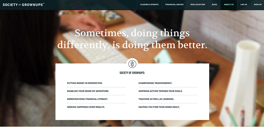
Society of Grown-ups
www.societyofgrownups.comOn this website, the interior pages are set up like landing pages, with custom page elements to help present the unique content for each page. This also makes each page more interesting, with helps to engage users. Each page has a consistent layout and navigation, making it easy to navigate through the website no matter what page a user comes in on.

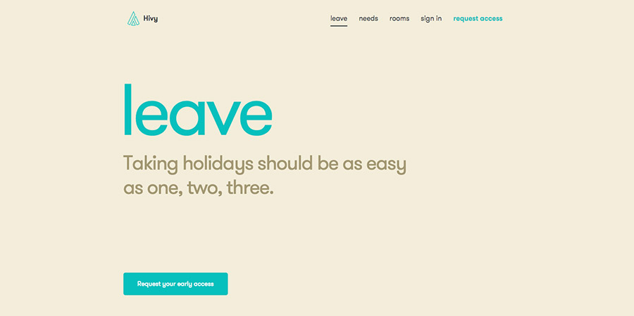
Hivy
The interior pages of the Hivy website use changing headers and background colors to differentiate between each main section of the website. There is also a consistent call-to-action button at the top of each page to reinforce the desired user action across each interior page, so they are all pushing towards the same goal.
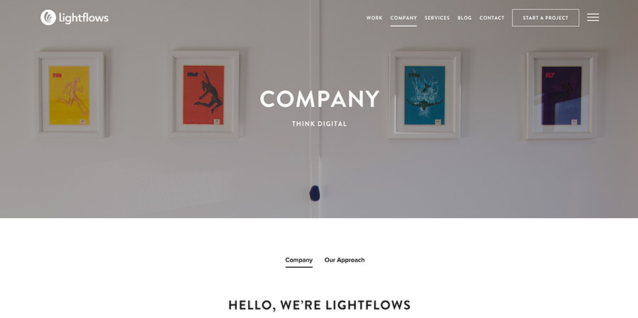
Lightflows
www.lightflows.co.ukThe Lightflows website uses similar page elements throughout the interior pages, but uses a variety of graphical elements to present the content in the best way possible. The consistent elements help to make the website more cohesive and familiar to users as they are browsing the site.

Gold Republic
www.goldrepublic.comThis website has the same general interior page structure for the majority of its pages, but uses custom templates tailored to the content for key pages. For example, the about page or the news page, which both deviate from the generic structure to better stand out to users.

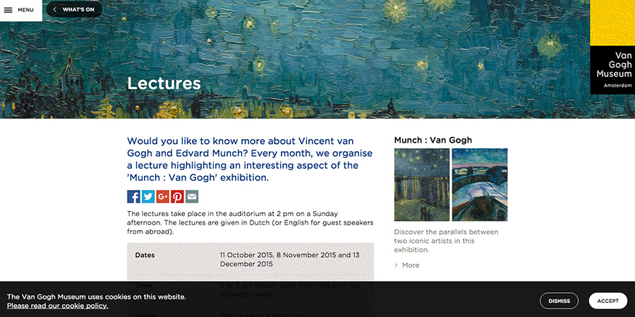
Van Gogh Museum
www.vangoghmuseum.nlWhile most pages on this website have a similar layout, they are still unique enough to make the pages interesting. Each interior page easily guide users throughout the site with calls-to-action and breadcrumb links.

