Just because a web design looks good doesn’t mean it is a successful website. There are a variety of factors in addition to look and feel that contribute to the success of a web design, such as whether or not it provides a good user experience or adequately meets a business’s goals. These factors should be taken into consideration when reviewing a website design in order to maximize its potential.
Asking the following questions can help you to conduct a more productive review of a website design and how it will work to help achieve your overall marketing goals.
Asking the following questions can help you to conduct a more productive review of a website design and how it will work to help achieve your overall marketing goals.
1. Does it look professional and follow good design principles?
While there is more to a website’s success than design, it’s still crucial that your website looks modern and professional. It should properly employ spacing, typography, hierarchy, and other design principles. Learn more about common design mistakes to avoid.2. Does the design promote the appropriate look and feel for your business?
The overall design should “feel” like it represents your business. Design contributes to the overall emotion a website conveys, so it’s important that it aligns with your company’s overall image. Keep in mind that your website should be an extension of your brand, and should coordinate with any existing marketing materials.3. Is your primary message clearly stated?
Your website’s homepage should prominently state your marketing message. Your visitors should immediately understand what your business does and what product or service you are offering.
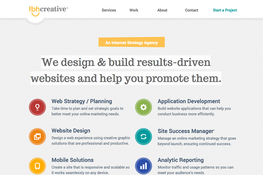
TBH Creative website home page: Clear statement of what they do at the very top of the page.
4. Is it targeting the appropriate audience?
One of the most important factors when reviewing a design is to ensure it’s tailored towards your target audience. Your audience should be the key factors in determining everything from design elements like colors and graphics to content layout and language. Learn more about the importance of understanding your audience.5. Does it include the correct content sections in the right order?
Content hierarchy is an important part of the overall website design. For example, the most important information should be more prominently placed than secondary content.6. Does it promote the correct call to action?
A website design should drive users to the appropriate action that you want them to take. For example, do you want them to contact you or to buy a product as the primary action? Your primary call to action should be reinforced throughout your design.
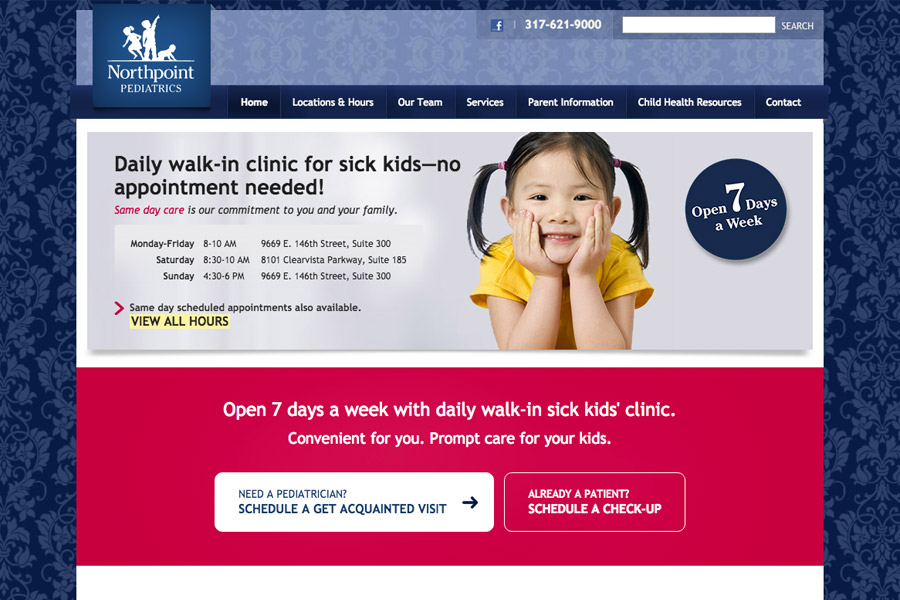
Northpoint Pediatrics website home page: Provides a bold content area with call-to-action buttons for scheduling an appointment
7. Is the navigation clear and accounting for all important areas?
A website needs to be easy to navigate so users don’t get frustrated or confused. A good navigation should be designed to include the important sections of your website, but should be limited to a small number of links in order to keep it clear and simple. Also, make sure your links are named appropriately so that users are clear on where they need to go to access the information they need.8. Does it promote a good user experience?
While usability often becomes a primary focus during the development phase, it’s important to start thinking about it during the design phase as well. For example, determine if there is a clear hierarchy of information that makes the content easy to scan, if styles are consistent throughout the design, if forms are designed to be short and to the point, and so on.Ready to revamp your website? Start here
