In this article, we’ll discuss some of our personal pet peeves and how to avoid them.
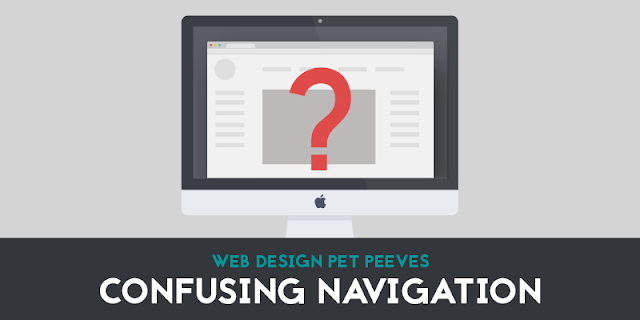
1. Confusing navigation.
Navigation is one of the most important parts of a website. If a user doesn’t know where to go or how to find content, your website will not be successful. Make sure your navigation is clear and concise in order to get people to important content.Tips:
- Use short, clear and precise words for each link
- Include less than 8 main choices, less if possible
- Make the navigation bar stand out with white space or color and clean/clear font choice
- Keep the navigation bar consistent on all pages
- Include an active and hover state
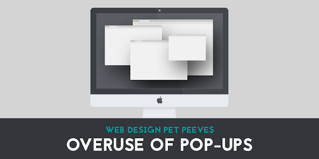
2. Overuse of pop-ups.
Too many windows or alerts popping up on your site will quickly drive away website visitors. Use such features sparingly, or instead move the important content to be prominently featured within the page instead of in a pop-up.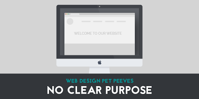
3. Websites that don’t explain what they do.
Even if you have a great web design, if you don’t state what it is you have to offer, you will quickly lose visitors. Make sure this information is prominent on your homepage. Consider using a bold headline at the top of your page.If your website does not answer the question of who you are and what you do, reconsider your main statement and page arrangement.
Get more information on how to write an effective headline.
Example:

The Imaging Office website uses a large hero section with a prominent
headline that states what they do and how they can help their customers.
headline that states what they do and how they can help their customers.
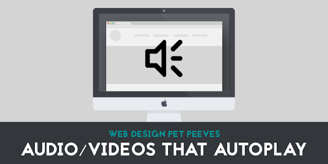
4. Music or videos that start playing when you open a website.
You should never set audio or video to autoplay, but instead should let users initiate it themselves if they are interested.Why is autoplay bad?
- Interruption. The sound from the clip will conflict with other sounds that your user is listening to and may catch them off-guard. This is also bad when in a quiet office.
- Accessibility. Worst case scenario with autoplay is that the website becomes unusable for people using screen reader software. They cannot continue until the clip has finished.
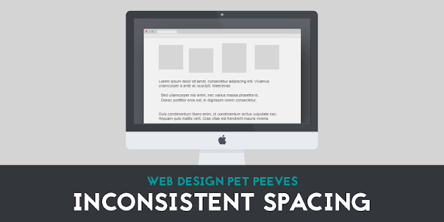
5. Inconsistent spacing on elements and text.
Bad spacing can negatively affect the readability of your content. Make sure that elements and text have consistent spacing with enough white space to avoid looking cluttered.White space in a design is the spaces around elements in the design to help them stand out or separate from the other elements; the absence of text and graphics. White space is any color.
Things to check:
- Consistent space around photos, panels and key elements
- Enough space between paragraphs and new sections (more space before the next paragraph and less space between the headline and connected body of text)
- Avoid letterspacing that is too tight
- Check the leading of the body text and increase or user a lighter type if text areas are too dense.
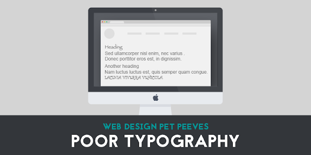
6. Poor typography and lack of hierarchy.
Typography is important to the overall design of a website, and should be well thought out. Generally, it’s best to stick with 1-2 fonts to avoid a messy design, and you should have a clear hierarchy for your headings and subheadings.Learn more about how to choose fonts for your website.
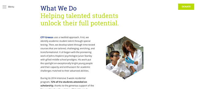
The For The Bright website uses a combination of good typography, a clear hierarchy,
and adequate white space to provide a clean design with easy-to-read content.
and adequate white space to provide a clean design with easy-to-read content.
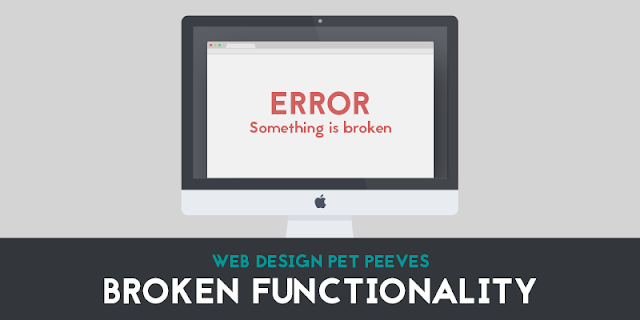
7. Broken functionality.
A website shouldn’t include any content or feature that is broken. If a link is no longer working or functionality like a search box or contact form stops working, it should be fixed or removed as soon as possible. If your website appears broken, your visitors aren’t likely to stick around.Tips:
- Check your Google Webmaster tools for reported 404 page errors and fix
- Run a Link Checker software regularly to check broken links
- Create a creative 404 page with links and options to get back into the website as well as to report the error. Learn more about the importance of a custom 404 page.
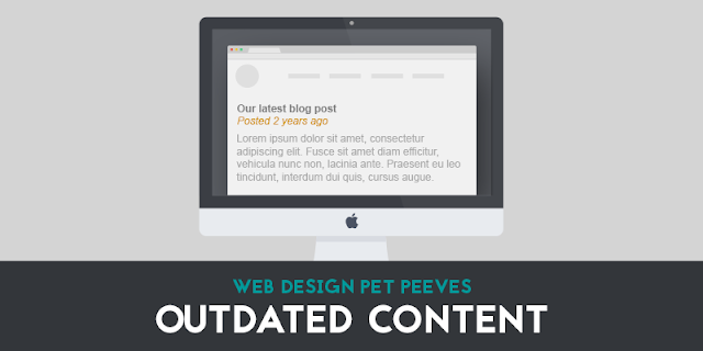
8. Outdated content.
If a website has news, events, or other dynamic content that is outdated, this gives the impression that it is no longer in use and can drive away potential customers. You should always frequently update your content in order to improve the success of your website.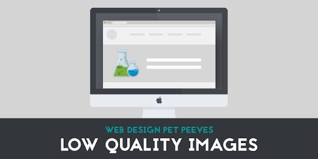
9. Low quality or stolen photos.
Images and graphics are essential to a successful design, but many website choose cheesy photos, images that don’t make sense with the content. It’s important to choose images for you website wisely, and ensure they are high-quality and customized to your content. Furthermore, if you have the budget, custom photography is generally the best route for getting unique, relevant photos for your website.Advice: Don’t steal photos from the Internet.
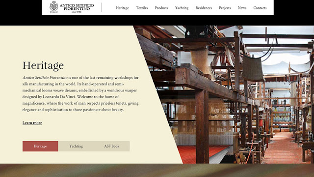
Custom photos of your company or products, like those used on the Antico Setificio Fiorentino website,
make your website more unique and can help develop emotional connections with your visitors.
make your website more unique and can help develop emotional connections with your visitors.
- Learn more about choosing photos for your website.
- Check our link library for stock photo resources.
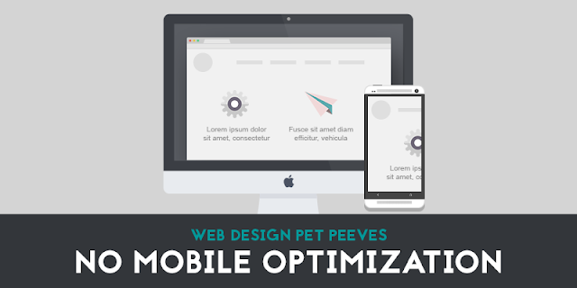
10. Lack of mobile optimization.
It’s likely a good portion of your visitors are going to be coming to your website on a mobile device, and if your website isn’t mobile optimized, it will be glaringly obvious. If your website isn’t mobile friendly, now is the time to implement a mobile solution.Why?
- Customers are on mobile devices and expect it
- Increased SEO value
- Better user experience
- Keep up with competitors
Is your website guilty of one or more of these mistakes?
If so, don’t worry! TBH Creative can help pinpoint your website’s problem areas and resolve them.Ready to revamp your website? Start here