The backbone of most visually appealing websites is a well-thought out grid system. A grid is best thought of as a plan for your website. It holds the designs together, outlines what its structure is, and provides a blueprint for where page elements can go.
Like well-planned neighborhoods with blocks that follow a logical layout, websites built around grid-based designs provide structures that keep content orderly and help users find what they’re looking for when visiting. Grid-based designs incorporate the best aspects of predictability and clear navigation.
More and more developers favor grid-based designs because, after the initial preparatory math and planning, using them speeds up and simplifies production by enabling them to leverage the defined configurations.
A combination of common measurements and CSS makes designing websites using a grid-based design useful for rapid prototyping during the development workflow. Grid-based designs even facilitate easy adjustments once the website is live by providing flexibility that is useful for easily accommodating changing advertising and promotion needs.
Web designers can work wonders with even the most rigid grid-based design systems. Used creatively, grid-based designs provide a basis for uniformity and consistency. Web designers use grid-based designs to present website content in unique and exciting ways that leverage carefully considered padding and white space, among other elements, without creating cluttered, structureless websites.
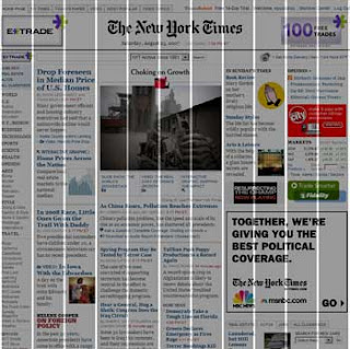
Suspect a website was built using a grid-based design? Add the free Firefox plugin GridFox to your browser to take a sneak peek the structure behind its layout. It’s like having Superman powers for web development nerds. It’s our kind of x-ray vision.
Interested in building a website with a flexible grid-based design? TBH Creative specializes in web design that is contemporary, flexible, and attractive. We are experts at designing large amounts of information strategically and with visual appeal. Whether you are starting from scratch, want a design “facelift” or are looking for a complete redesign, we can help.
