
Web design involves more than picking out pretty pictures and choosing cool type because what’s popular is always changing.
Do you remember …
Although which web design trend will next go down in history over the coming years is yet to be known, one thing is for sure: the web designers who make design decisions based on customer needs will be the people who create the most profitable websites.
Do you remember …
- hit counters recording every visit on so many homepages during the late ’90s,
- rounded corners on nearly all photos during the early-’00s,
- over-sized buttons designed for most call-to-action prompts during the mid-’00s, and
- skeuomorphism motifs used for just about everything during the early ’10s?
Although which web design trend will next go down in history over the coming years is yet to be known, one thing is for sure: the web designers who make design decisions based on customer needs will be the people who create the most profitable websites.
This article is part of the Complete Guide to Planning a Success Website Redesign Project.
Good website design basics
If you’re unsure what it takes to create a good website design, begin by identifying what your users are trying to do. Then, use that target audiences research—and these five crucial design principles—to construct your website design strategy:- Aesthetics
- Typography
- Content organization
- Optimization
- Wayfinding
1
Design patterns are web elements—such as menus, links, CTA buttons, and copy placements—that feature repeatable patterns and appear consistently.
Aesthetics: Use design patterns to create consistency.
You don’t want to make your users think hard when they navigate their way through your website. You can use design patterns as a tool to use to enhance usability and build trust by meeting users’ expectations.
Good website design patterns are also helpful for branding purposes, but don’t limit yourself to only your company’s preferred fonts and established color palette. Also, consider repeating shapes and graphic treatments. This repetition, done thoughtfully, can help make browsing more intuitive.
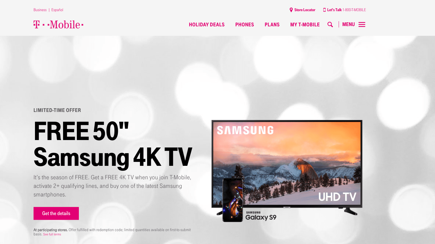
T-Mobile’s design-related brand are very strong, especially online. They use their main brand color—hot pink—wisely as part of the site’s navigation (as well as for CTAs) to create natural design patterns and a consistent look and feel throughout their website.
2
Readers don’t read, they scan. (Be honest: when is the last time you read a webpage in its entirety from top to bottom?)
Typography: Make font decisions based on readability and scannability.
What message do you want to send to your customers? As you choose fonts for your web design project, it’s essential to know your audience and think about who you want to attract and influence through your website. Use this information to inform which typefaces you pick for your site design, but don’t select too many!
Integrating lots of different fonts can make your website look messy and unprofessional. A good rule of thumb is to stick with two or three typefaces. Look for web fonts that match your message or brand identity. Google Fonts has a vast library to choose from because its typefaces are open source (which, in non-web designer speak means they allow both commercial and personal use), and its selections are generally high-quality in terms of legibility and readability.
Pro-tip: If your brand identity doesn’t include any web-friendly options, do your best to pick new web fonts that best match the established typefaces your company is already using in other collateral. Find an option that is versatile with several weights and styles (thin, regular, bold, italics, condensed, etc.)
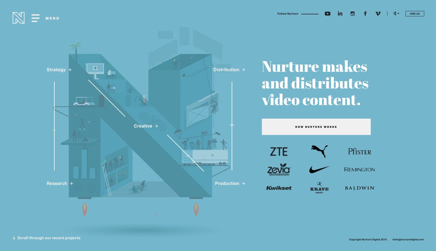
Nurture Digital’s modern use of type creates visual harmony. From headers and body copy to navigation links and CTAs, they are consistent which is why their entire website is easy to read (and easy to navigate).
3
It pays to be judicious when it comes to figuring out how to display content—from copy and forms to CTAs and image—in the design of a homepage or landing page.
Content organization : Create balance with the right mix of copy and graphics.
Don’t put everything out there. Less really is more to ensure your website isn’t overwhelming.
If you’re having trouble prioritizing what you want to share, consider your target audiences’ needs and on top level pages only show whats the most relevant and create an online destination that’s visually appealing and useful to your users.
As usability expert Steve Krug advises in his must-read book Don’t Make Me Think, your target audience should quickly be able to figure out what you want them to do (and they should be able to accomplish those tasks easily without getting frustrated).
As you consider how to use your layout to provide different entry points and form a definite, clear hierarchy, follow these tips for handling different types of content to convert more of website visitors into customers:
- Copy: Keep text minimal and helpful, and use formatting (subheads, bulleted lists) to break-up longer blocks and make words easier to scan. Don’t forget that basic-yet-critical information should be easy to find (and presented in a way that’s easy to understand). For instance, your customer service contact information shouldn’t be buried on the page or presented under a cutesy label that makes it easy to miss.
- Imagery: Better, bigger high-quality photos and illustrations are always more powerful than building your design around lots of stock-y, postage stamp-sized graphics. Running copy or graphics like logos on top of images? Don’t forget to check contrast to make sure any reversed out copy is readable.
- CTAs buttons and forms: When you want people to download, buy, click, or sign-up for something, make sure your integrations are visible and prominent to get your users to perform those specific actions. Look at your homepage. Are you asking your users to do too much? Rethink what matters, then reprioritize accordingly. When the Weather Channel wanted to optimize their landing page for a severe weather alert product, they started by focusing on including just one CTA, and that minor change resulted in a 225% increase in conversions.
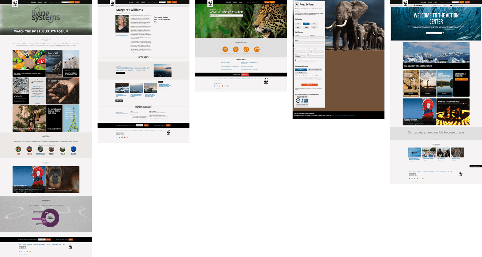
“The fact that the people who built the site didn’t care enough to make things obvious—and easy—can erode our confidence in the site and the organization behind it.” Steve Krugworldwildlife.org finds the right balance with its mix of copy, forms, CTAs, and images. Although they have a lot of content to share on a wide range of topics, the pages are designed to make it easy to scan and find the information you need.
4
Everyone wants their website to stand out, but make sure your website is memorable for the right reasons (and not because it is slow loading or hard to use)!
Optimization: Remember load time!
A website that performs is also a website that is optimized, and optimization starts with good website design. Small details matter.
For example, if you include a background video in your site’s hero section, to best serve all of your users don’t just upload any old huge, unedited video clip. Make sure to tweak your video’s resolution, bit rate, and length (an ideal runtime is between 10–30 seconds) to keep the file size reasonable. And, don’t forget to remove the audio! Not only is this a user experience best practice, but getting rid of your video clip’s audio will also make the file size smaller (and decrease the data required to play your video).
Pro-tip: You can’t count on every visitor coming to your website from a smartphone or tablet having a fast wifi connection or an unlimited data plan, so consider replacing any autoplaying video in your hero section with a placeholder image for your mobile device users.
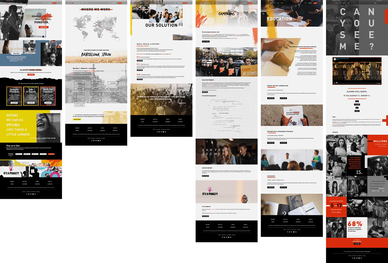
a21.org integrates eye-catching photography, vibrant graphics, and background videos throughout their website to tell the story of their important work fighting human trafficking, but they have incorporated these powerful visual elements strategically to ensure they load quickly for users.
5
Is your navigation intuitive? If it’s not, it should be. Take a closer look, and make sure your website’s navigation design follows these best practices:
Wayfinding: Create clear navigation to help customers find what they need quickly.
- Use clear labels: When choosing navigation link labels, avoid the esoteric! Create navigation link labels using common words and pithy phrases your actual users might use to find what they’re looking for specific content on your website.
- Limit the number of options: Make sure no more than eight links make up your list of primary menu items
- Be consistent with formatting: Create uniformity by repeating color, sizing, and positioning choices for navigation buttons and links.
- Be considerate when creating your site architecture: Don’t make your users dig for the information they need. Keep your architecture as flat as possible so that nothing is more than a few clicks away.
- Think “sticky”: Make sure your top content is always accessible by adding sticky navigation.
- Remember hierarchy matters: If you’re using multiple navigations, make sure the hierarchy of your different menus is immediately clear through your choice of design treatments, like font sizes and weights.
Good website design maximizes the power of images and words to create websites that deliver for small businesses and big corporations alike. If you don’t see the results you want from your site, it’s time to take action.
You can stay ahead of your competition with a good website design and bold digital marketing strategy, and our team is here to help if you need some assistance.
Is it time to redesign your website? We can help. Let’s talk
You might also like: