
A landing page can be a great way to promote and generate interest in an event, such as a conference, workshop, or fundraiser. An effective event landing page should be strategically designed to make it easy for users to register or purchase tickets, as well as find important details. It should make both the purpose and the value of the event obvious to potential attendees.
In this showcase, we’ve collected seven stand-out examples of event landing pages for inspiration.
In this showcase, we’ve collected seven stand-out examples of event landing pages for inspiration.
Circles Conference
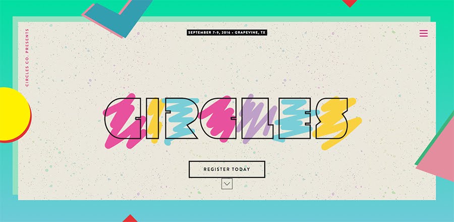
Why it’s effective: The register button is prominent in the top section of the website, making it easy for visitors to purchase tickets. Immediately following is a section explaining what the event is and the value it provides. The site has a fun design theme with extra features like a photo gallery to engage potential attendees.
Visit the website: https://circlesconference.com/
Prevention R3 Summit
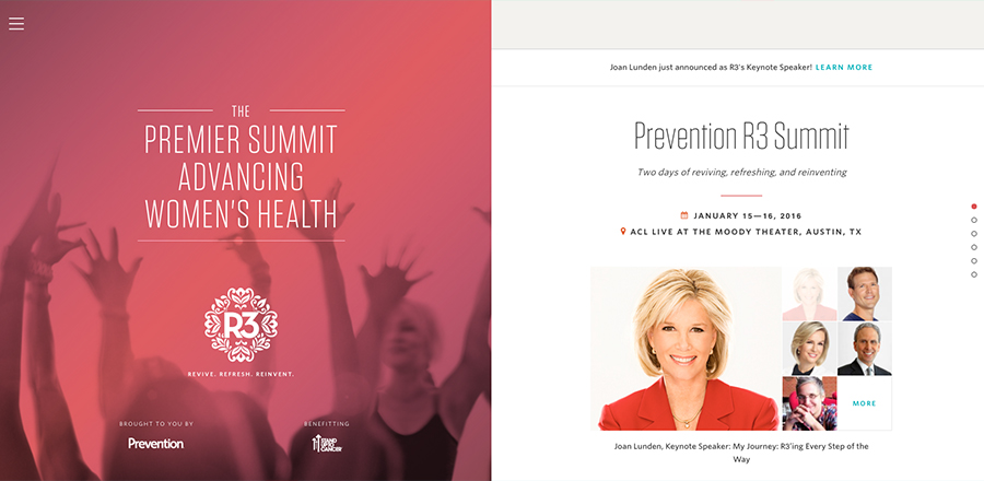
Why it’s effective: There are updates at the top of the content section to promote the latest events news. There is a FAQ included after the main event details to help attendees easily find additional information. The menu opens up extra testimonials, articles, and videos related to the event that potential attendees may find interesting.
Lappin180 Training Event

Why it’s effective: All of the important information, including a prominent registration link, is included at the top of the page where visitors can easily find it. It uses a photo of the training instructor as the main image in order to give a face to the event and better connect with the audience. The page also includes video testimonials from people who have been through the training in order to demonstrate the real value of the event.
Generate Conference
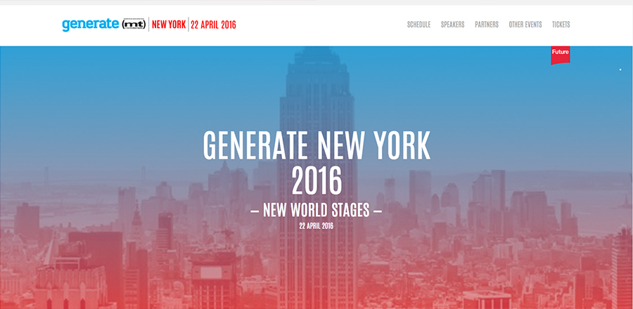
Why it’s effective: All the important information is presented right away. You can instantly see where and when the event takes place, as well as how much tickets cost. The banner area uses an image of New York City to reinforce the location and add interest to the page. While all the important details are on the main page, secondary info is easily accessible through the menu.
ICON conference
Why it’s effective: The homepage includes a promo to get discounted tickets, which is a great incentive for visitors to register right away. The purpose of the event is clearly stated, and testimonials are included to show how the conference can be beneficial to attendees.
Visit the website: https://attendicon.com/
OpenVis Conference
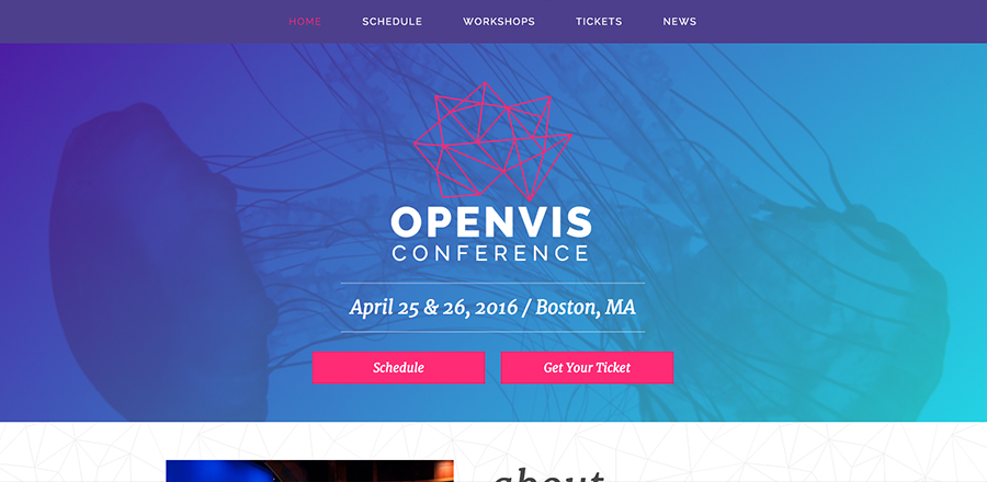
Why it’s effective: This conference website uses a one-page approach to make it easy for users to navigate through the event details. It uses photos from past events throughout the page to give visitors a feel for the conference experience. There’s a newsletter sign-up at the bottom of the page to encourage visitors to connect and get updates.
Visit the website: https://www.openvisconf.com/
Market Street Allen USA Celebration
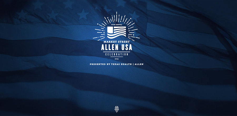
Why it’s effective: The video background makes the page captivating and gives a preview of the event. The design is clean and presents information in a straightforward manner. The sticky navigation along the bottom of the page makes it easy to jump to the information you need.
Visit the website: https://allenusa.org/
Call to Action Conference
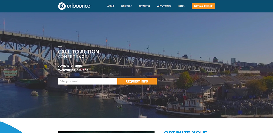
Why it’s effective: The “get my ticket” button is located in the navigation, which stays at the top of the screen while browsing this website, so it’s always easy to access. The top section of the page includes a form for users to quickly request more information about the event. The content includes statistics, testimonials, and reasons to attend the conference that help to generate interest and show the value it provides.
Visit the website: https://unbounce.com/call-to-action-conference/
Have an event coming up that you need to promote? With our variety of marketing services, we can help you develop a strategy to make your event a success. Contact TBH Creative for more information.
Let’s get started