
Each year, more companies build interactive annual reports for their stakeholders and customers. Creating an online annual report online gives you an opportunity to connect with a larger audience and present your data in a more meaningful, impactful way.
Have you started to work on your 2018 online annual report? Check out these nine great examples of inspiring annual report designs from across a wide range of industries.
BMO
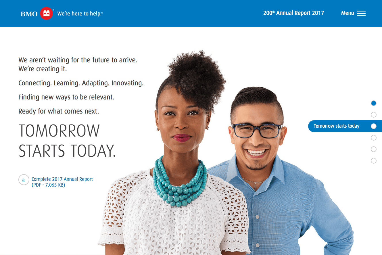
View BMO’s 2017 online annual report »
BMO’s online annual report is a great example of a sleek yet creative annual report design. It organizes topics into distinct sections, and uses functional storytelling and no-frills imagery to put the focus on their customers and their needs.
Best-in-class annual report design elements:
- Scannable copy
- Cohesive color scheme
GE
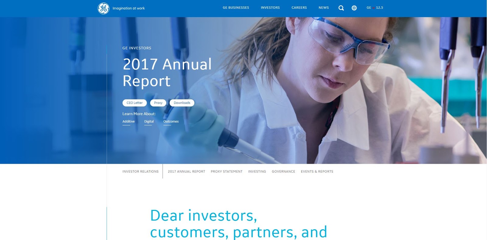
GE’s online annual report is a great example of online annual report design for good reason: it presents a lot of detailed information in an easy-to-digest manner.
Best-in-class annual report design elements:
- Strategic use of white space to balance in-depth information
- Infinite scroll with a side navigation to make it easier to find topics of interest
NORC at the University of Chicago

NORC’s annual report combines deep information with fun facts (like how many cups of coffee their staff drank over the past year). Their report is presented as a microsite that makes it easy to find the topic you’re interested in, using either the top navigation or left-and-right arrow styles.
Best-in-class annual report design elements:
- Full-width design to organize and present information
- Repository of thoughtful interactive infographics
Allstate

View Allstate’s 2017 annual report »
Allstate’s sustainability report features a clean, modern design that uses color and great copy to grab interest. By including components such as moving charts, videos, and infographics, their report provides an informative and effective overview that doesn’t overwhelm.
Best-in-class annual report design elements:
- Customizable displays of data, sorted by geographic region
- Compelling video usage in the hero
- Easy to navigate microsite format to organize copious information
Procter & Gamble
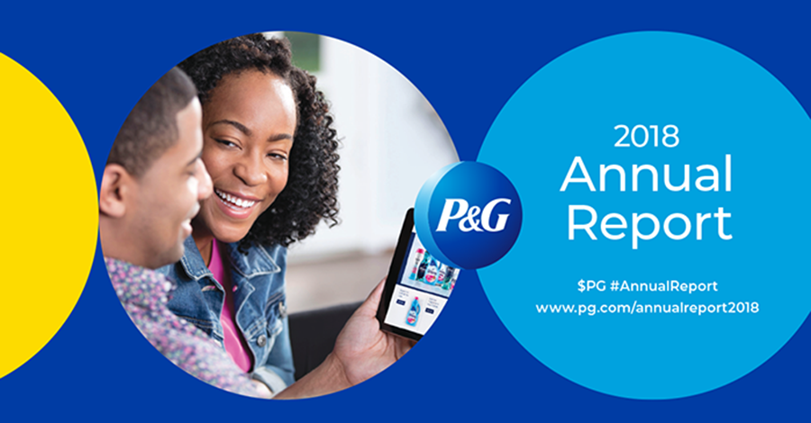
View P&G’s 2018 annual report »
P&G, the maker of famous products like Tide, Charmin, Olay, and Pantene, created a microsite to detail their company’s growth. To illustrate important achievements and company goals, they incorporated custom illustrations and icons throughout the annual report.
Best-in-class annual report design elements:
- Page-by-page navigation
- Inspiring use of brand colors
- Custom iconography
Target
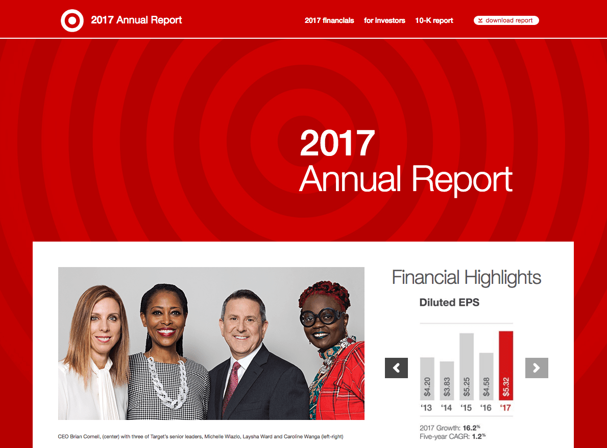
View Target’s 2017 annual report »
Known for their commitment to design, it’s no surprise that Target carries that tradition to the presentation of their financials, too. Target lets their strong results speak for themselves in the annual report, giving prominence to a collection of clean, easy-to-understand, and effective charts that make their report quick—and fun!—to review.
Best-in-class annual report design elements:
- Effective, condensed presentation of crucial metrics
- Design elements that show-off their brand elements
Flywheel
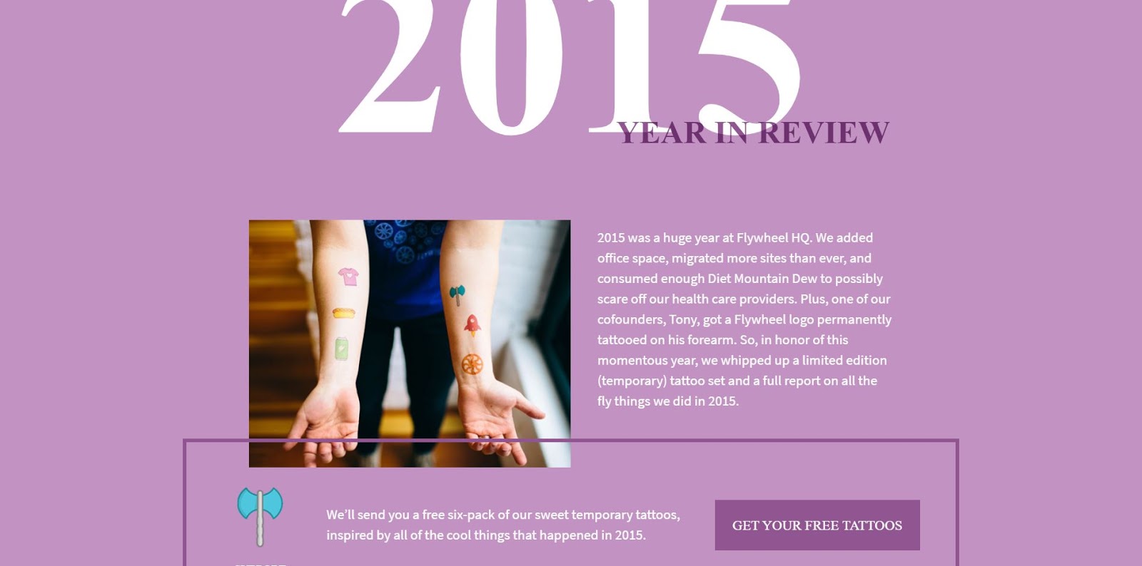
View Flywheel’s 2015 annual report »
Flywheel’s annual report engages readers with quick facts and strategic use of color and movement. Their interactive number elements highlight statistics about progress, and the overall mood of their report is anything but stuffy—which perfectly matches their brand voice.
Best-in-class annual report design elements:
- The prominent call-to-action (they featured a free temporary tattoos giveaway, but you could set up a downloadable content offer to collect emails from leads)
- Modern typography and colorful graphics
Xero

Xero has created an online annual report optimized for mobile users.
Designed as a scrolling page, their annual report marries bold typography with powerful photography to create a visual feast that both tells stories and highlights significant milestones and accomplishments.
View Xero’s 2018 annual report »
Best-in-class annual report design elements:
- Mobile-first design format (that also looks great for desktop users!)
- Prioritization of integrating story-driven content
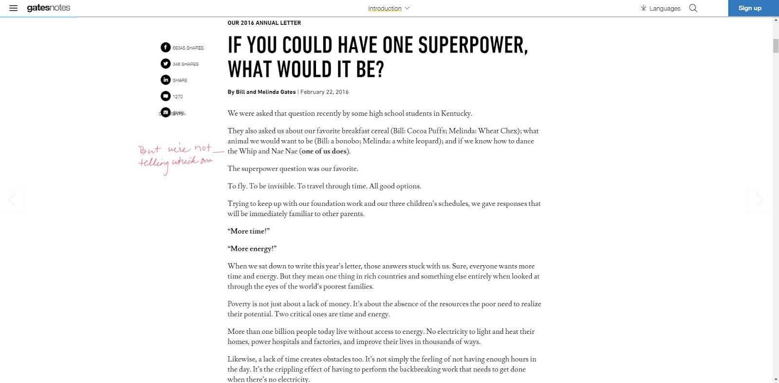
Bill and Melinda Gates Foundation
View the Gates Foundation’s 2017 annual report »
The Bill and Melinda Gates Foundation’s annual report uses a narrative letter format to shares its results conversationally. To complete the effect, they even integrate handwritten notes in the margins that act like pull quotes to give extra emphasis to noteworthy information and make the page more scannable.
Best-in-class annual report design elements:
- Sticky header for easy navigation down the page
- Letter format to engage with your audience in an authentic way