
It can be challenging to turn a complex process on a website into a user-friendly experience. Processes that require multiple steps and fields to fill out, such as making a purchase or creating a profile, can be overwhelming if not properly designed. If you want to create a seamless process workflow for your users, you need to balance a variety of factors like usability, accessibility, and interaction design. Every part of the process should be planned out and well-tested so that users are completing the desired action.
In this showcase, we will take a look at three examples of complex process design on the web and analyze some of the key characteristics that make them so effective.
In this showcase, we will take a look at three examples of complex process design on the web and analyze some of the key characteristics that make them so effective.
TurboTax: https://turbotax.intuit.com
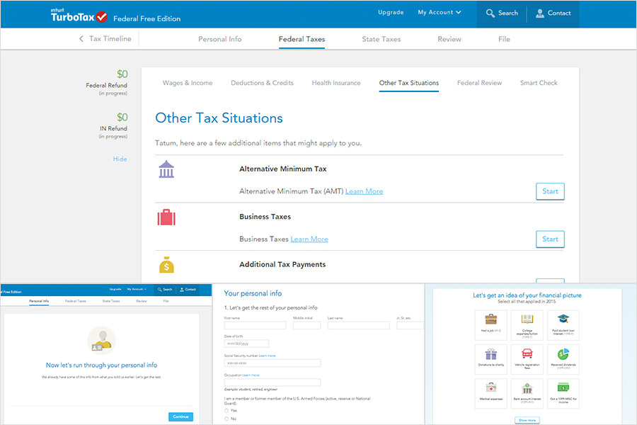
Process highlights:
- With so many steps to work through, there are multiple instances of navigation for some views. This is handled well between main navigation items at the top of the page and sub-navigation above the content area so users can easily distinguish between sections.
- On the left side of the page, users can see a running tally of their tax refund for reference as they work through each step.
- Visual aids such as icons and illustrations are used throughout the processes to help users easily identify sections and pieces of information.
- As you’re completing a process, TurboTax makes it apparent if there any errors in your information and guides you through correcting them, which eliminates any confusion about what you need to revisit.
Airbnb: https://www.airbnb.com
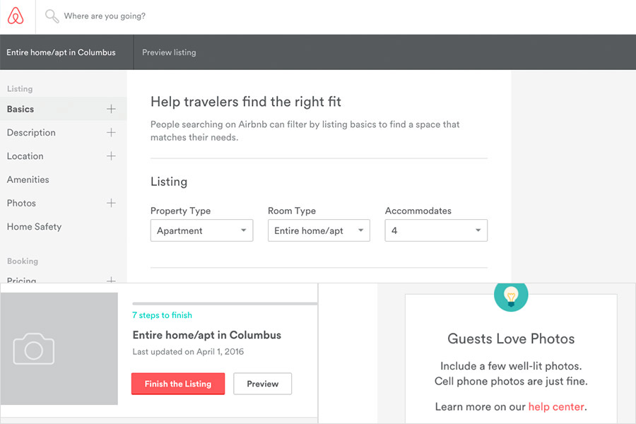
Process highlights:
- After signing in, there is a dashboard showing how many steps are still needed to finish a listing, making it easy for the user to see their progress.
- There are helpful callouts that provide tips and suggestions to aid the user.
- The form fields include effective error messages that help the user to accurately fill out all required information.
Mint: https://www.mint.com
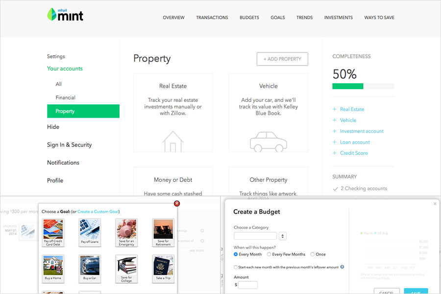
Process highlights:
- The account completeness progress bar shows users how much of the process they have left when setting up their profile.
- When setting up a goal, the user is guided through the process with helpful explanations and examples to make the process easier.
- Graphics like charts and graphs are used throughout the site to help users visualize information better.