For a growing number of people, the habit of sticking with a provider just because you “like them” is fading away. Today’s patients anticipate excellent service at every point during their healthcare journey. This expectation means having a good hospital website so your practice can provide a satisfying experience online is no longer an optional part of your overall marketing strategy.
And, it’s not just tech-savvy Gen Z patients who you need to keep happy with a robust and easy-to-use hospital website. Other patients want tech conveniences as part of their care, too. Check out this a breakdown from Solution Reach’s recent patient-provider relationship study:
Baby boomers: 20% are likely to switch doctors in the next three years
Generation X: 44% are likely to change providers in the next three years
Millennials: 43% are likely to switch physicians in the next few years, and 54% have already made a switch over the last two or three years
Keep reading to learn what it takes to design and develop an exceptional healthcare site, and get inspired by 48 examples of good hospital websites.
Key considerations when designing a good hospital website
The very best hospital websites’ qualities are no different from those that make up any other great site. The best of the best are easy-to-use, optimized for search and mobile use, feature fresh and engaging content with clear CTAs, sync up with established branding, and—well—look good.
When it comes to hospital websites specifically, the sites that patients like using tend to present content in a way that takes note of what is most convenient for them—whether that means providing the ability to make an appointment online, view medical records, find a new specialist, or learn about treatments—over everything else.
Hospitals are no stranger to the idea of being patient-centric, but putting this into practice online can be a challenge, especially when everyone wants a presence near the top of the homepage or in the main navigation.
Focus on the needs of your hospital website’s primary users
To build a website that isn’t cluttered with content of secondary importance to users, consider developing website personas that analyze your target audiences and what they want. This research about your users can provide invaluable guideposts for organizing content, helping to ensure your team stays focused on what your users really need during each step of the complex hospital website redesign process.
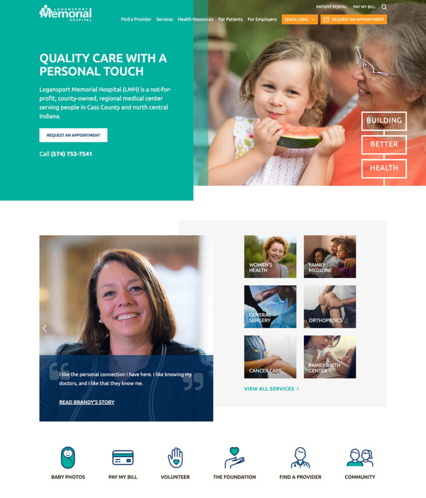
From its custom icons to its simplified main navigation, Logansport Memorial Hospital’s award-winning site includes visual touches and straightforward messaging throughout that help patients get the information they need without hassle.
2
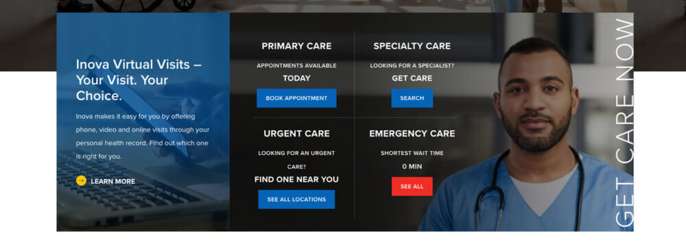
Inova
Inova’s hospital website features an attractive grid presentation of quick links to services their patients use the most.
3
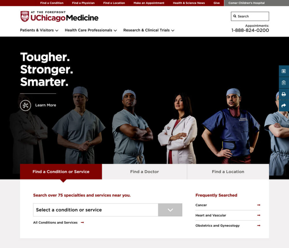
UChicago Medicine
UChicago Medicine’s hospital homepage does a great job matching the University’s main visual brand elements, presenting search tools to simplify popular user tasks, and incorporating bold custom photography.
4
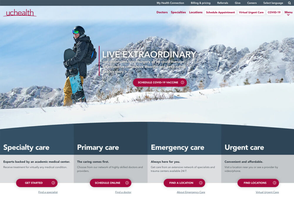
UC Health
UC Health uses its hospital website hero area to distinctively highlight the four main types of care its physicians provide.
5
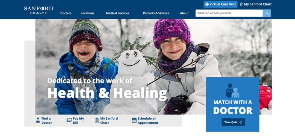
Sanford Health
Sanford Health provides a prominent link from its homepage hero area to a helpful interactive tool that guides its new patients through the process of matching with a doctor.
6
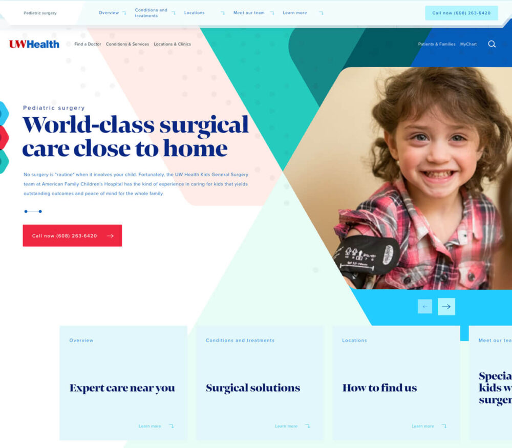
UW Health
UW Health customizes specific service area pages—like this one for its pediatrics treatments—with vibrant photography and patient-centric content.
7
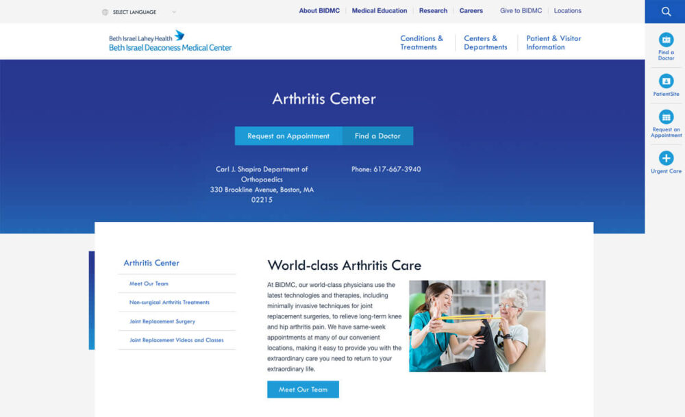
Beth Israel Deaconess Medical Center
On their good hospital website’s service area pages, Beth Israel Deaconess Medical Center uses the hero area and a simple side navigation panel to help users find what they are looking for about treatment options.
8
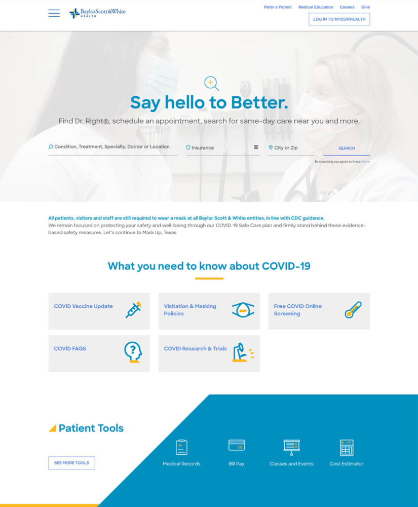
Baylor, Scott & White Health
Sometimes, something so big happens that a simple alert bar isn’t enough to communicate news to your target audience. Knowing that patients in their community are worried about COVID-19, Baylor, Scott & White Health created an attractive, custom space on their homepage with information about screenings, treatments, and more so that their patients wouldn’t have to dig through lots of pages to find this content.
9
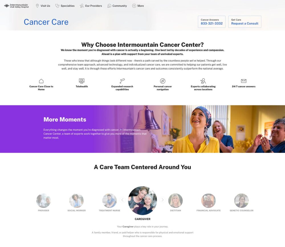
Intermountain Utah Valley Hospital
Intermountain Utah Valley Hospital puts findings from its website persona research front and center on each service line landing page, like this example web page that details their cancer care offerings.
10
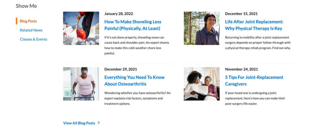
Henry Ford Health System
The hospital website for the Henry Ford Health System uses a compact, flexible panel to present its latest news and events content to users looking to explore healthcare resources online.
11
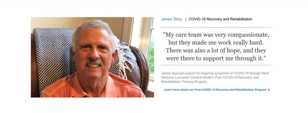
Lancaster General Health
Many good hospital websites include testimonials from grateful patients, but Lancaster General Health makes their standalone pull quotes more impactful by incorporating details about the patient’s condition and related services.
12
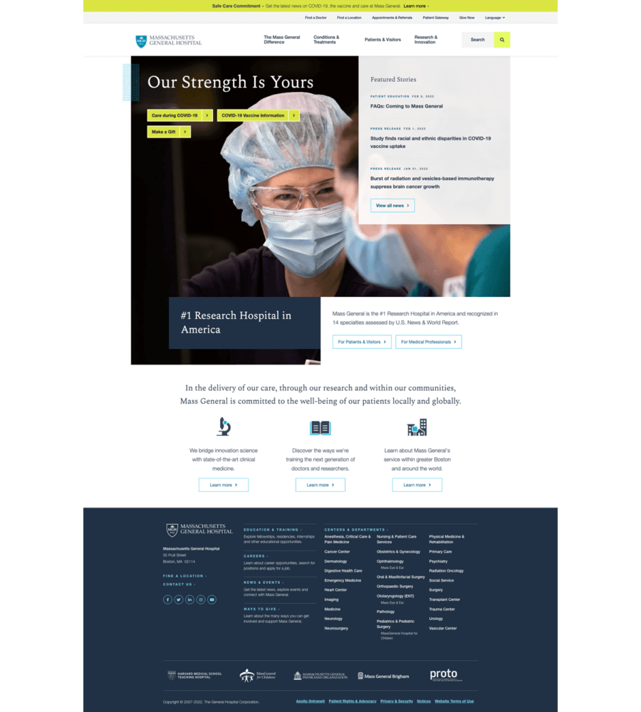
Massachusetts General Hospital
Massachusetts General Hospital’s homepage incorporates bold custom photography with quick links to their services, providers, and other top-read information.
13
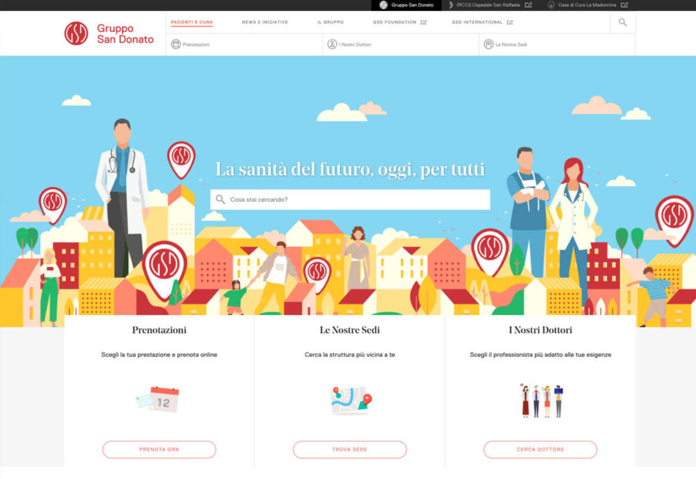
Gruppo San Donato
Who says a good hospital website’s homepage has to be blue? Or use photos? Gruppo San Donato’s healthcare site design presents links to its top content in a hero that stands out because of the webpage’s accompanying colorful, custom illustration.
14
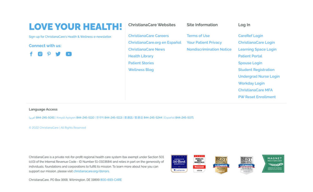
ChristianCare
ChristianCare cleverly uses its hospital website footer area to show its awards and remind users of its bona fides.
15
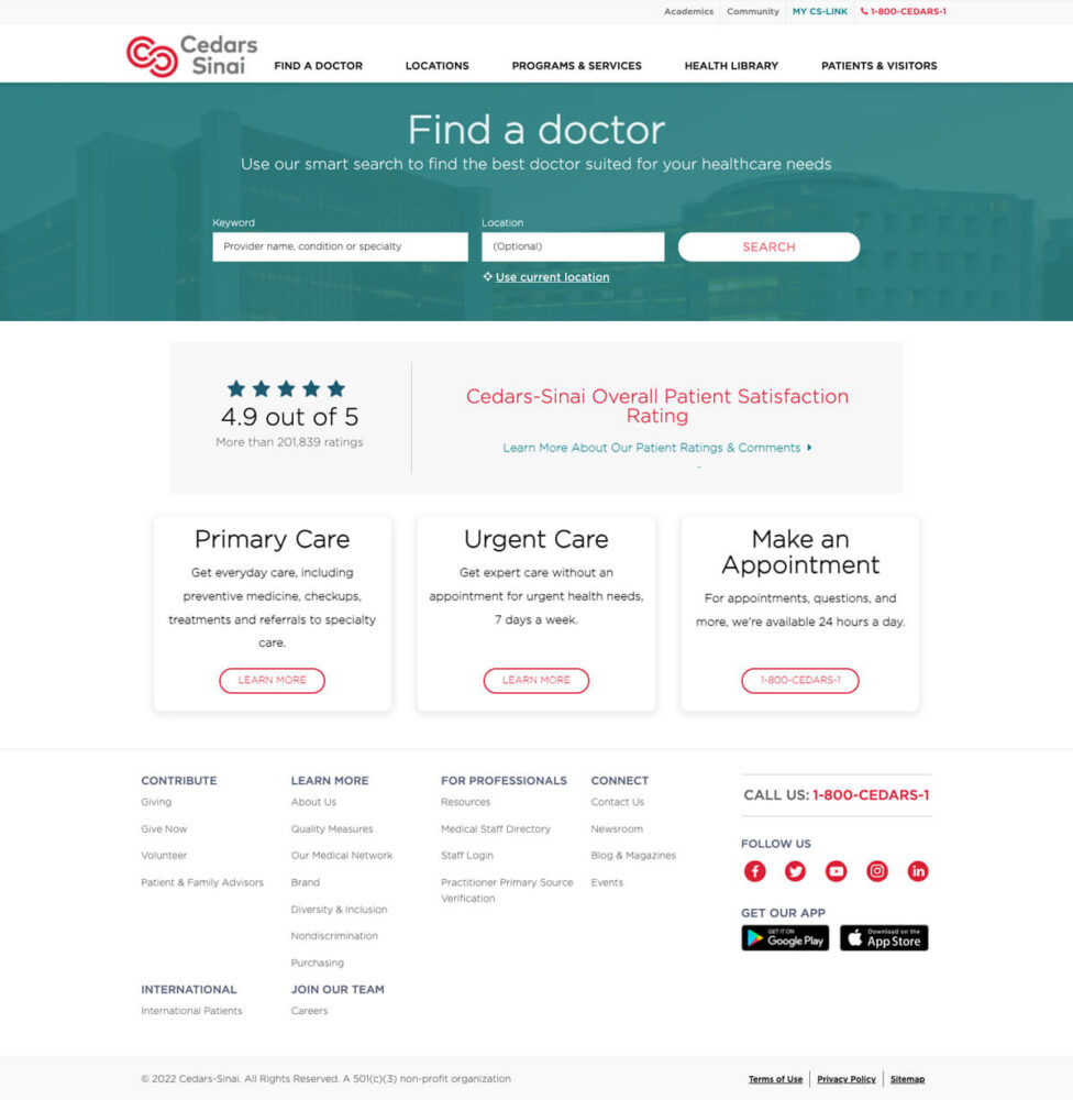
Cedars Sinai
Cedars Sinai knows that most of its users are coming to their website to get care, so the homepage features its “find a doctor” tool in the hero area so that users can get down to business as soon as they arrive.
16
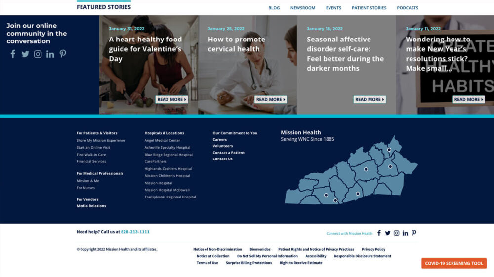
Mission Health
Mission Health makes its super-sized footer multi-functional by incorporating an interactive resources bar, map of its locations, and quick links to top patient content.
17
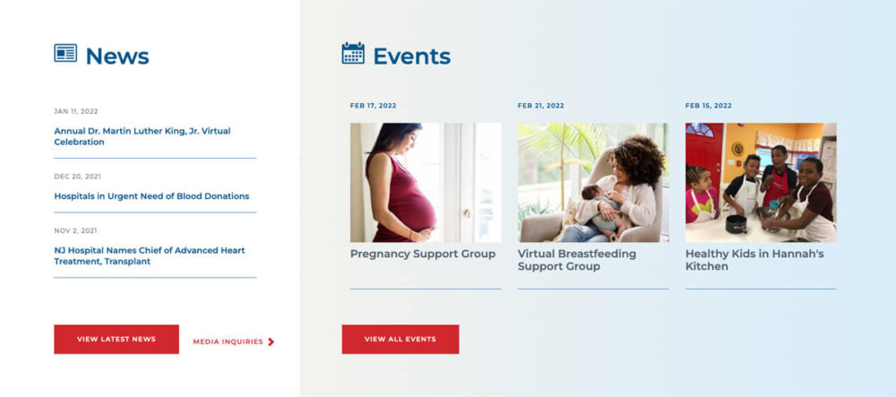
Newark Beth Israel Medical Center
Newark Beth Israel Medical Center includes a clean, easy-to-use news and events panel on select pages throughout its website to make it easy for users to quickly access its latest news, resources, and other offerings for the community.
18
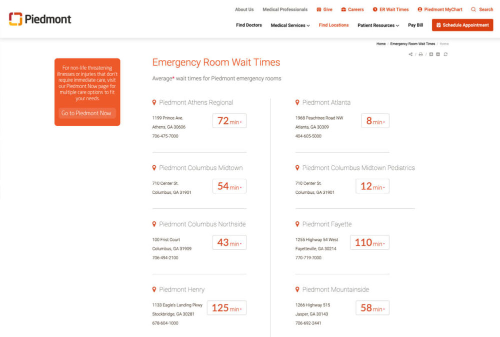
Piedmont
To be as helpful as possible to its patients who need emergency services, Piedmont’s good hospital website includes a webpage with real-time information about wait times at all of its ER locations.
19
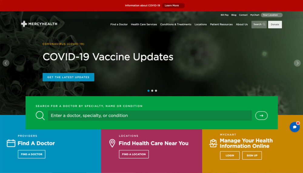
MercyHealth
MercyHealth’s hospital homepage uses bold color-blocking to help users find their way to top links.
20
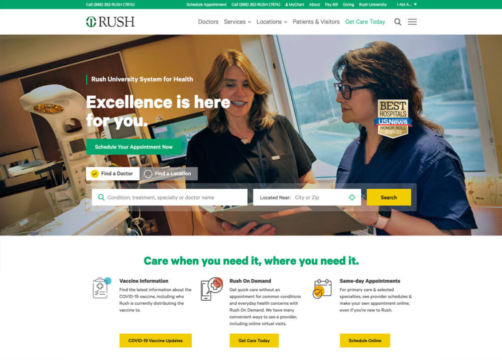
Rush
Rush’s homepage features a simple-but-effective “find a doctor” tool in its hero area.
21
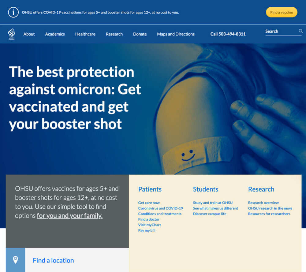
OHSU
OHSU’s healthcare website features an attractive alert bar that catches the user’s eye without disrupting the harmony of the rest of its homepage design.
22
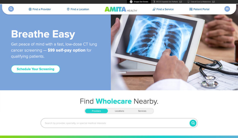
Amita
Amita’s healthcare website features a Google-esque search bar after its hero area, where users can quickly search for information about the hospital’s providers, locations, and services.
23
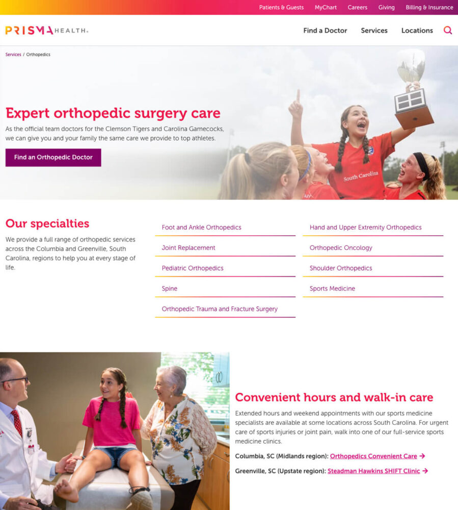
Prisma Health
Prisma Health uses custom photography feature colors from its brand to create a cohesive look on its service landing pages.
24
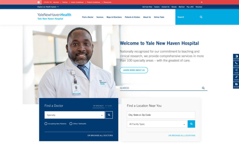
Yale New Haven Health
Yale New Haven Health presents its “find a doctor” and “find a location” tools alongside a general search so that users have quick pathways to finding the information they need as quickly as possible.
25
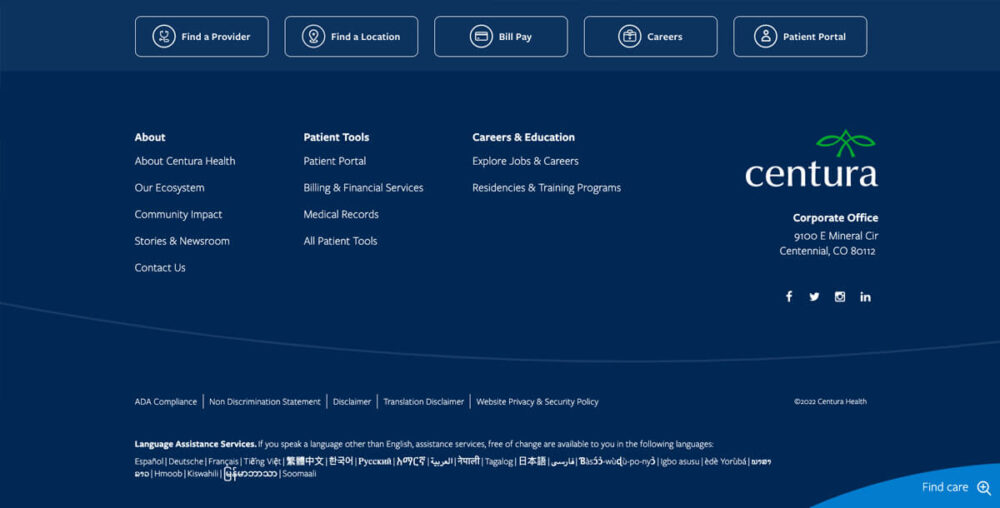
Centura
Centura includes buttons in their hospital website footer to give users fast ways to access top pages.
26
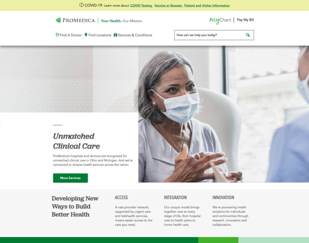
ProMedica
ProMedica uses a clean design on its homepage to present information about its practice’s services.
27
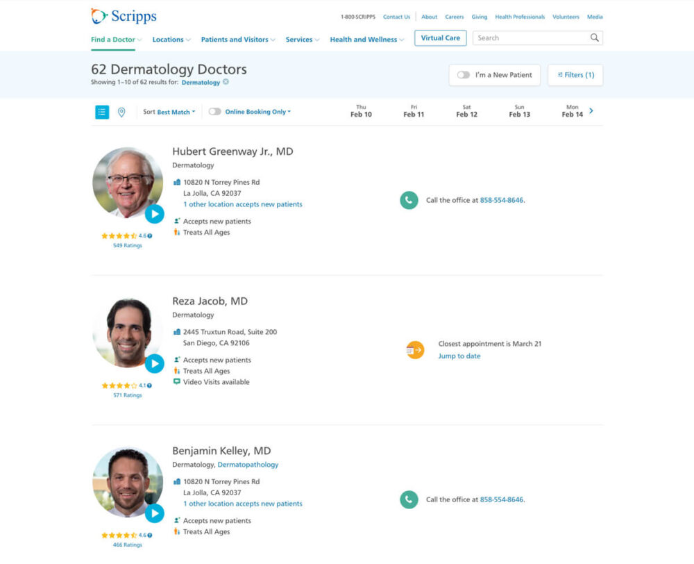
Scripps
Scripps’ provider search results webpage saves users a step. If they need to see a doctor right away, it includes a calendar so that users can quickly find out which providers have openings in their schedules and who is already booked.
28
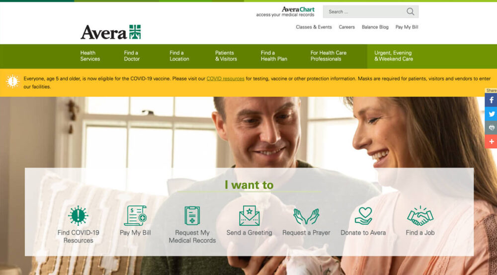
Avera
Avera uses custom icons to provide a sub-nav in its homepage’s hero area with links to top resources and information.
29
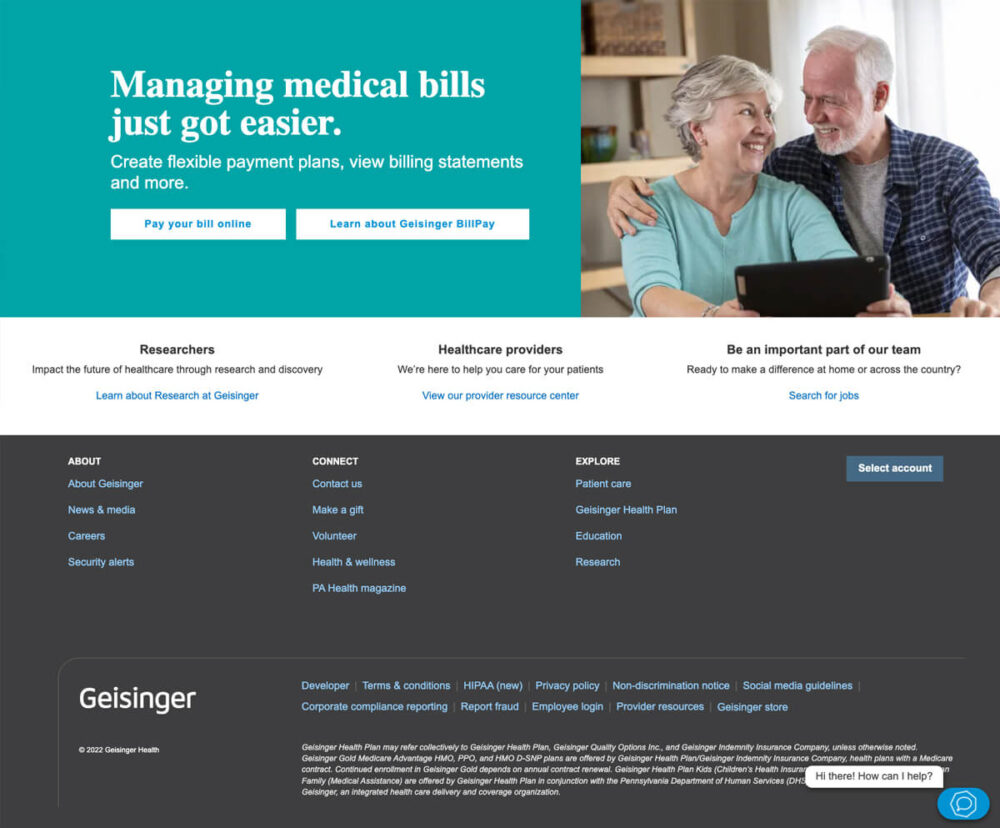
Geisinger
Geisinger designed its hospital website footer by putting primary user transactional links upfront where users won’t miss them.
30
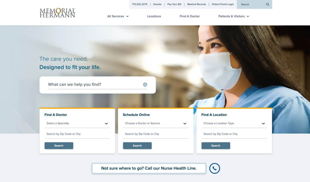
Memorial Hermann
Memorial Hermann cleanly incorporates useful search tools in its homepage hero design.
31
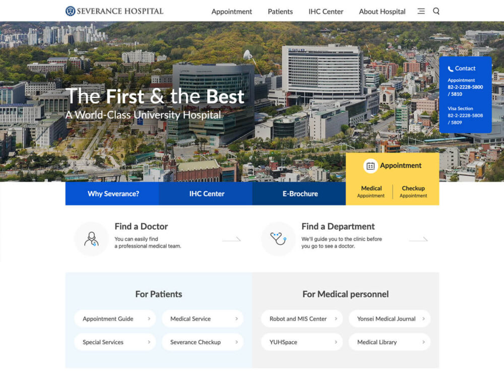
Severance Hospital
Severance Hospital’s healthcare website homepage provides two pathways to critical content, organized by the needs of its patients and medical personnel.
32
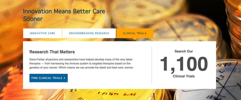
Dana Farber
Many good hospital websites use numbers on their homepage to talk about what they do, but Dana Farber goes a step further. They include context for the stats on their healthcare website so that each number’s relevance is clear to users.
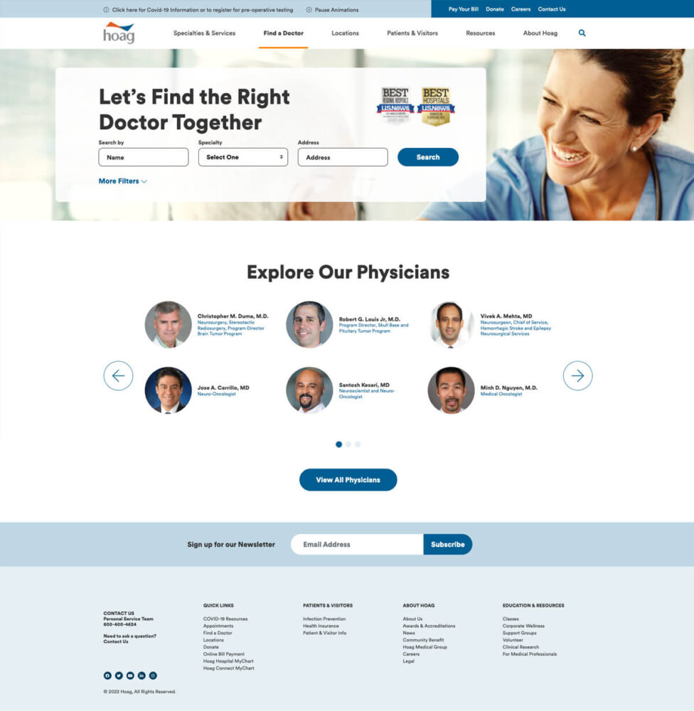
33
Hoag
Hoag uses the fact that many users who visit their website need to get care. This user goal has clearly informed their design decision to place a multi-variable “find a doctor” tool in the hero area.
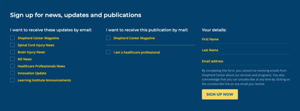
34
Shepherd Center
Shepherd Center’s website content strategists (knowing that no one wants to get spam) wisely designed their healthcare site’s email signup panel to permit users to customize what messages they will receive as part of the opt-in process.
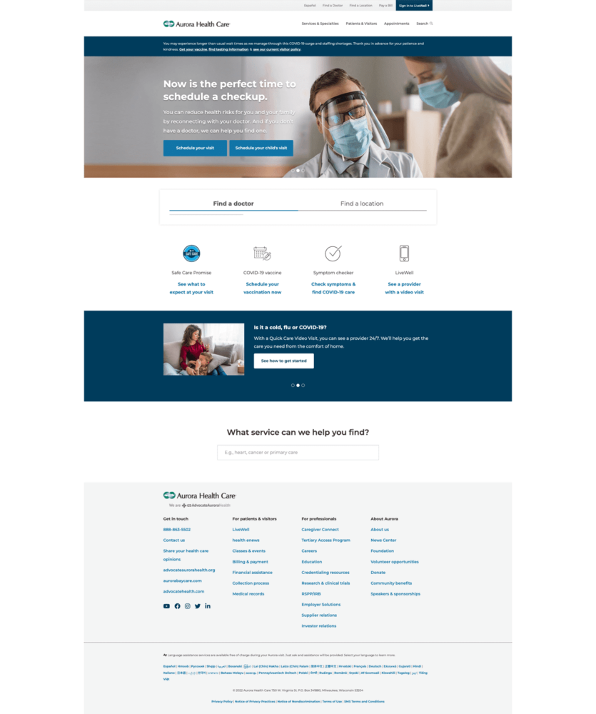
35
Aurora Health Care
On its modern, simple homepage, Aurora Health Care displays only top content so that users don’t have to wade through lots of content to find the information they are looking for.
36
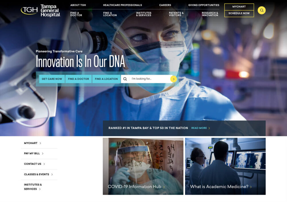
Tampa General Hospital
Tampa General Hospital uses custom photography and visual design elements (typography, colors) from its brand to create a unique and memorable homepage.
37
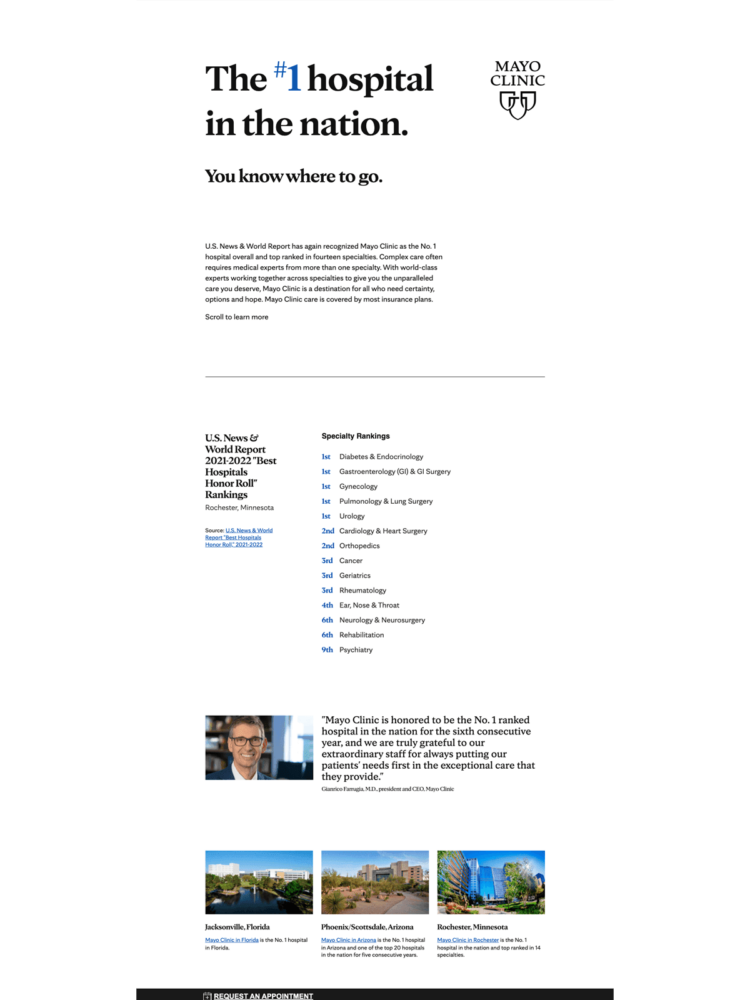
Mayo Clinic
Mayo Clinic lets its impressive bona fides—set off with a straightforward presentation—do the talking on its landing page describing why a patient should choose them for their care.
38
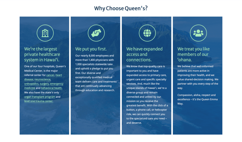
Queen’s Medical Center
Queen’s Medical Center presents its differentiators in a graphical panel accented with custom icons.
39
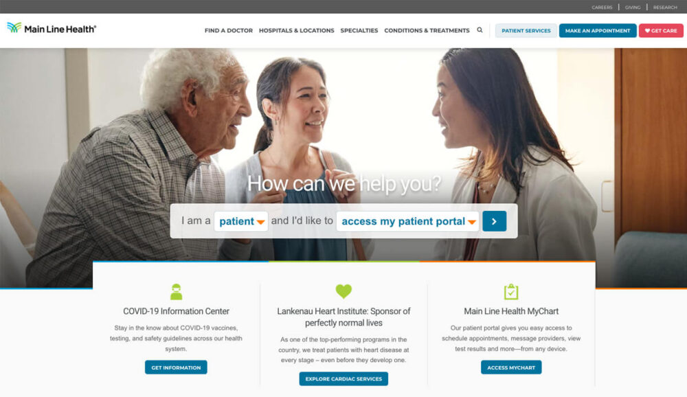
Main Line Health
Main Line Health’s homepage incorporates a simplified, personas-driven search tool in its hero to help users access top content.
40
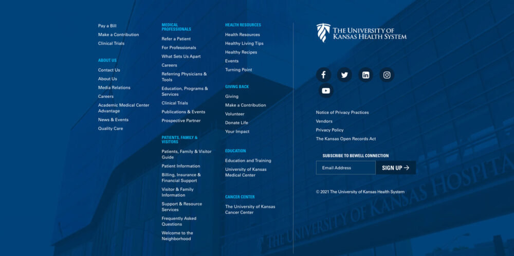
The University of Kansas Health System
The University of Kansas Health System’s hospital website features a footer that provides well-organized links to information and resources their users need the most.
41
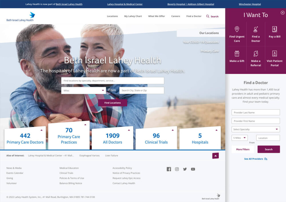
Beth Israel Lahey Health
Beth Israel Lahey Health’s dynamic homepage features a bifurcated design to use space in the top right for personas-driven links.
42
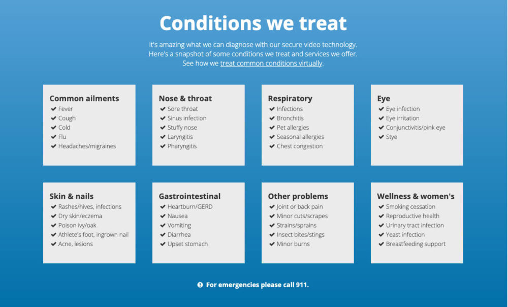
Swedish Express Care
Swedish Express Care’s good hospital website includes a scannable panel of information that gives its users in-depth details on the conditions they treat.
43
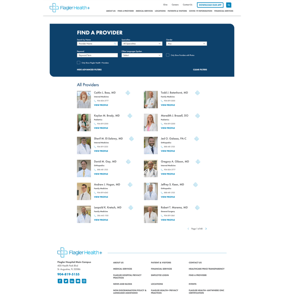
Flagler Health
Flagler Health’s listing webpage with information about its providers incorporates options patients care about in its top of the page search tool to make filtering out results from the physician database easier for users.
44
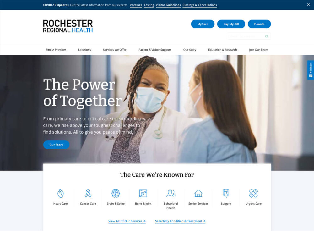
Rochester Regional Health
Rochester Regional Health’s homepage includes a sub-nav as part of its hero–featuring custom icons—to give users eye-catching, quick links to top pages.
45
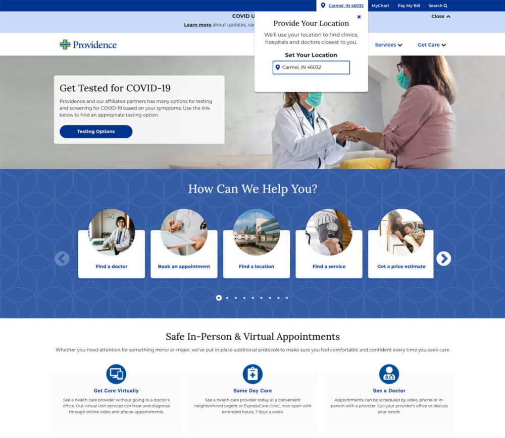
Providence
As a hospital system with multiple locations, Providence helps users pinpoint where they can get care with a tool that customizes its homepage information based on where you are browsing its site.
46
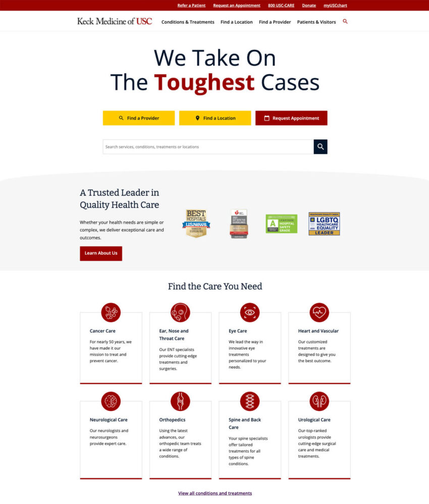
Keck Medicine of USC
Keck Medicine of USC presents its differentiators right up front—without any unnecessary photos or extra graphic distractions–so that users know their hospital is a trusted leader in quality health care.
47
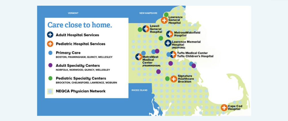
Tufts Medical Center
Tufts Medical Center’s good hospital website includes an infographic panel on the homepage to clearly show users where its system has different healthcare locations in their region.
48
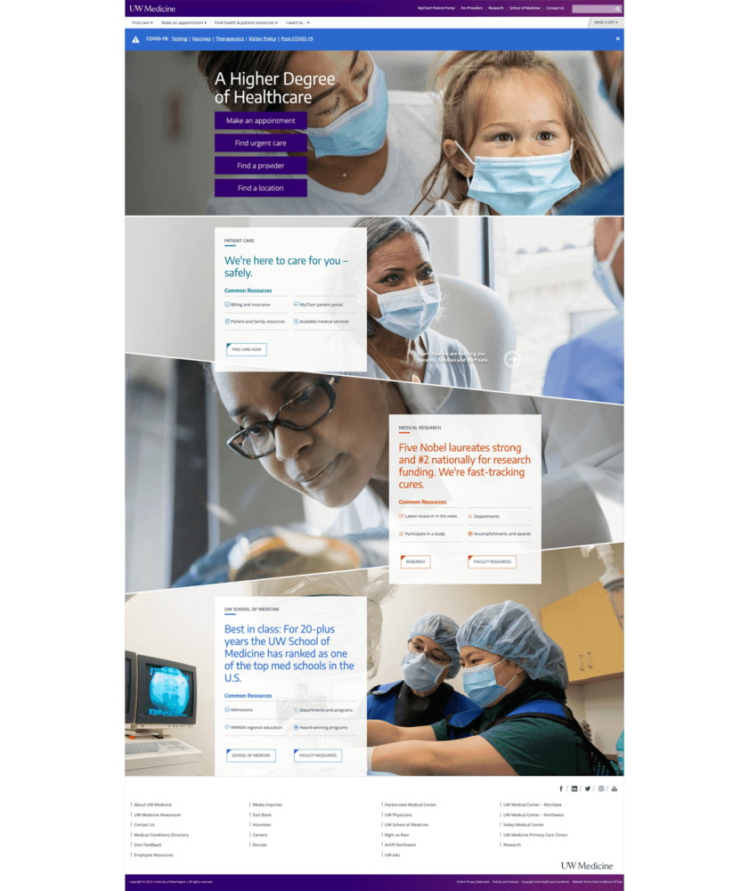
UW Medicine
UW Medicine uses blocks with custom photo backgrounds to show off their top talking points.
Tatum is the president of TBH Creative and is responsible for building long-term client relationships. She enjoys the strategy behind web design and collaborating with clients to define and execute online marketing goals. She likes to blog about hot topics in web design and digital marketing, as well as share tips for strengthening your online presence.