
How many emails have you received today? How many have you sent?
Chances are, that number is at least in the double digits since email is now the primary type of communication for most businesses. In fact, the experts at the Radicati Group estimates that the average number of business emails sent and received every day is over 100 per person, according to the Radicati Group.
If you send even a fraction of that many emails per day, you may be overlooking a major marketing opportunity: your email signature.
Email signature marketing focuses on taking your email signature beyond just basic contact information and transforming it into a beneficial marketing tool. By optimizing your email signature, every message you send has the opportunity to promote your brand, generate leads, or drive website traffic.
In this article, we’ll walk you through how to create an email signature that is professional, attractive, and beneficial to your marketing strategy.
Step 1: Create your email signature foundation
Your email signature is a reflection on yourself and your company. Oftentimes, email is the first (and perhaps only) communication you’ll have with someone, so an optimized signature can help to make a good impression. Follow these tips to build a better email signature.Basic information
To create the foundation of your email signature, start with laying out your basic information. Include your name, title, any applicable contact information, and a link to your website. Keep this portion simple and aim for no more than 3-4 lines. (Note: Save a line! You probably don’t need to repeat your email address in your signature.)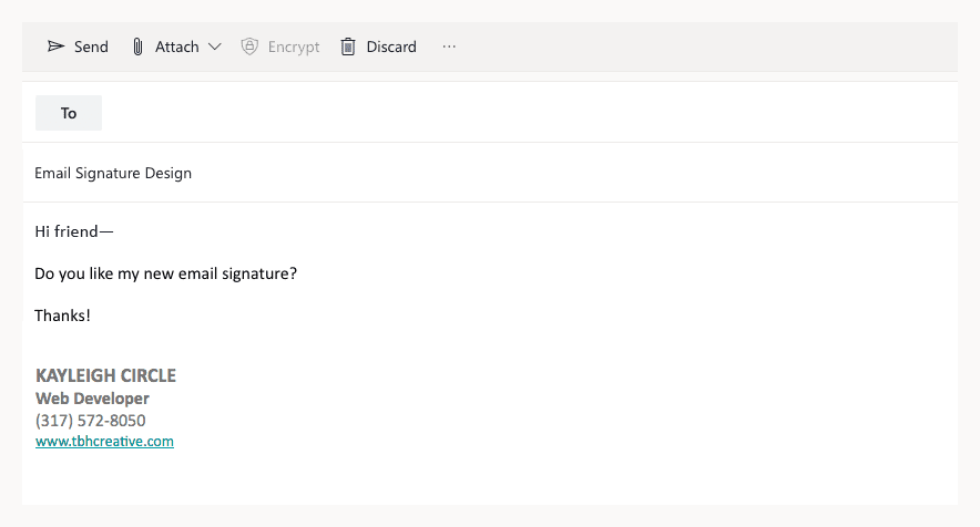 An example of a barebones email signature with a minimum amount of information.
Brand elements
Once you have the basics down, consider adding some visual interest by incorporating brand elements. First, check if your company has any specific standards you are required to follow. For example, the University of Connecticut provides general email signature guidelines for faculty and staff to follow.If you don’t have a template to follow, here are some basic recommendations:
- Incorporate your brand guideline colors. Limit yourself to using only one or two colors so your email signature doesn’t look visually cluttered.
- Include your logo for better brand recognition and brand reinforcement.
- Choose a single font to use consistently (and make sure it’s a web-safe font or that you provide appropriate fallbacks).
- Focus on alignment and using proper hierarchy to ensure your signature looks clean and balanced.
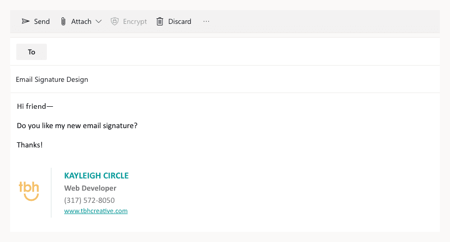 In this example, logo and brand styles have been added to the base signature to improve the overall design.
Extras
Depending on your job and industry, there may be other elements you’ll want to add to your email signature. Consider the following additions only if needed, with the goal being to keep your signature as uncluttered as possible.Social links. Many people include social media links in their email signature. However, keep in mind the more links you present, the less likely people are to click on your primary call to action. So, weigh the pros and cons of multiple social links. Are you actually active on those accounts? Is social media an important aspect of your job? If not, ditch them!
Personal photo. Including a headshot in your signature is a great way to add a personal touch to your emails. If you work directly with customers or potential clients, this can increase engagement and trustworthiness in your brand. It’s typically best to only include a photo if it’s high-quality and professional.
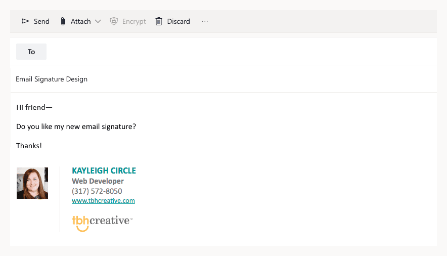 Including a photo in your email signature adds a more personal touch.
Disclaimers and other legal notices. If you currently have a disclaimer on your emails, first determine if you actually need this information. Is it a company policy or legal requirement? If it must be included, try placing at the bottom of your signature, and style it in a way that it doesn’t call attention away from the rest of your content.
Email signature mistakes to avoid
Here are some common mistakes to be mindful of when creating your email signature:- Not considering mobile. With almost half of all emails opened on mobile these days, make sure your email signature is optimized for mobile viewing. If it’s too wide or not formatted properly, this can cause display issues on smaller devices.
- Including too much information. If you have multiple lines of professional or contact information in your signature, consider how much of that is actually needed. Eliminate anything that is not relevant to the people who you are emailing daily.
- Presenting too many links. Keep the number of links to a minimum as well. Giving people too many options can be overwhelming or confusing.
- Using a single image for your whole signature. Make sure to use actual content in your signature. If your entire signature is an image, some users might not see any of your information, as email clients often have images turned off by default.
- Adding a quote. Generally, including an inspirational or favorite quote is just unnecessary noise. Leave it off unless the quote applies to your brand.
- Including irrelevant photos. Don’t add extra photos in your signature unless absolutely necessary. They add on to the size and loading time of your emails, so your email recipients will thank you for leaving them off.
Pro tip: If possible, get everyone in your company using the same email signature template. This helps to promote brand consistency and professionalism across company communication.
Step 2: Add your call-to-action
Once you have the information and style of your email signature determined, it’s time to add your call-to-action. Every email signature should have a CTA.Choose a topic
First, brainstorm what you might want to promote with your signature. Here are some popular ideas:- Product promotions
- Marketing campaigns
- Downloadable offers
- Latest blog posts
- Recent publications
- Awards
- Case studies
- Upcoming events
Design your CTA
Take your chosen topic or topics and decide on both content and design for your CTA element. The level of complexity for your CTA will likely depend on the resources you have available. If you want to keep it simple, you could add a basic link to the bottom of your email signature. If you want your CTA to stand out more, work with a designer to create a more complex graphic.When creating graphics for your email signature CTA, here are some general guidelines:
- Be consistent with brand styles.
- As with the rest of your signature, keep colors and fonts to a minimum so your signature doesn’t end up messy and overwhelming.
- If you are including photos, make sure you are selecting high-quality images.
- In general, a signature CTA graphic is best kept under 500 pixels wide to work best at a variety of screen sizes. If you have a text-heavy image, you’ll likely want to make it even smaller so it doesn’t shrink too small on mobile devices.
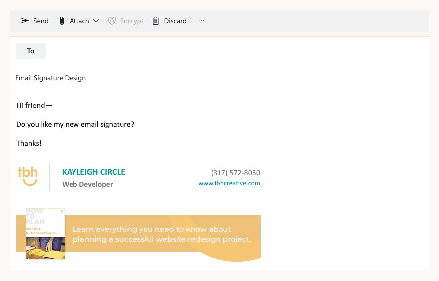
In the final version of this email signature, a call to action promoting a downloadable offer has been added.
Develop a strategy
Design multiple email signature CTA options to give yourself a variety to choose from. You’ll want to swap them out from time to time to keep your signature fresh. Make sure you are removing outdated information as needed.Furthermore, you might try switching out your CTA depending on who you are emailing. For example, if you are in sales and emailing a potential customer, use a CTA that is relevant to their interests or industry. Or, choose a CTA that promotes your recent work or case studies. The more personalized your email signature marketing is, the more effective it will be.
Find inspiration
If you’re looking for inspiration for email signature design, start by checking out real-world examples in the emails you receive every day. See what others are doing and what stands out. For other examples, check out the following links:- Sigstr’s email signature marketing examples
- Email Signature Rescue’s templates
- WiseStamp’s email signature templates
- Dribbble
Step 3: Implement your email signature
The final step is to actually built out and use your email signature.Code it out
This part might require some help from a web developer if you aren’t savvy with HTML coding.Your signature should be built out according to email coding standards, using a table-based layout for maximum compatibility across email clients. To avoid images sending out as attachments, you’ll want to host them on a server.
Pro-tip: If you don’t have the help of a web developer, you could also consider using an online signature generator such as the ones from HubSpot, WiseStamp, or MySignature.
Test, test, test
Once you have your signature built and in place, you’ll want check what it looks like when viewed it in a variety of email clients, such as Outlook, Gmail, and Apple Mail.Test on desktop, tablet, and mobile sizes as well. Thorough testing will help you to make sure that your recipients aren’t seeing your signature in an entirely unexpected way.
Track & analyze
One of the most important steps in any marketing effort is to analyze the results. To successfully measure the success of your email signature marketing, set up tracking for any links in your signature so you can see where people are clicking. This will help you determine which CTAs work best with which audiences so you can improve your efforts over time.Subscribe to our marketing blog for free resources
You might also like …
