Looking for more ways to optimize your site? Discover how to design a faster website.
When it comes to adding imagery to your website, there are two basic image types to choose from: raster images and vector images.
A raster image, typically a photograph, is made up of pixels and has a set resolution. When scaled up, it will lose quality and can appear pixelated or grainy.
A vector image is created using points, lines, and shapes. You can scale vector images to any size without losing quality. Vectors images are limited in how much detail they can represent, so they are best used for elements like typography, logos, icons, or illustrations.
Support for vector graphics on the web has come a long way. Traditionally, vector graphics were rasterized and saved out as JPG, PNG, or GIF files for use on a website.
Now that higher-resolution devices have become popular, such as Apple devices with Retina display, raster images are no longer guaranteed to display at a high-quality level for all users.
With responsive design, images often need to be used at a variety of dimensions for different screen sizes. While there are numerous approaches to account for these issues with raster images, there is an even easier solution for vector-based graphics: use SVG.
SVG stands for scalable vector graphics, and it is a file format that allows you to display vector images on your website. This means that you can scale an SVG image up and down as needed without losing any quality, making it a great choice for responsive web design.
In this article, we’ll take a look at how to use SVGs during web development and how they are beneficial to your website.
Ways to use SVG
There are two main ways that you can implement SVGs on your website:
- As an .svg file. SVG files can be used just like other image files, displaying them on a page using the the <img> tag or as a background in CSS.
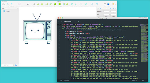
- Using inline SVG code. Where SVGs differ is that the code inside the file can be copied and pasted directly on a page to display the image. This method allows for more control over manipulating the image.
For more advanced information on the different ways to use SVG, check out the CSS Tricks article Using SVG.
Benefits of SVG
Scalability
One the major benefits of SVG is that they are resolution independent. This means that unlike file types such as JPG or PNG, SVGs retain the same quality no matter what screen resolution or size they are being at. So, on a retina display where a JPG might appear blurry if it’s not large enough, an SVG will still look high-quality.

File size
Using SVGs can result in smaller file sizes than other file types when optimized properly. This is helpful when dealing with higher resolution screens, since SVGs don’t need to be created at larger sizes to accommodate the difference like raster images do. If you are using SVG files on your website, smaller file sizes mean your images will load faster.
Editing capabilities
SVG files are unique in that they can be edited in graphic editing programs (such as Illustrator or Sketch) like other images, but also in a text editor where the markup can be adjusted directly.

Performance
Using inline SVG is beneficial to the performance of a website because it eliminates the HTTP request needs to load in an image file. Since no file needs to download, this results in smaller loading times for a page. This makes your website appear faster to visitors, improving the user experience.
Style control
Another benefit of using the inline SVG method is that it allows you to control the styles within your image. You can control properties such as fill color, stroke color, sizing, and more through CSS. This is especially useful for adding hover effects to an image, eliminating the need for image sprites.

Advanced options
SVGs can be manipulated with technologies such as Javascript, making them more dynamic than raster images. For example, SVG animation is a popular technique for adding interest and interactivity to a website. Check out our Animated GIFs and SVGs article for some creative examples.
As you can see, SVG is a beneficial tool for displaying vector-based images on your website. If you’re looking to improve your website but not sure where to start, TBH Creative can help.

