User experience, also known as UX, is an integral part of any website redesign. If you want results from your new site, you have to listen to your target audience.
The good news is that this is work anyone can do. All it takes is empathy, understanding, and common sense.
You don’t have to have a master’s degree in website user experience to lead a web design project that supports your customers, sets you apart, and meets your goals. You only have to want to help people—and then be willing to fight to make sure your new site delivers with its refreshed content, design, and functionality.
Are you ready to put the “friend” in user-friendly?
Read on to discover how you can leverage website user experience principles to identify patterns of behavior and ensure your new site gives your customers what they need.
Start with what your target audience needs
Your target audience is on a mission when they come to your website. The quickest way to understand website user experience is to analyze the time and effort it takes for your top users to complete common tasks.
Beyond following general best practices, use what you know about this group of users to customize every aspect of your new website.
Not everyone has full-fledged website personas research or one-on-one customer interviews at hand as sources of UX insights. If that’s the case, you can create a clearer picture of your target audience’s needs by answering basic questions, such as:
- What are your customers trying to do when they come to your website? What are their problems?
- What is their background, goals, and values? What technology will they use to access your site? Do any of these factors create limitations or influence how they use your site?
- How could your website make it easier for them to reach their goal? What could you do better?
What you learn through this exercise can help reveal business-centric biases you didn’t know you had and makes it easier to make decisions that improve your overall website user experience.
The user experience honeycomb

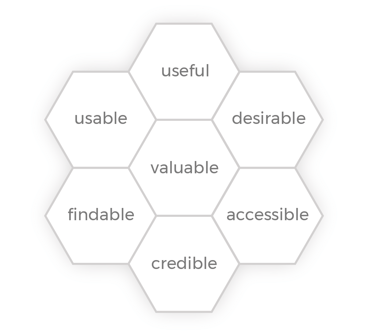
Peter Morville and his colleagues created the user experience honeycomb to describe the seven main facets of user experience. As you develop each page of your website, the quickest way to spot problem areas is by asking yourself if the page is:
- Useful
- Usable
- Desirable
- Findable
- Accessible
- Credible
- Valuable
Through this simple process, you might find out you don’t need the page, it doesn’t have enough depth/its content isn’t helpful, its images send the wrong message, it’s missing a CTA, it should interconnect with other content on your site, its main messages are lost, and more.
UX = getting things right
User experience existed long before the Internet, and it’s always been about reducing friction.
You never notice when the air conditioning is working. You just tend to detect when a room is too hot or too cold. The same goes for experiences using a website. Factors that cause a poor website user experience—like error messages, slow-loading pages, messy design patterns, sloppy or out-of-date/inaccurate copy, and unclear navigation—always stand out.
Website user experience covers how design, code, and content interconnect to eliminate the unnecessary to make every interaction as useful and meaningful as possible.
Some web design and development conventions, like maximizing readability, improving engagement, and keeping users’ attention, are universal. They are based on commonalities in human behavior. Website user experience includes all of these and more.
So how do you design a good experience for your website users? Start with research. Follow these tips to uncover your users’ real problems so that you can create an optimal website user experience.
Write for users who scan
Most people won’t read every word on every web page. Drop what you don’t need so your main message isn’t lost. Follow copy optimization best practices to make your content more useful and engaging. Break up large blocks of text with bulleted/numbered lists, key-term highlights, and pull quotes. Include vital information near the top of the page by writing in inverted-pyramid format style and use headings to organize info down the page.
Think beyond your homepage
Your homepage isn’t the only page you need to design with care. In fact, your homepage might be your least important page. In many cases, your users will start their visit from a search result or ad that points them to a landing page or blog post. Give as much care to the design of your interior pages Use the wireframing phase to look for contradictions.
Focus on simplifying interactions
Are your forms easy to fill out? Are your CTAs clear? Is it as easy to use your website on mobile devices as it is from laptops and desktop computers? Go beyond browsing, and look at all the ways your users will engage with your website to identify blind spots.
Taking website user experience to the next level
Building a website that behaves how your users want and expect takes a lot of planning and research, and that work doesn’t have to be something you do on your own. When you need a helping hand, look for an experienced website marketing partner with a track record of creating award-winning websites that make visitors convert.

