Hyperlinks are the backbone of the web. They are what gets you from one web page to another—without them, you wouldn’t be able to navigate websites.
Since links are so important, we should give them the design attention they deserve. This includes properly designing the various states of a link. A link state is essentially how a link looks at different points of interaction. For example, a link’s state changes when a user hovers over it with a mouse, aptly referred to as the “hover” state.
Optimizing link design is important to the overall user experience of a website. It helps to improve both usability and accessibility. In this article, we’ll look at the different types of link states and best practices for designing user-friendly links.
Default state
The default state of a link is the most important—if a user doesn’t know something is clickable, they won’t click it! Therefore, links should always look like links. While that may seem obvious, there’s actually a lot to consider.Back in the early days of the web, links were traditionally blue and underlined. As web design has changed over the years, link design has evolved along with it. Combinations of color, background, border, and more are now used to indicate clickable text.
However, blue and underlined text is still the most familiar indication of a link for many users. This has caused much debate about whether to stray from this easily recognized formula, and many UX professionals will recommend at least keeping the underline within body copy for better link visibility.
Regardless of which side you end up on, here are some best practices for designing a default link state:
- Be consistent. Choose a style and stick with it across your website (with navigation menu links being the exception). Multiple link styles can confuse users as they navigate your website.
- Whether or not you underline links in their default state, avoid underlining any other pieces of copy within your page content; underlining non-link words may cause confusion about whether or not that text is a link. As a general rule, don’t make elements look clickable if they are not.
- Follow accessibility guidelines. For example, according to WCAG, color should not be used as the sole indicator of a link, unless it adheres to strict contrast rules. If you are using color alone to differentiate links from surrounding content, this can make your site difficult to browse for low-vision or colorblind users.
- Consider adding context to different link types. For example, you might add some type of unique indicator to all external links, like an arrow. This special treatment allows users to better anticipate what will happen when they click on a link.
- If you are including icons with linked text, make sure to use globally recognizable icons or ensure that there is sufficient descriptive text included. Some users might not immediately understand what an icon represents.
Hover state
A hover state is triggered by a mouse when a user moves their cursor over a link.A change in style on hover provides immediate feedback to the user, reinforcing the fact that an element is clickable. It can help to eliminate confusion about which link a user is clicking on if there are multiple links close together. And as a bonus, hover effects are a way to add some fun interactivity to your website.
Hover states should be different enough from the default link state to clearly show a change to the link. Also, remember that most people visiting your website will be using a touch device and they will never see link hover states. Therefore, it’s important to not rely on hover design to display any important information.
 Codrops shows how to get creative with link hover states
Focus state
The focus state occurs when a link is tabbed to, either by a keyboard or programmatically. This is an important accessibility consideration for keyboard-only users navigating a website.The default focus state of a link is usually a blue outline, but that doesn’t always work well depending on the design and color scheme for your website. Customize the focus state design to further improve link usability.
As with the hover state, make sure your focus state sufficiently stands apart from the default link style to make it clear which link is in focus.
 Smashing Magazine’s focus state is a custom border that matches their branding.
Active state
The active (or “pressed”) state occurs after a link has been clicked but before you navigate away.Active states can be easy to overlook, but they are a useful tool for communicating information to a user. While they may be seen for only a fraction of time depending on connection and website speed, they confirm that a link has been successfully activated.
 Active links on the MDN website get a blue background.
Visited state
The visited state indicates a link that you have previously visited in your browser. It’s another often-overlooked state that is beneficial to optimize for usability.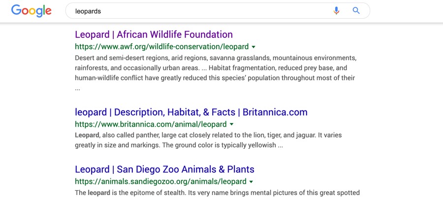 Google helpfully displays visited links in different styles to make it clear which search results you’ve already clicked on.
Visited states help to prevent user frustration. If users can quickly tell the difference between a fresh link and one they’ve already clicked just by looking at them, they can better navigate through content. This is especially useful on websites with many links, such as a wiki site, or within a page with search results.
Set up a content strategy consultation
You might also like…
