All finished websites are the result of design compromise.
Compromising on design decisions is a standard part of every project—and overall that is a good thing—but, design compromising takes a nasty turn when those trade-offs go beyond the needs of the target audiences and start to hurt the effectiveness of the overall design.
As a client, when you work with a designer, they should always be willing to make revisions based on your feedback, especially when those changes will maintain or improve the direction of the overall aesthetic. It’s all about striking the right balance. But, don’t be surprised if your designer pushes back on changes that you suggest for purely subjective reasons (e.g., “Sorry, but I’m not a fan of using photos of blonde babies in our website’s diaper product shots.”).
This article is part of the Complete Guide to Planning a Success Website Redesign Project.
If you’re unsure about some feature of a design you’re evaluating, before you request a specific change that might dismay your designer (and postpone your project’s progress), propel the project forward by starting a dialogue. Ask questions to learn the reason behind your designer’s decision, and then use this new information to evaluate the design with fresh eyes. Put your trust the designer and reserve pushing back for those elements of the design that you know will keep your customers from reaching their goal.
Ultimately, you’ll be better off even if your website doesn’t please you—or your designer—100%, as long as it does a great job supporting your users and helping them meet their needs.
Compromise to future-proof your project
At the start of any project, it’s not uncommon for clients often come to us with ideas about what they want their design to look like by showing us something that they’ve seen their competitors doing (or, even showing us something they randomly stumbled upon). In fact, if a client doesn’t have a lot of branded collateral, getting samples of what clients like can be especially helpful and serve as a framework for guiding our work as designers.
Pro-tip: Inspiration can come from anywhere. Really. During a presentation at the 2003 Society of Publication Designers convention, type designers Tobias Frere-Jones and Jonathan Hoefler revealed what went into creating their flexible slab serif Archer for Martha Stewart Living magazine. In the midst of their ideation process, the lifestyle publication’s famous namesake—domestic doyenne Martha Stewart herself!—faxed over some lettering that she wanted the two to use while brainstorming. Which typeface was used in the example she shared? Courier.

Troubles arise, though, when clients want a carbon copy of a design that someone else has created for another purpose.
Your goal should be to end up with a modern design that helps your company stand out from the competition, and to do that you need to:
- avoid passé typography,
- ignore past-their-prime UX treatments,
- shy away from out-dated layout grids, and
- stay clear of from other anachronous graphic design solutions that may be nice enough to look at but do not offer the best way to serve your customers (and meet their needs).
For some clients, modern design trends may be new or not their aesthetic. For example, you might think that a design solution’s use of whitespace (or negative space) seems weird at first or maybe even like wasted space, but, as a client, try to resist the urge to ask your designer to fill that space.
Not only is whitespace vital because it makes key design elements stand out more prominently, but it can also help:
- create a sense of visual harmony,
- improve legibility and scannability,
- guide users through the page, and
- add sophistication.
Next time you stop into an art gallery or browse portfolios at a design community (like dribbble) notice how curators and artists use whitespace as an essential part of the presentation of work.
Background videos, oversized bold typography, isometric illustrations, flat designs, gradient fills, high-contrast duotones—the list of contemporary design trends changes often, and not every treatment will be right for your brand. Trust your designer to deliver a design that is fresh and gets you closer to meeting your digital marketing goals. Unique, powerful designs attract customers (and make them feel special).
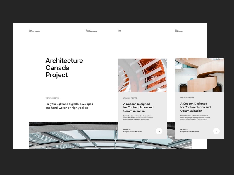
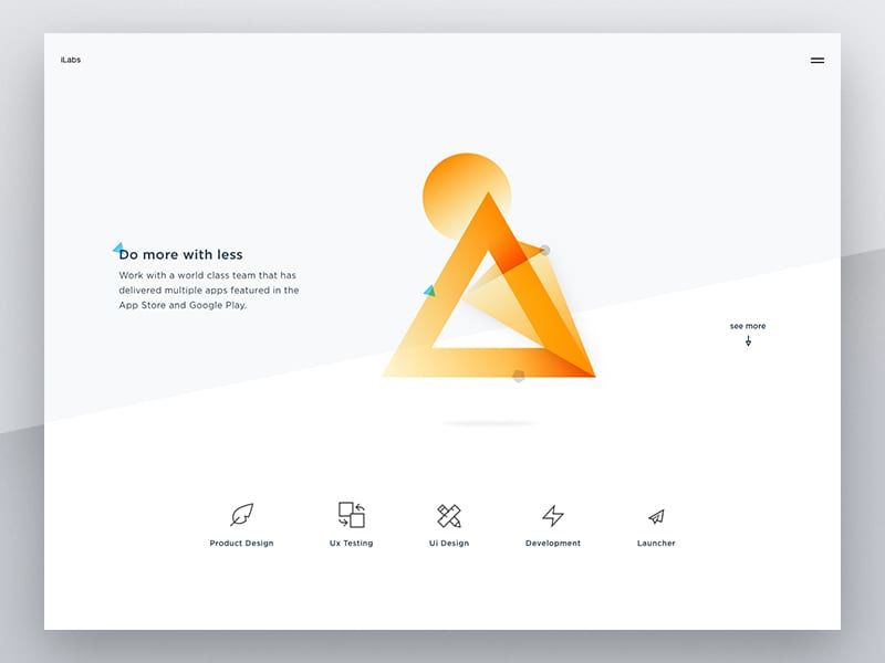
Here are some websites featuring powerful, modern designs:


Have faith in your designer
Putting your trust in a designer is essential. Pick someone whose portfolio you have vetted, someone who you will trust to make the right design decisions. Doing this initial work up front will make the process of getting to the right solution go more smoothly—and reduce the amount of design compromising during your project.
Look for a designer with experience who has spent a lot of time researching design trends and best practices.
Spend time planning upfront to expedite the design process
Every project includes changes along the way. There is only so much you can know upfront before diving into the project.
As with many things in life, upfront preparation can alleviate some backtracking and stalling during a project. When you finalize wireframes, write your copy, and choose your photography before moving into the high fidelity design stage, it often speeds up a project’s timeline and prevents the need for excessive revisions down the road.
That’s why, knowing that it’s easy to fall into limbo and iterate forever, your designer may limit the number of rounds of revisions as a way to keep everyone focused and keep the project on track so you hit your deadline.

What sets the best websites apart?
Gain more leads by letting the experts lead
If there’s a question about your product or service, you’re the expert, right? The same goes for design. If you’ve done your homework and hired an experienced designer, it is likely they have studied design and helped hundreds of clients reach their goals by creating website designs that deliver significant ROI and leverage user experience best practices.
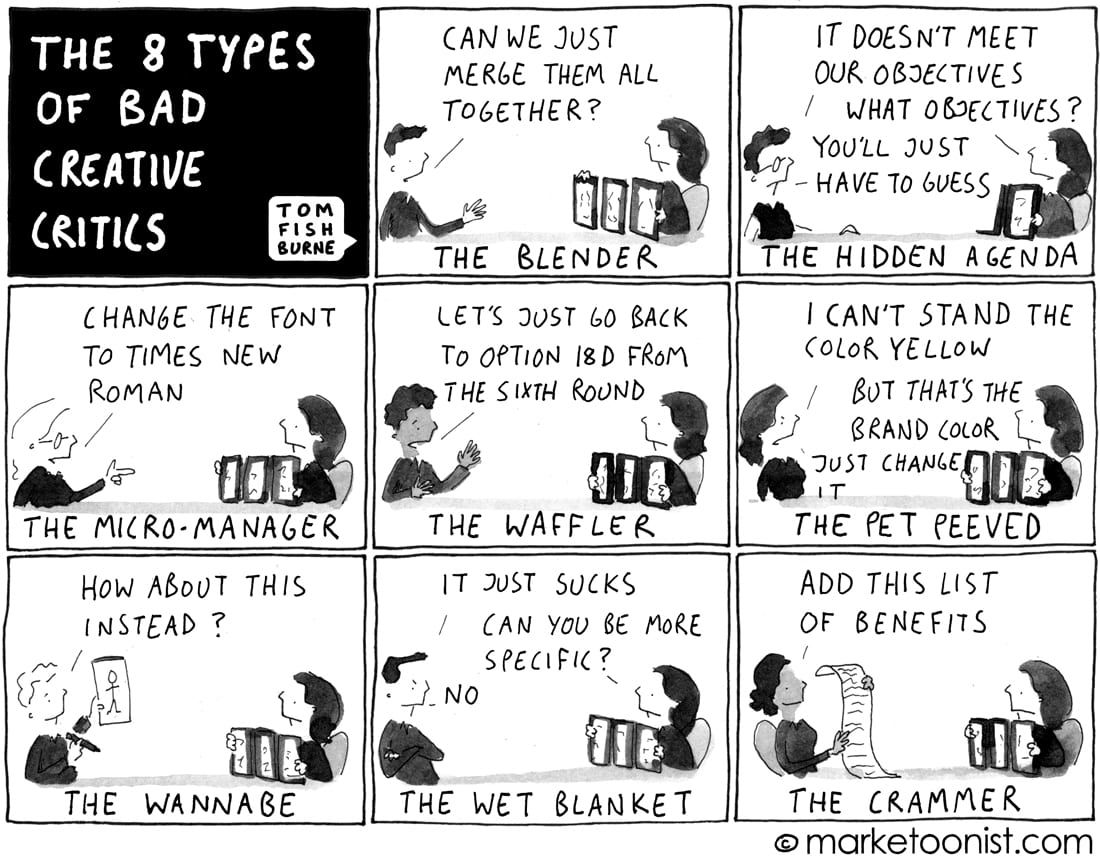
If your designer pushes back on a revision request proposed by someone on your team who has less web design experience, as the project owner, you will be in the sticky situation of having to decide which way you’ll go. Our best advice is to consider the problem that your team member is trying to solve with their request. If the issue is purely a subjective design change that won’t keep you from serving your customers, you might want to support your designer and stick with their solution.
Deferring to design by committee, especially when that committee isn’t made up of graphic design pros with extensive experience in web design, rarely delivers the best results.

Compromising isn’t settling
In the end, clients will (and should) always get what they ask for, but web design solutions that deliver maximum results are ones that put customer needs first. Find a web designer who isn’t afraid to fight for your users, then trust that web designer to deliver a new website design solution that puts you on the path to be successful.

