
An excellent healthcare website design is vital because today’s patients expect their providers to deliver the care they need in-person and online. In fact, according to the U.S. Department of Health and Human Services, there was a 63-fold increase in virtual-care consultations and other telemedicine appointments during the COVID-19 pandemic.
Whether users access your site to read up on doctors, view ER waiting room times, set up consultations, request appointments, renew prescriptions, find phone numbers, pay medical bills, check out test results, or even just look for self-diagnostic info, it’s essential to make the patient experience online as frictionless as possible by following the latest trends. Doing so when redesigning can help future-proof your medical site, make it feel fresh, and ensure it supports your other healthcare marketing efforts.
But, what exactly do the best sites for hospitals and other practices have in common? Beyond basics like minimalism, white space, and clean layouts, how do organizations use different elements to make complex medical details easier to understand?
Keep reading to find out and get inspiration before starting your next healthcare website design project.
10 trends in healthcare website design
- Simple illustrations
- Video storytelling and custom photography
- Shape pop-outs
- Dark mode
- Large type
- 3D graphics
- Overlapping
- Branded color shapes
- Robust staff details
- Animated icons
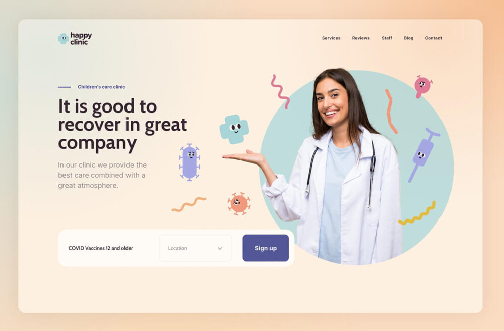
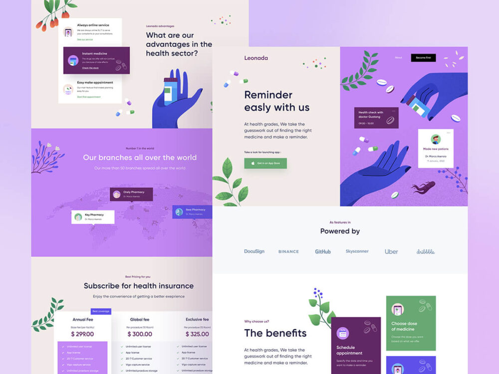
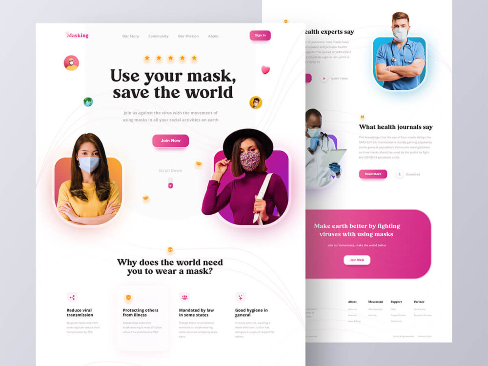
Simple illustrations
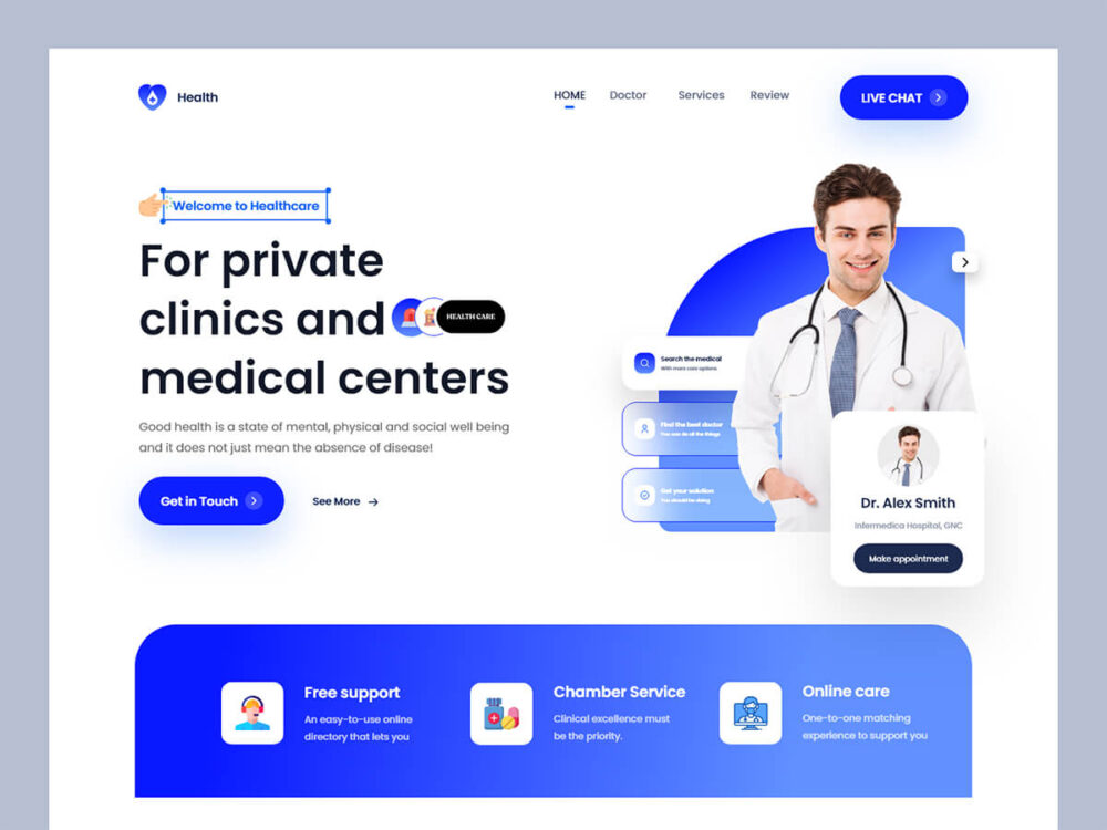
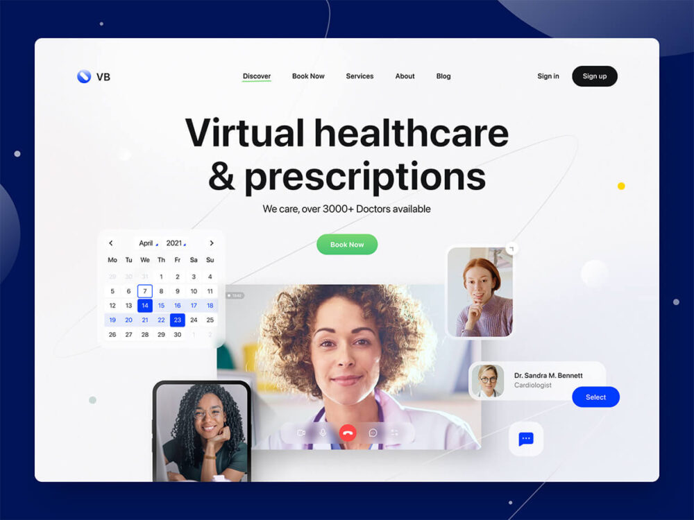
Simple symbols and illustrations are understood in any language and can be used to communicate ideas to people from all walks of life. In these two healthcare website design examples, they are being used effectively in a colorful and branded way.
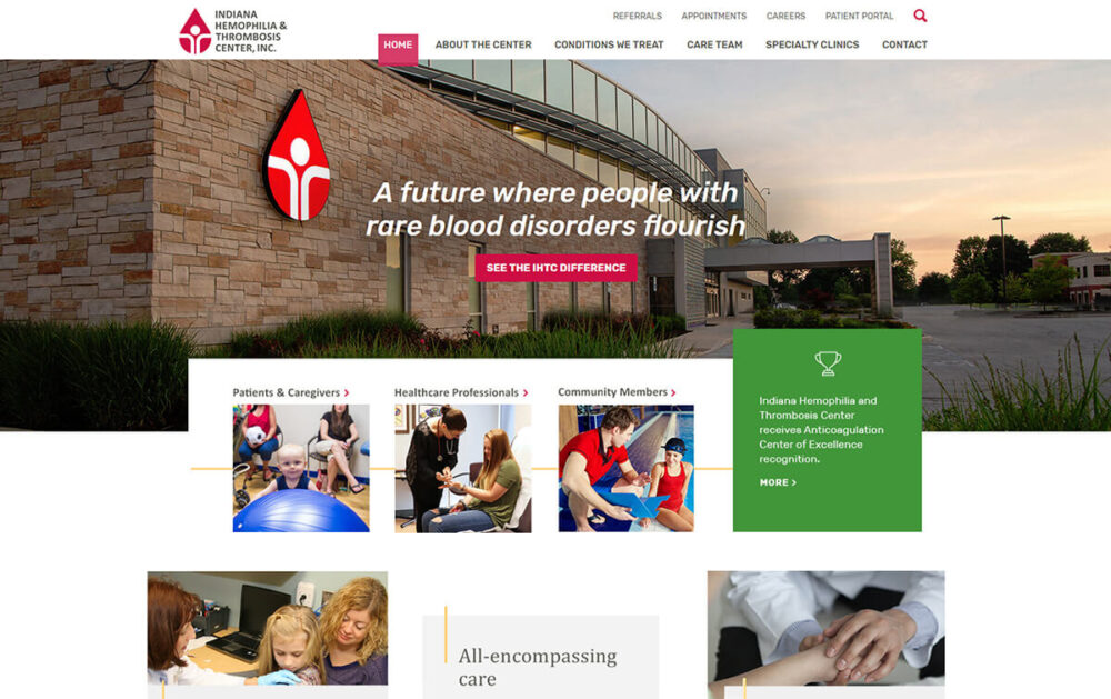
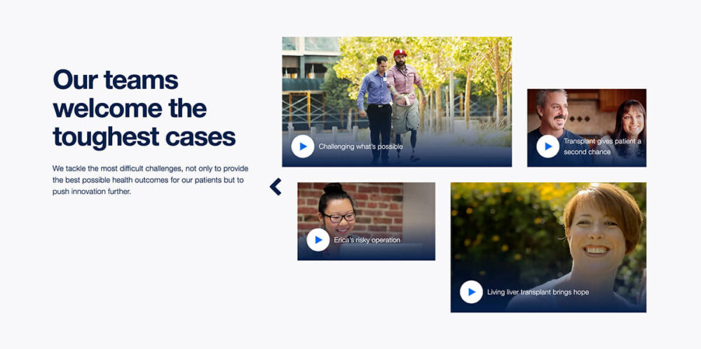
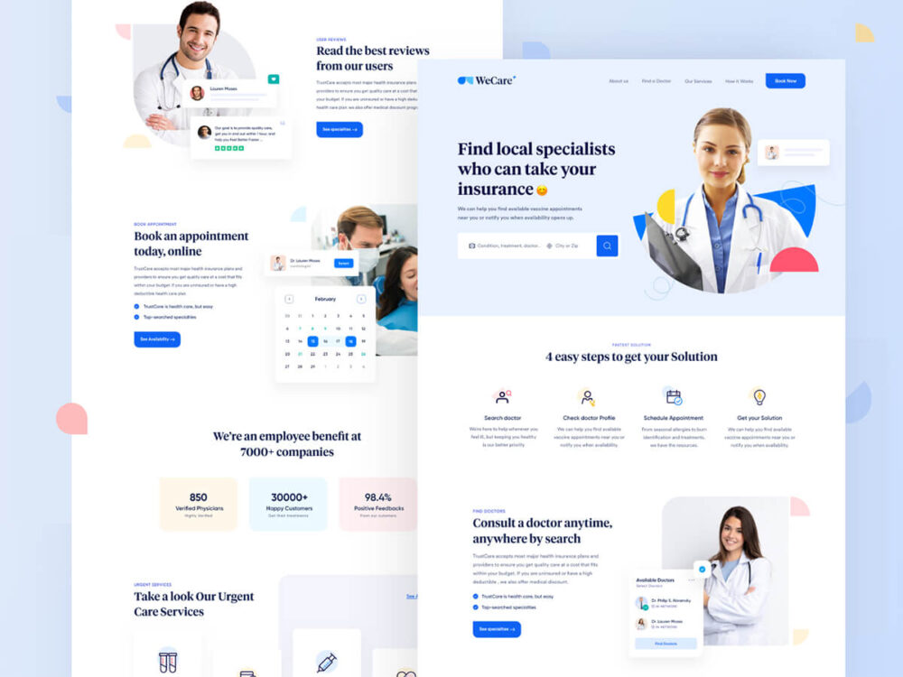
Video storytelling and custom photography
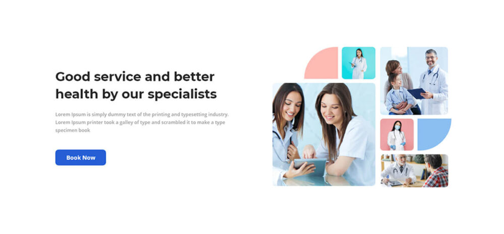
Ideally, when planning a new medical website design, you will want to hire a photographer/videographer before starting on the visual elements. Custom photography and videos help tell a story about your brand and keep visitors engaged on your site much longer.
Showing your brand in the background is a solid way to show that they aren’t just pulled off a stock website. It makes a huge difference and further instills trust in the visitor.
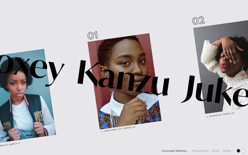
Shape pop-outs
There might be another term for this, but … shape pop-outs are basically when a photo of a person that is both isolated within the shape and also popping out of it. Its popularity as a design style is growing, especially in the healthcare industry.
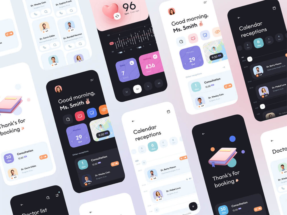
Dark mode
Dark mode is more commonly within platforms, apps, and product websites. Still, it might not be long before you start seeing this feature on healthcare websites, given its growing popularity elsewhere.
Especially with healthcare and accessibility, designing a site that allows users to be able to switch to a dark mode web design might help reduce eye strain, reduce glare, increase contrast, and save some battery life.
Large type
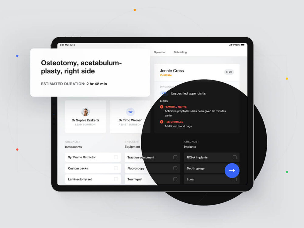
The bigger the heading, the better. Large bold typography can look good, but it also serves a purpose. It helps for clarity, accessibility, and anyone who might not currently be wearing their prescription glasses.
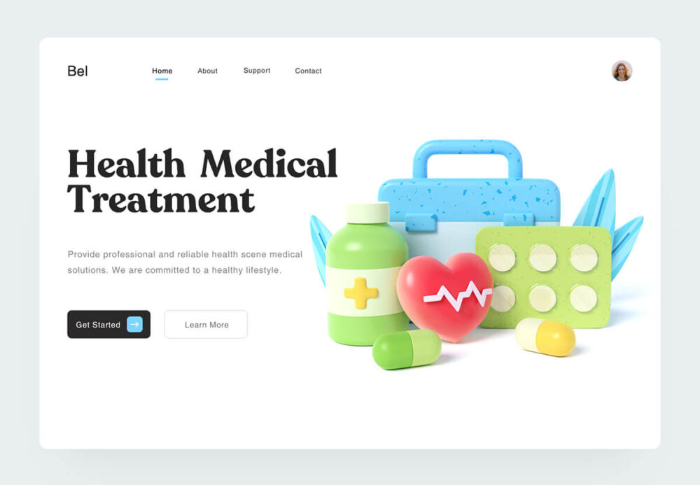
3D graphics
3D graphics have been used in the medical industry for representing blood cells and anatomy for quite some time now. Now, you can see it being implemented in a more simplified way on healthcare websites and in many medical app designs.

Overlapping
Using overlapping elements with a super subtle drop shadow is a great way to showcase features of your healthcare app, for example. Subtle glows below the buttons are also a nice way to make them stand out.
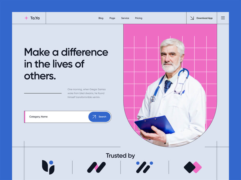
Branded color shapes
White space doesn’t have to just refer to the color white. Your brand colors can be used to give your content a bit of breathing room. They can also be used for creative shapes, patterns, and elements.
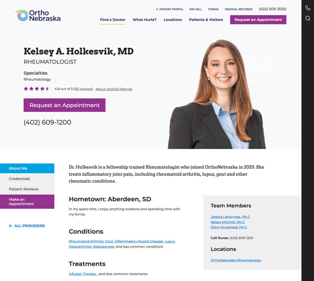
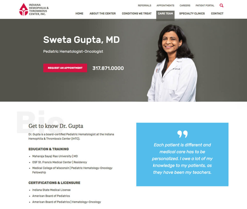
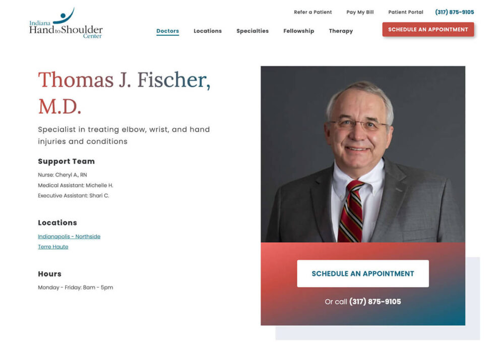
Robust staff details
Going along with non-stock photography are professional headshots. Having good quality, high-resolution photos of the staff and full detail pages for each team member can build trust.
Animated icons
Animated icons can represent many things in the healthcare industry, from indicating blood flow to pain points on different parts of the body. Another fine example of a well-designed animated icon is when you click the ♥ on Twitter.

What matters the most when starting a healthcare website redesign in 2022
When thinking about these healthcare website design trends, the most important to consider is custom photography and videos.
They will enhance your site and make your other marketing assets—like brochures, emails, and social media—much stronger. You can create new photography and videos before your healthcare website redesign project begins. Still, sometimes the results will be even better if you commission these elements during the planning and wireframing stage. Your web designer can provide specs on desired shot formats, etc.
Let’s use the metaphor of investing in a new dream car. Would you opt for crank windows and no A/C? “Also, go ahead and leave the windshield and wheels off. I’ll add those on in a few months.” There might be a few track race car scenarios where that could be the case, but I digress …
With this detailed list of healthcare website design trends, you could even use all of them on one website. Combine good photography with illustrations and 3D. Add video backgrounds with large typographic headings overlaid and keep your visitors engaged with video stories. Find an illustrator and 3D artist you like, or just contact TBH Creative, and we’ll cover you on all fronts.