
When you’re a blogger, coming up with fresh, high-quality content is usually your main focus.
Though compelling content is why they come, how you present your articles is what will ensure they stick around to read it. This is why making sure your blog page design is optimized to best serve your content is so essential, especially if you want users to stick around to see other great posts you’re publishing (and maybe even check out your products and services, too).
Your readers have options. Fine-tune your blog’s design around their needs to keep them from immediately bouncing back to Google to get answers from another source. In this blog post, we’ll cover functionality and design must-haves for optimal blog user experience.
Read on to learn more about the do’s of blog page design.
Do: Create blog styles that improve readability
David Carson is a groundbreaking designer, but creating a layout reminiscent of those that appeared in Raygun in the 1990s won’t help you keep most users on your site.
Don’t make it hard on your users. Be engaging-yet-straight-forward with your design choices—especially if your users are coming to your blog for information on topics like trends in banking, when to stop taking medications before surgery, or how to choose the best antibacterial wipes for your gym.
Designing a business blog that users find easy to read requires typesetting your articles in a clean font, formatting with consistent heading styles, and making sure content is proofread and edited.
EXAMPLES
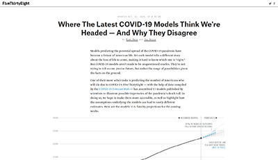 FiveThirtyEight
Nate Silver’s website FiveThirtyEight uses statistical analysis to talk about elections, politics, sports, science, economics, and more. His website’s article design format complements its content and features great readability because the design includes:
- interlinks to other articles and blog posts on related topics
- a body copy column width that’s not too wide, which ensures readability
- infographics, images, and subheadings that break up the body copy and make it easier to scan
- a customized design for mobile device viewing
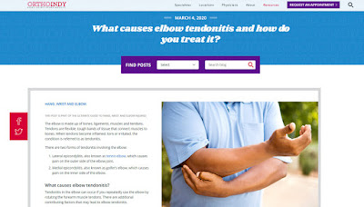 OrthoIndy
By limiting the number of columns and distractions, OrthoIndy encourages its users to read the complete blog post. The reader’s attention is only competing with the large photo and the main content, rather than multiple columns of text, CTAs, and other images.
The more you work to break up posts with images and large visuals, the more the user will want to stick around and keep reading.
Do: Use white space
By removing anything that might be clutter on your blog content a way to “breathe.” Strategically using your white space to frame out posts, topics, and calls to action will allow each post to stand independently of one another, helping readers find the content they care to read.
While simple, single-column may not be your favorite look, this simple grid-based design choice makes it easier to create familiar pathways for readers.
 BONUS TIP
Optimize the design your blog’s landing page
TBH Creative uses its blog landing page to share short intros and strong visuals to give users a taste of what they are about to read when they click through to each individual article page. Users also have the option to browse posts by tagged topics or use the search tool to find articles associated with specific topics.
Do: Include an option to filter by topic
Organize your posts with tags, so users can easily find other related content using filtering. Giving users this tool helps to get your readers to the content they care about most—quickly!
One word of warning: Beware of using too many tags. Until you have a handful of blog posts to go with a topic, don’t include a tag for it.
Do: Create a blog page design that is mobile-friendly
In 2016, mobile web users were greater than desktop. Having a responsive website is no longer an optional consideration. Your users expect your blog to be mobile-friendly. Make sure you’re optimizing your blog to load quickly and look good on smartphones and tablets.
 EXAMPLE
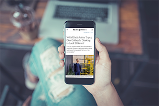
The New York Times
The New York Times excels in presenting a mobile experience for its users.
Their web designer has left enough space so that their individual article pages are easy to scroll through. Body copy is presented using text that is large enough to read without zooming in, too.
Want to find out if your site is mobile-friendly or not? Check out this handy tool, enter your URL, and be on your way to becoming more mobile-friendly.
The most effective blogs put users first. If you have written content that your target audiences want to read, make sure your blog page design is refined to enhance the user experience.
