One way to increase interest in your content is by creating effective visuals. There’s no denying the power of images on the web, and while words can be powerful on their own, images have the benefit of telling a story instantly and forging a deeper connection with viewers. Adding visuals to your content is a great way to pull users in and get them interested in learning more.
The key to creating engaging visuals is to understand how images can be used to communicate information. In this article, we’ll provide you with some tips on how to identify potential visuals within your content and create imagery that will make an impact on your audience.
1. Start with high-quality content
It’s hard to create compelling visuals if you’re working from subpar content. Even if you create high-quality graphics that successfully attract viewers, they aren’t going to stick around if your content isn’t well-written. Before you start planning imagery, take some time to make sure your content is structured, informative, and concise. Once your content has been improved, it will be easier to pull out the bits of information that will get your audience interested in reading more of your content.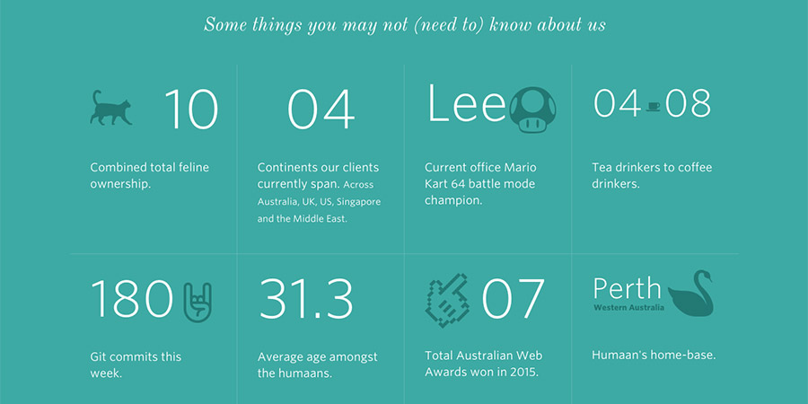
The Humaan website icons and typography to highlight statistics about its team. This is a more engaging approach then just providing facts in a typical list format.
2. Identify key information
Once you have your content set, you can start identifying key points that can be reinforced or represented with a visual counterpart. Choose content based on importance, as well as how easily it will lend itself to graphical representation, such as:- Main concepts or ideas that can be reinforced through imagery
- Number-based data that can be represented as a graphic or in a chart
- Steps or processes that can be visually represented
- Calls to action that should stand out
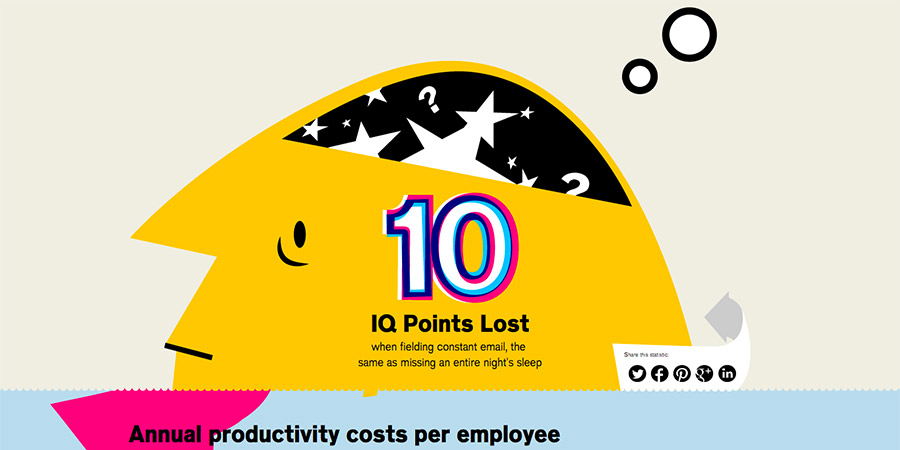
Atlassian’s interactive infographic about how much time is wasted at work does a great job of visually representing key statistics in an effective way. This helps to engage the audience and make the data more interesting.
3. Define a purpose
What purpose will your visual serve? Is it meant to educate, capture attention, or encourage social sharing? Who is your primary audience? Ask yourself these questions in order to get a better idea of how your visuals will be used to promote your content. This will help you to define a general strategy for your imagery and make more-informed decisions about how to portray your information in order to maximize effectiveness.
Bellroy uses interactive photos on their website to help users visualize their product’s purpose, which is more effective than just explaining it with words.
4. Choose the right type of visual
Most pieces of information can be represented in a number of ways, so it’s important to select a visual type that fits into your overall strategy. When deciding on a type, you should consider the information it will include and its intended purpose. Here are some popular choices:- Infographics
- Illustrations
- Charts or graphs
- Photographs
- Icons
- Animated GIFs
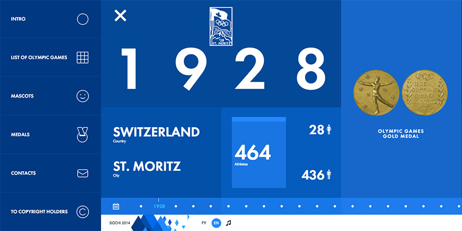
There is a wide variety of visual types used to represent information on the Olympic Story including icons, photos, charts, and more. The combination of these visuals makes the website fun and interactive.
5. Keep it simple
Focus on creating visuals that present your information in a simplified manner. Don’t try to put too much information into one graphic, as that can distract from its main purpose. An image that focuses on representing one concept will generally be more effective than one that tries to represent multiple concepts.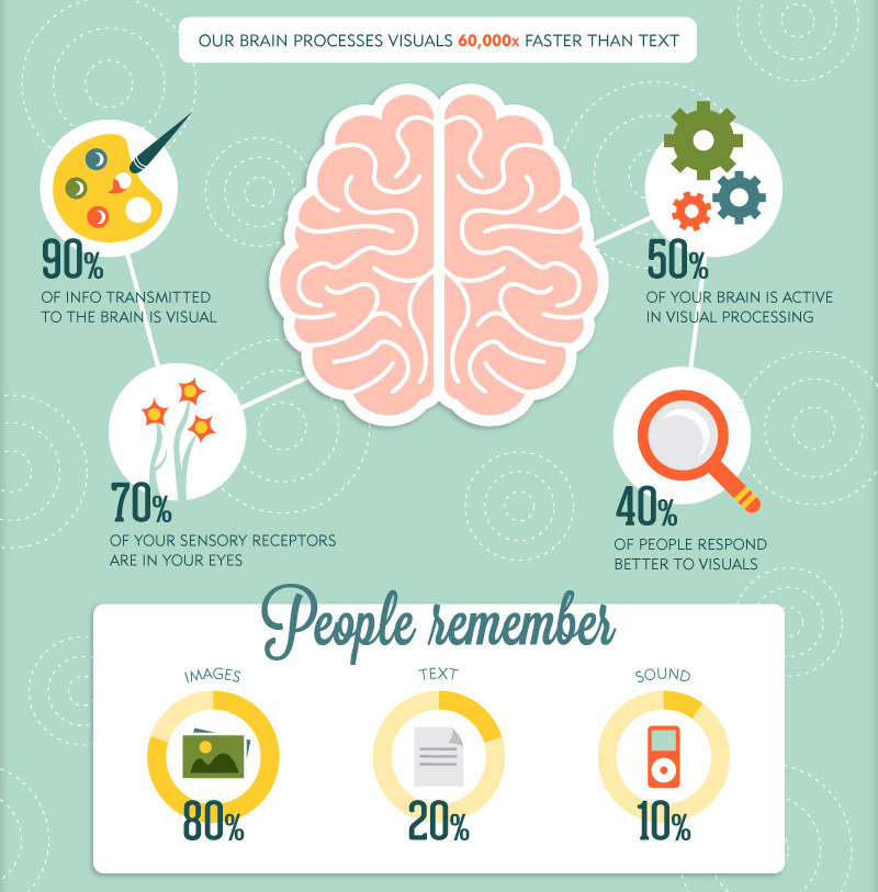
Learn more about why visuals are such an effective marketing tool in this infographic from Optimal Targeting.
Get inspired
Check out the links below for high-quality examples of visual content.
Need help translating your content into effective imagery? TBH Creative can help walk you through the process and create visuals that will captivate and engage your audience. Learn more about our services.
