How do you incorporate calls to action in your writing?
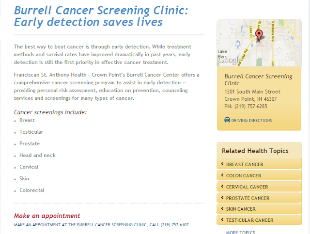
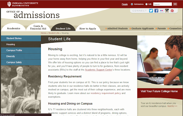
First, consider what you want users to do when visiting a particular page. Do you want them to continue deeper into the site? Maybe you want them to email you for more information? Or perhaps both are viable options to capture the interest of readers at different levels of interest? You should have goals for your website overall but each page should also have a communication objective. Now that you know the objective for the page, write the content to lead them there:1. Consider placement: Don’t limit yourself to the basic, ‘line of copy plus button’ at the bottom of the page. Yes, that’s a good call to action but it’s not the only one. Use text links within your content where appropriate. Place buttons in the middle of the page. Create feature boxes in the right column. Is the page long? Consider having a CTA in the middle of the page and at the end. Try to look at the page from your prospect’s point of view and consider where he might take action – then give them a way to do just that.

2. Don’t just use a phone number: People on your website are often there because they don’t want to pick up the phone. Even if your ultimate goal is to convince users to call, give them good alternatives. Create forms that are easy to complete to start the lead-gathering process. Include a link to an email address (and make sure someone answers it promptly). Invite people to attend an event or watch a video or listen to a webinar. Don’t ignore your phone number, but consider that this may not be the most desirable action for your prospects.

3. Feature + Benefit: It’s Marketing 101. If you want a prospect to take the next step, give them a good reason. Don’t just include a big button to Watch A Demo! Tell your reader why they want to watch the demo. Then include the big button to make it easy to do so.

Pay attention to the design of your calls to action to make them more effective.
If your page has more than one call to action, it’s critical that you consider the design of them to make sure you communicate their relative importance. After all, not every CTA deserves a large button. Even if your page has just one call to action, don’t make people hunt for it. Whether you use graphics or text for your calls to action, make them obvious and you’ll have more success getting your prospects to take the desired action.Make the text link bold. Make the button large and distinctive. Use white space effectively. In short, use design to make your calls to action more effective. Read more about call to action design tips and view examples.
To be effective, a call to action needs to be well-written and well-placed. Want more information on improving your calls to action?
Calls to action should never be considered as an after-thought. The objectives behind them, their design and implementation should all be part of your website strategy from the beginning. Not sure where to start? TBH Creative can help. From start to finish we can help you create an effective online strategy and improve your website’s functionality. Contact us to learn more.
TBH Creative is a website strategy company—located in Carmel, Indiana—that serves Indianapolis and the greater central Indiana area, as well as other locations remotely. Learn more about TBH Creative.
