The web has fads that come and go, and color is one of these trends to keep in mind. The use of color on a website sets the mood and visually communicates the brand personality of a website. For 2013, we are seeing both the use of calmer, more subdued color palettes as well as palettes pairing bright neons with gray hues.
These trends are also influenced by Pantone’s Color of the Year for 2013, which is emerald.
These trends are also influenced by Pantone’s Color of the Year for 2013, which is emerald.
Trends for 2013
Grayscale
Using gray on a website instead of black tones down the contrast on text and aids readability. Incorporating bright color accents brings attention to important elements and creates hierarchy among the content and design.Paypal’s new website uses grayscale colors paired with soft hues throughout the site.
Another interesting way to use grayscale accented color is with photographic images. When the user interacts with the image or mouses over the grayscale photo, the image comes to life with color. Once a user interacts with that pop of color, they will be that much more inclined to click.
Another interesting way to use grayscale accented color is with photographic images. When the user interacts with the image or mouses over the grayscale photo, the image comes to life with color. Once a user interacts with that pop of color, they will be that much more inclined to click.
Use of block colors
Blocking content is a trend that has evolved and this year we are seeing color being introduced via this technique. Visually, color blocking is a great way to categorize content and sections of your site and allows for clear interactions with blocked elements.iStockphoto uses color blocks for content and when interacting with the design elements.
Neon colors
Neon colors are bold and bright. Neon colors are beautiful when coupled with gray hues. The gray hues allow the bright colors to stand out and immediately catch the eyes of users.Pastels
When used correctly, pastels help create a feel that is friendly and often engaging; whereas neon colors tend to be bold, with the main purpose of making a statement.Coullon.com, an online portfolio, uses subtle pastels to communicate a friendly experience.
Kuler
Kuler was a great tool to explore color and can be used directly from within Adobe software programs like Photoshop and Dreamweaver.
Colourlovers
Colourlovers is a great tool. It is maintained by graphic designers and is supported by a large community of developers.
Ready to revamp your website? Start here
Use color tools to tweak your palette
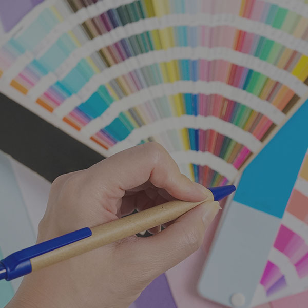
There are many tools out on the web that you can use to test color combinations and tweak your existing palette. Below are a few of our favorite tools that we use when exploring color in our web design process.Kuler
Kuler was a great tool to explore color and can be used directly from within Adobe software programs like Photoshop and Dreamweaver.
Colourlovers
Colourlovers is a great tool. It is maintained by graphic designers and is supported by a large community of developers.
Ready to revamp your website? Start here