Check out a newer version of this post! Facebook no longer uses tabs in this way, but you can use a cover photo as a “Welcome Message” variation. For more current tips, head over to our instructions for a great Facebook cover photo article.
Throughout this month, we’re focusing on how businesses and organizations can use custom tabs to strengthen their Facebook pages. Last week we introduced why businesses and organizations should consider using custom Facebook tabs. Now, we’re focusing on specific examples of effective custom tabs. First up? “Welcome Message or “Like” page” tabs.

A welcome message is a useful type of custom tab to include on your Facebook page. Use one to reinforce your brand image. Consider it a friendly hello page—a home page for your visitors to check out when visiting your Facebook business page that’s more welcoming than the default timeline page.
A welcome / Like Us page should:
- Encourage visitors to like your page.
- Offer an incentive after liking the page.
- Lead to additional information.
- Include a call to action message.
This type of custom tab used to be more popular when Facebook allowed businesses and organizations to set-up a non-fan landing page, but it still can be used with just a little re-purposing.
Examples of exemplary Welcome custom tabs
Example that encourages likes without providing an incentive
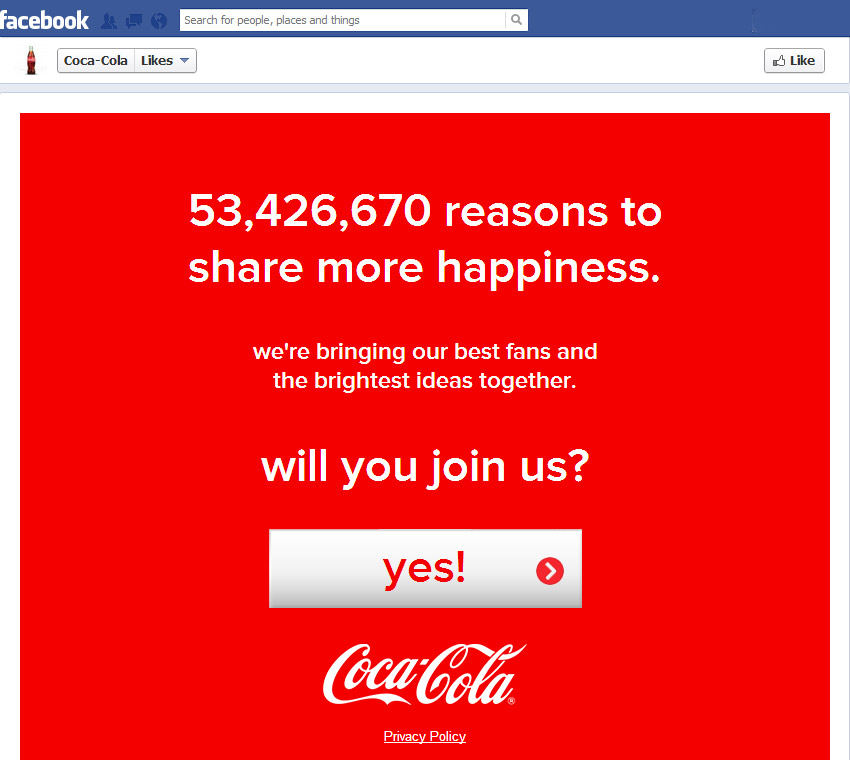
Coca-Cola takes a positive spin. They encourage visitors to “join” the best fans and brightest ideas. In general, this page is a great extension of their brand’s existing positive messaging. They are not offering a specific incentive, but the page is inviting.
Examples that encourage likes by providing an incentive
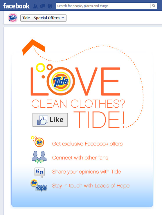
Tide offers several features reasons for users to like their page. The list includes vague offerings that might not encourage immediate participation, but if the copy was tweaked to include specific offers (such as mentioning the exclusive offers are coupons) the return would be more convincing for those unsure visitors.
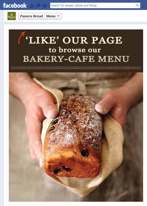
Panera Bread offers popular information upon like: convenient access to their full menu! Once you become a fan, the menu displays. The menu is well-done—as nice as a web page might be with scrolling featured items, divided by types of food (cafe, bakery, sandwiches, salads, etc.).
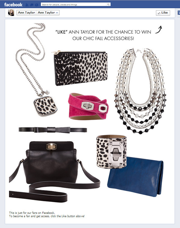
Ann Taylor offers a chance to win free accessory products to those who like their fan page. While the offer is a compelling reason to like the page, their messaging could be improved. Instead of showing “exclusive” products to individuals who like the page, more information about the drawing should be shown to build trust with fans. Providing details about when the drawing will be held as well as who has won in the past would be useful.
Examples that do a good job integrating call to action messages
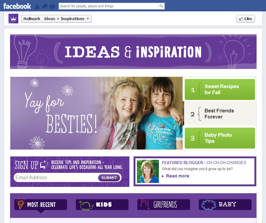
Hallmark includes a lot of information and a few calls to action on their welcome page. This page resembles a website home page. They actually have several pages like this on their Facebook profile/tabs. They include a lot of options and information, but I wish they would consolidate what they’re trying to do and present less to me on each tab so it was not overwhelming.
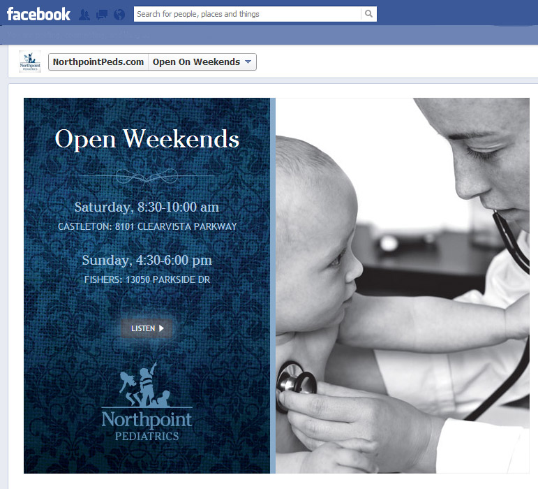
Northpoint Pediatrics uses a custom Welcome tab to communicate a key offering to their audience: weekend hours. The page features audio to add more detail about their weekend hours and care options for patients.
Which of these examples of custom Facebook welcome tabs do you like best? What should we add to the list of good examples of custom Facebook welcome tabs? Over the coming weeks, we will be posting examples of other types of custom Facebook tabs. If you send us some good ones, we might include in our coming posts.
Social media marketing is constantly changing. TBH Creative can help you stay on top of things.
