Welcome to part three of the Best Practices for Common Pages series. Today we’re looking at products and/or services pages.
Products and/or services pages should display information about whatever your business offers. It’s important to pay special attention to this page, even if you aren’t selling anything online. It should be created to capture interest and push users to engage in purchasing a product or utilizing a service.
Key elements
- Products or services: The most important thing to include is your products and/or services! It’s key that this information is up-to-date so your customers get accurate information.
- Detailed descriptions: You should include enough information for each product and/or service to give customers a clear idea of what they’ll be getting.
- Benefits: Include any major benefits as a result of purchasing your products and/or services. Most customers want to see what’s in it for them, and if they aren’t quickly enticed by what you’re selling, they may leave before seeing everything you offer.
- Images/video: Including media, like photos or videos, about your products or services can increase visitor interest. Creating a strong visual generally captures attention more successfully than text, and visuals are great for showcasing the features of a product.
- Reviews/testimonials: Include any reviews or testimonials from happy customers in order to add credibility to what you’re selling.
- Prices: If you’re able to list prices on your website then do so, especially if having low prices is a big selling point.
- Contact information: Visitors may have questions about your products and/or services, so make sure your contact information is easily accessible.
- Call to action: A well-placed CTA is needed to get visitors to the next step. Once they’ve seen what you have to offer, what do you want them to do? For example, if the next step would be to contact your company for a quote, then make sure that is a prominent call to action on the page.
Tips for success
- Design this page in a clean, easily scannable manner. Make sure it is easy to navigate and attractively showcases your offerings.
- Consider creating a separate page for each product or service if you have a lot of information so that users aren’t overwhelmed by too much at once. For example, start with an overview page, then link to more information about each product and/or service. This allows users to quickly see what all you offer, and can choose to find out more abo ut what they are most interested in.
- Differentiate yourself from the competition. Make it clear where your products and/or services stand out from other businesses.
- Clearly and effectively communicate major benefits and selling points. Don’t add unnecessary information, but keep things simple and to the point. Provide all the necessary information for a customer to understand why they want the product.
Examples
 /td> /td> |
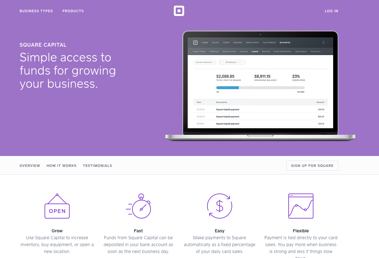
| Square’s provides a separate page for each of its products. They are in-depth and provide a variety of beneficial information. Each page includes testimonials to show what customers have to say about the products. |
 |
| Blue Dolphin Charters incorporates high quality photography on its product pages to add interest and entice visitors. It includes prominent calls to action at the top of each product detail page. |
 |
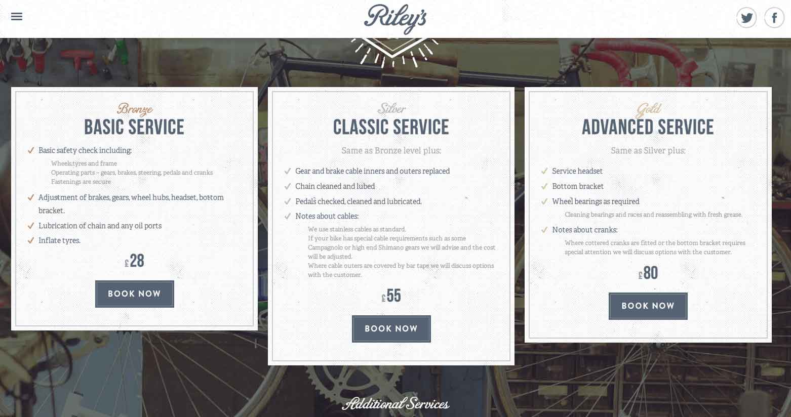
| Riley’s Cycles displays its services in a tiered format. A call to action is included for each service to encourage visitors to book a service. |
 |
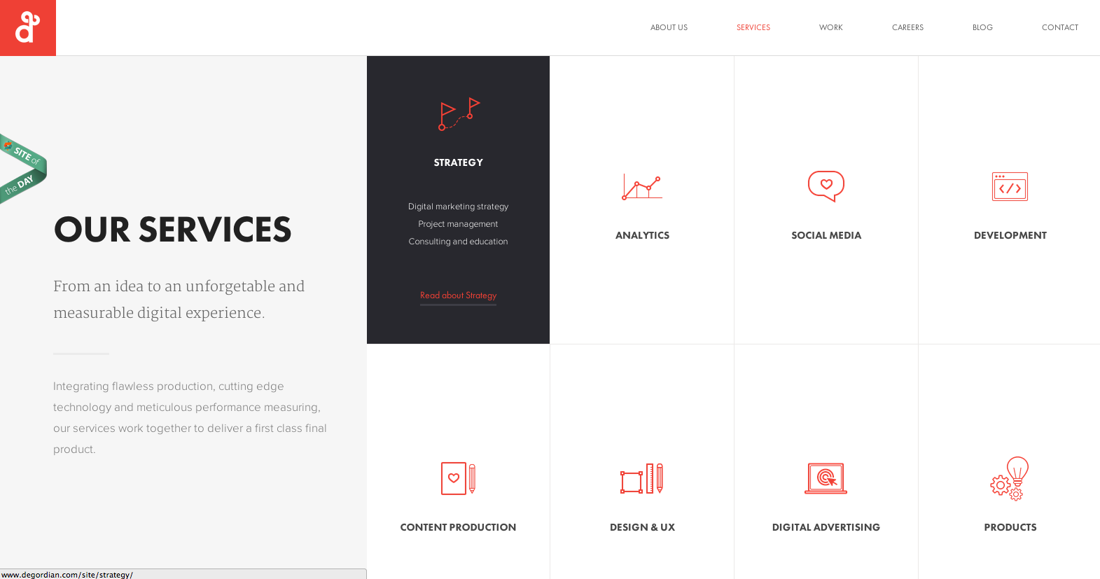
| Degordian provides strong visuals for each of its services. On the overview page, the services are listed with a short description and link to find out more. |
Do you have a website content challenge?
TBH Creative has experience working with a variety of teams to bring websites to life. Learn more about our
website content development services. Then
contact us to see how we can help you.
 /td>
/td>
